
While back I had offered the group a 4 or 5 year study (can't remember how many years now) of users and their impressions, suggestions, complaint and so on regarding KDE and Ark Linux (most KDE since it was how they interfaced) but no one seemed interested.
Because of this I've remained silent watching the emails go by. However, I'm going to offer some of that now.
I agree for the most part, but we must be careful not to be bold and different in the KDE4 style. ;-). Sometimes minor changes are OK in small quantities between releases, but usually large, sweeping changes will start alienating the types of users that are interested in this project.
This is very true. Aggressive changes leave no reference point for which to make the adaptive leap.
So here are some thoughts about the default Trinity desktop.
- As you seem keen on changing references from KDE to Trinity, you
might want to consider a new splash image. Likewise for your side image in
the K-Menu.
Done. Thank goodness for the GIMP!
Beware of excessive customization, they rarely go over well. 90% of the time, the users found a basic initial setup a good ground point to customize their DE.
- I always found the KDE-Classic Icon Theme somewhat unpleasant. The
Crystal SVG icon set is popular and cleaner.
Agree; it looks like the default is already set to crystalsvg in the code though?
A variety of icon sets should be made available, crystal is indeed one of the most popular, as were (in my studies) sparkle, Alien Aqua Baghira was also a very popular theme.
- I never understood the blind acceptance of four virtual desktops.
Most new users will appreciate two.
Sorry; I don't agree here. I can't imagine life without four desktops (and I have two 21" screens per desktop)! While this usage case may be a bit extreme, this feature is still a major productivity enhancer compared to Window$/Mac, therefore I think it should be emphasized as much as possible. Also on a more practical note, IIRC other Linux DEs use four desktops by default.
Even my noobiest of noobie users found having multiple desktops advantages it helped them focus their multitasking.
- Digital clocks are geeky. Just choose Plain as the default.
Agree; changed.
Many, especially the visually impaired found the digtil clock helpful. So long as its still there, it doesn't matter what the default is.,
- Change the default desktop icon text to non-shadowed, white.
Not sure on this one; the non-shadowed icons blend in to certain desktop wallpapers and this may confuse users over time. Any thoughts from other list members?
None shadowing, helps in most cases, once again, especially with the visually impaired. A semi bright blue will show up on dark and light backgrounds.
- Get rid of the bouncing mouse cursor. :) Yeah, I mentioned that
already. I'm making a not-so-subtle point. The thing is obnoxious. Stupid,
Dumb. Irritating. Annoying. Childish. Unprofessional. I greatly
appreciate > > any distro I test where the devs have changed the default
mouse pointer to Non Busy. And quite a few devs have done that too.
Fully agree; I thought I already got rid of it though?
The bouncy cursor is very popular, but was off by default on pure kde distros.
- None of the desktop device icons are enabled. You went through the
effort to create many new useful icons, so why not add them and set enable
Device Icons as the default?
Agree; changed.
Define Icon sets enabled?
- I don't understand the fetish and dumbing down with the default view
in Konqueror with icons. Set the default view to Tree View, and Show Hidden Files. Treat users like adults and not kids. :)
I completely agree here as do the results of my studies. 100% of the average 80 people switched to treeview (but didn't show hidden files). This dumbing down, for example "folders" instead of directory, is killing the chances of creating an educated KDE user.
Sorry, disagree. I like the intuitive icon view myself, and even by their name, hidden files are supposed to be hidden! ;-) I can see too many "oops, I just dragged and dropped my .<critical system file> who knows where and now I can't use my computer" type complaints cropping up.
Exposing hidden files is a dangerous idea, I've seen the results of it first hand. A combination of things can be used here. For example targeted icons sets for directories. All of my setups have custom icons to help identify the purpose of that dir. For example. The music dir under Media_Works, has a musically icon. Video dir has a video icon. Konq is still set to tree view but the icons help them ID the dir of choice faster. The icon view annoyed many people because of its lack of functionality. For example in tree view you can "peek" into the dir without having to enter it.
- A bug: Selecting the My Documents Device Icon results in an error
because the ~/Documents directory does not exist. I personally would get upset if any software created such a directory on my system. On the other hand, I think when a person explicitly enables that device icon then such a directory should get created. No, not quite. I think when a person enables that directory a pop-up should appear asking for the path to that directory. The default would be ~/Documents, but the user can change the text in the popup text box. I don't consider that a feature request needing to be added after your feature freeze. I consider this behavior a bug.
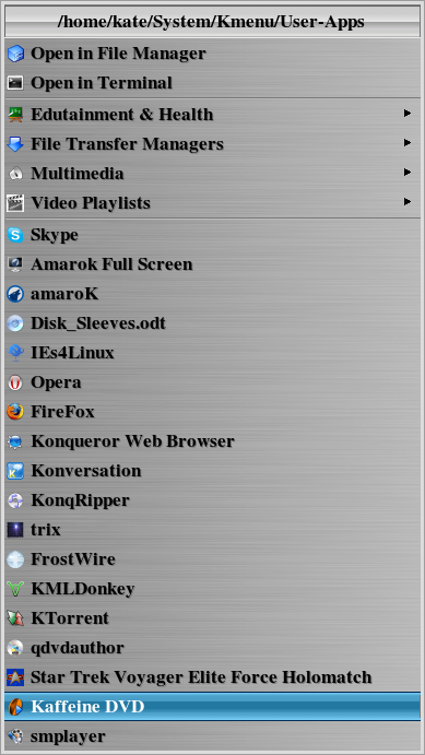
This is interesting since I use a User-Files dir for my files (See attached image), I also focus the side bar better. This allows for faster, easier navigation. My test subjects (ok victims) increased their ability to find file and navigate through the dirs by at least 80%.
- I'm glad you selected to display both software names and
descriptions in the K-Menu. I always empathize with new users and they need
both.
Exactly.
Flip a coin, but I prefer Description (Name) rather than Name (Description). My belief is that most people are looking to solve a task and a description first helps toward that goal. Especially since so many developers have given their apps names that provide no clue to the apps purpose.
I would have agreed with this, it was what I believed at first too. However, I was proven wrong. Most times, they wanted the name first then the description, because once they knew that K3B was the burner app, they looked for K3B, not the description. It slowed them down to have to glance through it before they found the name. Sort of like "get to the point already"
The problem is that descriptions can change; e.g. become more descriptive. Change the first letter in the description and the user has to hunt through the entire list to find the same application again.
Exactly
- So you added the option to use a Kickoff style K-Menu. Nice
programming touch. Really! You'll never see me use the Kickoff though.
I'm just too old to change some habits. :)
None of my users like kickoff, they preferred a the straight to the point kmenu. They do like personalized menus, its basically a dir contained in a "system" dir in user's home. the dir contains deskop files of the fave apps. Which is then used as a quick browser on kicker. Its a great short cut to all the most used apps. I can create a video for anyone who is interested. The most used "mini menu" is the penguin menu (so called because use a crystal tux for the icon, everyone loves it). You drag and drop your fave apps in there and then click, there it is. As I said, I can provide videos to anyone who wants to see it in action.
- Place the Exit/Lockout applet buttons on the default kicker. Many
people use the buttons and they provide a familiar method to exit for new users.
yes and no. I have found that, if people use a top bar, they like it, but putting it on the bottom kicker makes it "too busy". Most of my users, use ctrl, alt del, to bring it up or just right click on the desktop itself (most common way they use).
I hope this is of some use and for what its worth.
Kate Draven