
-----BEGIN PGP SIGNED MESSAGE----- Hash: SHA512
On 2015/11/16 07:57 AM, Alexandre wrote:
- --
*De :* Andrew Young mail@andrewyoung.co.uk
*Envoyé :* 15 novembre 2015 12:50 *À :* trinity-devel@lists.pearsoncomputing.net *Objet :* Re: [trinity-devel] New splash proposal for amaroK Hi
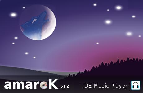
The new Amarok splash looks great. However I have a few comments, IDK if they've been mentioned already.
Is the CD spinning in the correct direction?
Is the moon correctly aligned? I assume it's Earth's moon
eh, really?
- TDE Music Player, I think Trinity Music Player is better
I don't like the word ''Trinity'' personally. I think TDE is cooler.
There is a grey background tint at the bottom of the image, I don't think it's needed
The tops of 'amar' and the CD have a few grey pixels
That is anti-alias, or sub-pixel hinting.
- White pixels top left and top right
I like the trees silhouette, grey hills and purple glow.
I guess these are fairly minor quibbles.
Andrew
Hi all,
Here is a new version, with the version (ha!) number in it.
This is not a good idea to have the version number in a splash screen, because it means that the splash screen picture will have to be modified if/when a new version of the app is out. More maintenance is not better...
I will keep the wolf. Matter of fact there is a wolf in the amaroK icon since the first release (maybe in 2005?). It is only in the last splash screen that they did, that the wolf has been removed. But anyway, the concept of the wolf yelling at the moon would make no sense at all without the wolf.
-Alexandre
What about the attached modified version? The CD is spinning in the other way, "TDE music player" is slightly smaller and the v1.4 is near the Amarok name and not "lost" in the top right corner. I just did a raw select-copy-paste so the result is somehow basic, surely Alex can do better. Cheers Michele