
-----BEGIN PGP SIGNED MESSAGE----- Hash: SHA224
Am Mittwoch, 15. Oktober 2014 schrieb Timothy Pearson:
All,
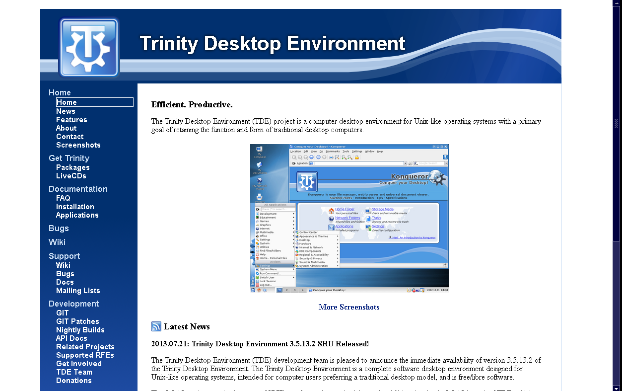
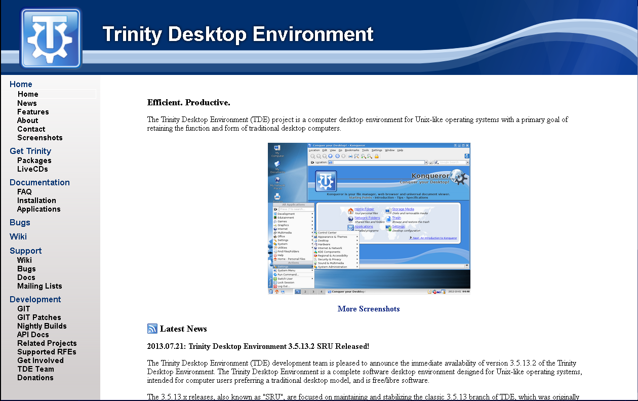
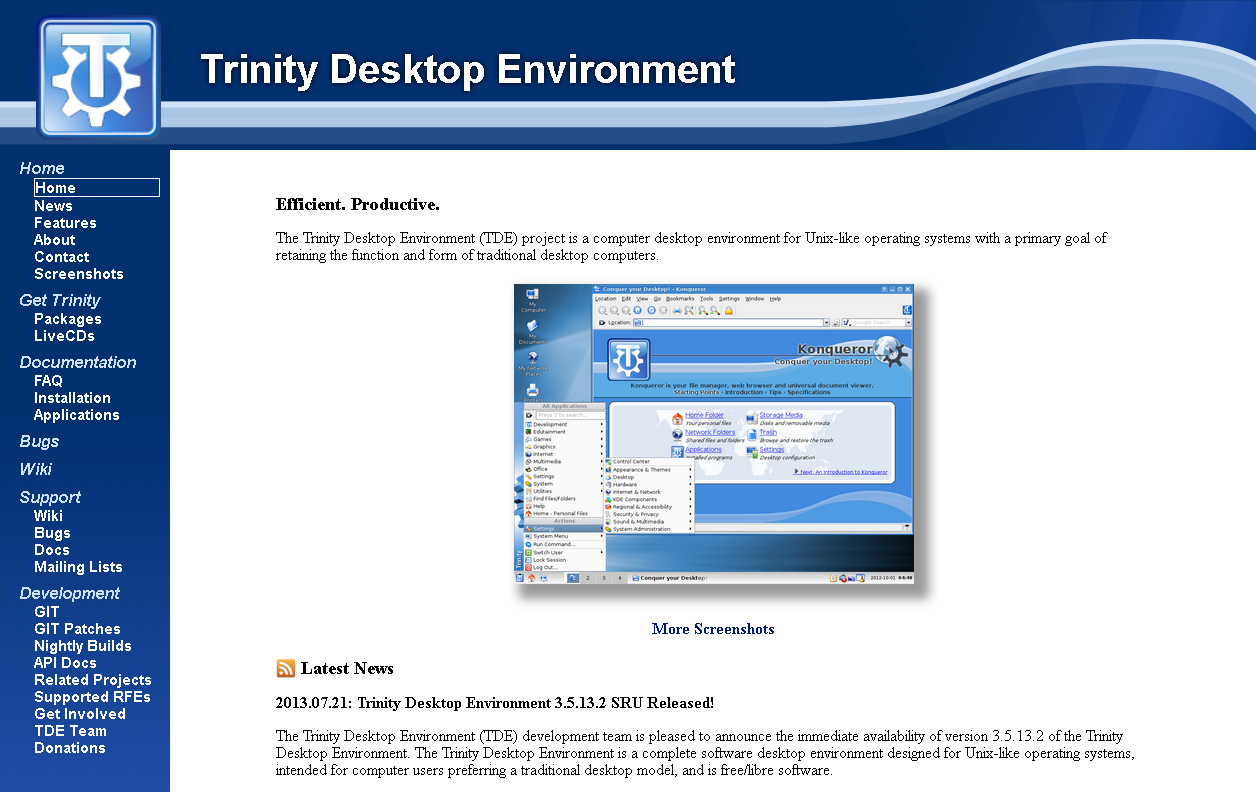
Thanks to the efforts of the TDE web development team we proudly announce the debut of our new website (https://www.trinitydesktop.org)!
The new site provides a cleaner and easier to use interface without
sacrificing availability of any information. In fact, several items were
added, including a new FAQ page and application documentation.
Additionally, per popular request we have transitioned from our old
FOSWIki installation to a new MediaWiki installation, with all old content
having been migrated over the course of several months. This should make it much easier to add new content to the TDE knowledge base.
Let us know what you think!
Timothy Pearson Trinity Desktop Project
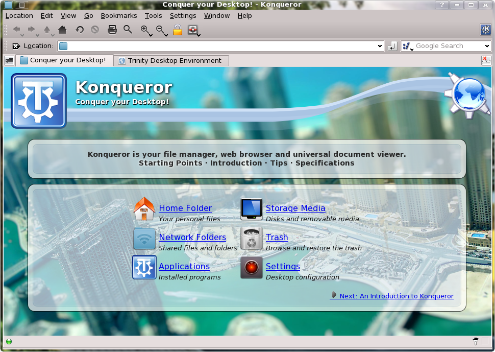
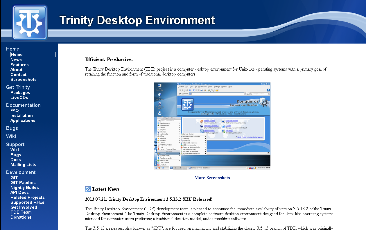
Looks really nice in firefox, but the left menu tree breaks in konqueror
;-)
Nik
Thanks for the info; hadn't thought to check it in Konqueror.
I'm not sure I can fix it; Konqueror's broken HTML rendering is a known problem but I haven't gotten around to seeing what would be required to replace KHTML with Webkit. That process will be lengthy and won't happen for R14 in any case.
Tim
-----BEGIN PGP SIGNED MESSAGE----- Hash: SHA224
-----BEGIN PGP SIGNED MESSAGE----- Hash: SHA224
Am Mittwoch, 15. Oktober 2014 schrieb Timothy Pearson:
All,
Thanks to the efforts of the TDE web development team we proudly announce the debut of our new website (https://www.trinitydesktop.org)!
The new site provides a cleaner and easier to use interface without
sacrificing availability of any information. In fact, several items were
added, including a new FAQ page and application documentation.
Additionally, per popular request we have transitioned from our old
FOSWIki installation to a new MediaWiki installation, with all old content
having been migrated over the course of several months. This should make it much easier to add new content to the TDE knowledge base.
Let us know what you think!
Timothy Pearson Trinity Desktop Project
Looks really nice in firefox, but the left menu tree breaks in konqueror
;-)
Nik
Thanks for the info; hadn't thought to check it in Konqueror.
I'm not sure I can fix it; Konqueror's broken HTML rendering is a known problem but I haven't gotten around to seeing what would be required to replace KHTML with Webkit. That process will be lengthy and won't happen for R14 in any case.
Tim -----BEGIN PGP SIGNATURE----- Version: GnuPG v1.4.9 (GNU/Linux)
iFYEARELAAYFAlQ+xgMACgkQLaxZSoRZrGEeXwDfdENzNvqkl5slOVNzhCb8l8Uu eJSf2oCnnbu+gADcD48XOjPyxXqIkq+sRdNepr5ANdX1UcKSkJUi1w== =62F1 -----END PGP SIGNATURE-----
Sorry about this message; got the lists tangled up. Discussion is ongoing in trinity-users. :-)
Tim

On Wed, 15 Oct 2014 14:32:30 -0500 "Timothy Pearson" kb9vqf@pearsoncomputing.net wrote:
-----BEGIN PGP SIGNED MESSAGE----- Hash: SHA224
-----BEGIN PGP SIGNED MESSAGE----- Hash: SHA224
Am Mittwoch, 15. Oktober 2014 schrieb Timothy Pearson:
All,
Thanks to the efforts of the TDE web development team we proudly announce the debut of our new website (https://www.trinitydesktop.org)!
The new site provides a cleaner and easier to use interface without
sacrificing availability of any information. In fact, several items were
added, including a new FAQ page and application documentation.
Additionally, per popular request we have transitioned from our old
FOSWIki installation to a new MediaWiki installation, with all old content
having been migrated over the course of several months. This should make it much easier to add new content to the TDE knowledge base.
Let us know what you think!
Timothy Pearson Trinity Desktop Project
Looks really nice in firefox, but the left menu tree breaks in konqueror
;-)
Nik
Thanks for the info; hadn't thought to check it in Konqueror.
I'm not sure I can fix it; Konqueror's broken HTML rendering is a known problem but I haven't gotten around to seeing what would be required to replace KHTML with Webkit. That process will be lengthy and won't happen for R14 in any case.
Tim -----BEGIN PGP SIGNATURE----- Version: GnuPG v1.4.9 (GNU/Linux)
iFYEARELAAYFAlQ+xgMACgkQLaxZSoRZrGEeXwDfdENzNvqkl5slOVNzhCb8l8Uu eJSf2oCnnbu+gADcD48XOjPyxXqIkq+sRdNepr5ANdX1UcKSkJUi1w== =62F1 -----END PGP SIGNATURE-----
Sorry about this message; got the lists tangled up. Discussion is ongoing in trinity-users. :-)
For some reason, messages from -users aren't getting to me, so I'll respond here: fix pushed. Tested in Konqueror, Firefox (well, Seamonkey) and Chrome to ensure that it doesn't break the positioning of the sidebar in other browsers. I also fixed broken wiki links in the sidebar generation code.
E. Liddell
-----BEGIN PGP SIGNED MESSAGE----- Hash: SHA224
On Wed, 15 Oct 2014 14:32:30 -0500 "Timothy Pearson" kb9vqf@pearsoncomputing.net wrote:
-----BEGIN PGP SIGNED MESSAGE----- Hash: SHA224
-----BEGIN PGP SIGNED MESSAGE----- Hash: SHA224
Am Mittwoch, 15. Oktober 2014 schrieb Timothy Pearson:
All,
Thanks to the efforts of the TDE web development team we proudly announce the debut of our new website (https://www.trinitydesktop.org)!
The new site provides a cleaner and easier to use interface without
sacrificing availability of any information. In fact, several items were
added, including a new FAQ page and application documentation.
Additionally, per popular request we have transitioned from our old
FOSWIki installation to a new MediaWiki installation, with all old content
having been migrated over the course of several months. This should make it much easier to add new content to the TDE knowledge base.
Let us know what you think!
Timothy Pearson Trinity Desktop Project
Looks really nice in firefox, but the left menu tree breaks in
konqueror
;-)
Nik
Thanks for the info; hadn't thought to check it in Konqueror.
I'm not sure I can fix it; Konqueror's broken HTML rendering is a
known
problem but I haven't gotten around to seeing what would be required
to
replace KHTML with Webkit. That process will be lengthy and won't
happen
for R14 in any case.
Tim -----BEGIN PGP SIGNATURE----- Version: GnuPG v1.4.9 (GNU/Linux)
iFYEARELAAYFAlQ+xgMACgkQLaxZSoRZrGEeXwDfdENzNvqkl5slOVNzhCb8l8Uu eJSf2oCnnbu+gADcD48XOjPyxXqIkq+sRdNepr5ANdX1UcKSkJUi1w== =62F1 -----END PGP SIGNATURE-----
Sorry about this message; got the lists tangled up. Discussion is ongoing in trinity-users. :-)
For some reason, messages from -users aren't getting to me, so I'll respond here: fix pushed. Tested in Konqueror, Firefox (well, Seamonkey) and Chrome to ensure that it doesn't break the positioning of the sidebar in other browsers. I also fixed broken wiki links in the sidebar generation code.
E. Liddell
Copied it over to the production site with some changes; I would like the Documentation header to link to the ./docs page as it does now instead of over to the wiki as you originally had it.
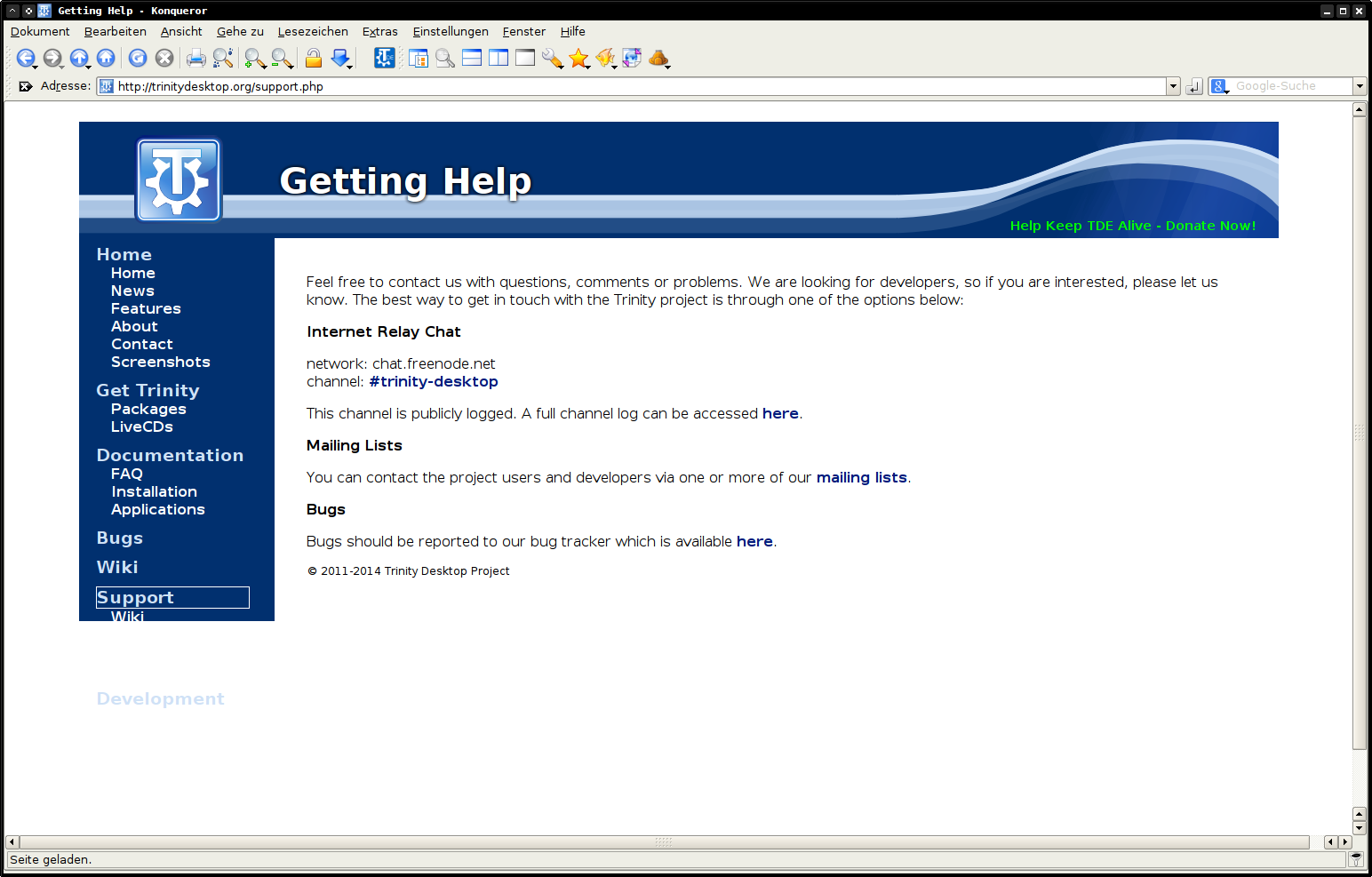
Unfortunately there is now a different issue with the sidebar. On short pages like the support page the sidebar gradient is truncated, leaving impossible-to-read white on white text: http://trinitydesktop.org/support.php
Quick fix?
Thanks!
Tim

Copied it over to the production site with some changes; I would like the Documentation header to link to the ./docs page as it does now instead of over to the wiki as you originally had it.
Unfortunately there is now a different issue with the sidebar. On short pages like the support page the sidebar gradient is truncated, leaving impossible-to-read white on white text: http://trinitydesktop.org/support.php
Quick fix?
Thanks!
Tim
partly better, but please look at the attached screenshot. that's happening in firefox, too.
nik
On Wed, 15 Oct 2014 16:20:11 -0500 "Timothy Pearson" kb9vqf@pearsoncomputing.net wrote:
-----BEGIN PGP SIGNED MESSAGE----- Hash: SHA224
On Wed, 15 Oct 2014 14:32:30 -0500 "Timothy Pearson" kb9vqf@pearsoncomputing.net wrote:
-----BEGIN PGP SIGNED MESSAGE----- Hash: SHA224
-----BEGIN PGP SIGNED MESSAGE----- Hash: SHA224
Am Mittwoch, 15. Oktober 2014 schrieb Timothy Pearson:
All,
Thanks to the efforts of the TDE web development team we proudly announce the debut of our new website (https://www.trinitydesktop.org)!
The new site provides a cleaner and easier to use interface without
sacrificing availability of any information. In fact, several items were
added, including a new FAQ page and application documentation.
Additionally, per popular request we have transitioned from our old
FOSWIki installation to a new MediaWiki installation, with all old content
having been migrated over the course of several months. This should make it much easier to add new content to the TDE knowledge base.
Let us know what you think!
Timothy Pearson Trinity Desktop Project
Looks really nice in firefox, but the left menu tree breaks in
konqueror
;-)
Nik
Thanks for the info; hadn't thought to check it in Konqueror.
I'm not sure I can fix it; Konqueror's broken HTML rendering is a
known
problem but I haven't gotten around to seeing what would be required
to
replace KHTML with Webkit. That process will be lengthy and won't
happen
for R14 in any case.
Tim -----BEGIN PGP SIGNATURE----- Version: GnuPG v1.4.9 (GNU/Linux)
iFYEARELAAYFAlQ+xgMACgkQLaxZSoRZrGEeXwDfdENzNvqkl5slOVNzhCb8l8Uu eJSf2oCnnbu+gADcD48XOjPyxXqIkq+sRdNepr5ANdX1UcKSkJUi1w== =62F1 -----END PGP SIGNATURE-----
Sorry about this message; got the lists tangled up. Discussion is ongoing in trinity-users. :-)
For some reason, messages from -users aren't getting to me, so I'll respond here: fix pushed. Tested in Konqueror, Firefox (well, Seamonkey) and Chrome to ensure that it doesn't break the positioning of the sidebar in other browsers. I also fixed broken wiki links in the sidebar generation code.
E. Liddell
Copied it over to the production site with some changes; I would like the Documentation header to link to the ./docs page as it does now instead of over to the wiki as you originally had it.
Unfortunately there is now a different issue with the sidebar. On short pages like the support page the sidebar gradient is truncated, leaving impossible-to-read white on white text: http://trinitydesktop.org/support.php
Quick fix?
I think what I just pushed should do it. (There is scrollable blank space at the bottoms of some pages, but I don't consider that a major defect.)
E. Liddell
On Wed, 15 Oct 2014 17:48:15 -0400 "E. Liddell" ejlddll@googlemail.com wrote:
On Wed, 15 Oct 2014 16:20:11 -0500 "Timothy Pearson" kb9vqf@pearsoncomputing.net wrote:
-----BEGIN PGP SIGNED MESSAGE----- Hash: SHA224
On Wed, 15 Oct 2014 14:32:30 -0500 "Timothy Pearson" kb9vqf@pearsoncomputing.net wrote:
-----BEGIN PGP SIGNED MESSAGE----- Hash: SHA224
-----BEGIN PGP SIGNED MESSAGE----- Hash: SHA224
Am Mittwoch, 15. Oktober 2014 schrieb Timothy Pearson: > All, > > Thanks to the efforts of the TDE web development team we proudly > announce > the debut of our new website (https://www.trinitydesktop.org)! > > The new site provides a cleaner and easier to use interface without
sacrificing availability of any information. In fact, several items were
> added, including a new FAQ page and application documentation. > > Additionally, per popular request we have transitioned from our old
FOSWIki installation to a new MediaWiki installation, with all old content
> having been migrated over the course of several months. This should > make > it much easier to add new content to the TDE knowledge base. > > Let us know what you think! > > Timothy Pearson > Trinity Desktop Project
Looks really nice in firefox, but the left menu tree breaks in
konqueror
;-)
Nik
Thanks for the info; hadn't thought to check it in Konqueror.
I'm not sure I can fix it; Konqueror's broken HTML rendering is a
known
problem but I haven't gotten around to seeing what would be required
to
replace KHTML with Webkit. That process will be lengthy and won't
happen
for R14 in any case.
Tim -----BEGIN PGP SIGNATURE----- Version: GnuPG v1.4.9 (GNU/Linux)
iFYEARELAAYFAlQ+xgMACgkQLaxZSoRZrGEeXwDfdENzNvqkl5slOVNzhCb8l8Uu eJSf2oCnnbu+gADcD48XOjPyxXqIkq+sRdNepr5ANdX1UcKSkJUi1w== =62F1 -----END PGP SIGNATURE-----
Sorry about this message; got the lists tangled up. Discussion is ongoing in trinity-users. :-)
For some reason, messages from -users aren't getting to me, so I'll respond here: fix pushed. Tested in Konqueror, Firefox (well, Seamonkey) and Chrome to ensure that it doesn't break the positioning of the sidebar in other browsers. I also fixed broken wiki links in the sidebar generation code.
E. Liddell
Copied it over to the production site with some changes; I would like the Documentation header to link to the ./docs page as it does now instead of over to the wiki as you originally had it.
Unfortunately there is now a different issue with the sidebar. On short pages like the support page the sidebar gradient is truncated, leaving impossible-to-read white on white text: http://trinitydesktop.org/support.php
Quick fix?
I think what I just pushed should do it. (There is scrollable blank space at the bottoms of some pages, but I don't consider that a major defect.)
Ugh, screwed up again--it does fix what it's supposed to fix, but I accidentally dropped the styles for the top-corner donation link, so you might want to apply a diff utility.
E. Liddell
-----BEGIN PGP SIGNED MESSAGE----- Hash: SHA224
On Wed, 15 Oct 2014 17:48:15 -0400 "E. Liddell" ejlddll@googlemail.com wrote:
On Wed, 15 Oct 2014 16:20:11 -0500 "Timothy Pearson" kb9vqf@pearsoncomputing.net wrote:
-----BEGIN PGP SIGNED MESSAGE----- Hash: SHA224
On Wed, 15 Oct 2014 14:32:30 -0500 "Timothy Pearson" kb9vqf@pearsoncomputing.net wrote:
-----BEGIN PGP SIGNED MESSAGE----- Hash: SHA224
-----BEGIN PGP SIGNED MESSAGE----- Hash: SHA224
> Am Mittwoch, 15. Oktober 2014 schrieb Timothy Pearson: >> All, >> >> Thanks to the efforts of the TDE web development team we
proudly
>> announce >> the debut of our new website (https://www.trinitydesktop.org)! >> >> The new site provides a cleaner and easier to use interface
without
sacrificing availability of any information. In fact, several
items
were >> added, including a new FAQ page and application documentation. >> >> Additionally, per popular request we have transitioned from our
old
FOSWIki installation to a new MediaWiki installation, with all
old
content >> having been migrated over the course of several months. This
should
>> make >> it much easier to add new content to the TDE knowledge base. >> >> Let us know what you think! >> >> Timothy Pearson >> Trinity Desktop Project > > Looks really nice in firefox, but the left menu tree breaks in
konqueror
;-) > > Nik
Thanks for the info; hadn't thought to check it in Konqueror.
I'm not sure I can fix it; Konqueror's broken HTML rendering is a
known
problem but I haven't gotten around to seeing what would be
required
to
replace KHTML with Webkit. That process will be lengthy and
won't
happen
for R14 in any case.
Tim -----BEGIN PGP SIGNATURE----- Version: GnuPG v1.4.9 (GNU/Linux)
iFYEARELAAYFAlQ+xgMACgkQLaxZSoRZrGEeXwDfdENzNvqkl5slOVNzhCb8l8Uu eJSf2oCnnbu+gADcD48XOjPyxXqIkq+sRdNepr5ANdX1UcKSkJUi1w== =62F1 -----END PGP SIGNATURE-----
Sorry about this message; got the lists tangled up. Discussion is ongoing in trinity-users. :-)
For some reason, messages from -users aren't getting to me, so I'll respond here: fix pushed. Tested in Konqueror, Firefox (well, Seamonkey)
and
Chrome to ensure that it doesn't break the positioning of the
sidebar in
other browsers. I also fixed broken wiki links in the sidebar generation
code.
E. Liddell
Copied it over to the production site with some changes; I would like
the
Documentation header to link to the ./docs page as it does now instead
of
over to the wiki as you originally had it.
Unfortunately there is now a different issue with the sidebar. On
short
pages like the support page the sidebar gradient is truncated, leaving impossible-to-read white on white text: http://trinitydesktop.org/support.php
Quick fix?
I think what I just pushed should do it. (There is scrollable blank space at the bottoms of some pages, but I don't consider that a major defect.)
Ugh, screwed up again--it does fix what it's supposed to fix, but I accidentally dropped the styles for the top-corner donation link, so you might want to apply a diff utility.
E. Liddell
Yep saw that--fixed and copied to main site.
You might want to pull from GIT so that your copy is up to date before committing anything else. :-)
Thanks!
Tim
On Wed, 15 Oct 2014 17:39:01 -0500 "Timothy Pearson" kb9vqf@pearsoncomputing.net wrote:
-----BEGIN PGP SIGNED MESSAGE----- Hash: SHA224
On Wed, 15 Oct 2014 17:48:15 -0400 "E. Liddell" ejlddll@googlemail.com wrote:
Ugh, screwed up again--it does fix what it's supposed to fix, but I accidentally dropped the styles for the top-corner donation link, so you might want to apply a diff utility.
E. Liddell
Yep saw that--fixed and copied to main site.
You might want to pull from GIT so that your copy is up to date before committing anything else. :-)
I did--the problem was that the git directory is not my working directory (basically, I was too lazy to fix the symlink for my local Apache server to point to the new location). I need to do something about that . . . but not tonight. ;)
E. Liddell
Hi,
I'm so sorry to say this, but I do not find that the new website design honors the work that has been done to renew the TDEUI. Don't take it personally, but I almost prefer the old website. The colors were brighter.
For the various graphic work I did here, I provided tens and tens of variants, to make sure that it was right for everyone, but this website popped out, without any improvements before going to production. I asked for a preview with a provided graphic gradient, and you didn't even answered at all.
1.First of all, it really has to grow to follow the browser's window size, without stopping at a definite place, leaving the user think that it is a bug. And in the left-top and right directions.
2.Also, the TDE logo position and the title vertical alignment does not follow the new TDEUI that much, leaving the title on the line of the ribbon, instead of well centered between the top of the page and the ribbon.
3.Then, there is something just wrong with the strong contrast created with the top images and the rest of the site. If the text was in kind of rounded rectangle, filled with white, on a blue background, it would fit much better and look smoother too. Just like the new TDEUI.
4.If the font could be forced to be something like Arial, it would be much better, because it looks strange on browsers set to display text in Times New Roman.
It will be better, but it needs some polish.
Just my 2 cents... -Alexandre
-----BEGIN PGP SIGNED MESSAGE----- Hash: SHA224
Yep saw that--fixed and copied to main site.
You might want to pull from GIT so that your copy is up to date before committing anything else. :-)
I did--the problem was that the git directory is not my working directory (basically, I was too lazy to fix the symlink for my local Apache server to point to the new location). I need to do something about that . . . but not tonight. ;)
E. Liddell
Hi,
I'm so sorry to say this, but I do not find that the new website design honors the work that has been done to renew the TDEUI. Don't take it personally, but I almost prefer the old website. The colors were brighter.
For the various graphic work I did here, I provided tens and tens of variants, to make sure that it was right for everyone, but this website popped out, without any improvements before going to production. I asked for a preview with a provided graphic gradient, and you didn't even answered at all.
1.First of all, it really has to grow to follow the browser's window size, without stopping at a definite place, leaving the user think that it is a bug. And in the left-top and right directions.
2.Also, the TDE logo position and the title vertical alignment does not follow the new TDEUI that much, leaving the title on the line of the ribbon, instead of well centered between the top of the page and the ribbon.
3.Then, there is something just wrong with the strong contrast created with the top images and the rest of the site. If the text was in kind of rounded rectangle, filled with white, on a blue background, it would fit much better and look smoother too. Just like the new TDEUI.
4.If the font could be forced to be something like Arial, it would be much better, because it looks strange on browsers set to display text in Times New Roman.
It will be better, but it needs some polish.
Just my 2 cents... -Alexandre
The somewhat deployment was partially due to technical reasons. The old FOSWiki was loading down the Web server too heavily and I needed to fix that ASAP. Additionally, we were starting to get into a "split-head" scenario with two websites (production and the vastly different development) that had to be kept in sync; much longer and we would have had a lot of work to do porting newly-added content from the old site to the new site.
If you like, think of the current site as a beta. I can give you access to the development site and I am fairly confident we can polish it up the rest of the way for R14 release--at least I now have the much-needed ability to add new content to the site again.
Thanks!
Tim
-----BEGIN PGP SIGNED MESSAGE----- Hash: SHA224
-----BEGIN PGP SIGNED MESSAGE----- Hash: SHA224
Yep saw that--fixed and copied to main site.
You might want to pull from GIT so that your copy is up to date
before
committing anything else. :-)
I did--the problem was that the git directory is not my working directory (basically, I was too lazy to fix the symlink for my local Apache server to point to the new location). I need to do something about that . . . but not tonight. ;)
E. Liddell
Hi,
I'm so sorry to say this, but I do not find that the new website design honors the work that has been done to renew the TDEUI. Don't take it personally, but I almost prefer the old website. The colors were brighter.
For the various graphic work I did here, I provided tens and tens of variants, to make sure that it was right for everyone, but this website popped out, without any improvements before going to production. I asked for a preview with a provided graphic gradient, and you didn't even answered at all.
1.First of all, it really has to grow to follow the browser's window size, without stopping at a definite place, leaving the user think that it is a bug. And in the left-top and right directions.
2.Also, the TDE logo position and the title vertical alignment does not follow the new TDEUI that much, leaving the title on the line of the ribbon, instead of well centered between the top of the page and the ribbon.
3.Then, there is something just wrong with the strong contrast created with the top images and the rest of the site. If the text was in kind of rounded rectangle, filled with white, on a blue background, it would fit much better and look smoother too. Just like the new TDEUI.
4.If the font could be forced to be something like Arial, it would be much better, because it looks strange on browsers set to display text in Times New Roman.
It will be better, but it needs some polish.
Just my 2 cents... -Alexandre
The somewhat deployment was partially due to technical reasons. The old FOSWiki was loading down the Web server too heavily and I needed to fix that ASAP. Additionally, we were starting to get into a "split-head" scenario with two websites (production and the vastly different development) that had to be kept in sync; much longer and we would have had a lot of work to do porting newly-added content from the old site to the new site.
If you like, think of the current site as a beta. I can give you access to the development site and I am fairly confident we can polish it up the rest of the way for R14 release--at least I now have the much-needed ability to add new content to the site again.
Thanks!
Tim -----BEGIN PGP SIGNATURE----- Version: GnuPG v1.4.9 (GNU/Linux)
iFYEARELAAYFAlQ/KjQACgkQLaxZSoRZrGGGjQDgx2zex99kmaqyXbVDpawmDHNG VChMmSOuLq7zxwDfcPXgqP70IosJkG2GE3jAg/YiTA20uA1zxK2eyA== =/acX -----END PGP SIGNATURE-----
Whoops, that should read "sudden deployment" above. Spell check. :-)
Tim

<snip> 2.Also, the TDE logo position and the title vertical alignment does not follow the new TDEUI that much, leaving the title on the line of the ribbon, instead of well centered between the top of the page and the ribbon.
<snip>
First of all a big thanks to all people who worked on the new site for several months!
I agree with Alex about the position of the TDE icon and text. I think we should aligned it to match the style use in Konqueror/Control Center/.... It looks nicer and cleaner Even before I read Alex's mail, my first reaction when I opened the new site was exactly the same.
And to all, please remember the site has just been launched, so adjustments here and there are to be expected :)
Cheers Michele
On Wed, 15 Oct 2014 22:07:27 -0400 Alexandre ac586133@hotmail.com wrote:
Yep saw that--fixed and copied to main site.
You might want to pull from GIT so that your copy is up to date before committing anything else. :-)
I did--the problem was that the git directory is not my working directory (basically, I was too lazy to fix the symlink for my local Apache server to point to the new location). I need to do something about that . . . but not tonight. ;)
E. Liddell
Hi,
I'm so sorry to say this, but I do not find that the new website design honors the work that has been done to renew the TDEUI. Don't take it personally, but I almost prefer the old website. The colors were brighter.
S'okay, I figured out a long time ago that a critique of my work is not a critique of me personally.
For the various graphic work I did here, I provided tens and tens of variants, to make sure that it was right for everyone, but this website popped out, without any improvements before going to production. I asked for a preview with a provided graphic gradient, and you didn't even answered at all.
I'm sorry. I have migraines pretty much constantly at this time of year. It causes some lower-priority items to be put off. That was one of them. I didn't expect the site to be rolled out in such a hurry.
1.First of all, it really has to grow to follow the browser's window size, without stopping at a definite place, leaving the user think that it is a bug. And in the left-top and right directions.
There's a tension there between readability (which requires a relatively narrow text block) and what looks good to people with really large screens. I don't think I've ever seen a design that completely resolves it to my satisfaction--most of them either expand until the text block is unreadable or do pretty much what I've done (except that they often don't allow any flexibility for smaller screens, either). Expanding just the header would look odd. I could have the header expand and then center the text block under it, I suppose . . . but that just moves the whitespace around.
2.Also, the TDE logo position and the title vertical alignment does not follow the new TDEUI that much, leaving the title on the line of the ribbon, instead of well centered between the top of the page and the ribbon.
That's a relatively easy fix (I hope), and I'll look at it after work.
3.Then, there is something just wrong with the strong contrast created with the top images and the rest of the site. If the text was in kind of rounded rectangle, filled with white, on a blue background, it would fit much better and look smoother too. Just like the new TDEUI.
Thing is, the plain black-on-white text is likely to be more readable for people with certain kinds of vision problems . . . but I'll see about doing a mock-up anyway, to go along with the one with the gradient.
4.If the font could be forced to be something like Arial, it would be much better, because it looks strange on browsers set to display text in Times New Roman.
I'm against forcing the font of the main text block to anything, because I assume that if a user has his or her browser set to display in Times New Roman (or Webdings, for that matter), they've done it on purpose, because they find it easier to read or it has other desirable qualities. To my mind, that trumps "looks strange".
E. Liddell
-----BEGIN PGP SIGNED MESSAGE----- Hash: SHA224
On Wed, 15 Oct 2014 17:39:01 -0500 "Timothy Pearson" kb9vqf@pearsoncomputing.net wrote:
-----BEGIN PGP SIGNED MESSAGE----- Hash: SHA224
On Wed, 15 Oct 2014 17:48:15 -0400 "E. Liddell" ejlddll@googlemail.com wrote:
Ugh, screwed up again--it does fix what it's supposed to fix, but I accidentally dropped the styles for the top-corner donation link, so you might want to apply a diff utility.
E. Liddell
Yep saw that--fixed and copied to main site.
You might want to pull from GIT so that your copy is up to date before committing anything else. :-)
I did--the problem was that the git directory is not my working directory (basically, I was too lazy to fix the symlink for my local Apache server to point to the new location). I need to do something about that . . . but not tonight. ;)
E. Liddell
Found another quirk--there is now tons of whitespace below the page, therefore users cannot easily scroll to the end of the content by scrolling down to the hard stop--if they do this, they get a blank white page.
Quick fix for this?
Thanks!
Tim
On Wed, 15 Oct 2014 22:36:31 -0500 "Timothy Pearson" kb9vqf@pearsoncomputing.net wrote:
-----BEGIN PGP SIGNED MESSAGE----- Hash: SHA224
On Wed, 15 Oct 2014 17:39:01 -0500 "Timothy Pearson" kb9vqf@pearsoncomputing.net wrote:
-----BEGIN PGP SIGNED MESSAGE----- Hash: SHA224
On Wed, 15 Oct 2014 17:48:15 -0400 "E. Liddell" ejlddll@googlemail.com wrote:
Ugh, screwed up again--it does fix what it's supposed to fix, but I accidentally dropped the styles for the top-corner donation link, so you might want to apply a diff utility.
E. Liddell
Yep saw that--fixed and copied to main site.
You might want to pull from GIT so that your copy is up to date before committing anything else. :-)
I did--the problem was that the git directory is not my working directory (basically, I was too lazy to fix the symlink for my local Apache server to point to the new location). I need to do something about that . . . but not tonight. ;)
E. Liddell
Found another quirk--there is now tons of whitespace below the page, therefore users cannot easily scroll to the end of the content by scrolling down to the hard stop--if they do this, they get a blank white page.
Quick fix for this?
Pushed. (Mea culpa--I should have fixed it before.)
E. Liddell
-----BEGIN PGP SIGNED MESSAGE----- Hash: SHA224
On Wed, 15 Oct 2014 22:36:31 -0500 "Timothy Pearson" kb9vqf@pearsoncomputing.net wrote:
-----BEGIN PGP SIGNED MESSAGE----- Hash: SHA224
On Wed, 15 Oct 2014 17:39:01 -0500 "Timothy Pearson" kb9vqf@pearsoncomputing.net wrote:
-----BEGIN PGP SIGNED MESSAGE----- Hash: SHA224
On Wed, 15 Oct 2014 17:48:15 -0400 "E. Liddell" ejlddll@googlemail.com wrote:
Ugh, screwed up again--it does fix what it's supposed to fix, but I accidentally dropped the styles for the top-corner donation link, so you might
want
to apply a diff utility.
E. Liddell
Yep saw that--fixed and copied to main site.
You might want to pull from GIT so that your copy is up to date
before
committing anything else. :-)
I did--the problem was that the git directory is not my working
directory
(basically, I was too lazy to fix the symlink for my local Apache server to point to the new location). I need to do something about that . . . but not tonight. ;)
E. Liddell
Found another quirk--there is now tons of whitespace below the page, therefore users cannot easily scroll to the end of the content by scrolling down to the hard stop--if they do this, they get a blank white page.
Quick fix for this?
Pushed. (Mea culpa--I should have fixed it before.)
E. Liddell
Copied to production.
Thanks!
Tim
E. Liddell
Found another quirk--there is now tons of whitespace below the page, therefore users cannot easily scroll to the end of the content by scrolling down to the hard stop--if they do this, they get a blank white page.
Hi,
I downloaded the website with httrack. I'll try to look at small ways to improve it. The frame is good, but it needs improvements.
I'll post screenshots when I can.
-Alexandre
Here's a quick peek at what I've been twiddling with before I go off to look at something other than a screen for the rest of the evening. Changes made (some of which may not stay):
-The top banner is wider, and the title has been moved upward so that it's centered relative to the whole banner as it now stands (Alexandre, did you want me to try to center it in the space between the top edge and the stripe instead?) I experimented with adding a subtitle, but I couldn't get it to look right. :(
-Gradient under the nav area.
-Sans-serif font forced in the title and navigation areas only. (The exact font stack is Arial, Libre Sans, sans-serif.)
-The logo has grown again (I admit I just stretched it again rather than running off another copy at the right size, though).
-There's a veeeery faint blue-grey border stripe at the right edge of the text area to give it a bit more structure.
E. Liddell

On Friday 17 of October 2014 02:21:48 E. Liddell wrote:
Here's a quick peek at what I've been twiddling with before I go off to look at something other than a screen for the rest of the evening. Changes made (some of which may not stay):
-The top banner is wider, and the title has been moved upward so that it's centered relative to the whole banner as it now stands (Alexandre, did you want me to try to center it in the space between the top edge and the stripe instead?) I experimented with adding a subtitle, but I couldn't get it to look right. :(
-Gradient under the nav area.
-Sans-serif font forced in the title and navigation areas only. (The exact font stack is Arial, Libre Sans, sans-serif.)
-The logo has grown again (I admit I just stretched it again rather than running off another copy at the right size, though).
-There's a veeeery faint blue-grey border stripe at the right edge of the text area to give it a bit more structure.
E. Liddell
Just by chance I came to the page with mailing-lists. I have a little smaller browser window, the result is seen in the screen shot.
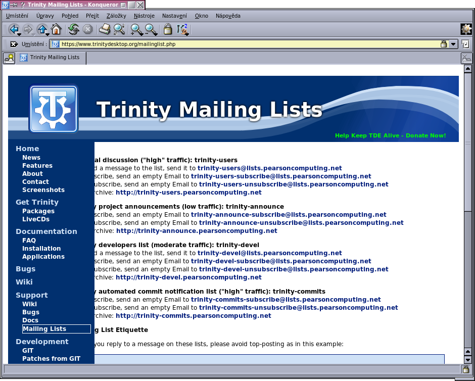
On 10/17/2014 10:04 AM, Slávek Banko wrote:
On Friday 17 of October 2014 02:21:48 E. Liddell wrote:
Here's a quick peek at what I've been twiddling with before I go off to look at something other than a screen for the rest of the evening. Changes made (some of which may not stay):
-The top banner is wider, and the title has been moved upward so that it's centered relative to the whole banner as it now stands (Alexandre, did you want me to try to center it in the space between the top edge and the stripe instead?) I experimented with adding a subtitle, but I couldn't get it to look right. :(
-Gradient under the nav area.
-Sans-serif font forced in the title and navigation areas only. (The exact font stack is Arial, Libre Sans, sans-serif.)
-The logo has grown again (I admit I just stretched it again rather than running off another copy at the right size, though).
-There's a veeeery faint blue-grey border stripe at the right edge of the text area to give it a bit more structure.
E. Liddell
Just by chance I came to the page with mailing-lists. I have a little smaller browser window, the result is seen in the screen shot.
Confirmed. When resizing Firefox window, if the width is less than 1250 pixel (more or less), then I see the same problem.
cheers Michele
On Fri, 17 Oct 2014 11:06:04 +0900 Michele Calgaro michele.calgaro@yahoo.it wrote:
On 10/17/2014 10:04 AM, Slávek Banko wrote:
Just by chance I came to the page with mailing-lists. I have a little smaller browser window, the result is seen in the screen shot.
Confirmed. When resizing Firefox window, if the width is less than 1250 pixel (more or less), then I see the same problem.
It's the PRE blocks containing the top-posting demonstration. I've committed a fix that re-wraps those, which should be okay down to something below 800 x 600.
E. Liddell
hen I see the same problem.
It's the PRE blocks containing the top-posting demonstration. I've committed a fix that re-wraps those, which should be okay down to something below 800 x 600.
E. Liddell
Hi E. Liddell,
I have to say that with the provided screenshot, it is much better.
Can you provide a screenshot with the header filling the whole browser width, and without any border around the website, just like the TDEUI. I don't care if the text paragraph has limited width, to increase readability, but the header really needs to be full width, with the left sidebar being completely at left, no matter the browser size.
With the way the text is placed and the font forced, it looks much better. Again, I don't care if the paragraph text is not forced, but it is much better for the header.
Also, the gradient on the sidebar makes it look much softer, but I wonder if it would make the site softer to see and more agreeable with a soft silver gradient (such as the one provided) for the left sidebar, and the text in black. The text paragraph would look less ''in the corner'' than it is presently.
Can you provide a screenshot with the header filling the whole width, no withe space around the website and the provided gradient?
Thank you! -Alexandre
On Fri, 17 Oct 2014 11:14:37 -0400 Alexandre ac586133@hotmail.com wrote:
Can you provide a screenshot with the header filling the whole browser width, and without any border around the website, just like the TDEUI. I don't care if the text paragraph has limited width, to increase readability, but the header really needs to be full width, with the left sidebar being completely at left, no matter the browser size.
[...]
Also, the gradient on the sidebar makes it look much softer, but I wonder if it would make the site softer to see and more agreeable with a soft silver gradient (such as the one provided) for the left sidebar, and the text in black. The text paragraph would look less ''in the corner'' than it is presently.
Can you provide a screenshot with the header filling the whole width, no withe space around the website and the provided gradient?
Here you go.
Unfortunately, when I see a webpage with no whitespace at the edges, the first thing that pops into my head is, "The 1990s called--they want their aesthetic back." All it needs is a few old-style frames. ;P
Also, the grey gradient you provided doesn't look good to me with the other graphics.
(In other words, the version doesn't do much for me.)
E. Liddell
-----BEGIN PGP SIGNED MESSAGE----- Hash: SHA224
On Fri, 17 Oct 2014 11:14:37 -0400 Alexandre ac586133@hotmail.com wrote:
Can you provide a screenshot with the header filling the whole browser width, and without any border around the website, just like the TDEUI. I don't care if the text paragraph has limited width, to increase readability, but the header really needs to be full width, with the left sidebar being completely at left, no matter the browser size.
[...]
Also, the gradient on the sidebar makes it look much softer, but I wonder if it would make the site softer to see and more agreeable with a soft silver gradient (such as the one provided) for the left sidebar, and the text in black. The text paragraph would look less ''in the corner'' than it is presently.
Can you provide a screenshot with the header filling the whole width, no withe space around the website and the provided gradient?
Here you go.
Unfortunately, when I see a webpage with no whitespace at the edges, the first thing that pops into my head is, "The 1990s called--they want their aesthetic back." All it needs is a few old-style frames. ;P
Also, the grey gradient you provided doesn't look good to me with the other graphics.
(In other words, the version doesn't do much for me.)
E. Liddell
Yeah, the gray looks lousy. Sorry Alaxandre. :-)
I'm divided on the whitespace border issue. A large part of me hates wasting screen space like that, but we don't need to scream "obsolete" either.
Tim
Here you go.
Unfortunately, when I see a webpage with no whitespace at the edges, the first thing that pops into my head is, "The 1990s called--they want their aesthetic back." All it needs is a few old-style frames. ;P
Also, the grey gradient you provided doesn't look good to me with the other graphics.
(In other words, the version doesn't do much for me.)
E. Liddell
Yeah, the gray looks lousy. Sorry Alaxandre. :-)
I'm divided on the whitespace border issue. A large part of me hates wasting screen space like that, but we don't need to scream "obsolete" either.
Tim -----BEGIN PGP SIGNATURE----- Version: GnuPG v1.4.9 (GNU/Linux)
Hi,
To my personal preference, it's the best version of the website. I'd prefer it to stay with the lightsilver gradient, but if you really don't want, can you at least keep the dark blue gradient I provided.
I looks much better without white border all around.
I don't know what tells you that it's only obsolete websites that are expanding to the full browser size. Most big websites such as facebook.com, outlook.com, gmail.com, webs.com are filling the screen. Seeing it as obsolete doesn't hold to me!
Just my way of seeing it, but the screenshot provided has the version I prefer...
Have a great day! -Alexandre
-Alexandre
-----BEGIN PGP SIGNED MESSAGE----- Hash: SHA224
Here you go.
Unfortunately, when I see a webpage with no whitespace at the edges,
the
first thing that pops into my head is, "The 1990s called--they want their
aesthetic
back." All it needs is a few old-style frames. ;P
Also, the grey gradient you provided doesn't look good to me with the other graphics.
(In other words, the version doesn't do much for me.)
E. Liddell
Yeah, the gray looks lousy. Sorry Alaxandre. :-)
I'm divided on the whitespace border issue. A large part of me hates wasting screen space like that, but we don't need to scream "obsolete" either.
Tim -----BEGIN PGP SIGNATURE----- Version: GnuPG v1.4.9 (GNU/Linux)
Hi,
To my personal preference, it's the best version of the website. I'd prefer it to stay with the lightsilver gradient, but if you really don't want, can you at least keep the dark blue gradient I provided.
I looks much better without white border all around.
I don't know what tells you that it's only obsolete websites that are expanding to the full browser size. Most big websites such as facebook.com, outlook.com, gmail.com, webs.com are filling the screen. Seeing it as obsolete doesn't hold to me!
Just my way of seeing it, but the screenshot provided has the version I prefer...
Have a great day! -Alexandre
Just going on E. Liddell's opinion regarding the full screen. If there are no objections from others I prefer the full screen approach with no border.
E. Liddell, could you please run off a screenshot of a version with a blue gradient and no border for comments on the list?
Thanks!
Tim
On Sat, 18 Oct 2014 18:06:54 -0500 "Timothy Pearson" kb9vqf@pearsoncomputing.net wrote:
-----BEGIN PGP SIGNED MESSAGE----- Hash: SHA224
Here you go.
Unfortunately, when I see a webpage with no whitespace at the edges,
the
first thing that pops into my head is, "The 1990s called--they want their
aesthetic
back." All it needs is a few old-style frames. ;P
Also, the grey gradient you provided doesn't look good to me with the other graphics.
(In other words, the version doesn't do much for me.)
E. Liddell
Yeah, the gray looks lousy. Sorry Alaxandre. :-)
I'm divided on the whitespace border issue. A large part of me hates wasting screen space like that, but we don't need to scream "obsolete" either.
Tim -----BEGIN PGP SIGNATURE----- Version: GnuPG v1.4.9 (GNU/Linux)
Hi,
To my personal preference, it's the best version of the website. I'd prefer it to stay with the lightsilver gradient, but if you really don't want, can you at least keep the dark blue gradient I provided.
I looks much better without white border all around.
I don't know what tells you that it's only obsolete websites that are expanding to the full browser size. Most big websites such as facebook.com, outlook.com, gmail.com, webs.com are filling the screen. Seeing it as obsolete doesn't hold to me!
Just my way of seeing it, but the screenshot provided has the version I prefer...
Have a great day! -Alexandre
Just going on E. Liddell's opinion regarding the full screen. If there are no objections from others I prefer the full screen approach with no border.
My reaction may be idiosyncratic--I saw an awful lot of those frame-at-the-top frame-at-the-side pages back in the day (and coded the odd one myself).
E. Liddell, could you please run off a screenshot of a version with a blue gradient and no border for comments on the list?
Here you go.
E. Liddell
Hi,
Well, it's almost okay this way! With the slight gradient on the sidebar, the site is less ''bold and serious'' than without gradient at all.
Can we test 2 little details? 1. It is possible to underline the text of the categories in the sidebar? Just to make it even clearer that these are separate categories. (I know that I'm usually again over-separating elements, but in this design, the way parts are separated is a little too subtle to my taste) 2. Is it possible to replace the blue RSS logo with the standard orange one? Orange contrasts and fit very well with blue and would make the site a little more colorful. I can provide the icon from the KFaenza icon theme, if you want.
Another little thing, but I'm not sure it would be accepted here is a false shadow displayed under the main screenshot, to make the site more attractive. I can provide the false shadow picture if wanted.
Thank you! -Alexandre
-----BEGIN PGP SIGNED MESSAGE----- Hash: SHA224
Just going on E. Liddell's opinion regarding the full screen. If there are no objections from others I prefer the full screen approach with no border.
My reaction may be idiosyncratic--I saw an awful lot of those frame-at-the-top frame-at-the-side pages back in the day (and coded the odd one myself).
E. Liddell, could you please run off a screenshot of a version with a blue gradient and no border for comments on the list?
Here you go.
E. Liddell
Hi,
Well, it's almost okay this way! With the slight gradient on the sidebar, the site is less ''bold and serious'' than without gradient at all.
Can we test 2 little details?
- It is possible to underline the text of the categories in the sidebar?
Just to make it even clearer that these are separate categories. (I know that I'm usually again over-separating elements, but in this design, the way parts are separated is a little too subtle to my taste) 2. Is it possible to replace the blue RSS logo with the standard orange one? Orange contrasts and fit very well with blue and would make the site a little more colorful. I can provide the icon from the KFaenza icon theme, if you want.
Another little thing, but I'm not sure it would be accepted here is a false shadow displayed under the main screenshot, to make the site more attractive. I can provide the false shadow picture if wanted.
Used properly (tastefully) I see no problem with it. Let's see what it looks like.
Tim
Hi,
Well, it's almost okay this way! With the slight gradient on the sidebar, the site is less ''bold and serious'' than without gradient at all.
Can we test 2 little details?
- It is possible to underline the text of the categories in the sidebar?
Just to make it even clearer that these are separate categories. (I know that I'm usually again over-separating elements, but in this design, the way parts are separated is a little too subtle to my taste) 2. Is it possible to replace the blue RSS logo with the standard orange one? Orange contrasts and fit very well with blue and would make the site a little more colorful. I can provide the icon from the KFaenza icon theme, if you want.
Another little thing, but I'm not sure it would be accepted here is a false shadow displayed under the main screenshot, to make the site more attractive. I can provide the false shadow picture if wanted.
Used properly (tastefully) I see no problem with it. Let's see what it looks like.
Tim -----BEGIN PGP SIGNATURE----- Version: GnuPG v1.4.9 (GNU/Linux)
iFYEARELAAYFAlRDDl8ACgkQLaxZSoRZrGFEQgDgxM1oIHC+uYNduz/IRCXkd3jB DmIXLeIiMWVQbwDfalbz6lYsDwI4Wex7mkj64FDsA3epsSlrdykDCw== =T3oW -----END PGP SIGNATURE-----
Hi,
Here I provide a sample of what it would look like with a false shadow under the main screenshot. It loks good, without being an appleish ''too much'' shadow. I also provide the false shadow alone and an orange RSS logo, from the KFaenza icon theme. To have the shadow smaller, just resize vertically the picture.
Thank you! -Alexandre
On Sat, 18 Oct 2014 21:24:26 -0400 Alexandre ac586133@hotmail.com wrote:
Hi,
Well, it's almost okay this way! With the slight gradient on the sidebar, the site is less ''bold and serious'' than without gradient at all.
Can we test 2 little details?
- It is possible to underline the text of the categories in the sidebar?
Just to make it even clearer that these are separate categories. (I know that I'm usually again over-separating elements, but in this design, the way parts are separated is a little too subtle to my taste)
I've used italic rather than underlining in these, to avoid telegraphing false information about what is or isn't a link. IMHO, it should still improve distinction.
- Is it possible to replace the blue RSS logo with the standard orange
one? Orange contrasts and fit very well with blue and would make the site a little more colorful. I can provide the icon from the KFaenza icon theme, if you want.
Another little thing, but I'm not sure it would be accepted here is a false shadow displayed under the main screenshot, to make the site more attractive. I can provide the false shadow picture if wanted.
Used properly (tastefully) I see no problem with it. Let's see what it looks like.
Here I provide a sample of what it would look like with a false shadow under the main screenshot. It loks good, without being an appleish ''too much'' shadow. I also provide the false shadow alone and an orange RSS logo, from the KFaenza icon theme. To have the shadow smaller, just resize vertically the picture.
First screenshot uses Alexandre's shadow. The second uses the CSS3 box-shadow attribute (this has the advantage of not requiring an additional image, but won't work in Konqueror and may be "too much" shadow for Alexandre's taste).
E. Liddell
-----BEGIN PGP SIGNED MESSAGE----- Hash: SHA224
On Sat, 18 Oct 2014 21:24:26 -0400 Alexandre ac586133@hotmail.com wrote:
Hi,
Well, it's almost okay this way! With the slight gradient on the sidebar, the site is less ''bold and serious'' than without gradient at all.
Can we test 2 little details?
- It is possible to underline the text of the categories in the
sidebar?
Just to make it even clearer that these are separate categories. (I know that I'm usually again over-separating elements, but in
this
design, the way parts are separated is a little too subtle to my
taste)
I've used italic rather than underlining in these, to avoid telegraphing false information about what is or isn't a link. IMHO, it should still improve distinction.
- Is it possible to replace the blue RSS logo with the standard
orange
one? Orange contrasts and fit very well with blue and would make the
site
a little more colorful. I can provide the icon from the KFaenza
icon
theme, if you want.
Another little thing, but I'm not sure it would be accepted here is
a
false shadow displayed under the main screenshot, to make the site
more
attractive. I can provide the false shadow picture if wanted.
Used properly (tastefully) I see no problem with it. Let's see what
it
looks like.
Here I provide a sample of what it would look like with a false shadow under the main screenshot. It loks good, without being an appleish ''too much'' shadow. I also provide the false shadow alone and an orange RSS logo, from the KFaenza icon theme. To have the shadow smaller, just resize vertically the picture.
First screenshot uses Alexandre's shadow. The second uses the CSS3 box-shadow attribute (this has the advantage of not requiring an additional image, but won't work in Konqueror and may be "too much" shadow for Alexandre's taste).
E. Liddell
Visually I prefer the CSS shadow. However, in all honesty when I first read Alexandre's description I envisioned something more like the reflection shown below the icon in this image: http://rtg.in.ua/galleries/mythtv/mythtv-screen.jpg
We could tone down the reflection a bit and make the horizontal line more prominent; this would also help segment the page a bit so that the screenshot isn't running into the news as much,
Thoughts on whether this is a good idea or terrible?
Thanks!
Tim
On Sun, 19 Oct 2014 16:39:24 -0500 "Timothy Pearson" kb9vqf@pearsoncomputing.net wrote:
-----BEGIN PGP SIGNED MESSAGE----- Hash: SHA224
However, in all honesty when I first read Alexandre's description I envisioned something more like the reflection shown below the icon in this image: http://rtg.in.ua/galleries/mythtv/mythtv-screen.jpg
We could tone down the reflection a bit and make the horizontal line more prominent; this would also help segment the page a bit so that the screenshot isn't running into the news as much,
Thoughts on whether this is a good idea or terrible?
The problem with that is that it involves extra work (possibly significant extra work, if we want to use the effect on other screenshots on the site), because every time the screenshot is changed, someone will have to produce a new "reflection" graphic. It also increases the vertical space needed for each image to which it's applied by around 1/3, and might require moving or removing the "More screenshots" link (you'll notice that your sample image does not have text directly below it).
E. Liddell
Hi,
Visually, I have no problem with either using the provided false shadow or the CSS3 one. What it does when it is displayed in Konq-error? Does it make Konq go crazy or it is just not shown.
On the other side, if it is problematic when shown in Konqueror, maybe we could use a false shadow picture, but with the 2 sides, as the CSS3 one. But it is almost only to make it Dillo-proof...
Also, it was a good idea to make the text italic, and the orange RSS logo make it a little more colorful, which is not bad!
Thank you! Good work! -Alexandre
On Monday 20 of October 2014 01:05:57 Alexandre wrote:
However, in all honesty when I first read Alexandre's description I envisioned something more like the reflection shown below the icon in this image: http://rtg.in.ua/galleries/mythtv/mythtv-screen.jpg
We could tone down the reflection a bit and make the horizontal line more prominent; this would also help segment the page a bit so that the screenshot isn't running into the news as much,
Thoughts on whether this is a good idea or terrible?
The problem with that is that it involves extra work (possibly significant extra work, if we want to use the effect on other screenshots on the site), because every time the screenshot is changed, someone will have to produce a new "reflection" graphic. It also increases the vertical space needed for each image to which it's applied by around 1/3, and might require moving or removing the "More screenshots" link (you'll notice that your sample image does not have text directly below it).
E. Liddell
Hi,
Visually, I have no problem with either using the provided false shadow or the CSS3 one. What it does when it is displayed in Konq-error? Does it make Konq go crazy or it is just not shown.
On the other side, if it is problematic when shown in Konqueror, maybe we could use a false shadow picture, but with the 2 sides, as the CSS3 one. But it is almost only to make it Dillo-proof...
Also, it was a good idea to make the text italic, and the orange RSS logo make it a little more colorful, which is not bad!
Thank you! Good work! -Alexandre
I'd prefer shadow using CSS - without additional image.
On Sun, 19 Oct 2014 19:05:57 -0400 Alexandre ac586133@hotmail.com wrote:
However, in all honesty when I first read Alexandre's description I envisioned something more like the reflection shown below the icon in this image: http://rtg.in.ua/galleries/mythtv/mythtv-screen.jpg
We could tone down the reflection a bit and make the horizontal line more prominent; this would also help segment the page a bit so that the screenshot isn't running into the news as much,
Thoughts on whether this is a good idea or terrible?
The problem with that is that it involves extra work (possibly significant extra work, if we want to use the effect on other screenshots on the site), because every time the screenshot is changed, someone will have to produce a new "reflection" graphic. It also increases the vertical space needed for each image to which it's applied by around 1/3, and might require moving or removing the "More screenshots" link (you'll notice that your sample image does not have text directly below it).
E. Liddell
Hi,
Visually, I have no problem with either using the provided false shadow or the CSS3 one. What it does when it is displayed in Konq-error? Does it make Konq go crazy or it is just not shown.
Konqueror just ignores the style instruction, because it's limited to CSS2. So the screenshot appears with no shadow (and a little bit of extra whitespace below it). In other words, it's harmless and downgrades gracefully.
E. Liddell
Hi,
Well, it's okay for me to have the CSS3 shadow if it is harmless for Konqueror. These little adjustments improves a lot the website and I think that these changes are ready to go to production. What do you think?
Thank you! -Alexandre
-----BEGIN PGP SIGNED MESSAGE----- Hash: SHA224
Hi,
Visually, I have no problem with either using the provided false
shadow or the CSS3 one. What it does
when it is displayed in Konq-error? Does it make Konq go crazy or it is
just not shown.
Konqueror just ignores the style instruction, because it's limited to CSS2. So the screenshot appears with no shadow (and a little bit of extra whitespace below it). In other words, it's harmless and downgrades gracefully.
E. Liddell
Hi,
Well, it's okay for me to have the CSS3 shadow if it is harmless for Konqueror. These little adjustments improves a lot the website and I think that these changes are ready to go to production. What do you think?
Thank you! -Alexandre
OK, let's go with the CSS3 shadow and get opinions from others on the list regarding this design. If the consensus is that the new site is better then we'll put it into production.
Thanks!
Tim
On Sun, 19 Oct 2014 21:10:41 -0500 "Timothy Pearson" kb9vqf@pearsoncomputing.net wrote:
-----BEGIN PGP SIGNED MESSAGE----- Hash: SHA224
Hi,
Visually, I have no problem with either using the provided false
shadow or the CSS3 one. What it does
when it is displayed in Konq-error? Does it make Konq go crazy or it is
just not shown.
Konqueror just ignores the style instruction, because it's limited to CSS2. So the screenshot appears with no shadow (and a little bit of extra whitespace below it). In other words, it's harmless and downgrades gracefully.
E. Liddell
Hi,
Well, it's okay for me to have the CSS3 shadow if it is harmless for Konqueror. These little adjustments improves a lot the website and I think that these changes are ready to go to production. What do you think?
Thank you! -Alexandre
OK, let's go with the CSS3 shadow and get opinions from others on the list regarding this design. If the consensus is that the new site is better then we'll put it into production.
There may be a problem with the stylesheet on screens where the main text area is shorter than the sidebar. I'm trying to figure out a fix.
E. Liddell
On Mon, 20 Oct 2014 17:32:53 -0400 "E. Liddell" ejlddll@googlemail.com wrote:
On Sun, 19 Oct 2014 21:10:41 -0500 "Timothy Pearson" kb9vqf@pearsoncomputing.net wrote:
-----BEGIN PGP SIGNED MESSAGE----- Hash: SHA224
Hi,
Visually, I have no problem with either using the provided false
shadow or the CSS3 one. What it does
when it is displayed in Konq-error? Does it make Konq go crazy or it is
just not shown.
Konqueror just ignores the style instruction, because it's limited to CSS2. So the screenshot appears with no shadow (and a little bit of extra whitespace below it). In other words, it's harmless and downgrades gracefully.
E. Liddell
Hi,
Well, it's okay for me to have the CSS3 shadow if it is harmless for Konqueror. These little adjustments improves a lot the website and I think that these changes are ready to go to production. What do you think?
Thank you! -Alexandre
OK, let's go with the CSS3 shadow and get opinions from others on the list regarding this design. If the consensus is that the new site is better then we'll put it into production.
There may be a problem with the stylesheet on screens where the main text area is shorter than the sidebar. I'm trying to figure out a fix.
Never mind, found a fix, although I'm not entirely happy with it. The revised site style is now on webdev, for those who have access. Tim, due to the rearrangement of the page's geometry, your "donate!" link has shifted out of place. I'll fix that later.
E. Liddell
-----BEGIN PGP SIGNED MESSAGE----- Hash: SHA224
On Mon, 20 Oct 2014 17:32:53 -0400 "E. Liddell" ejlddll@googlemail.com wrote:
On Sun, 19 Oct 2014 21:10:41 -0500 "Timothy Pearson" kb9vqf@pearsoncomputing.net wrote:
-----BEGIN PGP SIGNED MESSAGE----- Hash: SHA224
Hi,
Visually, I have no problem with either using the provided false
shadow or the CSS3 one. What it does
when it is displayed in Konq-error? Does it make Konq go crazy or
it is
just not shown.
Konqueror just ignores the style instruction, because it's limited
to
CSS2. So the screenshot appears with no shadow (and a little bit of extra whitespace below it). In other words, it's harmless and downgrades
gracefully.
E. Liddell
Hi,
Well, it's okay for me to have the CSS3 shadow if it is harmless for Konqueror. These little adjustments improves a lot the website and I
think
that these changes are ready to go to production. What do you think?
Thank you! -Alexandre
OK, let's go with the CSS3 shadow and get opinions from others on the
list
regarding this design. If the consensus is that the new site is
better
then we'll put it into production.
There may be a problem with the stylesheet on screens where the main text area is shorter than the sidebar. I'm trying to figure out a fix.
Never mind, found a fix, although I'm not entirely happy with it. The revised site style is now on webdev, for those who have access. Tim, due to the rearrangement of the page's geometry, your "donate!" link has shifted out of place. I'll fix that later.
E. Liddell
Looks good overall, however I prefer the non-italicised header links. Was there any previous discussion on that UI element? If not, what is the rationale behind italicizing those links? I personally have a hard time determining they are links instead of noninteractive headers when they are italicized.
Thanks!
Tim
On Mon, 20 Oct 2014 18:35:29 -0500 "Timothy Pearson" kb9vqf@pearsoncomputing.net wrote:
-----BEGIN PGP SIGNED MESSAGE----- Hash: SHA224
On Mon, 20 Oct 2014 17:32:53 -0400 "E. Liddell" ejlddll@googlemail.com wrote:
On Sun, 19 Oct 2014 21:10:41 -0500 "Timothy Pearson" kb9vqf@pearsoncomputing.net wrote:
-----BEGIN PGP SIGNED MESSAGE----- Hash: SHA224
> Hi, > > Visually, I have no problem with either using the provided false shadow or the CSS3 one. What it does >when it is displayed in Konq-error? Does it make Konq go crazy or
it is
just not shown.
Konqueror just ignores the style instruction, because it's limited
to
CSS2. So the screenshot appears with no shadow (and a little bit of extra whitespace below it). In other words, it's harmless and downgrades
gracefully.
E. Liddell
Hi,
Well, it's okay for me to have the CSS3 shadow if it is harmless for Konqueror. These little adjustments improves a lot the website and I
think
that these changes are ready to go to production. What do you think?
Thank you! -Alexandre
OK, let's go with the CSS3 shadow and get opinions from others on the
list
regarding this design. If the consensus is that the new site is
better
then we'll put it into production.
There may be a problem with the stylesheet on screens where the main text area is shorter than the sidebar. I'm trying to figure out a fix.
Never mind, found a fix, although I'm not entirely happy with it. The revised site style is now on webdev, for those who have access. Tim, due to the rearrangement of the page's geometry, your "donate!" link has shifted out of place. I'll fix that later.
E. Liddell
Looks good overall, however I prefer the non-italicised header links. Was there any previous discussion on that UI element? If not, what is the rationale behind italicizing those links? I personally have a hard time determining they are links instead of noninteractive headers when they are italicized.
The sequence went something like this, IIRC:
A few emails back, Alexandre asked that I underline the headers, because he didn't think they were sufficiently differentiated.
I didn't want to underline them because I was afraid it would suggest that the other links weren't links, if you see what I mean, so I italicized them instead.
It was all mixed in with the discussion about the drop shadow.
E. Liddell
-----BEGIN PGP SIGNED MESSAGE----- Hash: SHA224
On Mon, 20 Oct 2014 18:35:29 -0500 "Timothy Pearson" kb9vqf@pearsoncomputing.net wrote:
-----BEGIN PGP SIGNED MESSAGE----- Hash: SHA224
On Mon, 20 Oct 2014 17:32:53 -0400 "E. Liddell" ejlddll@googlemail.com wrote:
On Sun, 19 Oct 2014 21:10:41 -0500 "Timothy Pearson" kb9vqf@pearsoncomputing.net wrote:
-----BEGIN PGP SIGNED MESSAGE----- Hash: SHA224
> > Hi, > > > > Visually, I have no problem with either using the provided
false
> shadow or the CSS3 one. What it does > >when it is displayed in Konq-error? Does it make Konq go crazy
or
it is
> just not shown. > > Konqueror just ignores the style instruction, because it's
limited
to
> CSS2. > So the screenshot appears with no shadow (and a little bit of
extra
> whitespace > below it). In other words, it's harmless and downgrades
gracefully.
> > E. Liddell >
Hi,
Well, it's okay for me to have the CSS3 shadow if it is harmless
for
Konqueror. These little adjustments improves a lot the website
and I
think
that these changes are ready to go to production. What do you
think?
Thank you! -Alexandre
OK, let's go with the CSS3 shadow and get opinions from others on
the
list
regarding this design. If the consensus is that the new site is
better
then we'll put it into production.
There may be a problem with the stylesheet on screens where the main text area is shorter than the sidebar. I'm trying to figure out a
fix.
Never mind, found a fix, although I'm not entirely happy with it. The revised site style is now on webdev, for those who have access. Tim, due to the rearrangement of the page's geometry, your "donate!" link has shifted out of place. I'll fix that later.
E. Liddell
Looks good overall, however I prefer the non-italicised header links. Was there any previous discussion on that UI element? If not, what is the rationale behind italicizing those links? I personally have a hard time determining they are links instead of noninteractive headers when they are italicized.
The sequence went something like this, IIRC:
A few emails back, Alexandre asked that I underline the headers, because he didn't think they were sufficiently differentiated.
I didn't want to underline them because I was afraid it would suggest that the other links weren't links, if you see what I mean, so I italicized them instead.
It was all mixed in with the discussion about the drop shadow.
E. Liddell
OK, thanks for the info. Alexandre, do you see a problem with making the headers non-underlined and non-italic? The color differences set them apart well enough for me.
Also, while I haven't had time to evaluate a proper overhaul of the patch pages I have at least modified the backend so as to allow pagination. Patches are now available by default in 100-patch lists, starting with the newest. Everything else currently functions the same as before.
E. Liddell, now that the patches page is a little easier to work with, can you send me an example of what the aforementioned css-driven table should look like? I can implement the changes quickly on this end.
Thanks!
Tim
Hi,
Even if I see well my colors, the color difference is not 100% evident to me, but with the italic text, it is more visible. Also, if the user is noodle enough to not know that it is a link, then too bad for him... But it is not such a big matter in the end...
Also, can you replace the TDE logo with a well resized one, to avoid blur?
Thank you! -Alexandre
On Tue, 21 Oct 2014 10:59:28 -0400 Alexandre ac586133@hotmail.com wrote:
The sequence went something like this, IIRC:
A few emails back, Alexandre asked that I underline the headers, because he didn't think they were sufficiently differentiated.
I didn't want to underline them because I was afraid it would suggest that the other links weren't links, if you see what I mean, so I italicized them instead.
It was all mixed in with the discussion about the drop shadow.
E. Liddell
OK, thanks for the info. Alexandre, do you see a problem with making the headers non-underlined and non-italic? The color differences set them apart well enough for me.
Also, while I haven't had time to evaluate a proper overhaul of the patch pages I have at least modified the backend so as to allow pagination. Patches are now available by default in 100-patch lists, starting with the newest. Everything else currently functions the same as before.
E. Liddell, now that the patches page is a little easier to work with, can you send me an example of what the aforementioned css-driven table should look like? I can implement the changes quickly on this end.
Thanks!
Tim
Hi,
Even if I see well my colors, the color difference is not 100% evident to me, but with the italic text, it is more visible.
I honestly don't think the italics are necessary either--the headers are differently-coloured, in slightly larger text, and outdented relative to the links below them.
Also, if the user is noodle enough to not know that it is a link, then too bad for him... But it is not such a big matter in the end...
In the end, webpage design is a form of user interface design, and it's just as prone to the problem of the universe creating bigger and better idiots as any other form of programming. If you can imagine a mistake, there's always someone out there somewhere who's capable of making it. ;P
Also, can you replace the TDE logo with a well resized one, to avoid blur?
That's at the bottom of my priority list right now, until the design is otherwise finalized and I'm reasonably sure the size isn't going to change again.
E. Liddell
On Wednesday 22 of October 2014 01:13:13 E. Liddell wrote:
Hi,
Even if I see well my colors, the color difference is not 100% evident to me, but with the italic text, it is more visible.
I honestly don't think the italics are necessary either--the headers are differently-coloured, in slightly larger text, and outdented relative to the links below them.
It also seems to me sufficient differentiation by color, size and offset. Underline usually bothers me.
From: slavek.banko@axis.cz To: trinity-devel@lists.pearsoncomputing.net Date: Wed, 22 Oct 2014 01:29:06 +0200 Subject: Re: [trinity-devel] Re: [trinity-users] New TDE site released
On Wednesday 22 of October 2014 01:13:13 E. Liddell wrote:
Hi,
Even if I see well my colors, the color difference is not 100% evident to me, but with the italic text, it is more visible.
I honestly don't think the italics are necessary either--the headers are differently-coloured, in slightly larger text, and outdented relative to the links below them.
It also seems to me sufficient differentiation by color, size and offset. Underline usually bothers me.
-- Slávek
It's not very important. You can update the site with italic if you wish to.
-Alexandre
Hi,
Finally, it is supposed to be the new version of the website, or it will be forgotten? In other words, will the website be updated to this version?
-Alexandre
On Sun, 26 Oct 2014 10:06:30 -0400 Alexandre ac586133@hotmail.com wrote:
From: slavek.banko@axis.cz To: trinity-devel@lists.pearsoncomputing.net Date: Wed, 22 Oct 2014 01:29:06 +0200 Subject: Re: [trinity-devel] Re: [trinity-users] New TDE site released
On Wednesday 22 of October 2014 01:13:13 E. Liddell wrote:
Hi,
Even if I see well my colors, the color difference is not 100% evident to me, but with the italic text, it is more visible.
I honestly don't think the italics are necessary either--the headers are differently-coloured, in slightly larger text, and outdented relative to the links below them.
It also seems to me sufficient differentiation by color, size and offset. Underline usually bothers me.
-- Slávek
It's not very important. You can update the site with italic if you wish to.
-Alexandre
Hi,
Finally, it is supposed to be the new version of the website, or it will be forgotten? In other words, will the website be updated to this version?
See the "new website - patches" thread. I have to get the wiki and bugzilla skins matching first.
E. Liddell
-----BEGIN PGP SIGNED MESSAGE----- Hash: SHA224
From: slavek.banko@axis.cz To: trinity-devel@lists.pearsoncomputing.net Date: Wed, 22 Oct 2014 01:29:06 +0200 Subject: Re: [trinity-devel] Re: [trinity-users] New TDE site released
On Wednesday 22 of October 2014 01:13:13 E. Liddell wrote:
Hi,
Even if I see well my colors, the color difference is not 100%
evident to
me, but with the italic text, it is more visible.
I honestly don't think the italics are necessary either--the headers
are
differently-coloured, in slightly larger text, and outdented relative
to
the links below them.
It also seems to me sufficient differentiation by color, size and offset. Underline usually bothers me.
-- Slávek
It's not very important. You can update the site with italic if you wish to.
-Alexandre
Hi,
Finally, it is supposed to be the new version of the website, or it will be forgotten? In other words, will the website be updated to this version?
-Alexandre
I am waiting on the matching MediaWiki/Bugzilla skins before publishing the modified site design. Don't worry, it won't be forgotten. :-)
Tim
And we're on the new site!
There is a glitch in the Wiki still; as soon as E. Liddell gets a fix to me I'll officially announce the updates.
Tim
On Mon, 20 Oct 2014 21:59:07 -0500 "Timothy Pearson" kb9vqf@pearsoncomputing.net wrote:
-----BEGIN PGP SIGNED MESSAGE----- Hash: SHA224
On Mon, 20 Oct 2014 18:35:29 -0500 "Timothy Pearson" kb9vqf@pearsoncomputing.net wrote:
-----BEGIN PGP SIGNED MESSAGE----- Hash: SHA224
On Mon, 20 Oct 2014 17:32:53 -0400 "E. Liddell" ejlddll@googlemail.com wrote:
On Sun, 19 Oct 2014 21:10:41 -0500 "Timothy Pearson" kb9vqf@pearsoncomputing.net wrote:
-----BEGIN PGP SIGNED MESSAGE----- Hash: SHA224
> >> > Hi, >> > >> > Visually, I have no problem with either using the provided
false
>> shadow or the CSS3 one. What it does >> >when it is displayed in Konq-error? Does it make Konq go crazy
or
it is
>> just not shown. >> >> Konqueror just ignores the style instruction, because it's
limited
to
>> CSS2. >> So the screenshot appears with no shadow (and a little bit of
extra
>> whitespace >> below it). In other words, it's harmless and downgrades
gracefully.
>> >> E. Liddell >> > > Hi, > > Well, it's okay for me to have the CSS3 shadow if it is harmless
for
> Konqueror. These little adjustments improves a lot the website
and I
think
> that these changes are ready to go to production. What do you
think?
> > Thank you! > -Alexandre >
OK, let's go with the CSS3 shadow and get opinions from others on
the
list
regarding this design. If the consensus is that the new site is
better
then we'll put it into production.
There may be a problem with the stylesheet on screens where the main text area is shorter than the sidebar. I'm trying to figure out a
fix.
Never mind, found a fix, although I'm not entirely happy with it. The revised site style is now on webdev, for those who have access. Tim, due to the rearrangement of the page's geometry, your "donate!" link has shifted out of place. I'll fix that later.
E. Liddell
Looks good overall, however I prefer the non-italicised header links. Was there any previous discussion on that UI element? If not, what is the rationale behind italicizing those links? I personally have a hard time determining they are links instead of noninteractive headers when they are italicized.
The sequence went something like this, IIRC:
A few emails back, Alexandre asked that I underline the headers, because he didn't think they were sufficiently differentiated.
I didn't want to underline them because I was afraid it would suggest that the other links weren't links, if you see what I mean, so I italicized them instead.
It was all mixed in with the discussion about the drop shadow.
E. Liddell
OK, thanks for the info. Alexandre, do you see a problem with making the headers non-underlined and non-italic? The color differences set them apart well enough for me.
Also, while I haven't had time to evaluate a proper overhaul of the patch pages I have at least modified the backend so as to allow pagination. Patches are now available by default in 100-patch lists, starting with the newest. Everything else currently functions the same as before.
E. Liddell, now that the patches page is a little easier to work with, can you send me an example of what the aforementioned css-driven table should look like? I can implement the changes quickly on this end.
I'll look at it over the next day or two.
E. Liddell
-----BEGIN PGP SIGNED MESSAGE----- Hash: SHA224
On Fri, 17 Oct 2014 11:06:04 +0900 Michele Calgaro michele.calgaro@yahoo.it wrote:
On 10/17/2014 10:04 AM, Slávek Banko wrote:
Just by chance I came to the page with mailing-lists. I have a little
smaller
browser window, the result is seen in the screen shot.
Confirmed. When resizing Firefox window, if the width is less than 1250 pixel (more or less), then I see the same problem.
It's the PRE blocks containing the top-posting demonstration. I've committed a fix that re-wraps those, which should be okay down to something below 800 x 600.
E. Liddell
Copied to main site. I've also properly sized the first screenshot preview; I think 71k is a perfectly acceptable size for an image file on the home page. ;-)
Tim
On Friday 17 of October 2014 12:42:32 E. Liddell wrote:
On Fri, 17 Oct 2014 11:06:04 +0900
Michele Calgaro michele.calgaro@yahoo.it wrote:
On 10/17/2014 10:04 AM, Slávek Banko wrote:
Just by chance I came to the page with mailing-lists. I have a little smaller browser window, the result is seen in the screen shot.
Confirmed. When resizing Firefox window, if the width is less than 1250 pixel (more or less), then I see the same problem.
It's the PRE blocks containing the top-posting demonstration. I've committed a fix that re-wraps those, which should be okay down to something below 800 x 600.
E. Liddell
Good job, now it looks good. On the page http://www.trinity.desktop.org/patches/ is the same problem.
On Sat, 18 Oct 2014 13:22:52 +0200 Slávek Banko slavek.banko@axis.cz wrote:
On Friday 17 of October 2014 12:42:32 E. Liddell wrote:
On Fri, 17 Oct 2014 11:06:04 +0900
Michele Calgaro michele.calgaro@yahoo.it wrote:
On 10/17/2014 10:04 AM, Slávek Banko wrote:
Just by chance I came to the page with mailing-lists. I have a little smaller browser window, the result is seen in the screen shot.
Confirmed. When resizing Firefox window, if the width is less than 1250 pixel (more or less), then I see the same problem.
It's the PRE blocks containing the top-posting demonstration. I've committed a fix that re-wraps those, which should be okay down to something below 800 x 600.
Good job, now it looks good. On the page http://www.trinity.desktop.org/patches/ is the same problem.
The problem there is the format of the table, which is outside my control, since it's generated by code I didn't write. It's just got too many fields in it.
Two possible fixes:
-combine the date, time, and GMT offset fields into one field. Then the separate bits of date-time information would arrange themselves one below the other if the screen width is too narrow, instead of trying to stay side-by-side. Alternatively, convert all dates to GMT or some other constant timezone and ditch the offset field to get a bit more space.
-remove the WIDTH="50%" stipulation from the last field of the table. Doing only this means that the table will look bad once you get it down below a certain width, though, so it's best combined with a rework of the date columns.
(This page was extremely difficult to work with due to its size. Does it really need to contain every single commit going back to 2009? Maybe it would be better just to keep the last six months' worth or the last few hundred?)
E. Liddell
-
 Alexandre
 -
 Dr. Nikolaus Klepp
 -
 E. Liddell
 -
 Michele Calgaro
 -
 Slávek Banko
 -
 Timothy Pearson