
Hi,
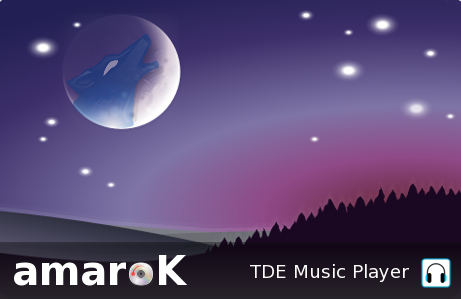
This morning I had some time to play with Gimp, and I made a new splash for amaroK.
It is based on a few KFaenza and Masalla 0.8 (0.8 is now gpl, by the way) icons.
Tell me what you think, and if someone is interested in seeing it replace the old one.
Have a great day!
-Alexandre

On Saturday 14 November 2015 18:53:11 Alexandre wrote:
Tell me what you think, and if someone is interested in seeing it replace the old one.
My husband and I just looked at both together. I like the old one - possibly because I associate it with Amarok, so I don't have to think, but he prefers the new. It is perhaps relevant that I have never known him to use Amarok. One comment though: the new would benefit from showing the version number, as the old one does.
The new one is certainly nicer on the eye - I'm just not sure about the message. But I don't feel strongly. One doesn't see it for long, and I'd soon identify it correctly. And as I say, it is pleasant eye-candy. In fact, it is positively pretty. But I do like seeing the version number on Application Splash screens.
Lisi
On Saturday 14 November 2015 18:53:11 Alexandre wrote:
Hi,
This morning I had some time to play with Gimp, and I made a new splash for amaroK.
It is based on a few KFaenza and Masalla 0.8 (0.8 is now gpl, by the way) icons.
Tell me what you think, and if someone is interested in seeing it replace the old one.
Have a great day!
-Alexandre
Just looked again more slowly. It _is_ pretty. And I love the CD and headphones. I think it has my vote. The wolf is perhaps a bit too subtle, but if I can see him at all, he probably isn't that subtle to other people. And I'mnot usre that in thsi case I am right about teh versuion number. The essentials are there - the TDE version of amaroK.
Thanks, Alexandre. I'll vote for it.
Lisi

On 14/11/2015 18:53, Alexandre wrote:
Hi,
This morning I had some time to play with Gimp, and I made a new splash for amaroK.
It is based on a few KFaenza and Masalla 0.8 (0.8 is now gpl, by the way) icons.
Tell me what you think, and if someone is interested in seeing it replace the old one.
The original for me.
In my case, Amarok was one of the main reasons for staying loyal to KDE3 and moving to TDE, so I would not want it changed, especially just for the sake of it. Whilst your different image looks nice it does nothing for the app in my opinion.
Now, adding the ability to 'glue' specific tracks together (i.e. ensure those tracks plat together, in order) whilst in random play mode, well, that would be earth shattering!
Mike.

-----BEGIN PGP SIGNED MESSAGE----- Hash: SHA512
On 2015/11/15 02:53 AM, Alexandre wrote:
Hi,
This morning I had some time to play with Gimp, and I made a new splash for amaroK.
It is based on a few KFaenza and Masalla 0.8 (0.8 is now gpl, by the way) icons.
Tell me what you think, and if someone is interested in seeing it replace the old one.
Have a great day!
-Alexandre
Alex, the new splash looks nice and modern. Two things, perhaps already highlighted by Lisi: 1) version number visible. I read many people that prefer the TDE version of Amarok to the KDE. So better make it visible ;-) 2) perhaps instead of the wolf in the moon, you could blend in the "double arrows" of the original logo, to serve as a "link" to the origin.
Let's see what other people think too. Cheers Michele

On 14/11/15 18:53, Alexandre wrote:
Hi,
This morning I had some time to play with Gimp, and I made a new splash for amaroK.
It is based on a few KFaenza and Masalla 0.8 (0.8 is now gpl, by the way) icons.
Tell me what you think, and if someone is interested in seeing it replace the old one.
Have a great day!
-Alexandre
Hi
The new Amarok splash looks great. However I have a few comments, IDK if they've been mentioned already.
1) Is the CD spinning in the correct direction? 2) Is the moon correctly aligned? I assume it's Earth's moon 3) TDE Music Player, I think Trinity Music Player is better 4) There is a grey background tint at the bottom of the image, I don't think it's needed 5) The tops of 'amar' and the CD have a few grey pixels 6) White pixels top left and top right
I like the trees silhouette, grey hills and purple glow.
I guess these are fairly minor quibbles.
Andrew
________________________________ De : Andrew Young mail@andrewyoung.co.uk Envoyé : 15 novembre 2015 12:50 À : trinity-devel@lists.pearsoncomputing.net Objet : Re: [trinity-devel] New splash proposal for amaroK Hi
The new Amarok splash looks great. However I have a few comments, IDK if they've been mentioned already.
1) Is the CD spinning in the correct direction?
2) Is the moon correctly aligned? I assume it's Earth's moon
eh, really?
3) TDE Music Player, I think Trinity Music Player is better
I don't like the word ''Trinity'' personally. I think TDE is cooler.
4) There is a grey background tint at the bottom of the image, I don't think it's needed
5) The tops of 'amar' and the CD have a few grey pixels
That is anti-alias, or sub-pixel hinting.
6) White pixels top left and top right
I like the trees silhouette, grey hills and purple glow.
I guess these are fairly minor quibbles.
Andrew
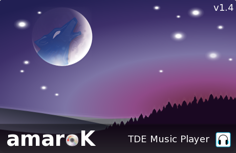
Hi all,
Here is a new version, with the version (ha!) number in it.
This is not a good idea to have the version number in a splash screen, because it means that the splash screen picture will have to be modified if/when a new version of the app is out. More maintenance is not better...
I will keep the wolf. Matter of fact there is a wolf in the amaroK icon since the first release (maybe in 2005?). It is only in the last splash screen that they did, that the wolf has been removed. But anyway, the concept of the wolf yelling at the moon would make no sense at all without the wolf.
-Alexandre
-----BEGIN PGP SIGNED MESSAGE----- Hash: SHA512
On 2015/11/16 07:57 AM, Alexandre wrote:
- --
*De :* Andrew Young mail@andrewyoung.co.uk
*Envoyé :* 15 novembre 2015 12:50 *À :* trinity-devel@lists.pearsoncomputing.net *Objet :* Re: [trinity-devel] New splash proposal for amaroK Hi
The new Amarok splash looks great. However I have a few comments, IDK if they've been mentioned already.
Is the CD spinning in the correct direction?
Is the moon correctly aligned? I assume it's Earth's moon
eh, really?
- TDE Music Player, I think Trinity Music Player is better
I don't like the word ''Trinity'' personally. I think TDE is cooler.
There is a grey background tint at the bottom of the image, I don't think it's needed
The tops of 'amar' and the CD have a few grey pixels
That is anti-alias, or sub-pixel hinting.
- White pixels top left and top right
I like the trees silhouette, grey hills and purple glow.
I guess these are fairly minor quibbles.
Andrew
Hi all,
Here is a new version, with the version (ha!) number in it.
This is not a good idea to have the version number in a splash screen, because it means that the splash screen picture will have to be modified if/when a new version of the app is out. More maintenance is not better...
I will keep the wolf. Matter of fact there is a wolf in the amaroK icon since the first release (maybe in 2005?). It is only in the last splash screen that they did, that the wolf has been removed. But anyway, the concept of the wolf yelling at the moon would make no sense at all without the wolf.
-Alexandre
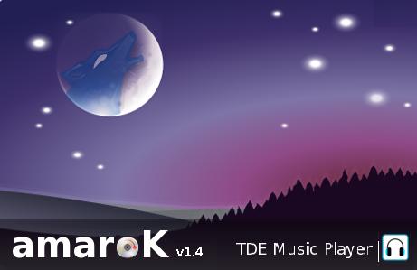
What about the attached modified version? The CD is spinning in the other way, "TDE music player" is slightly smaller and the v1.4 is near the Amarok name and not "lost" in the top right corner. I just did a raw select-copy-paste so the result is somehow basic, surely Alex can do better. Cheers Michele
-Alexandre
What about the attached modified version? The CD is spinning in the other way, "TDE music player" is slightly smaller and the v1.4 is near the Amarok name and not "lost" in the top right corner. I just did a raw select-copy-paste so the result is somehow basic, surely Alex can do better. Cheers Michele
Hi all,
As I said, more maintenance is NOT better. If the version number change, the splash screen will have to be modified. And it will more than likely not be me who will modify back the version number, for some reasons... If it is to be kept on the splash screen, I prefer to keep it in the top right corner, as I think something was kind-of missing in this corner.
Also, what is visible on the cd is not an arrow. It is a laser trace of the CD being read, which means that you all want to see it turn the wrong way.
Anyway things are getting complicated for no valuable reasons. If someone else is ready to do another splash, then let's do it. But no one did it, as it is for all other artwork on TDE...
Alexandre
On Monday 16 November 2015 19:48:34 Alexandre wrote:
Anyway things are getting complicated for no valuable reasons. If someone else is ready to do another splash, then let's do it. But no one did it, as it is for all other artwork on TDE
Only you feel this urgent need to change everything. You could change it on your own CD. :-)
Lisi
-
 Alexandre
 -
 Andrew Young
 -
 Lisi Reisz
 -
 Michael Howard
 -
 Michele Calgaro