
Conversative stance and traditions not withstanding, TDE might profit from some visual improvements, IMHO. Nothing fundamental, just some low-hanging fruits.
Perhaps worth considering: The icon sets from "http://www.ravefinity.com/". They claim to do only Open-Source work, so this should be feasible -- either for direct inclusion, or as a theme source. The "vibrantly simple" icon set works very well vor me, for example.
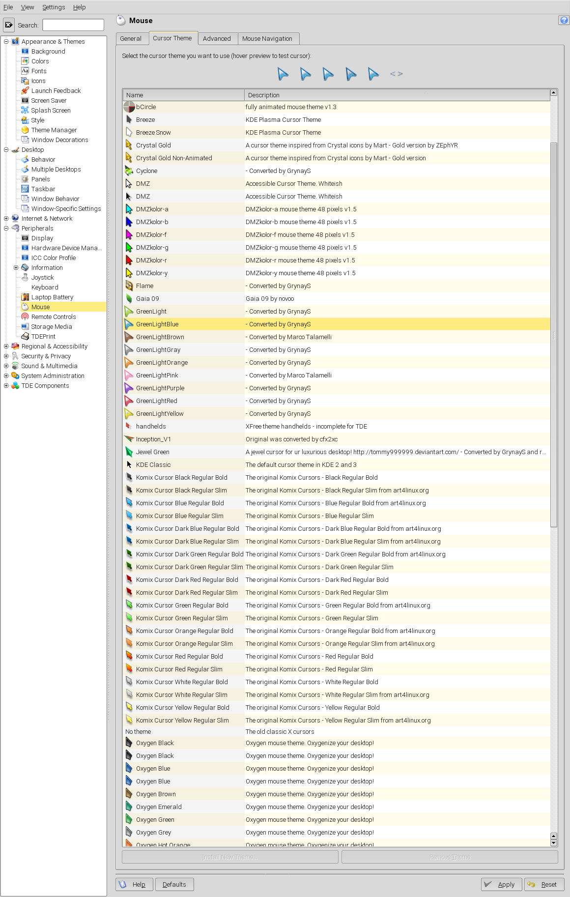
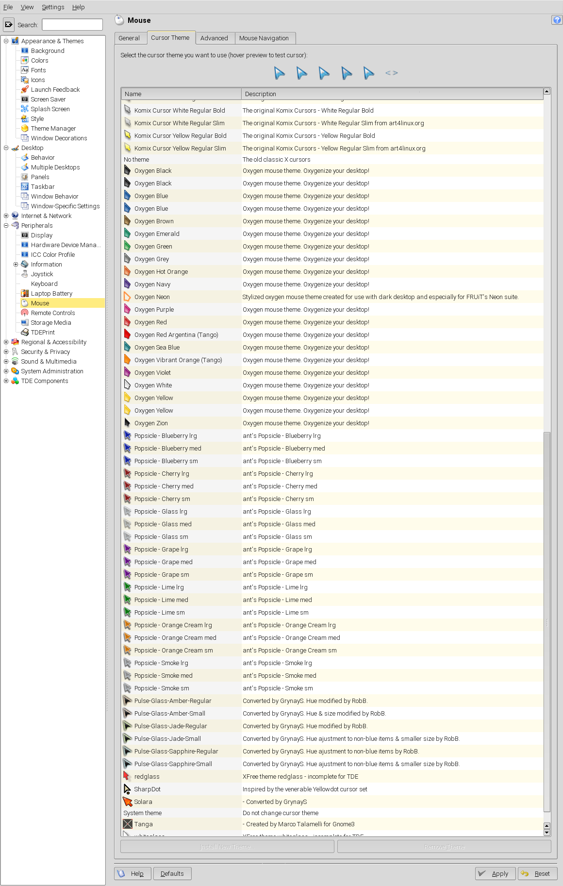
Over the years I've collected a lot of Xcursor icon sets for various purposes and reasons: * color variants of classic sets, better harmonizing with my colorscheme(s) ** Oxygen -- wide spectrum of colors, some slightly textured ** DMZ -- small spectrum of colors ** Komix -- wide color spectrum, somewhat flippant, but excellent in combination with e.g. the "Kids" icon set, and quite usable ** Popsicle -- wide color spectrum, quite flippant, but excellent in combination with e.g. the "Kids" icon set * dynamic/pulsating cursors, easier to locate (helpful accessibility feature for some people) ** e.g. "flame" rotating pseudo-3D object, but not to fidgety ** "GreenLight"-series, slowly pulsating glow, in the actual color of the cursor (not necessarily green ;-) ** "Pulse-Glass"-series, slowly pulsating glow ** "bCircle" and "Tanga" -- very unusual, but interesting design, with very strong visual cues maybe helpful in terms of accessibility
I attach a few (static) screenshots of the cursors -- if there is interest for some of them, I can dig into the license issues ...
Some of the icon sets have problems, e.g. * TDE-LoColor -- does this actually has still an use-case? your are not aiming at car dashboard display, aren't you? it is very low-res, too. * iKons -- IMHO nice, but quite incomplete? * Tango -- only apps icons!?
You might ask "so what?". Well, they might scare off some users, before they find the more pleasing themes.
For discussion: What about having a kind of "tag mechanism" for artwork? We could then tag artwork as "colorful", "dark theme", "light theme", "monochromatic", "accesibility optimzed", "nostalgia", "kids", "modern", "conversative", "flippant", etc. (multiple tags can be applied to an artwork!). The user might set preferences in the control-center, which limit the artwork actually presented for selection -- this would be innovative, improve the harmony of the resulting setup, reduce the clutter in the selection lists and would enable a harmonic co-existence of old and new visual styles, without need to drop legacy artwork.
Finally, about the TDE/Trinity logos, which are still very KDE-ish:
If that is wanted -- OK.
If more visual distance would be welcomed, have a view at: https://en.wikipedia.org/wiki/Triquetra https://en.wikipedia.org/wiki/Triskelion Would some simple, color-ramped (to stay clear of well-established meanings) Triquetra or Triskelion be of interest? I can draft those on positive feedback.
Best regards,
ThoMaus

On Wednesday 24 February 2016 19:35:18 Thomas Maus wrote:
Over the years I've collected a lot of Xcursor icon sets for various purposes and reasons:
From where can one source the mouse cursors you reference? Just a general google search? What re oyu showing in your screen-shot? It looks much better than I remember the KDE eye candy page looking.
Lisi
On Mittwoch, 24. Februar 2016, 23:19:54 wrote Lisi Reisz:
From where can one source the mouse cursors you reference?
Aah, somewhat difficult: I collected them mostly between 2005 and 2007, a 2nd batch around 2010, plus I did some manual repairs ... I will gladly provide them, but in total they encompass 213 MB uncompressed. Either we need some exchange place for the whole chunk or you select specific cursor sets ...
Just a general google search? What re oyu showing in your screen-shot?
I'm showing the TDE mouse cursor selection dialog, the keywords given should help to search for them -- much more information I do not have myself anymore.
It looks much better than I remember the KDE eye candy page looking.
As kde-look (and the similar named of the other desktops) IMHO lack useful * tagging or categorisation facilities, * powerful search filters, * actually meaningful previews and descriptions (just eye-candy, but no useful indication of ergonomy, design goals and principles, intended use cases (large screen, small screen, mouse or touch driven interface, casual vs. extended use, ...) * rating differentiation (e.g. independent rating dimensions "aesthetic", "ergonomic") they degraded to large junkyards, were you have to dig for hours, just to find the rare gems.
ciao,
ThoMaus
--
"'Breeze Plasma5' -- finally bringing LTS (leaning toothpick syndrome) to the desktop"
On Thursday 25 February 2016 02:05:44 Thomas Maus wrote:
I will gladly provide them, but in total they encompass 213 MB uncompressed. Either we need some exchange place for the whole chunk or you select specific cursor sets ...
Yes, please!! I shall only in fact use specific sets, but it would be difficult to choose them from what is there, and some of what you reference sound of enormous interest to me. Your whole approach sounds great. And if you can manage the exchange somehow, I can manage 213 MB. :-) As you say, KDE Look is really, really difficult to dig around in.
Lisi
On Donnerstag, 25. Februar 2016, 10:47:22 wrote Lisi Reisz:
Yes, please!! I shall only in fact use specific sets, but it would be difficult to choose them from what is there, and some of what you reference sound of enormous interest to me. Your whole approach sounds great. And if you can manage the exchange somehow, I can manage 213 MB. :-)
As "tar.bz" archive it shrinks to 12 MB.
@Tim Pearson as the list-owner: Is it OK for you, if I send the TAR to your list for general perusal * in terms of size * in the face of unchecked copyright status of the various cursors (all came from publicly accessible Web sites, probably all FLOSS -- but who knows ...)
ciao,
ThoMaus

Am Donnerstag, 25. Februar 2016 schrieb Thomas Maus:
On Donnerstag, 25. Februar 2016, 10:47:22 wrote Lisi Reisz:
Yes, please!! I shall only in fact use specific sets, but it would be difficult to choose them from what is there, and some of what you reference sound of enormous interest to me. Your whole approach sounds great. And if you can manage the exchange somehow, I can manage 213 MB. :-)
As "tar.bz" archive it shrinks to 12 MB.
@Tim Pearson as the list-owner: Is it OK for you, if I send the TAR to your list for general perusal
- in terms of size
- in the face of unchecked copyright status of the various cursors (all came
from publicly accessible Web sites, probably all FLOSS -- but who knows ...)
ciao,
ThoMaus
To unsubscribe, e-mail: trinity-devel-unsubscribe@lists.pearsoncomputing.net For additional commands, e-mail: trinity-devel-help@lists.pearsoncomputing.net Read list messages on the web archive: http://trinity-devel.pearsoncomputing.net/ Please remember not to top-post: http://trinity.pearsoncomputing.net/mailing_lists/#top-posting
I don't want to rush, but can't we build a package out of that archive and add it to TDE?
Nik
On Thursday 25 February 2016 14:06:52 Dr. Nikolaus Klepp wrote:
Am Donnerstag, 25. Februar 2016 schrieb Thomas Maus:
On Donnerstag, 25. Februar 2016, 10:47:22 wrote Lisi Reisz:
Yes, please!! I shall only in fact use specific sets, but it would be difficult to choose them from what is there, and some of what you reference sound of enormous interest to me. Your whole approach sounds great. And if you can manage the exchange somehow, I can manage 213 MB. :-)
As "tar.bz" archive it shrinks to 12 MB.
@Tim Pearson as the list-owner: Is it OK for you, if I send the TAR to your list for general perusal
- in terms of size
- in the face of unchecked copyright status of the various cursors (all
came from publicly accessible Web sites, probably all FLOSS -- but who knows ...)
ciao,
ThoMaus
To unsubscribe, e-mail: trinity-devel-unsubscribe@lists.pearsoncomputing.net For additional commands, e-mail: trinity-devel-help@lists.pearsoncomputing.net Read list messages on the web archive: http://trinity-devel.pearsoncomputing.net/ Please remember not to top-post: http://trinity.pearsoncomputing.net/mailing_lists/#top-posting
I don't want to rush, but can't we build a package out of that archive and add it to TDE?
I'd be greatly in favour. :-) But perhaps it is not possible, for some reason, or too much work?
Lisi

On Thu, 25 Feb 2016 14:15:36 +0000 Lisi Reisz lisi.reisz@gmail.com wrote:
On Thursday 25 February 2016 14:06:52 Dr. Nikolaus Klepp wrote:
Am Donnerstag, 25. Februar 2016 schrieb Thomas Maus:
On Donnerstag, 25. Februar 2016, 10:47:22 wrote Lisi Reisz:
Yes, please!! I shall only in fact use specific sets, but it would be difficult to choose them from what is there, and some of what you reference sound of enormous interest to me. Your whole approach sounds great. And if you can manage the exchange somehow, I can manage 213 MB. :-)
As "tar.bz" archive it shrinks to 12 MB.
@Tim Pearson as the list-owner: Is it OK for you, if I send the TAR to your list for general perusal
- in terms of size
- in the face of unchecked copyright status of the various cursors (all
came from publicly accessible Web sites, probably all FLOSS -- but who knows ...)
I don't want to rush, but can't we build a package out of that archive and add it to TDE?
I'd be greatly in favour. :-) But perhaps it is not possible, for some reason, or too much work?
The unknown copyright/licensing status would make it impossible even if the manpower were available, I think. Artwork distributed with Trinity has to be able to go out with the same license as everything else.
E. Liddell
On 26. Februar 2016, 07:12:06 wrote E. Liddell:
On Thu, 25 Feb 2016 14:15:36 +0000
Lisi Reisz lisi.reisz@gmail.com wrote:
On Thursday 25 February 2016 14:06:52 Dr. Nikolaus Klepp wrote:
Am Donnerstag, 25. Februar 2016 schrieb Thomas Maus: ...
- in the face of unchecked copyright status of the various cursors
(all came from publicly accessible Web sites, probably all FLOSS -- but who knows ...)
...
The unknown copyright/licensing status would make it impossible even if the manpower were available, I think. Artwork distributed with Trinity has to be able to go out with the same license as everything else.
Obviously, yet
1. I wrote "unchecked": "unchecked" == "unverified" != "unknown" != "unverifiable"
2. I stated that all are from public source, probably all Open Source affine. Before I check nigh to hundred cursors on licenses I want to know if this work is not in vain, and to limit the work of hunting down the copyright status to those cursor sets actually of interest.
3. even if -- as seems the case for the Oxygen and DMZ variants -- there is no explicit copyright statement in the cursor sets themselves, the original themes -- being distributed with common distros -- must have acceptable FLOSS licenses. 3.1 This then automatically applies to derived works. 3.2 It is a relatively trivial endeavour for me to take the original GPLed designs, do a little scripting based on ImageMagick for hue-shifting, and generate the spectrum wanted. The added advantage of this approach is, that I can previously repair, fine-tune, and (we can) possibly extend the cursor set (if there are some special cursors missing) once, and then generate a consistent color set.
The offer to put my work into this stands, the only precondition is that the development team voices which cursor sets are of interest and would be included, quality and copyright status allowing ...
To that end, the question is to answer, how those willing to have a look, get the cursor sets: 1. via private mail 2. via this mailing list 3. as attachment for an improvement on the bug report site And to avoid any problems for the list and site owner I ask if 2. or 3. would be OK despite yet unchecked copyright status.
ciao,
ThoMaus

Obviously, yet
- I wrote "unchecked":
"unchecked" == "unverified" != "unknown" != "unverifiable"
- I stated that all are from public source, probably all Open Source affine.
Before I check nigh to hundred cursors on licenses I want to know if this work is not in vain, and to limit the work of hunting down the copyright status to those cursor sets actually of interest.
- even if -- as seems the case for the Oxygen and DMZ variants -- there is no
explicit copyright statement in the cursor sets themselves, the original themes -- being distributed with common distros -- must have acceptable FLOSS licenses. 3.1 This then automatically applies to derived works. 3.2 It is a relatively trivial endeavour for me to take the original GPLed designs, do a little scripting based on ImageMagick for hue-shifting, and generate the spectrum wanted. The added advantage of this approach is, that I can previously repair, fine-tune, and (we can) possibly extend the cursor set (if there are some special cursors missing) once, and then generate a consistent color set.
The offer to put my work into this stands, the only precondition is that the development team voices which cursor sets are of interest and would be included, quality and copyright status allowing ...
To that end, the question is to answer, how those willing to have a look, get the cursor sets:
- via private mail
- via this mailing list
- as attachment for an improvement on the bug report site
And to avoid any problems for the list and site owner I ask if 2. or 3. would be OK despite yet unchecked copyright status.
Hi Thomas, sorry for the late reply. I have created bug report 2600 (http://bugs.pearsoncomputing.net/show_bug.cgi?id=2600) for this point. Please attached your 12 MB tar.xz archive there (hopefully Tim will not slash me for allowing that :-) ) for the time being, so we keep track of it and people (if they want) can evaluate the material. I am in favor of the proposed facelift, but it will take time since as you probably have understood there is only a bunch of already-busy developers. I suggest that for the time being you do not waste much time chasing or verifying licenses and wait until the time we will address the update. At that time we will probably ask you to do some dig up. Most likely it will not be a single massive upgrade but something more like many small updates over time.
Thanks for your contribution to TDE so far, it is already very precious and welcome. Keep it up :-)
Cheers Michele
On Friday 26 February 2016, 22:01 wrote Michele Calgaro:
... Hi Thomas, sorry for the late reply. I have created bug report 2600 (http://bugs.pearsoncomputing.net/show_bug.cgi?id=2600) for this point. Please attached your 12 MB tar.xz archive there
Done -- thanks!
... Most likely it will not be a single massive upgrade but something more like many small updates over time.
That is something, we should discuss on a strategic level: Perhaps it would be wise, to lump some facelifts together and add some innovation as the sketched tag-based preference theming within the control center. While normally prefering slow evolution, an impression visually and conceptually new (without breaking the core!), would give the magazines and blogger something to write about.
The message would be that Trinity is not dead/old-fashioned/backward-oriented but alive and kicking, and well worth considering. (one semiotic level of triscele and trifoil is "past/present/future as a trinity")
My 2¢, no ill feelings if any or all of you won't share this visions. (A German Elder Statesman once said: "if you have visions, go, see a doctor" ;-)
ciao,
ThoMaus
While normally prefering slow evolution, an impression visually and conceptually new (without breaking the core!), would give the magazines and blogger something to write about.
The message would be that Trinity is not dead/old-fashioned/backward-oriented but alive and kicking, and well worth considering.
Excellent point, I fully share that
What is the state of code sharing or cooperation between Trinity and the (in my perception former and stale?) OpenSuSE KDE3.5 efforts? Hopefully no ill feelings?
From TDE side there is no ill feeling AFAICT. Hopefully the same on the other side, no idea at all. In terms of cooperation, I think we are two independent groups, but if developers from KDE3 wants to join the TDE dev group they would be more than welcome :-)
Cheers Michele
Am Mittwoch, 24. Februar 2016 schrieb Thomas Maus:
Conversative stance and traditions not withstanding, TDE might profit from some visual improvements, IMHO. Nothing fundamental, just some low-hanging fruits.
Perhaps worth considering: The icon sets from "http://www.ravefinity.com/". They claim to do only Open-Source work, so this should be feasible -- either for direct inclusion, or as a theme source. The "vibrantly simple" icon set works very well vor me, for example.
Over the years I've collected a lot of Xcursor icon sets for various purposes and reasons:
- color variants of classic sets, better harmonizing with my colorscheme(s)
** Oxygen -- wide spectrum of colors, some slightly textured ** DMZ -- small spectrum of colors ** Komix -- wide color spectrum, somewhat flippant, but excellent in combination with e.g. the "Kids" icon set, and quite usable ** Popsicle -- wide color spectrum, quite flippant, but excellent in combination with e.g. the "Kids" icon set
- dynamic/pulsating cursors, easier to locate (helpful accessibility feature
for some people) ** e.g. "flame" rotating pseudo-3D object, but not to fidgety ** "GreenLight"-series, slowly pulsating glow, in the actual color of the cursor (not necessarily green ;-) ** "Pulse-Glass"-series, slowly pulsating glow ** "bCircle" and "Tanga" -- very unusual, but interesting design, with very strong visual cues maybe helpful in terms of accessibility
I attach a few (static) screenshots of the cursors -- if there is interest for some of them, I can dig into the license issues ...
Some of the icon sets have problems, e.g.
- TDE-LoColor -- does this actually has still an use-case? your are not aiming
at car dashboard display, aren't you? it is very low-res, too.
- iKons -- IMHO nice, but quite incomplete?
- Tango -- only apps icons!?
You might ask "so what?". Well, they might scare off some users, before they find the more pleasing themes.
For discussion: What about having a kind of "tag mechanism" for artwork? We could then tag artwork as "colorful", "dark theme", "light theme", "monochromatic", "accesibility optimzed", "nostalgia", "kids", "modern", "conversative", "flippant", etc. (multiple tags can be applied to an artwork!). The user might set preferences in the control-center, which limit the artwork actually presented for selection -- this would be innovative, improve the harmony of the resulting setup, reduce the clutter in the selection lists and would enable a harmonic co-existence of old and new visual styles, without need to drop legacy artwork.
Finally, about the TDE/Trinity logos, which are still very KDE-ish:
If that is wanted -- OK.
If more visual distance would be welcomed, have a view at: https://en.wikipedia.org/wiki/Triquetra https://en.wikipedia.org/wiki/Triskelion Would some simple, color-ramped (to stay clear of well-established meanings) Triquetra or Triskelion be of interest? I can draft those on positive feedback.
Best regards,
ThoMaus
I'd like it very much.
Nik
On Wed, 24 Feb 2016 20:35:18 +0100 Thomas Maus thomas.maus@gmx.de wrote:
Conversative stance and traditions not withstanding, TDE might profit from some visual improvements, IMHO. Nothing fundamental, just some low-hanging fruits.
Perhaps worth considering: The icon sets from "http://www.ravefinity.com/". They claim to do only Open-Source work, so this should be feasible -- either for direct inclusion, or as a theme source. The "vibrantly simple" icon set works very well vor me, for example.
Adding a new icon set isn't quite as simple as just packaging it up--we need to retouch some individual icons to provide, for instance, a "T"-logo menu icon variant. A new set addition is currently in (admittedly, slow) progress.
Some of the icon sets have problems, e.g.
- TDE-LoColor -- does this actually has still an use-case? your are not aiming
at car dashboard display, aren't you? it is very low-res, too.
Old hardware, especially stuff that isn't standard home PC hardware. Plus, just leaving it there as an optional set does no harm that I'm aware of.
- iKons -- IMHO nice, but quite incomplete?
Which icons do you feel are missing? It may be possible to create/retouch/repurpose something to fill in the gaps, but we need to know what they are. (This is the "royal we", more or less--with Alexandre having left the project, I'm the one who'd most likely be trying to do the work of creating additional icons.)
- Tango -- only apps icons!?
Not a TDE icon theme--in fact, I think it's intended for Gnome. TDE installs CrystalSVG, iKons, KDEClassic, Kids, Locolor, Slick, and (in the accessibility package) Mono. Candidates for addition would normally be KDE icon themes, which already have icons for most TDE applications.
You might ask "so what?". Well, they might scare off some users, before they find the more pleasing themes.
The first icon theme any new user is going to see is CrystalSVG, which is a complete theme with decent artwork, although in a style that isn't currently fashionable. We can live with that, I think.
For discussion: What about having a kind of "tag mechanism" for artwork? We could then tag artwork as "colorful", "dark theme", "light theme", "monochromatic", "accesibility optimzed", "nostalgia", "kids", "modern", "conversative", "flippant", etc. (multiple tags can be applied to an artwork!). The user might set preferences in the control-center, which limit the artwork actually presented for selection -- this would be innovative, improve the harmony of the resulting setup, reduce the clutter in the selection lists and would enable a harmonic co-existence of old and new visual styles, without need to drop legacy artwork.
What we really need for that sort of thing is probably Planet Trinity, to encompass enough artwork to usefully fill out the categories without supersizing the artwork packages. I've considered that from time to time (if only as a place to give users a clear list of what greeter, k3b, etc. theme packages will work with the Trinity versions of those applications), but I simply don't have the time to administer such a site.
One place that recommendations could be put right now is the wiki.
Finally, about the TDE/Trinity logos, which are still very KDE-ish:
If that is wanted -- OK.
If more visual distance would be welcomed, have a view at: https://en.wikipedia.org/wiki/Triquetra https://en.wikipedia.org/wiki/Triskelion Would some simple, color-ramped (to stay clear of well-established meanings) Triquetra or Triskelion be of interest? I can draft those on positive feedback.
There was some discussion of changing the logo artwork a couple of years ago (I agree that the current one has problems, and they go beyond being KDE-like--there's a reason the original logo had the K off-center). If I recall correctly, Tim nixed it in the end.
E. Liddell
On Friday 26 February 2016, 07:44 wrote E. Liddell:
On Wed, 24 Feb 2016 20:35:18 +0100 Thomas Maus wrote: ...
...
The "vibrantly simple" icon set works very well vor me, for example.
Adding a new icon set isn't quite as simple as just packaging it up--we need to retouch some individual icons to provide, for instance, a "T"-logo menu icon variant. A new set addition is currently in (admittedly, slow) progress.
The TDE-menu-icon is configured as a file reference and thus stays correct even if the icon set is switched. Activating the Ravefinity "vibrantly simple" icon set was as simple as installing into the right place and activating via control center ...
Some of the icon sets have problems, e.g.
- TDE-LoColor -- does this actually has still an use-case? your are not
aiming at car dashboard display, aren't you? it is very low-res, too.
Old hardware, especially stuff that isn't standard home PC hardware. Plus, just leaving it there as an optional set does no harm that I'm aware of.
Yes and no. As an optional set it does no harm, but at least the OpenSuSE repo has very wide dependencies configured. When selecting "trinity-desktop" and "trinity- desktop-applications" more or less everything was forced ... Without previous explanation and preparation the thus provoked first contact of the unsuspecting "modern user" with TDE-LoColor might intimidating and not in the best interest of Trinity ;-)
- iKons -- IMHO nice, but quite incomplete?
Which icons do you feel are missing? It may be possible to create/retouch/repurpose something to fill in the gaps, but we need to know what they are. (This is the "royal we", more or less--with Alexandre having left the project, I'm the one who'd most likely be trying to do the work of creating additional icons.)
Sorry, that was just an impression, I didn't follow up in depth. It might be caused by some inconsistencies between several desktops (and their settings), I was testing at the time.
- Tango -- only apps icons!?
Not a TDE icon theme--in fact, I think it's intended for Gnome. TDE installs CrystalSVG, iKons, KDEClassic, Kids, Locolor, Slick, and (in the accessibility package) Mono. Candidates for addition would normally be KDE icon themes, which already have icons for most TDE applications.
Yes, but Tango actually was forced as requirement of "trinity-kmymoney-common-1.0.5-14.0.2_1.oss421.x86_64"
You might ask "so what?". Well, they might scare off some users, before they find the more pleasing themes.
The first icon theme any new user is going to see is CrystalSVG, which is a complete theme with decent artwork, although in a style that isn't currently fashionable. We can live with that, I think.
Depends on what the vision for Trinity is. I imagine it difficult to widen the user base and achieve a long term perspective of survival, if the first impression of new users is "stale". (CrystalSVG is very decent artwork, no doubt)
Don't get me wrong: I'm not arguing on the aesthetic level -- a desktop is a very personal working environment and beauty is in the eye of the beholder. (And I don't care, what personal and aesthetic decisions a user will take, because normally I don't have to look at them nor use them ...)
My point is ergonomics: A user might be accustomed to a specific icon set since over a decade, the re-cognition being essential to off-load mental workload and a fluent use of the desktop. The same is true of other presets like window- shapes+behavior, button-placements, coloring and especially highlighting.
IMNSHO the cardinal sin of GNOME and KDE4/Plasma5 is the arrogant and dictatorial attitude of a few negating year-long efforts of many by: * ignoring the user's experience in their individual ergonomics * scraping features, which were honored not only by usage but by fine-tuned configuration, feedback, and improvement * underestimating the ease and speedup provided by of years of implicit training with a specific desktop set-up, and underestimating the effort changing all those reflexes (imagine changing the pedal layout in cars ...)
The question is: how to cater for different user expectations, communities and especially the modern, mostly impatient non-exploring approach to new SW.
That was the core question of the following proposal:
For discussion: What about having a kind of "tag mechanism" for artwork? We could then tag artwork as "colorful", "dark theme", "light theme", "monochromatic", "accesibility optimzed", "nostalgia", "kids", "modern", "conversative", "flippant", etc. (multiple tags can be applied to an artwork!). The user might set preferences in the control-center, which limit the artwork actually presented for selection -- this would be innovative, improve the harmony of the resulting setup, reduce the clutter in the selection lists and would enable a harmonic co-existence of old and new visual styles, without need to drop legacy artwork.
What we really need for that sort of thing is probably Planet Trinity, to encompass enough artwork to usefully fill out the categories without supersizing the artwork packages. I've considered that from time to time (if only as a place to give users a clear list of what greeter, k3b, etc. theme packages will work with the Trinity versions of those applications), but I simply don't have the time to administer such a site.
au contraire, I'd prefer to have this functionality in the "tdepersonalizer" and control-center. In "tdepersonalizer" as a few preconfigured fine-tuned and consistent themes (introduced by screenshots) plus a choice tag preset for the control-center. In the control-center the tags act as a filter to visible icon/cursor sets etc.
If users wants to start with a specific "modern look", that is what they get -- and until they decide to widen their perspective by changing the filter tags.
Equally, if users specifically choose a "KDE3.5"-similar experience, that is what they get, and that may apply to further "classical" or even "nostalgical" setups.
The two of us might consider a CDE or Win98 look-alike horribly in-ergonomic, somebody else might feel "at home" (and would run away screaming, when forced to work with our specific setups ;-)
And exactly that could be the unique characteristic (and "selling point") for Trinity:
You will feel at home with "Trinity Desktop Environment", if you are looking for a classical graphical desktop -- having enough screen estate to work with parallel windows and driven by mouse or similar pointing devices as well as a full-fledged keyboard --, as it is flexible enough to support most/any/all workstyles.
(Some native speaker might want to hone this text, should it be found agreeable at all ;-)
ciao,
ThoMaus
On Sunday 28 February 2016, 19:42 wrote Thomas Maus:
On Friday 26 February 2016, 07:44 wrote E. Liddell:
What we really need for that sort of thing is probably Planet Trinity, to encompass enough artwork to usefully fill out the categories without supersizing the artwork packages. I've considered that from time to time (if only as a place to give users a clear list of what greeter, k3b, etc. theme packages will work with the Trinity versions of those applications), but I simply don't have the time to administer such a site.
au contraire, I'd prefer to have this functionality in the "tdepersonalizer" and control-center. In "tdepersonalizer" as a few preconfigured fine-tuned and consistent themes (introduced by screenshots) plus a choice tag preset for the control-center. In the control-center the tags act as a filter to visible icon/cursor sets etc.
On 2nd thought -- "au contraire" is plain wrong: The following trinity would probably much better:
* On the Web-site extend the screenshot section to a " Desktops introduced" (optional sub-title: "unity in diversity" to keep up a Trinity aspect ;-)
This should not be pure eye-candy or screenshot, but an explanation of the complete desktop configuration choices, addressing the usage scenario, the focus of config and the resulting individual choices (either as structured or flowing text), based on individual experience. This is combined with a theme and some way to convey the settings not stored in themes (yet).
* In "tdepersonalizer" these introduced desktops should (later) be available choices, so that a user can preview and read about a desktop design on the Web-site, decide to try Trinity and then get exactly that desktop design in a streamlined process.
* In control-center users can explore the "configuration space", with the tag preset (initially) reducing and guiding through the configuration choices.
Here an example text, how I would introduce my desktop: ---8<------------------------------------------------------------------------------ My desktop needs to support working for many hours per day in a complex and mentally taxing environment. My primary requirements thus are, that on one hand it must prevent RSI and other computer work related maladies and must be especially easy on my eyes, and on the other hand it must not be distractive but with visual cues must support the workflows, habits and reflexes acquired in three decades of X11 GUI use.
Avoiding mouse clicks helps me to avoid RSI symptoms, so menus open on mouse hover and window focus follows mouse. I need to use a lot of windows -- many terminal emulations -- and switch often between them. This goes well with the "B II" window style, which produces a staggered, tabbed appearance for the window titles, making it easy to switch windows with mouse hovers. Active windows and other objects are highlighted in strong golden and red colors, to ease orientation on this dynamically changing desktop, and -- together with the informative terminal titlebars -- avoid desaster.
Icons, cursors, as well as text colors and fonts are choosen for good contrast and discernability.
Opposed to other window types, where I need to see the same colors as other people I'm communicating with, the background of the much-used terminal windows are black for several reasons: it is easier on the eyes (less retinol depletion), color codes of tools like "ls", "egrep", etc. are better visible
The colors were generally chosen to be "warm", and are intended to be used with a monitor set to "low color temperatures". The idea is to reduce the so- called "blue light hazard", especially avoiding insomnia after late-night sessions -- it is working for me. The wallpaper might be abstract or a motive, but most of the time I choose a warm green color, because of their stress- reducing effect. ---8<------------------------------------------------------------------------------
ciao,
ThoMaus
On Sun, 28 Feb 2016 19:42:44 +0100 Thomas Maus thomas.maus@gmx.de wrote:
On Friday 26 February 2016, 07:44 wrote E. Liddell:
On Wed, 24 Feb 2016 20:35:18 +0100 Thomas Maus wrote: ...
...
The "vibrantly simple" icon set works very well vor me, for example.
Adding a new icon set isn't quite as simple as just packaging it up--we need to retouch some individual icons to provide, for instance, a "T"-logo menu icon variant. A new set addition is currently in (admittedly, slow) progress.
The TDE-menu-icon is configured as a file reference and thus stays correct even if the icon set is switched. Activating the Ravefinity "vibrantly simple" icon set was as simple as installing into the right place and activating via control center ...
It isn't just the menu icon. There are a whole bunch of TDE applications that still share names and (potentially) icons with their KDE4 equivalents. Some of those icons have Ks embedded in them. TDE with KDE branding is selling TDE short.
Also, I just did a few experiments with different icon themes. The results confirm that if TDE can't find an icon for something, it falls back on CrystalSVG. This makes sense from a functional point of view (CrystalSVG is installed with tdelibs, so it will always be there), but it may not look so great if the main icon set is muted or flat-style.
- Tango -- only apps icons!?
Not a TDE icon theme--in fact, I think it's intended for Gnome. TDE installs CrystalSVG, iKons, KDEClassic, Kids, Locolor, Slick, and (in the accessibility package) Mono. Candidates for addition would normally be KDE icon themes, which already have icons for most TDE applications.
Yes, but Tango actually was forced as requirement of "trinity-kmymoney-common-1.0.5-14.0.2_1.oss421.x86_64"
If I had to guess, SUSE has an optional dependency switched on for a GTK-based configuration GUI for some library that is used by kmymoney. It isn't anything TDE is doing, and even the person building the SUSE packages may not be aware it's being pulled in.
I can't find a dependency path that would lead back to it for my distro, but Gentoo doesn't have packages for anything after kmymoney-1.0.2.
You might ask "so what?". Well, they might scare off some users, before they find the more pleasing themes.
The first icon theme any new user is going to see is CrystalSVG, which is a complete theme with decent artwork, although in a style that isn't currently fashionable. We can live with that, I think.
Depends on what the vision for Trinity is. I imagine it difficult to widen the user base and achieve a long term perspective of survival, if the first impression of new users is "stale".
I'm aware of the problem, and I'm actually cautiously in favour of a refresh, with some caveats:
1. "Fresh" is a moving target, and we have limited manpower. Every addition we make now will need to be maintained and refreshed down the road. That's why I'm a little uncomfortable with adding whole packages containing new types of artwork assets, like xcursors.
2. Removing existing artwork has to be done with caution, and packages intended for accessibility or special hardware should be left alone unless there are active complaints or bugs. That means I think Locolor should stick around (but if you want to make a case for removing, say, iKons, I'll take it seriously).
3. Trinity's largest audience is likely those looking for a somewhat "retro" desktop. That means we need to be careful not to go overboard. ;P
Don't get me wrong: I'm not arguing on the aesthetic level -- a desktop is a very personal working environment and beauty is in the eye of the beholder. (And I don't care, what personal and aesthetic decisions a user will take, because normally I don't have to look at them nor use them ...)
My point is ergonomics: A user might be accustomed to a specific icon set since over a decade, the re-cognition being essential to off-load mental workload and a fluent use of the desktop. The same is true of other presets like window- shapes+behavior, button-placements, coloring and especially highlighting.
I'm aware. My setup is non-standard to the point that it makes people used to the default settings for *any* desktop make strange noises and back away slowly. ;)
For discussion: What about having a kind of "tag mechanism" for artwork? We could then tag artwork as "colorful", "dark theme", "light theme", "monochromatic", "accesibility optimzed", "nostalgia", "kids", "modern", "conversative", "flippant", etc. (multiple tags can be applied to an artwork!). The user might set preferences in the control-center, which limit the artwork actually presented for selection -- this would be innovative, improve the harmony of the resulting setup, reduce the clutter in the selection lists and would enable a harmonic co-existence of old and new visual styles, without need to drop legacy artwork.
What we really need for that sort of thing is probably Planet Trinity, to encompass enough artwork to usefully fill out the categories without supersizing the artwork packages. I've considered that from time to time (if only as a place to give users a clear list of what greeter, k3b, etc. theme packages will work with the Trinity versions of those applications), but I simply don't have the time to administer such a site.
au contraire, I'd prefer to have this functionality in the "tdepersonalizer" and control-center. In "tdepersonalizer" as a few preconfigured fine-tuned and consistent themes (introduced by screenshots) plus a choice tag preset for the control-center. In the control-center the tags act as a filter to visible icon/cursor sets etc.
If users wants to start with a specific "modern look", that is what they get -- and until they decide to widen their perspective by changing the filter tags.
The problem is, again, that you can't please everybody. Four or five curated desktop themes, fine. Five hundred, with all their art assets? Much too large to be included in the core package downloads.
However, buried in the innards of the Control Center is an interface that accesses websites to provide access to additional wallpapers etc. Currently it only offers what comes off opendesktop.org's default RSS feeds (latest/highest rated/most downloads), but it could be extended: send keywords, get back custom feed of matching items. Put that in KPersonalizer too (if it isn't already there), and you've got the best of both worlds. But it needs the backing website store.
E. Liddell
On 2016/03/01 07:11 AM, E. Liddell wrote:
On Sun, 28 Feb 2016 19:42:44 +0100 Thomas Maus thomas.maus@gmx.de wrote:
On Friday 26 February 2016, 07:44 wrote E. Liddell:
On Wed, 24 Feb 2016 20:35:18 +0100 Thomas Maus wrote: ...
...
The "vibrantly simple" icon set works very well vor me, for example.
Adding a new icon set isn't quite as simple as just packaging it up--we need to retouch some individual icons to provide, for instance, a "T"-logo menu icon variant. A new set addition is currently in (admittedly, slow) progress.
The TDE-menu-icon is configured as a file reference and thus stays correct even if the icon set is switched. Activating the Ravefinity "vibrantly simple" icon set was as simple as installing into the right place and activating via control center ...
It isn't just the menu icon. There are a whole bunch of TDE applications that still share names and (potentially) icons with their KDE4 equivalents. Some of those icons have Ks embedded in them. TDE with KDE branding is selling TDE short.
Also, I just did a few experiments with different icon themes. The results confirm that if TDE can't find an icon for something, it falls back on CrystalSVG. This makes sense from a functional point of view (CrystalSVG is installed with tdelibs, so it will always be there), but it may not look so great if the main icon set is muted or flat-style.
- Tango -- only apps icons!?
Not a TDE icon theme--in fact, I think it's intended for Gnome. TDE installs CrystalSVG, iKons, KDEClassic, Kids, Locolor, Slick, and (in the accessibility package) Mono. Candidates for addition would normally be KDE icon themes, which already have icons for most TDE applications.
Yes, but Tango actually was forced as requirement of "trinity-kmymoney-common-1.0.5-14.0.2_1.oss421.x86_64"
If I had to guess, SUSE has an optional dependency switched on for a GTK-based configuration GUI for some library that is used by kmymoney. It isn't anything TDE is doing, and even the person building the SUSE packages may not be aware it's being pulled in.
I can't find a dependency path that would lead back to it for my distro, but Gentoo doesn't have packages for anything after kmymoney-1.0.2.
You might ask "so what?". Well, they might scare off some users, before they find the more pleasing themes.
The first icon theme any new user is going to see is CrystalSVG, which is a complete theme with decent artwork, although in a style that isn't currently fashionable. We can live with that, I think.
Depends on what the vision for Trinity is. I imagine it difficult to widen the user base and achieve a long term perspective of survival, if the first impression of new users is "stale".
I'm aware of the problem, and I'm actually cautiously in favour of a refresh, with some caveats:
- "Fresh" is a moving target, and we have limited manpower. Every
addition we make now will need to be maintained and refreshed down the road. That's why I'm a little uncomfortable with adding whole packages containing new types of artwork assets, like xcursors.
- Removing existing artwork has to be done with caution, and packages
intended for accessibility or special hardware should be left alone unless there are active complaints or bugs. That means I think Locolor should stick around (but if you want to make a case for removing, say, iKons, I'll take it seriously).
- Trinity's largest audience is likely those looking for a somewhat "retro"
desktop. That means we need to be careful not to go overboard. ;P
Don't get me wrong: I'm not arguing on the aesthetic level -- a desktop is a very personal working environment and beauty is in the eye of the beholder. (And I don't care, what personal and aesthetic decisions a user will take, because normally I don't have to look at them nor use them ...)
My point is ergonomics: A user might be accustomed to a specific icon set since over a decade, the re-cognition being essential to off-load mental workload and a fluent use of the desktop. The same is true of other presets like window- shapes+behavior, button-placements, coloring and especially highlighting.
I'm aware. My setup is non-standard to the point that it makes people used to the default settings for *any* desktop make strange noises and back away slowly. ;)
For discussion: What about having a kind of "tag mechanism" for artwork? We could then tag artwork as "colorful", "dark theme", "light theme", "monochromatic", "accesibility optimzed", "nostalgia", "kids", "modern", "conversative", "flippant", etc. (multiple tags can be applied to an artwork!). The user might set preferences in the control-center, which limit the artwork actually presented for selection -- this would be innovative, improve the harmony of the resulting setup, reduce the clutter in the selection lists and would enable a harmonic co-existence of old and new visual styles, without need to drop legacy artwork.
What we really need for that sort of thing is probably Planet Trinity, to encompass enough artwork to usefully fill out the categories without supersizing the artwork packages. I've considered that from time to time (if only as a place to give users a clear list of what greeter, k3b, etc. theme packages will work with the Trinity versions of those applications), but I simply don't have the time to administer such a site.
au contraire, I'd prefer to have this functionality in the "tdepersonalizer" and control-center. In "tdepersonalizer" as a few preconfigured fine-tuned and consistent themes (introduced by screenshots) plus a choice tag preset for the control-center. In the control-center the tags act as a filter to visible icon/cursor sets etc.
If users wants to start with a specific "modern look", that is what they get -- and until they decide to widen their perspective by changing the filter tags.
The problem is, again, that you can't please everybody. Four or five curated desktop themes, fine. Five hundred, with all their art assets? Much too large to be included in the core package downloads.
However, buried in the innards of the Control Center is an interface that accesses websites to provide access to additional wallpapers etc. Currently it only offers what comes off opendesktop.org's default RSS feeds (latest/highest rated/most downloads), but it could be extended: send keywords, get back custom feed of matching items. Put that in KPersonalizer too (if it isn't already there), and you've got the best of both worlds. But it needs the backing website store.
Hi Thomas, E., sorry for the late reply, I have been kind of busy these days. I will try to reply here to your points.
I like the idea of having some "default desktop" as initial available choices. Perhaps we could have at least a couple of them as standard, one being "TDE Classic" (i.e. now) and one being "TDE modern" (or something like this) with a more modern icon set, mouse icons, theme, .... We could show that on the website and update KPersonalizer to support both choices. KPersonalizer should basically offer the user a choice between "predefined desktop styles" (this new idea) and "manual configuration" (i.e. the current behavior). Also in the "manual configuration" we should add support for mouse icon set. As additional step (for a later stage), we could set up some space on the server for additional predefined desktops and themes and Improve KPersonalizer to download them on request. This would provide more appealing options for new users while at the same time keep old users happy. What do you think? Tim, Slavek, please also give your feedback.
Being that the developers are very few, this will be a slow upgrade process but as they say, if we never start, we will never get there :-)
Cheers Michele
On 02/25/2016 02:35 AM, Thomas Maus wrote:
If more visual distance would be welcomed, have a view at: https://en.wikipedia.org/wiki/Triquetra https://en.wikipedia.org/wiki/Triskelion Would some simple, color-ramped (to stay clear of well-established meanings) Triquetra or Triskelion be of interest? I can draft those on positive feedback.
By the way, I particularly like the "Trefoil knot" on the first link. Nice, simple, continuous, fluid... the essence of TDE :-) Just my opinion, would be interesting to hear from others.
If people are in favor and Tim agrees, we could consider adopting a new "KDE independent" logo for R14.1.x.
Cheers Michele
Am Freitag, 26. Februar 2016 schrieb Michele Calgaro:
On 02/25/2016 02:35 AM, Thomas Maus wrote:
If more visual distance would be welcomed, have a view at: https://en.wikipedia.org/wiki/Triquetra https://en.wikipedia.org/wiki/Triskelion Would some simple, color-ramped (to stay clear of well-established meanings) Triquetra or Triskelion be of interest? I can draft those on positive feedback.
By the way, I particularly like the "Trefoil knot" on the first link. Nice, simple, continuous, fluid... the essence of TDE :-) Just my opinion, would be interesting to hear from others.
If people are in favor and Tim agrees, we could consider adopting a new "KDE independent" logo for R14.1.x.
Cheers Michele
+1
On Friday 26 February 2016 15:06:52 Michele Calgaro wrote:
On 02/25/2016 02:35 AM, Thomas Maus wrote:
If more visual distance would be welcomed, have a view at: https://en.wikipedia.org/wiki/Triquetra https://en.wikipedia.org/wiki/Triskelion Would some simple, color-ramped (to stay clear of well-established meanings) Triquetra or Triskelion be of interest? I can draft those on positive feedback.
By the way, I particularly like the "Trefoil knot" on the first link. Nice, simple, continuous, fluid... the essence of TDE :-) Just my opinion, would be interesting to hear from others.
If people are in favor and Tim agrees, we could consider adopting a new "KDE independent" logo for R14.1.x.
Cheers Michele
I love the general idea, with a particular soft spot for the Greek type of triskelia. The trefoil knot is a little angular, but I take the point about continuity, and possibly already appropriated by the Girl Guides (Girl Scouts)- well they all are "taken" and it depends on how they are used. There is the Logo of Trisquel GNU/Linux for a start!
A lot would depend on how either was used and coloured. But I love the idea! I'd love to see various ideas based on both as starting points.
Lisi

Michele Calgaro wrote:
this looks great
I would have suggested the tetragrammaton as the base of whole universe, but we would go into deep religious and philosophic dispute if it is 3 or 4 etc. ;-), however it would fit the Trinity part
On 02/27/2016 06:27 AM, deloptes wrote:
Michele Calgaro wrote:
this looks great
I would have suggested the tetragrammaton as the base of whole universe, but we would go into deep religious and philosophic dispute if it is 3 or 4 etc. ;-), however it would fit the Trinity part
It seems the new logo idea is gathering some consensus. Thomas (or E.), would you be able to come up with some concept logos from the suggested page/symbol and post that to the list for consideration? Once we have a few options, we can further discuss with Tim who is the benevolent project coordinator ;-)
Cheers Michele

On 27/02/2016 15:25, Michele Calgaro wrote:
On 02/27/2016 06:27 AM, deloptes wrote:
Michele Calgaro wrote:
this looks great
I would have suggested the tetragrammaton as the base of whole universe, but we would go into deep religious and philosophic dispute if it is 3 or 4 etc. ;-), however it would fit the Trinity part
It seems the new logo idea is gathering some consensus. Thomas (or E.), would you be able to come up with some concept logos from the suggested page/symbol and post that to the list for consideration? Once we have a few options, we can further discuss with Tim who is the benevolent project coordinator ;-)
Cheers Michele
I personally have no problem with change unless it is foisted without choice. I don't like the particular images so far mentioned in the thread as I don't see my use of TDE having any link with religion, the Isle Of Man or any other Celtic origins. In fact, anything remotely linked with Religion is a big no no for me.
I have no idea why Trinity Desktop Environment is so named but I have never considered the 'Trinity' part to be of a religious nature. Can somebody enlighten me on where the 'T' as in Trinity originates from in this case?
So, basically, I would like the choice to remain with the current icon set or at least, a set not so completely diverse.
Cheers, Mike.
On 2016/02/27 10:37 PM, Michael Howard wrote:
I personally have no problem with change unless it is foisted without choice. I don't like the particular images so far mentioned in the thread as I don't see my use of TDE having any link with religion, the Isle Of Man or any other Celtic origins. In fact, anything remotely linked with Religion is a big no no for me.
I have no idea why Trinity Desktop Environment is so named but I have never considered the 'Trinity' part to be of a religious nature. Can somebody enlighten me on where the 'T' as in Trinity originates from in this case?
AFAICT, Trinity has nothing to do with religion, Isle of Man, Celtic origin or whatever other thing you can think of. Trinity was chosen because it means '3' as in KDE3. Any new potential logo will be subjected to user/developer list discussion (as we are already doing) and everyone is free to raise his/her own opinion.
Cheers Michele
On 27/02/2016 16:15, Michele Calgaro wrote:
On 2016/02/27 10:37 PM, Michael Howard wrote:
I personally have no problem with change unless it is foisted without choice. I don't like the particular images so far mentioned in the thread as I don't see my use of TDE having any link with religion, the Isle Of Man or any other Celtic origins. In fact, anything remotely linked with Religion is a big no no for me.
I have no idea why Trinity Desktop Environment is so named but I have never considered the 'Trinity' part to be of a religious nature. Can somebody enlighten me on where the 'T' as in Trinity originates from in this case?
AFAICT, Trinity has nothing to do with religion, Isle of Man, Celtic origin or whatever other thing you can think of. Trinity was chosen because it means '3' as in KDE3. Any new potential logo will be subjected to user/developer list discussion (as we are already doing) and everyone is free to raise his/her own opinion.
Cheers Michele
Oooh, that sounds a bit abrupt :)
I didn't for one minute suggest Trinity has _anything_ to do with religion, Isle of Man or Celtic origins, please show me where I did. What I wrote and implied was that the _images_ mentioned/linked to as replacements for the current TDE logos in this thread do have links to religion, the Isle of Man and Celtic origins.
As you point out, everyone is free to raise opinion, so I assume that includes me?
On 2016/02/27 11:23 PM, Michael Howard wrote:
On 27/02/2016 16:15, Michele Calgaro wrote:
On 2016/02/27 10:37 PM, Michael Howard wrote:
I personally have no problem with change unless it is foisted without choice. I don't like the particular images so far mentioned in the thread as I don't see my use of TDE having any link with religion, the Isle Of Man or any other Celtic origins. In fact, anything remotely linked with Religion is a big no no for me.
I have no idea why Trinity Desktop Environment is so named but I have never considered the 'Trinity' part to be of a religious nature. Can somebody enlighten me on where the 'T' as in Trinity originates from in this case?
AFAICT, Trinity has nothing to do with religion, Isle of Man, Celtic origin or whatever other thing you can think of. Trinity was chosen because it means '3' as in KDE3. Any new potential logo will be subjected to user/developer list discussion (as we are already doing) and everyone is free to raise his/her own opinion.
Cheers Michele
Oooh, that sounds a bit abrupt :)
I didn't for one minute suggest Trinity has _anything_ to do with religion, Isle of Man or Celtic origins, please show me where I did. What I wrote and implied was that the _images_ mentioned/linked to as replacements for the current TDE logos in this thread do have links to religion, the Isle of Man and Celtic origins.
As you point out, everyone is free to raise opinion, so I assume that includes me?
Hi Michael, indeed you are free to raise your opinion as well :-) Perhaps I misunderstand your first paragraph, but nevermind, not an issue at all ;-) Regarding the images suggested, personally I just look at the images for what they are, i.e. just images. In fact I didn't even read the text in the websites suggested, I just looked at images for potential logos. And anyone (including you :-) ) can propose other images for consideration as well. So far based on the answers received on this ML, it seems that there is some support for the trefoil knot. That does not mean it has already been chosen. Perhaps in the end we may just stick with the current logo, or we may adopt the trefoil knot or some other logo. At the moment we are just exchanging opinions.
Cheers Michele
On Sat, 27 Feb 2016 22:25:13 +0700 Michele Calgaro michele.calgaro@yahoo.it wrote:
On 02/27/2016 06:27 AM, deloptes wrote:
Michele Calgaro wrote:
this looks great
I would have suggested the tetragrammaton as the base of whole universe, but we would go into deep religious and philosophic dispute if it is 3 or 4 etc. ;-), however it would fit the Trinity part
It seems the new logo idea is gathering some consensus. Thomas (or E.), would you be able to come up with some concept logos from the suggested page/symbol and post that to the list for consideration? Once we have a few options, we can further discuss with Tim who is the benevolent project coordinator ;-)
For your amusement, then, here are some very early stage concept sketches. (I included a couple of random ones like the "tree-nity" logo from the batch I did ~4 years ago and the spiral-T just to give some variety to the set.) I didn't bother with colour/gradient/fancy outline tricks at this point because I'm not inclined to put that much work into something we end up not moving forward with.
Basic design criteria included incorporating some idea of "three-ness" (or "T-ness" in a couple of cases), and not looking too much like anyone else's logo that I know of. Which is why the one that looks most like Trisquel Linux's has that triangle added. Logos too similar = potential trademark infringement.
E. Liddell
On 03/01/2016 07:32 AM, E. Liddell wrote:
On Sat, 27 Feb 2016 22:25:13 +0700 Michele Calgaro michele.calgaro@yahoo.it wrote:
On 02/27/2016 06:27 AM, deloptes wrote:
Michele Calgaro wrote:
this looks great
I would have suggested the tetragrammaton as the base of whole universe, but we would go into deep religious and philosophic dispute if it is 3 or 4 etc. ;-), however it would fit the Trinity part
It seems the new logo idea is gathering some consensus. Thomas (or E.), would you be able to come up with some concept logos from the suggested page/symbol and post that to the list for consideration? Once we have a few options, we can further discuss with Tim who is the benevolent project coordinator ;-)
For your amusement, then, here are some very early stage concept sketches. (I included a couple of random ones like the "tree-nity" logo from the batch I did ~4 years ago and the spiral-T just to give some variety to the set.) I didn't bother with colour/gradient/fancy outline tricks at this point because I'm not inclined to put that much work into something we end up not moving forward with.
Basic design criteria included incorporating some idea of "three-ness" (or "T-ness" in a couple of cases), and not looking too much like anyone else's logo that I know of. Which is why the one that looks most like Trisquel Linux's has that triangle added. Logos too similar = potential trademark infringement.
E. Liddell
Hi E. Thanks for posting some logo prototypes, the one with the tree is quite nice. I think though we should move away from the "gear" concept if we are going to change our logo. Just my 2 cents, but I appreciate the effort you put in on this (as usual :-) ) Cheers Michele
On Thursday 03 March 2016 12:15:29 Michele Calgaro wrote:
I think though we should move away from the "gear" concept if we are going to change our logo.
I would sort of agree. But I rather like some of the combinations, and our roots are part of our attraction, so it is in some ways nice to be reminded.
I would also personally prefer to stay away from anything that reminds me, however remotely and unjustifiably, of the swastika. I know that it is an ancient symbol, I know that it is in fact the symbol of light, I know that it was the wrong way round, I know it had four arms etc. etc. But I don't like being reminded of it. (The one in the top right corner).
My husband (my resident guinea pig) particularly liked the tree and the one under it. I particularly like the one under the tree. Interestingly enough, my husband disliked the ones with gears on aesthetic grounds!! But I also liked the one at the far left of the bottom row. Not as much as the T with the triskele. That is really nice and very "suitable" IMHO.
Lisi
On Thu, 3 Mar 2016 14:47:21 +0000 Lisi Reisz lisi.reisz@gmail.com wrote:
On Thursday 03 March 2016 12:15:29 Michele Calgaro wrote:
I think though we should move away from the "gear" concept if we are going to change our logo.
I would sort of agree. But I rather like some of the combinations, and our roots are part of our attraction, so it is in some ways nice to be reminded.
I would also personally prefer to stay away from anything that reminds me, however remotely and unjustifiably, of the swastika. I know that it is an ancient symbol, I know that it is in fact the symbol of light, I know that it was the wrong way round, I know it had four arms etc. etc. But I don't like being reminded of it. (The one in the top right corner).
My husband (my resident guinea pig) particularly liked the tree and the one under it. I particularly like the one under the tree. Interestingly enough, my husband disliked the ones with gears on aesthetic grounds!! But I also liked the one at the far left of the bottom row. Not as much as the T with the triskele. That is really nice and very "suitable" IMHO.
Taking into account these and other comments, I've cut my original set of twelve down to five and performed a few revisions.
1. Triquetra/gear interlace: no changes. 2. Triskele-T: thickened the triskele for better visibility at small sizes. 3. Tree-nity: added more branches and leaves, for a healthier-looking tree. ;) 4. Triquetra + small gear: swapped colours 5. Triquetra over gear: made the triquetra larger.
Top row is the original logos from the first draft, second row is the modifications, third row is an attempt at the modifications as CrystalSVG- style menu buttons, fourth row is the original-original (KDE3 K button, easier to find on my machine than the T button) for comparison purposes.
Some of them still need a little more work (widening some lines more, possibly larger leaves on the tree-nity, more thought given to colours and gradients, and a good manual node cull), but I'm running out of weekend. ;)
E. Liddell
Am Sonntag, 6. März 2016 schrieb E. Liddell:
On Thu, 3 Mar 2016 14:47:21 +0000 Lisi Reisz lisi.reisz@gmail.com wrote:
On Thursday 03 March 2016 12:15:29 Michele Calgaro wrote:
I think though we should move away from the "gear" concept if we are going to change our logo.
I would sort of agree. But I rather like some of the combinations, and our roots are part of our attraction, so it is in some ways nice to be reminded.
I would also personally prefer to stay away from anything that reminds me, however remotely and unjustifiably, of the swastika. I know that it is an ancient symbol, I know that it is in fact the symbol of light, I know that it was the wrong way round, I know it had four arms etc. etc. But I don't like being reminded of it. (The one in the top right corner).
My husband (my resident guinea pig) particularly liked the tree and the one under it. I particularly like the one under the tree. Interestingly enough, my husband disliked the ones with gears on aesthetic grounds!! But I also liked the one at the far left of the bottom row. Not as much as the T with the triskele. That is really nice and very "suitable" IMHO.
Taking into account these and other comments, I've cut my original set of twelve down to five and performed a few revisions.
- Triquetra/gear interlace: no changes.
- Triskele-T: thickened the triskele for better visibility at small sizes.
- Tree-nity: added more branches and leaves, for a healthier-looking tree. ;)
- Triquetra + small gear: swapped colours
- Triquetra over gear: made the triquetra larger.
Top row is the original logos from the first draft, second row is the modifications, third row is an attempt at the modifications as CrystalSVG- style menu buttons, fourth row is the original-original (KDE3 K button, easier to find on my machine than the T button) for comparison purposes.
Some of them still need a little more work (widening some lines more, possibly larger leaves on the tree-nity, more thought given to colours and gradients, and a good manual node cull), but I'm running out of weekend. ;)
E. Liddell
my 2¢: 1 to 4 look good, but 5 looks like superman logo :-)
Nik

On Sunday 06 of March 2016 23:29:03 E. Liddell wrote:
Taking into account these and other comments, I've cut my original set of twelve down to five and performed a few revisions.
- Triquetra/gear interlace: no changes.
- Triskele-T: thickened the triskele for better visibility at small
sizes. 3. Tree-nity: added more branches and leaves, for a healthier-looking tree. ;) 4. Triquetra + small gear: swapped colours 5. Triquetra over gear: made the triquetra larger.
Top row is the original logos from the first draft, second row is the modifications, third row is an attempt at the modifications as CrystalSVG- style menu buttons, fourth row is the original-original (KDE3 K button, easier to find on my machine than the T button) for comparison purposes.
Some of them still need a little more work (widening some lines more, possibly larger leaves on the tree-nity, more thought given to colours and gradients, and a good manual node cull), but I'm running out of weekend. ;)
E. Liddell
E., its great!
I like 4, 5 and 2.
Ad 1 - seems to me too complicated. Ad 3 - hmm, tree, but not Yggdrasil ;)
<snip Thomas email> Hi Thomas, with reference to "Trefoil_as_Hypotrochoid.png", great!! To me it captures the fluidity concept perfectly (just my 2c). With colors and perhaps with a "T" in the middle, it may be a good candidate.
- Triquetra/gear interlace: no changes.
- Triskele-T: thickened the triskele for better visibility at small sizes.
- Tree-nity: added more branches and leaves, for a healthier-looking tree. ;)
- Triquetra + small gear: swapped colours
- Triquetra over gear: made the triquetra larger.
E. Liddell
Hi E. great stuff, I have to say that with color they look much better. I like number 3 (the tree one) and 4. As a possible variation of 4, what about trying to remove the "arch-style" end of each of the three points and use a round profile as Thomas did in "Trefoil_as_Hypotrochoid.png". Also, replacing the gear with TDE's "T" symbol may be an idea. If you have time and want to experiment with that, please go ahead :-)
Cheers Michele

Michele Calgaro composed on 2016-03-03 21:15 (UTC+0900):
I think though we should move away from the "gear" concept if we are going to change our logo.
Change for the sake of change is exactly what TDE is not about. I love maximum stability, both visually and functionally. With the limited resources available to the project, why waste any, and complicate maintenance, fixing what ain't broke? I like the gear.
Felix Miata wrote:
Michele Calgaro composed on 2016-03-03 21:15 (UTC+0900):
I think though we should move away from the "gear" concept if we are going to change our logo.
Change for the sake of change is exactly what TDE is not about. I love maximum stability, both visually and functionally. With the limited resources available to the project, why waste any, and complicate maintenance, fixing what ain't broke? I like the gear.
I never liked the gear and I like the Triquetra a lot, but I agree with the rest about stability and resources. In fact an icon change would not impact the functionality and stability in any way IMHO. Also IMHO the gear should be left for the 3.x branch.
regards
deloptes composed on 2016-03-04 00:54 (UTC+0100):
In fact an icon change would not impact the functionality and stability in any way IMHO.
Not a fact. Stability isn't just about not crashing. Stability includes familiarity, finding the functionality you expect to find where you expect to find it, not having to relearn on account of a change made for the sake of change.
Felix Miata wrote:
deloptes composed on 2016-03-04 00:54 (UTC+0100):
In fact an icon change would not impact the functionality and stability in any way IMHO.
Not a fact. Stability isn't just about not crashing. Stability includes familiarity, finding the functionality you expect to find where you expect to find it, not having to relearn on account of a change made for the sake of change.
So you claim that if the gear is replaced by Triquetra you won't be able to find your way around TDE?
But hey at the moment I see the menu icon is changed anyway - there is a T instead of K in the middle of the gear. It is hard for me to understand how changing the gear to Triquetra would impact you, given you are able to navigate with the T menu
I think you'll fall into the 5% statistical deviation and we could agree that it would be acceptable.
I like the arguments provied by "Thomas Maus"
regards
deloptes composed on 2016-03-04 00:54 (UTC+0100):
In fact an icon change would not impact the functionality and stability in any way IMHO.
Not a fact. Stability isn't just about not crashing. Stability includes familiarity, finding the functionality you expect to find where you expect to find it, not having to relearn on account of a change made for the sake of change.
Am Freitag, 4. März 2016 schrieb deloptes:
Felix Miata wrote:
Michele Calgaro composed on 2016-03-03 21:15 (UTC+0900):
I think though we should move away from the "gear" concept if we are going to change our logo.
Change for the sake of change is exactly what TDE is not about. I love maximum stability, both visually and functionally. With the limited resources available to the project, why waste any, and complicate maintenance, fixing what ain't broke? I like the gear.
I never liked the gear and I like the Triquetra a lot, but I agree with the rest about stability and resources. In fact an icon change would not impact the functionality and stability in any way IMHO. Also IMHO the gear should be left for the 3.x branch.
And that gear is a pain in the eyes for each and every hardware guy. Funny that Gene didn't complain about it :-)
Nik
On Thursday 03 March 2016, 12:30 wrote Felix Miata:
Michele Calgaro composed on 2016-03-03 21:15 (UTC+0900):
I think though we should move away from the "gear" concept if we are going to change our logo.
Change for the sake of change is exactly what TDE is not about.
Agreed. But what -- positively -- is TDE about? I would venture, it is about * ergonomics (usability) * stability * functionality (TDE's trinity -- I can't resist to say ;-)
IMHO, that is the edge of TDE even today (and I just did the Grand Tour through all major linux desktops ...)
I love maximum stability, both visually and functionally. With the limited resources available to the project, why waste any, and complicate maintenance, fixing what ain't broke? I like the gear.
I agree, necessity should drive this discussion. And I hold, the gear is broken and doing damage to TDE:
KDE3.5.10+ was widely perceived as a pinnacle of * ergonomics (in terms of user-configurable usability, i.e. the desktop adapting to the needs of the user, not vice versa) * stability and robustness * provided richness and tight integration of functionality between various applications
To indicate the continuation of this valuable tradition, the "gear" was a natural and probably even wise choice.
With KDE repeating the catastrophic transition and fracas (3->4) once again with 4->5 (and in 30+ years of X11 experience I have rarely used something less stable and ergonomic than Plasma5!) the luster of the gear is massively fading.
Do we really want to be associated with KDE's recent and future plunders in the areas of ergonomics, stability and functionality, when the mission of this project is to keep and improve what was achieve and then discarded by KDE?
If you take a look around, e.g. in Wikipedia and some linux forums, you'll find, that TDE is mostly perceived as a stale branch, an appendix of KDE.
IMHO, the "gear" obstructs the view to the real and imperishable values of TDE, the trinity mentioned above. It prevents new (young) people from trying TDE, because -- why should they try an "old KDE" if the red-hot KDE sucks?
To let TDE's values shine, and to attract a wider user base, user support and eventually more distro support (which in turn widens the user base) we need some change in terms of icon, wording, promoting the values and edge of TDE. My 2¢ ...
ciao,
ThoMaus
Thomas Maus composed on 2016-03-04 02:17 (UTC+0100):
I agree, necessity should drive this discussion. And I hold, the gear is broken and doing damage to TDE:
KDE3.5.10+ was widely perceived as a pinnacle of
- ergonomics (in terms of user-configurable usability, i.e. the desktop
adapting to the needs of the user, not vice versa)
- stability and robustness
- provided richness and tight integration of functionality between various
applications
To indicate the continuation of this valuable tradition, the "gear" was a natural and probably even wise choice.
With KDE repeating the catastrophic transition and fracas (3->4) once again with 4->5 (and in 30+ years of X11 experience I have rarely used something less stable and ergonomic than Plasma5!) the luster of the gear is massively fading.
I'm only mildly surprised it hasn't been replaced, only mildly because the project has so many things well overdue for fixing. The project has morphed away from what made it great. The gear is iconic for what it was at its best. Now it's not KDE, but a collection:
1-Workspace, aka Plasma
2-Frameworks, whatever that means
3-Applications, supposedly standalone, not dependent on Plasma or Frameworks
In user forums, users are constantly being chastised for writing KDE rather than being specific about which of the three was the subject of discussion, as if ordinary users could even become aware of how to distinguish where the fault underlying their problem might lie.
Do we really want to be associated with KDE's recent and future plunders in the areas of ergonomics, stability and functionality, when the mission of this project is to keep and improve what was achieve and then discarded by KDE?
What KDE is now lacks leadership and direction. It's a programmer's playground. There's no pressure from anywhere to fix what's broke.
If you take a look around, e.g. in Wikipedia and some linux forums, you'll find, that TDE is mostly perceived as a stale branch, an appendix of KDE.
Stale is a synonym for other words with more positive meaning, so not necessarily a bad thing. And TDE did start as a fork, of a great product. I would not like to see awareness of that lost, like the heritage that long ago made the USA great, but has all but disappeared over recent decades.
IMHO, the "gear" obstructs the view to the real and imperishable values of TDE, the trinity mentioned above.
I think it's clear enough from the language used on the Trinity Project website that the aim is reliable functionality without bling and naivette getting in the way. A gear is something that once installed just works. Nothing fancy, complicated or requiring constant attention. I can't see how it can obstruct anything.
It prevents new (young) people from trying TDE, because -- why should they try an "old KDE" if the red-hot KDE sucks?
Probably some. Probably others realize something went wrong and are interested in restoring the proven backup.
To let TDE's values shine, and to attract a wider user base, user support and eventually more distro support (which in turn widens the user base) we need some change in terms of icon, wording, promoting the values and edge of TDE.
ISTR Tim mentioning he doesn't see an indisciminately wider user base as in TDE's best interest. Word of mouth can attract a better crowd than marketing to get a bigger crowd. Some changes may be in order, but the existing cool (vs. warm; calming, soothing; not as often spelled "kewl") product look and feel I see as an advantage in itself.
What needs fixing:
1-Konq: keep functionality that made it special, but updat for a complete web experience equivalent to competition built on WebKit, Blink and Gecko, and without any need to flip between two different engines as in Konq 4. Keeping the ability to render physical CSS sizes (pt, mm, cm, in, etc.) as physical rather than logically equated to arbitrary pixel sizes is essential. The CSS spec regressed horribly in completely disposing of nominally physical sizes as real physical sizes. Gecko retains a proprietary hidden option, mozmm, to permit physical sizing, but only KHTML permits legacy content to be rendered as originally designed, or new content not be specially built with proprietary styles in order to render with genuinely physical dimensions.
2-starttde needs to be in $PATH regardless of underlying OS without any more fussing required by sysadmin beyond installing TDE in the first place. One shouldn't need to type WINDOWMANAGER=/opt/Trinity/bin/starttde before startx to start a TDE session without a login manager.
3-KDE3 menu style ought to be default, more tree branches, fewer apps to hunt through in each main or first sub menu branch selection.
On Monday 29 February 2016, 17:32 wrote E. Liddell:
For your amusement, then, here are some very early stage concept sketches.
Some very nice ideas and designs -- especially the "tree-nity" in (row 2, column 3) and the trinity knot around the gear (row 3, column 1).
4 years ago, I'd definitely would have said: go with the geared trinity knot. It is triangular, a classical and clever trinity symbol, yet defused of religious meaning by the use of the gear. Further it is the simplest torus knot around the gear -- very nice, because its conveys an infinity symbolism, a kind of iconographic "KDE3 forever".
Meanwhile I fear the gear is doing damage to the public perception of the trinity project -- see my answer to Felix Miata.
I share Lisi's sentiments about the angular designs (for these reasons I didn't propose the Valknut, which I'd find geometrically quite charming, and which would have some "gear resemblance")
The "tree-nity" is cute and clever, as among the shamanic cultures along the artic circle the idea of a "world-tree" is common, which is a kind of trinity. The Nordic Yggdrasil is a prominent example -- crown, trunk, and roots of the tree representing heavens/yonderworld, world of the humans, earth/underworld. But to avoid nasty puns about "looks like a dead tree/branch" it might should be less "T-ish" and more "Tree-ish" ...
A vibrant "Tree-nity" seems worth considering to me.
...
Basic design criteria included incorporating some idea of "three-ness" (or "T-ness" in a couple of cases), and not looking too much like anyone else's logo that I know of. Which is why the one that looks most like Trisquel Linux's has that triangle added. Logos too similar = potential trademark infringement.
I totally agree.
ciao,
ThoMaus
Am Samstag, 27. Februar 2016, 22:25:13 schrieb Michele Calgaro:
... It seems the new logo idea is gathering some consensus. Thomas (or E.), would you be able to come up with some concept logos from the suggested page/symbol and post that to the list for consideration? Once we have a few options, we can further discuss with Tim who is the benevolent project coordinator ;-)
As E. has already presented some designs worth consider (with a head start ;-), I share a proof sheet of my first triskelion design. To avoid misunderstandings: I'm not ignoring the general preference for the trefoil -- I had already the first triskele drafts going, and have to get them out of my head and out of the way, to do some trefoil designs.
This first batch needs some explanation: It is a transparent proof sheet, you're meant to load (e.g. in GIMP), and then proof against various backdrops.
The first row give you an idea of the construction principles. In the second column I couldn't fail to notice the outline of this pasley form, I then colored blue. This form appears in many contexts all around the world, be it celtic, gothic, japanese, korean, or chinese art ... Further I happened to see some illustrations about quarks constituting hadrons -- that side-tracked my imagination and produced the second row. Rows 3 to 6 contain a systematic exploration of these spinning forms from row 2 and some triskele variations. (You see, I'm an engineer ;-)
By choosing a white background the 3rd column will become equivalent to the 2nd if the gradient would have been set to white.
There are some imperfections. I suggest, you choose your favorite(s) from this batch and give their row/column coordinate. I'll then clean them up.
This is NOT THE VOTE FOR THE NEW LOGO, just a preference within this batch.
The next batch will be the triskele designs, I originally imagined, then -- with my brain dumped and free again -- the trefoil designs will be worked upon.
Enjoy (hopefully ;-),
ThoMaus
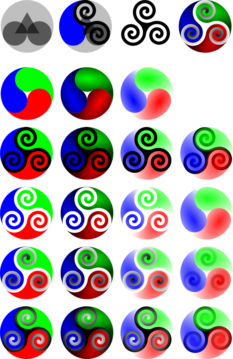

________________________________________ De : Thomas Maus thomas.maus@gmx.de Envoyé : 3 mars 2016 20:48 À : trinity-devel@lists.pearsoncomputing.net Objet : Re: [trinity-devel] Re: TDE new logo proposal?? (was Re: [trinity-devel] Visual facelifting proposals)
Am Samstag, 27. Februar 2016, 22:25:13 schrieb Michele Calgaro:
... It seems the new logo idea is gathering some consensus. Thomas (or E.), would you be able to come up with some concept logos from the suggested page/symbol and post that to the list for consideration? Once we have a few options, we can further discuss with Tim who is the benevolent project coordinator ;-)
As E. has already presented some designs worth consider (with a head start ;-), I share a proof sheet of my first triskelion design. To avoid misunderstandings: I'm not ignoring the general preference for the trefoil -- I had already the first triskele drafts going, and have to get them out of my head and out of the way, to do some trefoil designs.
This first batch needs some explanation: It is a transparent proof sheet, you're meant to load (e.g. in GIMP), and then proof against various backdrops.
The first row give you an idea of the construction principles. In the second column I couldn't fail to notice the outline of this pasley form, I then colored blue. This form appears in many contexts all around the world, be it celtic, gothic, japanese, korean, or chinese art ... Further I happened to see some illustrations about quarks constituting hadrons -- that side-tracked my imagination and produced the second row. Rows 3 to 6 contain a systematic exploration of these spinning forms from row 2 and some triskele variations. (You see, I'm an engineer ;-)
By choosing a white background the 3rd column will become equivalent to the 2nd if the gradient would have been set to white.
There are some imperfections. I suggest, you choose your favorite(s) from this batch and give their row/column coordinate. I'll then clean them up.
This is NOT THE VOTE FOR THE NEW LOGO, just a preference within this batch.
The next batch will be the triskele designs, I originally imagined, then -- with my brain dumped and free again -- the trefoil designs will be worked upon.
Enjoy (hopefully ;-),
ThoMaus
Hi,
It is certainly not me who will choose or works on a new logo, but I have been following the discussion remotely. I do not personally like the tri-something shape, as it looks pretty much like the logo of a sect or of a strange cult.
Take a look at the tree icon that can be found in the masalla icon theme. In my opinion it looks better and does not have any religious meaning. Maybe an agreement with the author of the masalla icon theme could be done?
-Alexandre
On Fri, 4 Mar 2016 15:36:07 +0000 Alexandre ac586133@hotmail.com wrote:
It is certainly not me who will choose or works on a new logo, but I have been following the discussion remotely. I do not personally like the tri-something shape, as it looks pretty much like the logo of a sect or of a strange cult.
Take a look at the tree icon that can be found in the masalla icon theme. In my opinion it looks better and does not have any religious meaning. Maybe an agreement with the author of the masalla icon theme could be done?
Trees do have a religious significance, actually, in a lot of what are loosely called pagan religions. The triquetra has been used as a Christian symbol, as has just about anything else with three-part symmetry. Actually, practically any simple form usable as a logo has probably been used by someone's religion at some point in time (including unexpected things like fish, cats, and hammers), so I'm not sure it's a good idea to exclude whole classes of objects on that basis.
The Masalla icon set is, in general, very well-made and very (there's no other word for it) iconic. However, the tree you've presented does not say "Trinity/TDE" to me. A more triangular tree (an evergreen?) in a similar style might work, but it also might drag in Christmas associations . . .
Branding is hard.
E. Liddell
Am Freitag, 4. März 2016 schrieb E. Liddell:
On Fri, 4 Mar 2016 15:36:07 +0000 Alexandre ac586133@hotmail.com wrote:
It is certainly not me who will choose or works on a new logo, but I have been following the discussion remotely. I do not personally like the tri-something shape, as it looks pretty much like the logo of a sect or of a strange cult.
Take a look at the tree icon that can be found in the masalla icon theme. In my opinion it looks better and does not have any religious meaning. Maybe an agreement with the author of the masalla icon theme could be done?
Trees do have a religious significance, actually, in a lot of what are loosely called pagan religions. The triquetra has been used as a Christian symbol, as has just about anything else with three-part symmetry. Actually, practically any simple form usable as a logo has probably been used by someone's religion at some point in time (including unexpected things like fish, cats, and hammers), so I'm not sure it's a good idea to exclude whole classes of objects on that basis.
The Masalla icon set is, in general, very well-made and very (there's no other word for it) iconic. However, the tree you've presented does not say "Trinity/TDE" to me. A more triangular tree (an evergreen?) in a similar style might work, but it also might drag in Christmas associations . . .
Branding is hard.
E. Liddell
When we are at religion, please don't let us forget spagetti ... http://www.venganza.org/
Nik
On Saturday 05 March 2016, 00:07 wrote Dr. Nikolaus Klepp:
When we are at religion, please don't let us forget spagetti ... http://www.venganza.org/
Oh, botch it -- you caught me, Nik!
What gave away, that I was trying to foist the FSM on you unsuspecting disbelievers? The two meatballs in the initial construct, latter to be covered by the spaghetti disguised as triskele spirals?
;-)
ciao,
ThoMaus
On Friday 04 March 2016 15:36:07 Alexandre wrote:
I do not personally like the tri-something shape, as it looks pretty much like the logo of a sect or of a strange cult.
Take a look at the tree icon that can be found in the masalla icon theme. In my opinion it looks better and does not have any religious meaning.
You cannot call something "Trinity" and avoid all religious associations. In fact, I doubt you could call it anything and avoid all religious associations. As has been pointed out, you couldn't even use pasta.
If the logo is to be in any way associated with the name, it is likely to be tri- something. (Even a T has three points) Things have associations. Perhaps try to avoid flaming crosses, black flags and swastikas, but trees are difficult, as has been pointed out, and are used too often by people looking for a logo with no associations (SOAS, University of London and the British Conservative Party to name two fairly recent ones from my personal experience.) Trees have associations for many people. I associate oak trees with Druids. Evergreens with Norse gods, Cedars with the Lebanon (fine) and my school (bad). Etc.
We cannot avoid associations.
Lisi
On Friday 04 March 2016, 02:48 wrote Thomas Maus:
... The next batch will be the triskele designs, I originally imagined, then -- with my brain dumped and free again -- the trefoil designs will be worked upon.
Attached find the proof sheets for the second batch of triskele-based design, alas, somewhat reluctant:
Considering that we are only talking about 2-dimensional arrays of pixels, PLEASE refrain from religious warfare! My proposals were meant to unite, not to divide ...
Feel free to ignore or dislike my designs, my joy was in preparing them and honing my rusty "gimp" and "inkscape" skills again. I will provide the SVGs on request via list, bug-attachment or PM under CC-BY-SA.
Also, feel free to suggest improvements or ideas, or simply do something better (with or without my designs).
In order to perhaps quell the occultism charge, this was my line of thought: The triskele is positioned to look like a T with very ornate, curly ends. The color triplet RGB was chosen, as it is these colors are base of every desktop, uniting to a diversity of colors, forms and impressions. The various shades and sometimes translucencies serve as (hopefully aesthetic) illustration ... This batch was my original design target, before becoming side-tracked ...
Again the proof sheet is intended to be viewed with various backgrounds. You will notice, that in the third row one design is missing -- I failed to do this within "inkscape" (if anybody knows how to achieve the glow effect in "inkscape", enlighten me ... ;-) I did it in GIMP, see the 2nd attachment.
Peace,
ThoMaus
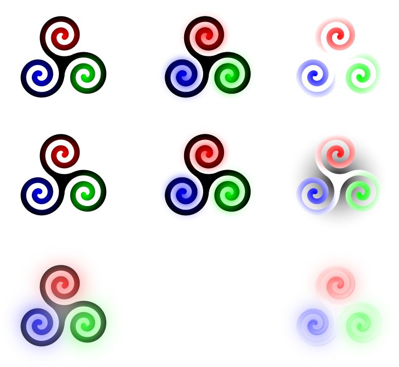
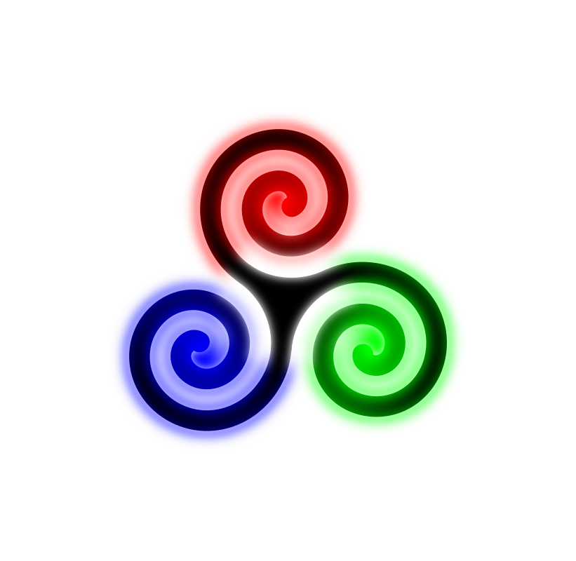

Hi Thomas, All,
On Friday 04 March 2016 18:25:10 Thomas Maus wrote:
On Friday 04 March 2016, 02:48 wrote Thomas Maus:
Peace,
ThoMaus
I like the left hand, middle row one. It's loud without being brash. :-)
On Fri, 04 Mar 2016 19:25:10 +0100 Thomas Maus thomas.maus@gmx.de wrote:
On Friday 04 March 2016, 02:48 wrote Thomas Maus:
... The next batch will be the triskele designs, I originally imagined, then -- with my brain dumped and free again -- the trefoil designs will be worked upon.
Also, feel free to suggest improvements or ideas, or simply do something better (with or without my designs).
In order to perhaps quell the occultism charge, this was my line of thought: The triskele is positioned to look like a T with very ornate, curly ends. The color triplet RGB was chosen, as it is these colors are base of every desktop, uniting to a diversity of colors, forms and impressions. The various shades and sometimes translucencies serve as (hopefully aesthetic) illustration ...
(This is a general set of remarks on both your batches, examined purely from a design/branding point of view and not meaning to discourage.)
I'm afraid the RGB colour set, despite its symbolism, was not necessarily a good choice from a purely mechanical point of view. Specifically, the blue is of too dark a value to contrast well with a black triskele, and the green is of too light a value to contrast well with a white triskele. This is more visible if you zoom out--you can see the lines disappear. The logo will be in use as an icon in various places, and the smallest static icon size provided by TDE is a 16px square. (A couple of my own designs need a little work in that regard, too.) Also, how will this work in a black-and-white context (Mono icon set, for accessibility)?
The other problem I have, with the second set especially, is that I'm not sure the shape you're using is distinct enough from the Trisquel Linux logo--yes, you've reversed the direction and the spiral is more uniform, but will a random person glancing at it casually *notice* that?
This batch was my original design target, before becoming side-tracked ...
Again the proof sheet is intended to be viewed with various backgrounds. You will notice, that in the third row one design is missing -- I failed to do this within "inkscape" (if anybody knows how to achieve the glow effect in "inkscape", enlighten me ... ;-)
I think you're looking at playing with the parameters of multiple filters. "Cutout glow" might be a place to start. (Inkscape filters are not a good choice for this particular task, though--they don't render outside of Inkscape, so they just make it more difficult to produce usable SVG icons.)
E. Liddell
On Friday 04 March 2016, 17:30 wrote E. Liddell:
On Fri, 04 Mar 2016 19:25:10 +0100 Thomas Maus thomas.maus@gmx.de wrote:
Also, feel free to suggest improvements or ideas, or simply do something better (with or without my designs).
In order to perhaps quell the occultism charge, this was my line of thought: The triskele is positioned to look like a T with very ornate, curly ends. The color triplet RGB was chosen, as it is these colors are base of every desktop, uniting to a diversity of colors, forms and impressions. The various shades and sometimes translucencies serve as (hopefully aesthetic) illustration ...
(This is a general set of remarks on both your batches, examined purely from a design/branding point of view and not meaning to discourage.)
I'm afraid the RGB colour set, despite its symbolism, was not necessarily a good choice from a purely mechanical point of view. Specifically, the blue is of too dark a value to contrast well with a black triskele, and the green is of too light a value to contrast well with a white triskele. This is more visible if you zoom out--you can see the lines disappear.
Yes, the eye has quite different sensitivity for these colors -- obviously even on the individual level, so that different people often have different color perceptions ...
But I followed my idea to the extreme to test it and maxed out the colors. A final version could work with reduced "light" and thus compensate the different sensitivities / perceived brightnesses.
The logo will be in use as an icon in various places, and the smallest static icon size provided by TDE is a 16px square. (A couple of my own designs need a little work in that regard, too.)
Actually I've tried that: The simpler designs simplify and scale quite well in terms of re-cognition from the larger ones. The larger, more ornate ones are meant for splash screens and the like, and perhaps for some large buttons like the menu button.
I'm neither an artist nor specialized in accessibility or visual design -- you seem much more knowledgeable in that area, so feel free to guide me or improve the design yourself.
Also, how will this work in a black-and-white context (Mono icon set, for accessibility)?
Ha, you find me well prepared: I've an alternative 1bpp design at hand ;-P (But it will give Nik and every other hardware guy a headache =8-O )
Just joking ...
I'd suggest the black Triskele with a hard white halo ...
The other problem I have, with the second set especially, is that I'm not sure the shape you're using is distinct enough from the Trisquel Linux logo--yes, you've reversed the direction and the spiral is more uniform, but will a random person glancing at it casually *notice* that?
Each arm is highlighted in a different primary color and the body is black -- that is a significant distance in feature space (and a second reason for the RGB choice). But perhaps the trefoil knots will solve the problems -- it just will take a few days ...
This batch was my original design target, before becoming side-tracked ...
Again the proof sheet is intended to be viewed with various backgrounds. You will notice, that in the third row one design is missing -- I failed to do this within "inkscape" (if anybody knows how to achieve the glow effect in "inkscape", enlighten me ... ;-)
I think you're looking at playing with the parameters of multiple filters. "Cutout glow" might be a place to start. (Inkscape filters are not a good choice for this particular task, though--they don't render outside of Inkscape, so they just make it more difficult to produce usable SVG icons.)
(Oh my, I first had to switch "inkscape" to English and restart to verify) I had tried "Cutout glow" and it is a nicely done effect, but what I wanted was the glow radiating into the black area. I did not find an approach within "inkscape". It is easy to get a glow, but to produce a soft cutout or do a hard cutout and apply a 2nd blur, seemed not possible (or missing something, I rarely use "inkscape")
ciao,
ThoMaus
On Sat, 05 Mar 2016 02:40:21 +0100 Thomas Maus thomas.maus@gmx.de wrote:
On Friday 04 March 2016, 17:30 wrote E. Liddell:
On Fri, 04 Mar 2016 19:25:10 +0100 Thomas Maus thomas.maus@gmx.de wrote:
Also, feel free to suggest improvements or ideas, or simply do something better (with or without my designs).
In order to perhaps quell the occultism charge, this was my line of thought: The triskele is positioned to look like a T with very ornate, curly ends. The color triplet RGB was chosen, as it is these colors are base of every desktop, uniting to a diversity of colors, forms and impressions. The various shades and sometimes translucencies serve as (hopefully aesthetic) illustration ...
(This is a general set of remarks on both your batches, examined purely from a design/branding point of view and not meaning to discourage.)
I'm afraid the RGB colour set, despite its symbolism, was not necessarily a good choice from a purely mechanical point of view. Specifically, the blue is of too dark a value to contrast well with a black triskele, and the green is of too light a value to contrast well with a white triskele. This is more visible if you zoom out--you can see the lines disappear.
Yes, the eye has quite different sensitivity for these colors -- obviously even on the individual level, so that different people often have different color perceptions ...
Actually, the conclusion I've come to over the years is that you should almost never use #0000ff for anything. Its contrast isn't great regardless of what you pair it with, you get odd synergies with neighbouring colours, etc. In general, highly saturated colours have to be used with extreme care. (They're also a bit difficult to print out, if we ever want to make fundraising mousepads or whatever.)
In this particular case, you probably want something closer to a sky blue with the black triskele. The white triskele, you want to move to darker colours all around.
I'm neither an artist nor specialized in accessibility or visual design -- you seem much more knowledgeable in that area, so feel free to guide me or improve the design yourself.
I have a diploma in graphic design. Which does not make me a good designer-- it just means that I showed up for classes, handed my assignments in on time, and wasn't completely terrible at it.
(I also have a degree in computer science, which does not make me a good programmer. ;P )
Also, how will this work in a black-and-white context (Mono icon set, for accessibility)?
Ha, you find me well prepared: I've an alternative 1bpp design at hand ;-P (But it will give Nik and every other hardware guy a headache =8-O )
Just joking ...
I'd suggest the black Triskele with a hard white halo ...
Given how the rest of the Mono set works, I'm not sure the white halo is appropriate--the single bit is more or less transparent/opaque, rather than black/white (I wouldn't use any of my designs for it unaltered either, mind you.)
The other problem I have, with the second set especially, is that I'm not sure the shape you're using is distinct enough from the Trisquel Linux logo--yes, you've reversed the direction and the spiral is more uniform, but will a random person glancing at it casually *notice* that?
Each arm is highlighted in a different primary color and the body is black -- that is a significant distance in feature space (and a second reason for the RGB choice). But perhaps the trefoil knots will solve the problems -- it just will take a few days ...
Ignore the colour. Look at the *shape*. To me, it doesn't seem differentiated enough to avoid the reaction, "Oh, Trisquel just punched up their colour scheme a bit!"
This batch was my original design target, before becoming side-tracked ...
Again the proof sheet is intended to be viewed with various backgrounds. You will notice, that in the third row one design is missing -- I failed to do this within "inkscape" (if anybody knows how to achieve the glow effect in "inkscape", enlighten me ... ;-)
I think you're looking at playing with the parameters of multiple filters. "Cutout glow" might be a place to start. (Inkscape filters are not a good choice for this particular task, though--they don't render outside of Inkscape, so they just make it more difficult to produce usable SVG icons.)
(Oh my, I first had to switch "inkscape" to English and restart to verify) I had tried "Cutout glow" and it is a nicely done effect, but what I wanted was the glow radiating into the black area. I did not find an approach within "inkscape". It is easy to get a glow, but to produce a soft cutout or do a hard cutout and apply a 2nd blur, seemed not possible (or missing something, I rarely use "inkscape")
Stacking, maybe. Create the outer glow on one path, then stack a second on top and apply the inner glow.
I have to admit, it isn't an effect I've ever needed to create, though.
Also, the Inkscape filters shouldn't be used in the final product for this project, because only Inkscape can display those filters on SVG files. (They'll be visible on exported PNGs, of course, but most of the TDE icon sets come with an SVG version.)
E. Liddell
<snip for all emails>
Thomas, E., thanks for all your work so far. I will try to summarize where we are with this discussion (if I forgot something please feel free to add to it).
- some users do not want any change - it would be good to give TDE a look refresh to move away from the "stale" perception and attract new users - some consensus for the treefoil knot - some consensus for triskele - some consensus and some objection to move away from the "gear" concept - new logo should capture the essence of TDE: easy, productive, fluid, simple
I guess we will not be able to please everyone. Anyhow if we move ahead, we should plan to have both a TDE-Classic style (i.e. current style) and a TDE-modern style (new theme, new logo, new icons....), so we can please old users and try to please new ones. KPersonalizer will allow the initial choice between the two.
I think we will have to narrow down on a few logo proposal and then choose one from there. Cheers Michele
PS: Thomas, with reference to the Triskele-Radiant-Drafts-TM-1.svg.png file, I like the top right one: "three" spirals, simple, fluid, easy on the eye. I also like the colors but I do not mind if we decide for others
I respond to multiple e-mails together, so excuse that the following are a few snippets...
On Saturday 05 of March 2016 06:39:29 Michele Calgaro wrote:
<snip for all emails>
Thomas, E., thanks for all your work so far. I will try to summarize where we are with this discussion (if I forgot something please feel free to add to it).
- some users do not want any change
- it would be good to give TDE a look refresh to move away from the "stale"
perception and attract new users
- some consensus for the treefoil knot
- some consensus for triskele
- some consensus and some objection to move away from the "gear" concept
- new logo should capture the essence of TDE: easy, productive, fluid,
simple
I guess we will not be able to please everyone. Anyhow if we move ahead, we should plan to have both a TDE-Classic style (i.e. current style) and a TDE-modern style (new theme, new logo, new icons....), so we can please old users and try to please new ones. KPersonalizer will allow the initial choice between the two.
I think we will have to narrow down on a few logo proposal and then choose one from there. Cheers Michele
PS: Thomas, with reference to the Triskele-Radiant-Drafts-TM-1.svg.png file, I like the top right one: "three" spirals, simple, fluid, easy on the eye. I also like the colors but I do not mind if we decide for others
Thank you - this is nicely summarized. I would like to emphasize: "easy, productive, fluid, simple"
On Saturday 05 of March 2016 12:15:39 Lisi Reisz wrote:
On Friday 04 March 2016 18:25:10 Thomas Maus wrote:
The color triplet RGB was chosen, as it is these colors are base of every desktop, uniting to a diversity of colors, forms and impressions.
I'm afraid that I particularly dislike this. It's immediate impression on me was that it was too like Windows, and it's secondary impression is simply that it hurts my eyes, specially with that glow effect. If we have this one, please can we also have a way to turn it off. Black and white feels very appealing, having just been looking at those!!
Sorry to be negative, Thomas, because I like your general approach.
Lisi
I agree here with Lisi. And in relation to the previous summary from Michele, I add my opinion: treefoil knot is beautifully simple, while triskele is much more complicated. By using a variety of colors in the proposal from ThoMaus logo is too garish. And as noted Lisi, colors very similar to the colors of the Windows logo. I believe that for Trinity suits more subtle colors.
On Monday 29 of February 2016 23:32:55 E. Liddell wrote:
For your amusement, then, here are some very early stage concept sketches. (I included a couple of random ones like the "tree-nity" logo from the batch I did ~4 years ago and the spiral-T just to give some variety to the set.) I didn't bother with colour/gradient/fancy outline tricks at this point because I'm not inclined to put that much work into something we end up not moving forward with.
Basic design criteria included incorporating some idea of "three-ness" (or "T-ness" in a couple of cases), and not looking too much like anyone else's logo that I know of. Which is why the one that looks most like Trisquel Linux's has that triangle added. Logos too similar = potential trademark infringement.
E. Liddell
In your proposals I like connection trefoil knot with gear - figures line 2 column 3, and line 3 column 3. For figure 3-3: You could try to emphasize the trefoil knot before the gear? I would have imagined: that treefoil knot was greater in the foreground and gear with similar size in the background? With colors as figure 2-3 - light treefoil knot, dark gear.
Thanks!
On Saturday 05 March 2016 13:08:17 Slávek Banko wrote:
E. Liddell
In your proposals I like connection trefoil knot with gear - figures line 2 column 3, and line 3 column 3. For figure 3-3: You could try to emphasize the trefoil knot before the gear? I would have imagined: that treefoil knot was greater in the foreground and gear with similar size in the background? With colors as figure 2-3 - light treefoil knot, dark gear.
What do you think of line 3 column 1? I thought that that married the trefoil and the gear particularly felicitously.
Lisi
On Saturday 05 of March 2016 19:21:14 Lisi Reisz wrote:
On Saturday 05 March 2016 13:08:17 Slávek Banko wrote:
E. Liddell
In your proposals I like connection trefoil knot with gear - figures line 2 column 3, and line 3 column 3. For figure 3-3: You could try to emphasize the trefoil knot before the gear? I would have imagined: that treefoil knot was greater in the foreground and gear with similar size in the background? With colors as figure 2-3 - light treefoil knot, dark gear.
What do you think of line 3 column 1? I thought that that married the trefoil and the gear particularly felicitously.
Lisi
Line 3, column 1 seems to me too complicated. I was thinking of something simpler - like a trefoil knot with gear in background. See attached proposal (based on SVG, which sent E.)
Am Samstag, 5. März 2016 schrieb Slávek Banko:
On Saturday 05 of March 2016 19:21:14 Lisi Reisz wrote:
On Saturday 05 March 2016 13:08:17 Slávek Banko wrote:
E. Liddell
In your proposals I like connection trefoil knot with gear - figures line 2 column 3, and line 3 column 3. For figure 3-3: You could try to emphasize the trefoil knot before the gear? I would have imagined: that treefoil knot was greater in the foreground and gear with similar size in the background? With colors as figure 2-3 - light treefoil knot, dark gear.
What do you think of line 3 column 1? I thought that that married the trefoil and the gear particularly felicitously.
Lisi
Line 3, column 1 seems to me too complicated. I was thinking of something simpler - like a trefoil knot with gear in background. See attached proposal (based on SVG, which sent E.)
IMO the center should be black, too.l
nik
Slávek Banko wrote:
On Saturday 05 of March 2016 19:21:14 Lisi Reisz wrote:
On Saturday 05 March 2016 13:08:17 Slávek Banko wrote:
E. Liddell
In your proposals I like connection trefoil knot with gear - figures line 2 column 3, and line 3 column 3. For figure 3-3: You could try to emphasize the trefoil knot before the gear? I would have imagined: that treefoil knot was greater in the foreground and gear with similar size in the background? With colors as figure 2-3 - light treefoil knot, dark gear.
What do you think of line 3 column 1? I thought that that married the trefoil and the gear particularly felicitously.
Lisi
Line 3, column 1 seems to me too complicated. I was thinking of something simpler - like a trefoil knot with gear in background. See attached proposal (based on SVG, which sent E.)
This looks great.
I do not agree that the center should be black. In the gear it is empty.
I would suggest to put a T on it, perhaps the same as in current logo.
regards
On Saturday 05 March 2016 20:34:50 deloptes wrote:
Slávek Banko wrote:
On Saturday 05 of March 2016 19:21:14 Lisi Reisz wrote:
On Saturday 05 March 2016 13:08:17 Slávek Banko wrote:
E. Liddell
In your proposals I like connection trefoil knot with gear - figures line 2 column 3, and line 3 column 3. For figure 3-3: You could try to emphasize the trefoil knot before the gear? I would have imagined: that treefoil knot was greater in the foreground and gear with similar size in the background? With colors as figure 2-3 - light treefoil knot, dark gear.
What do you think of line 3 column 1? I thought that that married the trefoil and the gear particularly felicitously.
Lisi
Line 3, column 1 seems to me too complicated. I was thinking of something simpler - like a trefoil knot with gear in background. See attached proposal (based on SVG, which sent E.)
This looks great.
I do not agree that the center should be black. In the gear it is empty.
I would suggest to put a T on it, perhaps the same as in current logo.
To be honest, not one of the suggestions is as nice as the present logo, IMHO.
Sorry guys, after all your work.
Lisi
Lisi Reisz composed on 2016-03-05 23:02 (UTC):
To be honest, not one of the suggestions is as nice as the present logo, IMHO.
+1
On Saturday 05 March 2016 20:34:50 deloptes wrote:
Slávek Banko wrote:
On Saturday 05 of March 2016 19:21:14 Lisi Reisz wrote:
On Saturday 05 March 2016 13:08:17 Slávek Banko wrote:
E. Liddell
In your proposals I like connection trefoil knot with gear - figures line 2 column 3, and line 3 column 3. For figure 3-3: You could try to emphasize the trefoil knot before the gear? I would have imagined: that treefoil knot was greater in the foreground and gear with similar size in the background? With colors as figure 2-3 - light treefoil knot, dark gear.
What do you think of line 3 column 1? I thought that that married the trefoil and the gear particularly felicitously.
Lisi
Line 3, column 1 seems to me too complicated. I was thinking of something simpler - like a trefoil knot with gear in background. See attached proposal (based on SVG, which sent E.)
This looks great.
I do not agree that the center should be black. In the gear it is empty.
I would suggest to put a T on it, perhaps the same as in current logo.
regards
And it has dawned on me with sadness that this would mean losing Konqui. :-(
Lisi
On Saturday 05 March 2016, 14:39 wrote Michele Calgaro:
<snip for all emails>
Thomas, E., thanks for all your work so far.
You're welcome.
... I think we will have to narrow down on a few logo proposal and then choose one from there.
I completely agree with the proposed procedure. Perhaps each should identify a small number of agreeable logo design (3? 5?), so that perhaps some overlap of preferences can be identified.
I might add a few thoughts:
1. Is not the usage of the gear and konqui a significant risk of a trademark or logo infringement? At least in Europe the typical jurisdiction is, that similar logos are seen as trademark infringements, when used in the same field.
I. e. using a triskele is relatively unproblematic concerning "triskele linux" as TDE is a desktop, while the other is a linux distro -- using some differentiation in colors and form should suffice.
But KDE and TDE play on exactly the same field. If the usage of the gears and/or konqui is not explicitely granted by KDE to TDE, KDE could raise complaints on a variety of grounds!
So my urgent request to those favoring the gear and konqui: State if you know, that these issues are settled legally!?
2. Both the trefoil and the triskele can be generated from gears. The trefoil by gears revolving on each other (hypotrochoid), as the attachment illustrates. The (arms of a) triskele either by a chain unrolling from a rotating gear (producing an involutive spiral) or a rack gear (happily T-shaped ;-) being driven outward by a rotating gear assembly (forming an Archimedean spiral). (It would take some time to illustrate the mechanisms, I trust in your imagination -- both spirals are quite similar and both are suitable for the triskele arms)
So gears are still at the heart of the construction, but hidden inside (as is normally is proper for gears around non-engineers anyhow ;-) So, the constructions are based on gears and transcend them, as TDE is based on KDE3.5 but transcends it.
3. Both the project name "trinity" as well as all logos around 3-someness are massively loaded with associations.
The discussion would be much easier to lead in German, because we have a multitude of terms to differentiate -- which all would be translated to the English "trinity"!
Besides the Christian trinitarian concept (for which we have two concise German words -- one focussing 3-in-1, the other 1-in-3), we have more universal words to describing similar concepts in cultures all around the world (in various degrees of unity of the three constitutes): I could give you tons of references from Laotsi and Taoism, Hinduism, Buddhism, arctic shamanism, Nordic + Greek + Roman culture, philosophy, psychoanalysis, physics, computational theory, ...
Surely enough for anybody, to find something objectionable -- or something appealing if so inclined ...
And that is the fundamental question: can we find unity in diversity, and bear diversity in unity?
ciao,
ThoMaus
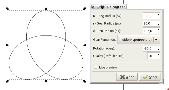
On Sun, 06 Mar 2016 19:12:56 +0100 Thomas Maus thomas.maus@gmx.de wrote:
On Saturday 05 March 2016, 14:39 wrote Michele Calgaro:
<snip for all emails>
Thomas, E., thanks for all your work so far.
You're welcome.
+1
... I think we will have to narrow down on a few logo proposal and then choose one from there.
I completely agree with the proposed procedure. Perhaps each should identify a small number of agreeable logo design (3? 5?), so that perhaps some overlap of preferences can be identified.
I'd say give it a couple more weeks, then call a vote (with "keep the existing logo" as one of the choices, just in case it has overwhelming support) to thin the ranks. Then approach Tim with the top ~3 if he hasn't weighed in yet at that point--ultimately, he has veto rights.
I might add a few thoughts:
- Is not the usage of the gear and konqui a significant risk of a trademark or
logo infringement? At least in Europe the typical jurisdiction is, that similar logos are seen as trademark infringements, when used in the same field.
I. e. using a triskele is relatively unproblematic concerning "triskele linux" as TDE is a desktop, while the other is a linux distro -- using some differentiation in colors and form should suffice.
But KDE and TDE play on exactly the same field. If the usage of the gears and/or konqui is not explicitely granted by KDE to TDE, KDE could raise complaints on a variety of grounds!
So my urgent request to those favoring the gear and konqui: State if you know, that these issues are settled legally!?
I'm pretty sure Tim was approached once previously by the KDE people about branding, which led to the initial "T" logo. If there's been a peep out of them since, he hasn't said anything. So I'd guess there's no problem with just including a gear in the logo (especially if it's distinct from any gear in a current KDE trademark--different shape and number of teeth or whatever).
Konqui's more dangerous, since he's still actively in use by KDE in pretty much the same form. There was some consideration given to changing the mascot a while back, but it petered out when no one could scrape together the time/energy to create any concept sketches.
(Also, I'm not sure how many judges can tell the difference between a Linux distro and a Linux desktop environment. Maybe European judges are better with tech, I don't know.)
- Both the project name "trinity" as well as all logos around 3-someness are
massively loaded with associations.
The discussion would be much easier to lead in German, because we have a multitude of terms to differentiate -- which all would be translated to the English "trinity"!
Besides the Christian trinitarian concept (for which we have two concise German words -- one focussing 3-in-1, the other 1-in-3), we have more universal words to describing similar concepts in cultures all around the world (in various degrees of unity of the three constitutes): I could give you tons of references from Laotsi and Taoism, Hinduism, Buddhism, arctic shamanism, Nordic + Greek + Roman culture, philosophy, psychoanalysis, physics, computational theory, ...
Don't worry--knowing the habits of English and its speakers, if the words are useful, our language will "borrow" them sooner or later. ;P
E. Liddell
On 03/07/2016 07:33 AM, E. Liddell wrote:
I'd say give it a couple more weeks, then call a vote (with "keep the existing logo" as one of the choices, just in case it has overwhelming support) to thin the ranks. Then approach Tim with the top ~3 if he hasn't weighed in yet at that point--ultimately, he has veto rights.
That is a good idea. +1
Cheers Michele
Dear all, we discussed about a new logo for a while. So I would like to invite whoever is interested to submit their proposals or ideas within the end of the month to this ML. After that we will arrange some sort of vote to choose 3 or 4 possible candidates (including the "keep the current logo possibility") and at the end we will see what Tim thinks about it. Thanks everyone for his/her contribution. Cheers Michele
PS: let's *NOT* start another war-like email chain on this again :-) Just submit yuor proposal ;-)
On 2016/03/21 09:54 PM, Michele Calgaro wrote:
Dear all, we discussed about a new logo for a while. So I would like to invite whoever is interested to submit their proposals or ideas within the end of the month to this ML. After that we will arrange some sort of vote to choose 3 or 4 possible candidates (including the "keep the current logo possibility") and at the end we will see what Tim thinks about it. Thanks everyone for his/her contribution. Cheers Michele
PS: let's *NOT* start another war-like email chain on this again :-) Just submit yuor proposal ;-)
It has been brought to my attention (thanks Thomas!) that this may be a holiday period for many people. So let's move the deadline to April 17, this should give enough time to everyone interested.
Cheers Michele
On Sunday 06 March 2016 18:12:56 Thomas Maus wrote:
So my urgent request to those favoring the gear and konqui: State if you know, that these issues are settled legally!?
Only a negative one - a lack of objection. The project was originally called KDE-Trinity, but the name had to be changed because KDE objected on trademark or copyright grounds - or both? - to the use of the name KDE. KDE did not at the time object to the use of anything else. Surely it would be hard to claim a picture of a gear as copyright? And some years after the other objection, we now have usage in our favour. We'll soon hit the Statute of Limitations.
Moreover, if Konqui and the gear are GPL and/or Creative Commons, they are available anyway! And a short period of Googling suggests a) that they are and b) that KDE5's Konqui has been redesigned and is recognisably different.
Lisi
On Friday 04 March 2016 18:25:10 Thomas Maus wrote:
The color triplet RGB was chosen, as it is these colors are base of every desktop, uniting to a diversity of colors, forms and impressions.
I'm afraid that I particularly dislike this. It's immediate impression on me was that it was too like Windows, and it's secondary impression is simply that it hurts my eyes, specially with that glow effect. If we have this one, please can we also have a way to turn it off. Black and white feels very appealing, having just been looking at those!!
Sorry to be negative, Thomas, because I like your general approach.
Lisi
Here my batch of draft "trefoil knot" designs. (Drafts -- meaning not necessarily ready for use, as all previous batches too)
The trefoil triquetra (as opposed to the triquetra vesica, the one with the pointed arcs) is the most neutral of the symbols proposed so far, as it can be cleanly based on and linked to mathematical properties: it can be generated as a trochoide and it is both the simplest torus knot and simplest non-trivial knot. (Of course, whatever our choice of logo -- it would be wise to nail down our interpretations of both the logo and "trinity" in words (mission statement and the like), to prevent malevolent misinterpretion or pocket of word or logo "trademarks"!)
As with all batches, please load them into GIMP (or the tool of your choice): * set them before different backgrounds * zoom them to different sizes (most of my design behave reasonably well at small sizes) * feel free to reduce color saturation, shift the hue, darken, lighten to your hearts (or eyes) content (some think my colors to vivid, but IMHO it works better within GIMP to deplete colors from a too vivid design than the other way round)
I generated the basic form and then stroked the path(es) with various calligraphic pens (simulating a wide calligraphic quill) to achieve some vividness and spatial substance:
* in "Trefoil_Knot_1TM.png" one of the three symmetric pathes is traced (in black, to avoid charges of being to colorful ;-) and then rotated. It is essentially like drawing each line with a quill after rotating the paper.
* in "Trefoil_Knot_2TM.png" the same quill and orientation is used, but the paper not turned -- the identical pathes look different, as the quill orientation is different.
Then my personal limit of mono-colored design was reached ;-) Perhaps I have to explain my perception of colors on desktops, so you better understand my designs:
The first art based on additive colors was the art of stained glass windows, as refined in Europe during the Romanic and Gothic period (there are precursors in persian, arabic, and mauric buildings, beautiful and artful indeed, but with all proper respect not as sophisticated). The explicitely declared goal of the builders of gothic cathedrals was the impression of entering a juwel -- an ethereal room flooded with living light, reacting to sun and clouds. Essentially a medieval cyper-space ... Considering how many people are sucked into cyber-space nowaday, that might give you an idea how impressed the medieval crofter must have been. The best way to get an impression is to enter a Romanic or Gothic church (or crypt) where at least in one area there is only light from stained windows on a sunny day with chasing clouds (substituting stained glass windows in such churches with blank glass is a barbaric crime, IMNSHO!). The 2nd best alternative -- lacking the color spectrum -- is a room solely lit by a fireplace. Or a screensaver on a large display at night, displaying professional¹ photos of stained glass windows ... [¹: the stone tracery must be black!]
Alas, in the early 15th century the art declined and lost its magic, as it was adapted to replicate artwork from paintings, i.e. from the substractive colorspace. With the Art Noveau some revival started, as some artists realized that drawing additively with colored light is a completely different matter than drawing subtractively with colored pigments.
So, after having dumped my brain, I hope you understand and can excuse, that I had absolutely no choice, but to do the next design in colors (;-).
* in "Trefoil_Knot_3TM.png" the quill direction was changed, to give a much more spatial impression and each branch was colored seperately -- it might be the previous deprivation of colors, but I immediately fell in love with this design!
If you wonder, why I bothered with simulated pen stroke, have a look at "Trefoil_Knot_6TM.png", trying a neon-desktop-suitable design: This flat design of uniform width looks more like a warning sign (think radioactivity or bio- hazard) than a menu button you want to click. (of course the neon version could be improved², but it is here as an motivation for my choices) [²: obviously by starting from "Trefoil_Knot_3TM.png" to make it more spatial, and of course by keeping 3 colors ]=->
The following two pictures are not meant as real logo proposal but to sketch an idea, which -- alas -- is not easily achieved (at least not with "inkscape" or GIMP). The colors are intended to make it easier to imagine the knot as a spatial object. If, keeping this in mind, you take a look at "Trefoil_Knot_8TM.png" (a color-depleted version of "Trefoil_Knot_7TM.png"), perhaps you can imagine the trefoil knot done in space with a tube from an uniform material, lit and with shadows which make the spatial structure visible.
Doing so would be quite an effort for me: construct the 3D-model and render it in "povray" or some other 3D-rendering system would probably take me a weekend -- so I'd do this if there is interest in such a "knotted tube design" (which, I promise, would be realistic and not garish ;-) If there is somebody with the necessary skills and tools, to do this faster -- you are invited to step forward!
Finally, if we are also considering triquetra-vesica designs (from E.), I want to throw the idea of a glover into the ring -- of course it is as the triquetra-vesica design strongly loaded with religious (St. Patrick) and Irish associations, but the need to fend of unwanted associations exists IMHO for any choice ...
It could either a cut-out of a real clover, or a more formal design like "Clover_Drafts-TM.svg.png".
ciao,
ThoMaus
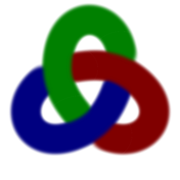
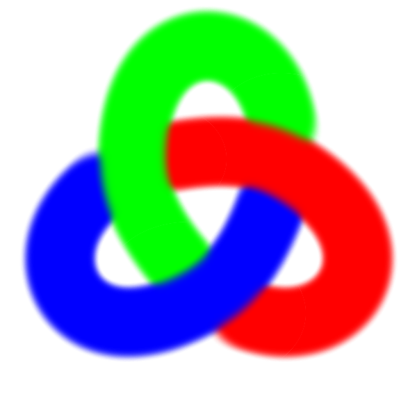
On 03/07/2016 08:37 PM, Thomas Maus wrote:
Here my batch of draft "trefoil knot" designs. (Drafts -- meaning not necessarily ready for use, as all previous batches too)
<snip>
Great stuff Thomas. Treefoil_know_3TM looks gorgeous and 1TM looks good as well. 2TM is also to consider. Probably you and E. would have to work out the colors, but to me it looks a nice candidate.
Cheers Michele
On Tuesday 08 March 2016 03:32:42 Michele Calgaro wrote:
On 03/07/2016 08:37 PM, Thomas Maus wrote:
Here my batch of draft "trefoil knot" designs. (Drafts -- meaning not necessarily ready for use, as all previous batches too)
<snip>
Great stuff Thomas. Treefoil_know_3TM looks gorgeous and 1TM looks good as well. 2TM is also to consider. Probably you and E. would have to work out the colors, but to me it looks a nice candidate.
Cheers Michele
Why do we need a new logo? And even more, why do we need a new colour scheme? We seem to be diving into design without asking those questions. The present blue is very pleasant, and changing logo often loses what one had before. Change for change's sake seems to me to be a Bad Thing.
The point of a trademark is to be instantly recognisable. The Bournemouth football team's nickname is "the Cherries". The New Zealand rugby team is "the All Blacks". My university has been known for several hundred years by its colour. Could they usefully change their colour on a whim? Changes of name, trademark etc. involve huge amounts of advertising to link the old and the new.
The whole point of TDE is that it ISN'T new and glitzy and shiny. It's functional. That is its raison d'être and its strength.
But anyway, why change? One has to have a very good reason for changing an established brand. The British Post Office spent an enormous sum of money changing its name to Consignia. It then had to spend an enormous sum of money changing it back.
Tim has said that what we need, in order to expand, is money and developers. I personally do not see how we are to get more developers and more money without more users. But it is not up to me. I have specifically been asked to stop proselytising for now, and have done so.
Killing the very identity and distinctiveness of TDE by "modernising" it, is not, IMHO, likely to bring great rewards.
Lisi
On 03/08/2016 08:41 PM, Lisi Reisz wrote:
I personally do not see how we are to get more developers and more money without more users.
That is the point: the current look-and-feel of TDE is the same as almost 10 years ago. This pleases a lot of old users (including me :-) ) but does not do anything to attract new users. Therefore it is quite unlikely to attract new developers. Thomas raised a good point in his emails, that is TDE is still perceived "as a stale clone of KDE 3.5". Modernizing its look could help getting rid of such perception and expand its user base. This does not mean making TDE less effective or less productive. It will be exactly the same TDE with an additional optional look-and-feel. As I stated in another email, we are not going to throw away whatever we have. The idea is to have two (perhaps more) default themes and give the generic new user the choice of which one to start with: classic TDE (now) or modern TDE. As for the logo, we are just discussing for the time being, nothing as been decided yet.
Cheers Michele
On Tuesday 08 March 2016 11:58:35 Michele Calgaro wrote:
On 03/08/2016 08:41 PM, Lisi Reisz wrote:
I personally do not see how we are to get more developers and more money without more users.
That is the point: the current look-and-feel of TDE is the same as almost 10 years ago. This pleases a lot of old users (including me :-) ) but does not do anything to attract new users. Therefore it is quite unlikely to attract new developers.
I also said: Tim has said that what we need, in order to expand, is money and developers. I personally do not see how we are to get more developers and more money without more users. But it is not up to me. I have specifically been asked to stop proselytising for now, and have done so.
You have quoted too selectively.
Lisi

On Tue, 8 Mar 2016, Lisi Reisz wrote:
On Tuesday 08 March 2016 03:32:42 Michele Calgaro wrote:
On 03/07/2016 08:37 PM, Thomas Maus wrote:
Here my batch of draft "trefoil knot" designs. (Drafts -- meaning not necessarily ready for use, as all previous batches too)
<snip>
Great stuff Thomas. Treefoil_know_3TM looks gorgeous and 1TM looks good as well. 2TM is also to consider. Probably you and E. would have to work out the colors, but to me it looks a nice candidate.
Cheers Michele
Why do we need a new logo? And even more, why do we need a new colour scheme?
A Bikeshed would make a good logo.
Jonesy
On Tuesday 08 March 2016, 11:41 wrote Lisi Reisz:
Why do we need a new logo?
I'm trying to lead a rational discussion here and I gave detailed arguments along this whole discussion thread. Have the kindness to read, consider and eventually falsify them -- the designs are secondary.
The KDE gear will not convey the same message to new users that it conveys to users intimately knowing KDE3.5 (and actually KDE4.7+). In other words: it conveys the wrong message to most of the people. IMHO nowadays it does damage to TDE.
How did I find Trinity? Well, I was investigating into potential extended OpenSuSE support for KDE4 or KDE3.5 and stumbled over remarks on Trinitity TDE -- all being negative on grounds of looks and claims of stasis.
Well, luckily I give a * [insert an acceptable derogatory of your choosing] on the opinion of people, arguing purely on aesthetics ore vague perceptions, and figured that it would take me less time to install and test Trinitity TDE myself, than searching for any profound test.
What did I find: A community keeping an excellent desktop not only alive, but improving it -- despite the fact that the improvements in e.g. TDErandrtray are quite buggy. I'm willing to see the potential, and contribute ... (most are not ...)
And the willingness to improve is necessary on many grounds: * technological change: Wayland is coming and substituting X11 (and seeing how decision making in the Open Source community is going meanwhile, I'd not be surprised to see a (over-quick) demise of X11) * improvements in other desktops: e.g. while XFCE was vastly inferior to KDE3.5 even 5 years ago, it meanwhile has nearly its level and is missing only a few (ergonomical important) features
So, how do I dare to suggest "change"?
Let's say: I'm not a complete stranger to Open Source community mechanics, since the early 80s ...
And even more, why do we need a new colour scheme? We seem to be diving into design without asking those questions.
I actually dived into these questions before presenting any draft, and deepened my argumentation on any response.
The present blue is very pleasant, and changing logo often loses what one had before. Change for change's sake seems to me to be a Bad Thing.
As stated R+m times (m>0, R being the number of repetitions I find acceptable):
I do not want change for change's sake, but for a detailed list of arguments. Read them and object to them ...
... The whole point of TDE is that it ISN'T new and glitzy and shiny. It's functional. That is its raison d'être and its strength.
All the functionality, and all the effort invested, is wasted if not used.
And actually the functionality contains the capability to support a modern looking desktop with superior features, compared to many current developments. So, why hide this power? Why this "you can have the T-modell in any color, as long as it is black"? The quality and functionality of the car (and the desktop) is not in the least impaired if other choices for the paint work and the seats are available.
... Tim has said that what we need, in order to expand, is money and developers. I personally do not see how we are to get more developers and more money without more users.
Exactly my point. Now: How do you think to attract more users?
I'm open for suggestions and willing to support any promising idea in place of my own, because I would hate to see this project die a long agonizing death by starvation!
ciao,
ThoMaus
Thomas Maus composed on 2016-03-08 21:07 (UTC+0100):
The KDE gear will not convey the same message to new users that it conveys to users intimately knowing KDE3.5 (and actually KDE4.7+). In other words: it conveys the wrong message to most of the people. IMHO nowadays it does damage to TDE.
Lest it not be clear, "IMHO" means *opinion*.
The web is rife with complainers. Happy users don't say much, so that you see some mention that TDE is "stale" it does not follow that "most" feel that way.
IMO, Trefoil_Knot_3TM.png is far out of character with the nature of TDE, much too intense for a mature and stable product outside art, graphics or film industries. It would send a wrong message. TDE is not intended for those for whom bling is a priority.
OTOH, a gear is symbolic of something that works reliably and steadily, and endures.
On Tuesday 08 March 2016 20:07:51 Thomas Maus wrote:
Tim has said that what we need, in order to expand, is money and developers. I personally do not see how we are to get more developers and more money without more users.
Exactly my point. Now: How do you think to attract more users?
I was attracting more users. Users who dislike all this "bling" that is so fashionable now. Tim asked me to stop. I have stopped. You want TDE to compete with all these other desktops. TDE appeals to those who do not want this competition.
On Tuesday 08 March 2016, 11:41 wrote Lisi Reisz:
Why do we need a new logo?
I'm trying to lead a rational discussion here and I gave detailed arguments along this whole discussion thread. Have the kindness to read, consider and eventually falsify them -- the designs are secondary.
There is no need to be offensive. I asked why "we" need a new logo. We know what you think and demand that the rest of us think.
Your credentials in Open Source are not relevant to your insistence that your opinion has to be taken as incontrovertible fact.
Moreover you are ignoring the fact that Tim asked me not to proselytise.
You may feel that _you_ have already answered the questions I asked. I asked them of "us". Plural, not dual. I know what you think. What about all those who have so far said nothing? What about all those on the users list?
You ARE wanting change for change's sake. You want change because TDE is not "modern" enough. That is change for change's sake.
The idea of having two completely different logos is IMHO a complete non-starter and makes nonsense of having a logo.
You _will_ lose present users if you go along the track you want. This may, of course, be part of your design. You are of course going to supply the large amount of money needed to expand the hardware capacity of the project to be able to cater for large numbers of new users.
The release candidates for PCLinuxOS interestingly had a garish, deliberately Windows-like, logo. It was ditched by the time of the first release.
I actually think that your analysis of the "problems" is completely wrong, and largely irrelevant. There are IMHO obstacles to expansion that interpose long before you get to the point where it is too old fashioned or otherwise. Destroying the essence of the project will not lead to huge numbers of users. And if it were to do so, it would not make any difference if TDE was no more.
Lisi
Lisi Reisz wrote:
On Tuesday 08 March 2016 20:07:51 Thomas Maus wrote:
Tim has said that what we need, in order to expand, is money and developers. I personally do not see how we are to get more developers and more money without more users.
Exactly my point. Now: How do you think to attract more users?
I was attracting more users. Users who dislike all this "bling" that is so fashionable now. Tim asked me to stop. I have stopped. You want TDE to compete with all these other desktops. TDE appeals to those who do not want this competition.
Lisi, with all the respect - I do not think this is related. We all agree we like TDE because KDE3.5 was most stable and usable. (Let's focus on the common points). We now have a new versioning and new name KDE 3.5 -> TDE 14 It seems logical to me to provide a new logo and complete this part of the transition. Regarding the logo - who cares actually about the logo that much? Is it more important than stability and functionality? I do not think so. I think TDE14 should have a new logo and completely agree with Thomas. The old logo with the gear is causing negative connotations to KDE, which failed for 2nd time in the past 5y to provide something stable and working. I even do not mind if one changes the look and feel ( as far as it is not childish colorful as someone suggested recently) but more options would definitely add value to TDE in terms of new users. I doubt however that this will attract that many new users. In terms of younger users the look and feel is probably more important, but who am I to judge.
On Tuesday 08 March 2016, 11:41 wrote Lisi Reisz:
Why do we need a new logo?
I'm trying to lead a rational discussion here and I gave detailed arguments along this whole discussion thread. Have the kindness to read, consider and eventually falsify them -- the designs are secondary.
There is no need to be offensive. I asked why "we" need a new logo. We know what you think and demand that the rest of us think.
Your credentials in Open Source are not relevant to your insistence that your opinion has to be taken as incontrovertible fact.
Moreover you are ignoring the fact that Tim asked me not to proselytise.
You may feel that _you_ have already answered the questions I asked. I asked them of "us". Plural, not dual. I know what you think. What about all those who have so far said nothing? What about all those on the users list?
You ARE wanting change for change's sake. You want change because TDE is not "modern" enough. That is change for change's sake.
The idea of having two completely different logos is IMHO a complete non-starter and makes nonsense of having a logo.
But new logo would be appropriate for the new TDE 14 branch, no?
You _will_ lose present users if you go along the track you want. This may, of course, be part of your design. You are of course going to supply the large amount of money needed to expand the hardware capacity of the project to be able to cater for large numbers of new users.
Wow, are you a prophet or if your statement is based on numbers/arguments let us/me see them. I do not think that the new user attraction has to do something with the logo, however it would be good to cut the connection to KDE with their insane mentality.
The release candidates for PCLinuxOS interestingly had a garish, deliberately Windows-like, logo. It was ditched by the time of the first release.
I actually think that your analysis of the "problems" is completely wrong, and largely irrelevant. There are IMHO obstacles to expansion that interpose long before you get to the point where it is too old fashioned or otherwise. Destroying the essence of the project will not lead to huge numbers of users. And if it were to do so, it would not make any difference if TDE was no more.
I thought we are talking about a logo - did I miss something? I have seen such transitions in big companies and mostly it is success. The point is to cut the associations with KDE.
I personally do not care what logo it has. I would like to see some changes in the look and feel or at least have more choice and I do not mind trying something more "modern". The present discussion however is about a new logo - I still do not understand why you oppose the idea so strong - it's just a f***ing image of something - and the one with the gear is ugly, so anything will be better in my opinion. I never associate a gear with a working something. It is not bad but the triquetra is way much better.
Why don't we vote on it? I have the subjective impression most of the people here liked the triquetra idea.
I also do not like the type of arguments with authority - is it a "free community" or is it not? Who cares who is who here - the logo is the message, so you have two sides - the subjective and the objective. The objective is covered by the message, the subjective is for each one of us - it is simply I like it or I do not. It makes no sense to argue about the subjective part, while arguing about the objective part leads to the conclusion that some improvement in the look and feel and in particular changing the logo will gain benefit for the project. If TDE was an enterprise it would have launched the new version of TDE with a new logo, but it is not, however it is never late to do so.
regard
deloptes composed on 2016-03-09 00:29 (UTC+0100):
We now have a new versioning and new name KDE 3.5 -> TDE 14 It seems logical to me to provide a new logo and complete this part of the transition.
I don't see any such logical connection.
I think TDE14 should have a new logo and completely agree with Thomas.
Lisi and I don't. We're probably not the only two.
The old logo with the gear is causing negative connotations to KDE
Has someone proven this somehow?
But new logo would be appropriate for the new TDE 14 branch, no?
No. 14 branched over a year ago, as if branching was even relevant in logo selection.
I thought we are talking about a logo - did I miss something? I have seen such transitions in big companies and mostly it is success. The point is to cut the associations with KDE.
KDE needs to cut its associations with KDE. TDE doesn't. TDE is what KDE was at its best, and a bit more. The current KDE is an abomination, nothing like what it was when TDE forked. It's a frequent crasher, memory hog, and time waster. Many good features were lost in the scratch rewrites since forking. And even though the project remains KDE and the web site remains kde.org, its focus centers on Plasma, and with it the connotation of change, contra-stability, even change for change's sake.
I personally do not care what logo it has.
Then why so much input from you advocating a change?
Why don't we vote on it? I have the subjective impression most of the people here liked the triquetra idea.
Voting is fine, as long as you're able to get the silent and content majority unsilenced. A vote here on devel would be anything but fair, unless fair means only the vociferous count.
To all:
The TDE mailing list is supposed to be a place where we discuss things in a polite and quiet manner. People are free to post their opinion, but please remember to respect others' opinion as well.
You may not like what is being discussed in a specific thread, you are free to raise your objections to that but please refrain from denigrating other people's comment or suggestion and respect the time and effort they put in to contribute to this project.
I have to say that over the last 12 months or so I have seen an increasingly number of "animated discussions" on this ML and it was not pleasant at all. Especially considering that it was completely unnecessary for them to be "animated"
For the records, some of our contributors have already decided to move away because his/her suggestions were continuously denigrated on this ML.
How can we expect to have new contributors if we are so negative about whatever thing they bring along??
I repeat:
"How can we expect to have new contributors if we are so negative about whatever thing they bring along??"
We are a small community, probably we will always be. Let's make sure this community remains a happy community. Please be considerate when you are messaging on this ML.
Cheers Michele
Felix Miata wrote:
I personally do not care what logo it has.
Then why so much input from you advocating a change?
1. I do not like the gear - it does not impact my daily life, but I like what was proposed more than the gear. It is about subjective liking something or not.
2. I honour other peoples opinion and want to give them a chance (just as Michele posted in replay to your message)
Why don't we vote on it? I have the subjective impression most of the people here liked the triquetra idea.
Voting is fine, as long as you're able to get the silent and content majority unsilenced. A vote here on devel would be anything but fair, unless fair means only the vociferous count.
No one said that we should vote here. I suggest to vote here, so that someone may setup a website for voting and then post a call for voting on the users list.
I also do not understand why you should oppose to changing the logo in such way - it's just a logo and some of us believe it will do good. In fact you did not answer the question I put forward last time.
The logo has changed already - there is a T over the gear now - what would be different if we replace the gear with a trefoil? In my opinion nothing, but we would be able to stay neutral from any association with current KDE. In my opinion this will complete the transition - name, versioning and logo.
If you do not understand the logic behind I can not help any more. I try to understand you as well, but it is not that easy. In my opinion a user of TDE knows what are the benefits and a changed logo would not impact the perseption, while a new user might be impacted by any association with KDE and its new philosophy. This is the only argument I accept and would vote yes.
regards
On Tuesday 08 March 2016, 22:44 wrote Lisi Reisz:
On Tuesday 08 March 2016 20:07:51 Thomas Maus wrote:
I'm trying to lead a rational discussion here and I gave detailed arguments along this whole discussion thread. Have the kindness to read, consider and eventually falsify them -- the designs are secondary.
There is no need to be offensive.
There is no intent to be offensive -- but for me English is not a native language, which makes it quite difficult in a heated discussion to hit the exactly correct tone.
I asked why "we" need a new logo. We know what you think and demand that the rest of us think.
So in your perception I'm not part of the "we"?
Your credentials in Open Source are not relevant to your insistence that your opinion has to be taken as incontrovertible fact.
My opinion is my opinion, and by definition a opinion is very obviously not a fact. (Even that my opinion is my opinion is not an incontrovertible fact, given convincing arguments ...)
But here some facts, I based my conclusions on:
Four surveys of desktop usage from a German Linux magazine. (of course the German speaking countries are know for disproportional large KDE usage, so there is a bias). The surveys were done 2016, 2014, 2012, 2010 -- thus covering enough time to see some developments:
http://www.pro-linux.de/umfragen/2/300/welchen-desktop-nutzen-sie-ueberwiege... http://www.pro-linux.de/umfragen/2/195/welchen-desktop-nutzen-sie-ueberwiege... http://www.pro-linux.de/umfragen/2/95/welche-desktop-umgebung-nutzen-sie-ueb... http://www.pro-linux.de/umfragen/2/6/welche-desktop-umgebung-nutzen-sie-bevo...
I consolidated this to the following tables, but you might prefer the original survey links given above:
2010 2012 2014 2016 Cinnamon - - 4% 9% Enlightenment 1% 1% 1% 0% GNUstep 0% - - - Gnome 2/MATE 31% 14% 4% 4% Gnome 3 - 13% 12% 19% KDE 3/Trinity 5% 2% 1% 1% KDE 4 54% 42% 42% 20% Plasma 5 - - - 19% LXDE 1% 2% 4% 2% XFCE 4% 11% 16% 20% Unity - 8% 10% 3% others 5% 8% 6% 7%
Now see how the two champions Gnome and KDE were significantly loosing ground with their follies (and as the 2016 survey is from February I expect many Plasma5 users yet to loose patience and switch ...)
That shows, IMHO, clearly that many users want to have a classical, stable, functional, ergonomic desktop. This lead to a proliferation of desktops -- IMHO opinion detrimental, as it binds and splits resources.
XFCE is prominently profiting from this -- not undeserving, as it has massively improved since 2011, when I last tried it. While it was clearly inferior to KDE3 2011, it is now quite on par with TDE -- lacking in some areas, better in others.
Given that -- IMHO -- TDE is still having a competive edge in many areas, the interesting questions are: * Why does TDE not benefit from the user migration away from Gnome and KDE??? * Especially, why did TDE not soak up the migrating users and soared between 2010 and 2012 and perhaps 2014, when it was clearly superior to XFCE (which soared)?
My conclusions are known, what are your's? (2nd person, plural -- as would be unmistakable in German ;-)
It is by no means bad to be a small desktop, and even small desktops (like LXDE or LXQT or even Enlightenment!) are supported as official OpenSuSE desktops. That would give Trinity Desktop access to resources -- so that is something I would like to try to achieve (especially if we could join forces with the remnants of their KDE3.5 team)!
Moreover you are ignoring the fact that Tim asked me not to proselytise.
I was not knowing this fact -- until now. You mentioned you were asked, but not by whom. (But I see not how this fact contributes to the discussion)
You may feel that _you_ have already answered the questions I asked. I asked them of "us". Plural, not dual. I know what you think.
Probably not -- see below.
What about all those who have so far said nothing? What about all those on the users list?
They are completely free to voice their opinion, add new arguments and help as to identify all chances, risks, pitfalls to find a good decision for the project. Actually, I would appreciate if the silent majority would speak.
You ARE wanting change for change's sake. You want change because TDE is not "modern" enough. That is change for change's sake.
No, I definitely do not want "change for change's sake" -- as stated often and in many variations (I don't know how to express this any clearer in English). Hopefully you do not want "stasis for stasis's sake".
Because "stasis for stasis's sake" is as stupid and deadly as "change for change's sake" ...
The idea of having two completely different logos is IMHO a complete non-starter and makes nonsense of having a logo.
You _will_ lose present users if you go along the track you want.
You state this as a fact!?
If this is a fact (or even a probable outcome) -- I'll stop immediately. Actually I considered stopping on the grounds of many intelligent people currently wasting a lot of time -- and only your next statement compelled me to answer:
This may, of course, be part of your design.
This is a serious imputation, far beyond purely offending!
I read, that this project is about "stasis" and "nostalgia" (well, that is benevolent rephrasing) in a lot of places, but so far not on the project's own Web-site. Maybe I missed something.
If there is no change wanted, please be so kind to state this prominently in a mission statement or project charter or whatever the correct and non- inflammatory term is.
It will surely protect the project from people like me -- in their enthusiasm -- doing anything active which could be construed as "foisting" their sinister "designs" of "change for change's sake" by chosing "garish deliberately M$- Windows"-like designs (like blue buttons, blue splash screens, blue background -- oops, that is status-quo, sorry, mixed that up, of course sparingly using the colors red/green/blue)
... I actually think that your analysis of the "problems" is completely wrong, and largely irrelevant.
That is fine with me.
Best regards,
ThoMaus
-- In the Internet nobody knows you smell of sulphur ];-)
Thomas Maus composed on 2016-03-08 22:23 (UTC-0500):
2010 2012 2014 2016 Cinnamon - - 4% 9% Enlightenment 1% 1% 1% 0% GNUstep 0% - - - Gnome 2/MATE 31% 14% 4% 4% Gnome 3 - 13% 12% 19% KDE 3/Trinity 5% 2% 1% 1% KDE 4 54% 42% 42% 20% Plasma 5 - - - 19% LXDE 1% 2% 4% 2% XFCE 4% 11% 16% 20% Unity - 8% 10% 3% others 5% 8% 6% 7%
Alignment's messed up enough to make evaluation more trouble than it's worth. Maybe try again with a big bunch of extra whitespace before first data column?
On Tuesday 08 March 2016, 22:44 wrote Felix Miata:
Thomas Maus composed on 2016-03-08 22:23 (UTC-0500):
2010 2012 2014 2016
Cinnamon - - 4% 9% Enlightenment 1% 1% 1% 0% GNUstep 0% - - - Gnome 2/MATE 31% 14% 4% 4% Gnome 3 - 13% 12% 19% KDE 3/Trinity 5% 2% 1% 1% KDE 4 54% 42% 42% 20% Plasma 5 - - - 19% LXDE 1% 2% 4% 2% XFCE 4% 11% 16% 20% Unity - 8% 10% 3% others 5% 8% 6% 7%
Alignment's messed up enough to make evaluation more trouble than it's worth.
Alignment is by purpose with tabulators to make copy&paste into the spreadsheet of your choice as painless as possible (on a developer ML I expect people to have well-behaved MUAs which don't mess with tabulators, but actually LibreOffice import would cope even with the tabs were substituted by spaces, given the correct options).
But as in your answer the tabulators are preserved, your MUA is well-behaved and you should meet my consideration in preparation with your consideration in usage.
Maybe try again with a big bunch of extra whitespace before first data column?
more trouble than it's worth.
ciao,
ThoMaus
Am Mittwoch, 9. März 2016 schrieb Thomas Maus:
I consolidated this to the following tables, but you might prefer the original survey links given above:
2010 2012 2014 2016 Cinnamon - - 4% 9% Enlightenment 1% 1% 1% 0% GNUstep 0% - - - Gnome 2/MATE 31% 14% 4% 4% Gnome 3 - 13% 12% 19% KDE 3/Trinity 5% 2% 1% 1% KDE 4 54% 42% 42% 20% Plasma 5 - - - 19% LXDE 1% 2% 4% 2% XFCE 4% 11% 16% 20% Unity - 8% 10% 3% others 5% 8% 6% 7% [...] Given that -- IMHO -- TDE is still having a competive edge in many areas, the interesting questions are:
- Why does TDE not benefit from the user migration away from Gnome and KDE???
- Especially, why did TDE not soak up the migrating users and soared between
2010 and 2012 and perhaps 2014, when it was clearly superior to XFCE (which soared)?
Let's cite some people from devuan ML: - TDE = KDE = bloatware - TDE too much configurable - xfce is much slimer (and less configurable, which is good) - as xfce and other WMs is so slim, there is need for 3rd party tools - dmenu is perfect as it makes wms (+xfce) usable
You see, these arguments run in circles. The funny point is, there are only some individuals that call for XFCE, but they make all the noise. If more users from TDE ML go to devuan ML, then there could/would be a change.
Current situation is, that no distribution bundles TDE (on contrary to all other above metioned DEs - even enlightment is packaged with debian, but I have not seen it in use ever). Debian did everything to kill KDE35 and will never include TDE. Giving that, 1% is good. Devuan would be an opportunity to change this, as would be FreeBSD or OpenBSD (which still has KDE 3.5).
From the marketing point of view, TDE is not "cool": The homepage shows 3 screenies "blue", one "gold" but for FreeBSD. The screenshot section has 6 screenies of "blue". So, if you don't like "blue", dont use TDE. The iconset is "old" and blue. Where are themes? Is this thing even themable?
Do not forget, the next (= this) new user generation has never seen KDE35.
So, having said this I think a visual facelift is the minimum that should happen. This does not mean that the classical themes should be removed. But there need to be more visual variation, e.g. themes presented on the homepage, etc.
Nik
On Wednesday 09 March 2016 03:23:36 Thomas Maus wrote:
On Tuesday 08 March 2016, 22:44 wrote Lisi Reisz:
On Tuesday 08 March 2016 20:07:51 Thomas Maus wrote:
I'm trying to lead a **rational** discussion here
[snip]
in a **heated** discussion to hit the exactly correct tone.
My stars. I rest my case.
I asked why "we" need a new logo. We know what you think and demand that the rest of us think.
So in your perception I'm not part of the "we"?
Of course you are. But you are PART of it. Not the whole of it. Other people matter too.
Your credentials in Open Source are not relevant to your insistence that your opinion has to be taken as incontrovertible fact.
My opinion is my opinion, and by definition a opinion is very obviously not a fact. (Even that my opinion is my opinion is not an incontrovertible fact, given convincing arguments ...)
But here some facts, I based my conclusions on:
My conclusions are known, what are your's? (2nd person, plural -- as would be unmistakable in German ;-)
I do not agree with you. Felix doesn't agree with you. Perhaps others don't agree with you.
Tim has asked me not to air my analysis and conclusions in public.
Moreover you are ignoring the fact that Tim asked me not to proselytise.
I was not knowing this fact -- until now. You mentioned you were asked, but not by whom. (But I see not how this fact contributes to the discussion)
Tim is the project owner - and owns the hardware on which the project runs.
You may feel that _you_ have already answered the questions I asked. I asked them of "us". Plural, not dual. I know what you think.
Probably not -- see below.
What about all those who have so far said nothing? What about all those on the users list?
They are completely free to voice their opinion, add new arguments and help as to identify all chances, risks, pitfalls to find a good decision for the project.
No - the final decision is Tim's.
Actually, I would appreciate if the silent majority would speak.
Go and ask on the users list. But ask, don't steam-roll.
You ARE wanting change for change's sake. You want change because TDE is not "modern" enough. That is change for change's sake.
No, I definitely do not want "change for change's sake" -- as stated often and in many variations (I don't know how to express this any clearer in English). Hopefully you do not want "stasis for stasis's sake".
Because "stasis for stasis's sake" is as stupid and deadly as "change for change's sake" ...
You see and hear only what you want to see and hear (like most of us.)
The idea of having two completely different logos is IMHO a complete non-starter and makes nonsense of having a logo.
You _will_ lose present users if you go along the track you want.
You state this as a fact!?
Yes. I personally know of people to whom this applies. There are bound to be others whom I do not know.
If this is a fact
It is.
(or even a probable outcome) -- I'll stop immediately. Actually I considered stopping on the grounds of many intelligent people currently wasting a lot of time
!! We agree on something!
-- and only your next statement compelled me
to answer:
This may, of course, be part of your design.
This is a serious imputation, far beyond purely offending!
Yes, I'm sorry. That was a bit low.
I read, that this project is about "stasis" and "nostalgia" (well, that is benevolent rephrasing) in a lot of places, but so far not on the project's own Web-site. Maybe I missed something.
First mission statement - first statement - on the website: <quote> The Trinity Desktop Environment (TDE) project is a computer desktop environment for Unix-like operating systems with a primary goal of **retaining** the **function** and **form** of traditional desktop computers. </quote> My stars.
If there is no change wanted, please be so kind to state this prominently in a mission statement or project charter or whatever the correct and non- inflammatory term is.
See above.
It will surely protect the project from people like me -- in their enthusiasm -- doing anything active which could be construed as "foisting" their sinister "designs" of "change for change's sake" by chosing "garish deliberately M$- Windows"-like designs (like blue buttons, blue splash screens, blue background -- oops, that is status-quo, sorry, mixed that up, of course sparingly using the colors red/green/blue)
... I actually think that your analysis of the "problems" is completely wrong, and largely irrelevant.
That is fine with me.
Yes, we are both entitled to our opinions. But yours is only an opinion, as is mine. And I disagree profoundly with your analysis, as I say.
In the Internet nobody knows you smell of sulphur ];-)
:-)
Are you sure? ;-)
Lisi
Lisi Reisz wrote:
Yes. I personally know of people to whom this applies. There are bound to be others whom I do not know.
Lisi, I am curios to know why a logo change would impact someones perception of the desktop, given s/he already uses it? I really do not understand your and Felixs logic. Perhaps me and Thomas, coming from the German speaking world think different, but I can not change the way we think and make conclusions.
In one point you are right. This is Timothys decision. A decision that should be made from marketing point of view. As of an example I would give a car facelifting. The manufacturer does not change the mechanics, but the look and feel to attract more customers. In my opinion this is compareable to what we discuss here. In terms of logo and the same example - there are car manufacturers that produce their own models under different brand/logo (Smart, Dacia etc).
I did not expect this discussion would be so long - very interesting and amusing to me.
regards
On Wednesday 09 March 2016 10:36:37 deloptes wrote:
Lisi Reisz wrote:
Yes. I personally know of people to whom this applies. There are bound to be others whom I do not know.
Lisi, I am curios to know why a logo change would impact someones perception of the desktop, given s/he already uses it? I really do not understand your and Felixs logic. Perhaps me and Thomas, coming from the German speaking world think different, but I can not change the way we think and make conclusions.
The logo alone obviously would not. But a logo is symbolic - as has been seen. If a logo doesn't matter, why all the fuss??
In one point you are right. This is Timothys decision. A decision that should be made from marketing point of view.
Only if Tim wants to market. The assumption all along is that we want the number of users to grow. Tim told me that for the moment he doesn't. Of course, that moment may be over and Tim may now want the numbers of users to grow, perhaps exponentially. But there are things we need to do before the numbers grow that are much more fundamental than a logo.
As of an example I would give a car facelifting. The manufacturer does not change the mechanics, but the look and feel to attract more customers. In my opinion this is compareable to what we discuss here. In terms of logo and the same example - there are car manufacturers that produce their own models under different brand/logo (Smart, Dacia etc).
Yes, and manufacturers sometimes get that badly wrong. And sometimes drive old customers away in the quest for new, without gaining the new.
A non-manufacturing example: BBC Radio 4 decided that it needed to grow its user base to attract more young people. It brought in a great number of changes. It did not attract the young, but it drove many of its current listeners away. To this day it has not recovered although it tried hard to retrace its steps.
I did not expect this discussion would be so long - very interesting and amusing to me.
Yes - it is interesting that people seem to care more about the appearance than the software function. Now, what was it TDE is meant to be about? :-/
Lisi
regards
To unsubscribe, e-mail: trinity-devel-unsubscribe@lists.pearsoncomputing.net For additional commands, e-mail: trinity-devel-help@lists.pearsoncomputing.net Read list messages on the web archive: http://trinity-devel.pearsoncomputing.net/ Please remember not to top-post: http://trinity.pearsoncomputing.net/mailing_lists/#top-posting
On Wednesday 09 March 2016 10:36:37 deloptes wrote:
Lisi, I am curios to know why a logo change would impact someones perception of the desktop, given s/he already uses it?
I did something that I ought to have done earlier in this discussion and had not done for years, and had a look at the KDE website and at what KDE is doing now. As a result, I am allowing some of you to persuade me that it would do no harm to differentiate more from KDE.
I would not want to lose all links, since our strength is that we have carried on what we see as the legacy of KDE 3. So I would favour something simple such as a design based on the so appropriate Wankel rotor, suggested by Jim, with a T, similar to now, to maintain that link.
But I am still against "modernisation". ;-)
Lisi
On Wed, 9 Mar 2016 09:29:04 +0000 Lisi Reisz lisi.reisz@gmail.com wrote:
On Wednesday 09 March 2016 03:23:36 Thomas Maus wrote:
I read, that this project is about "stasis" and "nostalgia" (well, that is benevolent rephrasing) in a lot of places, but so far not on the project's own Web-site. Maybe I missed something.
First mission statement - first statement - on the website:
<quote> The Trinity Desktop Environment (TDE) project is a computer desktop environment for Unix-like operating systems with a primary goal of **retaining** the **function** and **form** of traditional desktop computers. </quote> My stars.
I wasn't going to engage in this conversation, but you seem to have badly misunderstood what this point is supposed to mean.
"Form" here means retaining the trappings of the desktop as we've known it for the past twenty years (menu, system tray, etc.) rather than trying an experimental paradigm like Gnome 3 or Windows 8. This is something Trinity shares (so far, anyway) with a lot of the lightweight desktops. It's about the elements, not the details of their appearance.
E. Liddell
On Wednesday 09 March 2016 12:12:06 E. Liddell wrote:
On Wed, 9 Mar 2016 09:29:04 +0000
Lisi Reisz lisi.reisz@gmail.com wrote:
On Wednesday 09 March 2016 03:23:36 Thomas Maus wrote:
I read, that this project is about "stasis" and "nostalgia" (well, that is benevolent rephrasing) in a lot of places, but so far not on the project's own Web-site. Maybe I missed something.
First mission statement - first statement - on the website:
<quote> The Trinity Desktop Environment (TDE) project is a computer desktop environment for Unix-like operating systems with a primary goal of **retaining** the **function** and **form** of traditional desktop computers. </quote> My stars.
I wasn't going to engage in this conversation, but you seem to have badly misunderstood what this point is supposed to mean.
"Form" here means retaining the trappings of the desktop as we've known it for the past twenty years (menu, system tray, etc.) rather than trying an experimental paradigm like Gnome 3 or Windows 8. This is something Trinity shares (so far, anyway) with a lot of the lightweight desktops. It's about the elements, not the details of their appearance.
Don't let's get involved in a symantic disagreement now. Let's just agree to differ.
Lisi

On Wed, Mar 9, 2016 at 04:23 (+0100), Thomas Maus wrote:
Now see how the two champions Gnome and KDE were significantly loosing ground with their follies (and as the 2016 survey is from February I expect many Plasma5 users yet to loose patience and switch ...)
That shows, IMHO, clearly that many users want to have a classical, stable, functional, ergonomic desktop. This lead to a proliferation of desktops -- IMHO opinion detrimental, as it binds and splits resources.
XFCE is prominently profiting from this -- not undeserving, as it has massively improved since 2011, when I last tried it. While it was clearly inferior to KDE3 2011, it is now quite on par with TDE -- lacking in some areas, better in others.
Given that -- IMHO -- TDE is still having a competive edge in many areas, the interesting questions are:
- Why does TDE not benefit from the user migration away from Gnome and KDE???
- Especially, why did TDE not soak up the migrating users and soared between
2010 and 2012 and perhaps 2014, when it was clearly superior to XFCE (which soared)?
Perhaps one of the reasons why TDE is not benefitting is because of the lack (AFAIK) of installation packages for non-debian, non-redhat systems.
I use Slackware, and I have an older version of TDE compiled, thanks to getting a bunch of slackware build scripts from a person who, I believe, has moved away from the efforts of compiling TDE for Slackware.
I tried updating his scripts for R14.0.2, and got the base system compiled, but when I try to compile the other packages, it rolls over and dies. After poking and prodding for a while I decided I couldn't keep playing with the build files forever and gave up.
At this point I suppose my next move is to convert the debian or redhat packages to slackware install packages, install them, and see what happens. But I am not confident of that working because of some low-level system dependencies.
I realize that a "lot" of Linux users use debian-based systems, and so looking at it one way it makes sense to concentrate on those. However, I would not expect the average Ubuntu user to try to install a desktop environment that isn't in the official Ubuntu repositories. And I could say similar things for other Linux distros designed for "non-sophisticated" users.
Further, I speculate that the tourists who randomly "distro-hop" and those who bounce around from one desktop environment to another are probably going to try out the ones that are easy to install through their package management systems. It might be easy enough for one of us to d/l a pile of .deb files and install them, but the instructions on https://wiki.trinitydesktop.org/UbuntuInstall might be a bit daunting to the average "I just want to use it" person.
Further yet, are any people thrown for a loop that https://wiki.trinitydesktop.org/UbuntuInstall has "TDE R14.0.3" followed by deb http://mirror.ppa.trinitydesktop.org/trinity/trinity-r14.0.0/ubuntu ? To me it looks like the link is wrong, and should be .../trinity-r14.0.3/ubuntu, but then again, I'm not a debian/ubuntu person, so maybe such people expect these (apparent) version mismatches and take them in stride.
For what its worth: personally, I could care less about what the logo is, and whether the screen shots look like the themes are "modern" or not (whatever that means). What I do care about is whether I can install it easily. Perhaps there are other potential users with the same concerns as me.
Cheers.
Jim
On 03/09/2016 02:48 PM, Jim wrote:
Further yet, are any people thrown for a loop that https://wiki.trinitydesktop.org/UbuntuInstall has "TDE R14.0.3" followed by deb http://mirror.ppa.trinitydesktop.org/trinity/trinity-r14.0.0/ubuntu ? To me it looks like the link is wrong
Actually it is correct, but I admit perhaps a better choice would be to use -r14.0.x or just -r14.0 I guess this naming convention is caused by historical reasons, but I see no reason why we can not fix this.
Slavek, Tim, what do you think? Cheers Michele
On Tue, Mar 8, 2016 at 12:32 (+0900), Michele Calgaro wrote:
On 03/07/2016 08:37 PM, Thomas Maus wrote:
Here my batch of draft "trefoil knot" designs. (Drafts -- meaning not necessarily ready for use, as all previous batches too)
Great stuff Thomas. Treefoil_know_3TM looks gorgeous and 1TM looks good as well. 2TM is also to consider. Probably you and E. would have to work out the colors, but to me it looks a nice candidate.
I've been casually following this thread, so I prefix this comment with "if a comment from me isn't really isn't welcome, that's OK".
The thing that comes to mind for me, if I want to combine some idea of "three" with the idea of a gear is the rotor of a Wankel engine. Those of you who don't know what this looks like might want to do a search on "Wankel rotor", and see images like the one in http://www.brandsoftheworld.com/logo/mazda-wankel-rotary
One might want to stylize this a bit by simplifying it and putting a T in the middle.
Further, for those who are troubled about religious connections, to the best of my knowledge there is no religion which worships Wankel engines ;-)
And if someone is worried about copyright/patent issues, the similar Reuleaux triangle (still with a gear inside) might look as good.
Cheers. Jim
On Tuesday 08 March 2016 13:14:48 Jim wrote:
On Tue, Mar 8, 2016 at 12:32 (+0900), Michele Calgaro wrote:
On 03/07/2016 08:37 PM, Thomas Maus wrote:
Here my batch of draft "trefoil knot" designs. (Drafts -- meaning not necessarily ready for use, as all previous batches too)
Great stuff Thomas. Treefoil_know_3TM looks gorgeous and 1TM looks good as well. 2TM is also to consider. Probably you and E. would have to work out the colors, but to me it looks a nice candidate.
I've been casually following this thread, so I prefix this comment with "if a comment from me isn't really isn't welcome, that's OK".
The thing that comes to mind for me, if I want to combine some idea of "three" with the idea of a gear is the rotor of a Wankel engine. Those of you who don't know what this looks like might want to do a search on "Wankel rotor", and see images like the one in http://www.brandsoftheworld.com/logo/mazda-wankel-rotary
One might want to stylize this a bit by simplifying it and putting a T in the middle.
The minor detail of whether we do this at all aside, wow!! The best idea so far.
Lisi
Further, for those who are troubled about religious connections, to the best of my knowledge there is no religion which worships Wankel engines ;-)
And if someone is worried about copyright/patent issues, the similar Reuleaux triangle (still with a gear inside) might look as good.
Cheers. Jim
To unsubscribe, e-mail: trinity-devel-unsubscribe@lists.pearsoncomputing.net For additional commands, e-mail: trinity-devel-help@lists.pearsoncomputing.net Read list messages on the web archive: http://trinity-devel.pearsoncomputing.net/ Please remember not to top-post: http://trinity.pearsoncomputing.net/mailing_lists/#top-posting
On Tuesday 08 March 2016, 12:32 wrote Michele Calgaro:
On 03/07/2016 08:37 PM, Thomas Maus wrote:
Here my batch of draft "trefoil knot" designs. (Drafts -- meaning not necessarily ready for use, as all previous batches too)
<snip>
Great stuff Thomas.
Thank you, Michele for this is much needed encouraging support.
Treefoil_know_3TM looks gorgeous and 1TM looks good as well. 2TM is also to consider. Probably you and E. would have to work out the colors, but to me it looks a nice candidate.
Gladly ... But probably the "if at all" first is better decided before we invest much time into touching up of designs.
ciao,
ThoMaus

+1 for the rounded Trefoil knot. Already in use here (emerald green)
On 26 February 2016 at 15:06, Michele Calgaro michele.calgaro@yahoo.it wrote:
On 02/25/2016 02:35 AM, Thomas Maus wrote:
If more visual distance would be welcomed, have a view at: https://en.wikipedia.org/wiki/Triquetra https://en.wikipedia.org/wiki/Triskelion Would some simple, color-ramped (to stay clear of well-established meanings) Triquetra or Triskelion be of interest? I can draft those on positive feedback.
By the way, I particularly like the "Trefoil knot" on the first link. Nice, simple, continuous, fluid... the essence of TDE :-) Just my opinion, would be interesting to hear from others.
If people are in favor and Tim agrees, we could consider adopting a new "KDE independent" logo for R14.1.x.
Cheers Michele
________________________________________ De : Thomas Maus thomas.maus@gmx.de Envoyé : 27 février 2016 07:03 À : trinity-devel@lists.pearsoncomputing.net Objet : Re: [trinity-devel] TDE new logo proposal?? (was Re: [trinity-devel] Visual facelifting proposals)
On Saturday 27 February 2016, 00:02 wrote David Hare:
+1 for the rounded Trefoil knot. Already in use here (emerald green)
Do you care to share?
ciao,
ThoMaus
Hi,
I did some artwork for TDE over the last few years, but I won't do it anymore for some reasons.
However, I would like to share with you my artwork folder, just in case it could be useful for you: https://drive.google.com/open?id=0B37cGFKZ9yM8RnpCYUFILV9nRE0
I wish you good luck, because you will need it! -Alexandre
+1 for the rounded Trefoil knot. Already in use here (emerald green)
Do you care to share?
It is simple.. get the image from the link posted earlier and process it with gimp to the colour of your choice (select the by colour the black then "bucket fill"). Looks great.. but then, I'm biased because I like celtic artwork!
On 27 February 2016 at 12:03, Thomas Maus thomas.maus@gmx.de wrote:
On Saturday 27 February 2016, 00:02 wrote David Hare:
+1 for the rounded Trefoil knot. Already in use here (emerald green)
Do you care to share?
ciao,
ThoMaus
To unsubscribe, e-mail: trinity-devel-unsubscribe@lists.pearsoncomputing.net For additional commands, e-mail: trinity-devel-help@lists.pearsoncomputing.net Read list messages on the web archive: http://trinity-devel.pearsoncomputing.net/ Please remember not to top-post: http://trinity.pearsoncomputing.net/mailing_lists/#top-posting
On Friday 26 of February 2016 16:06:52 Michele Calgaro wrote:
On 02/25/2016 02:35 AM, Thomas Maus wrote:
If more visual distance would be welcomed, have a view at: https://en.wikipedia.org/wiki/Triquetra https://en.wikipedia.org/wiki/Triskelion Would some simple, color-ramped (to stay clear of well-established meanings) Triquetra or Triskelion be of interest? I can draft those on positive feedback.
By the way, I particularly like the "Trefoil knot" on the first link. Nice, simple, continuous, fluid... the essence of TDE :-) Just my opinion, would be interesting to hear from others.
If people are in favor and Tim agrees, we could consider adopting a new "KDE independent" logo for R14.1.x.
Cheers Michele
Yes, the trefoil knot looks good. It's a nice, simple, mysterious... I like it.
-
 Alexandre
 -
 Baron
Baron -
 David Hare
 -
 deloptes
 -
 Dr. Nikolaus Klepp
 -
 E. Liddell
 -
 Felix Miata
 -
 Jim
Jim -
 Jonesy
 -
 Lisi Reisz
 -
 Michael Howard
 -
 Michele Calgaro
 -
 Slávek Banko
 -
 Thomas Maus