
Hi,
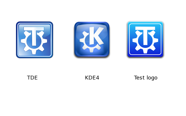
I made a new TDE logo, just to see what it could be, so I want to have your impressions on it. I used as a base the aKregator icon from the KFaenza icon theme. I remove the logo in the middle and replaced it by TDE base logo, from the moon svg background. I used cooler blue color gradient than the original to replace the orange of the aKregator logo.
Tell me what you think! Thank you! -Alexandre

-----BEGIN PGP SIGNED MESSAGE----- Hash: SHA224
Hi,
I made a new TDE logo, just to see what it could be, so I want to have your impressions on it. I used as a base the aKregator icon from the KFaenza icon theme. I remove the logo in the middle and replaced it by TDE base logo, from the moon svg background. I used cooler blue color gradient than the original to replace the orange of the aKregator logo.
Tell me what you think! Thank you! -Alexandre
It seems a little garish and "Apple-like" to me. What do others think?
Thanks!
Tim

On 2014/11/10 09:35 AM, Timothy Pearson wrote:
-----BEGIN PGP SIGNED MESSAGE----- Hash: SHA224
Hi,
I made a new TDE logo, just to see what it could be, so I want to have your impressions on it. I used as a base the aKregator icon from the KFaenza icon theme. I remove the logo in the middle and replaced it by TDE base logo, from the moon svg background. I used cooler blue color gradient than the original to replace the orange of the aKregator logo.
Tell me what you think! Thank you! -Alexandre
It seems a little garish and "Apple-like" to me. What do others think?
Thanks!
Tim -----BEGIN PGP SIGNATURE----- Version: GnuPG v1.4.11 (GNU/Linux)
iFYEARELAAYFAlRgCDgACgkQLaxZSoRZrGFdPQDeIfFHwllyt+1ydP75ihxwuUe7 Tb2Jc1MSPpMG7ADg0MM/U8dtv4apMAVTSgDBuAMRNmyYdiZWB736Lw== =YXwk -----END PGP SIGNATURE-----
The current one is better in my opinion. Cheers Michele

Dne po 10. listopadu 2014 Michele Calgaro napsal(a):
On 2014/11/10 09:35 AM, Timothy Pearson wrote:
Hi,
I made a new TDE logo, just to see what it could be, so I want to have your impressions on it. I used as a base the aKregator icon from the KFaenza icon theme. I remove the logo in the middle and replaced it by TDE base logo, from the moon svg background. I used cooler blue color gradient than the original to replace the orange of the aKregator logo.
Tell me what you think! Thank you! -Alexandre
It seems a little garish and "Apple-like" to me. What do others think?
Thanks!
Tim
The current one is better in my opinion. Cheers Michele
For me also current seems better.
-----BEGIN PGP SIGNED MESSAGE----- Hash: SHA224
The current one is better in my opinion. Cheers Michele
For me also current seems better.
-- Slávek
Just forget about it. It was just a fast mockup of what it could be.
-Alexandre
No problem. Thanks for coming up with an idea and presenting it for review here; your other changes to TDE have greatly improved its overall appearance!
Tim

I never replied, whoops. What I was going to say is i like the border on this image more, it's somehow simpler for my eye
On 11 November 2014 18:35, Timothy Pearson kb9vqf@pearsoncomputing.net wrote:
-----BEGIN PGP SIGNED MESSAGE----- Hash: SHA224
The current one is better in my opinion. Cheers Michele
For me also current seems better.
-- Slávek
Just forget about it. It was just a fast mockup of what it could be.
-Alexandre
No problem. Thanks for coming up with an idea and presenting it for review here; your other changes to TDE have greatly improved its overall appearance!
Tim -----BEGIN PGP SIGNATURE----- Version: GnuPG v1.4.11 (GNU/Linux)
iFYEARELAAYFAlRinUAACgkQLaxZSoRZrGHs1QDfUssbLKfWzxO0xfbVYVPB5Pvb r/5CEszkVtjwZQDff5u+WcUJZYIEuCtCWA/xibpLSYk2+uECKv6a/w== =xoFV -----END PGP SIGNATURE-----
To unsubscribe, e-mail: trinity-devel-unsubscribe@lists.pearsoncomputing.net For additional commands, e-mail: trinity-devel-help@lists.pearsoncomputing.net Read list messages on the web archive: http://trinity-devel.pearsoncomputing.net/ Please remember not to top-post: http://trinity.pearsoncomputing.net/mailing_lists/#top-posting

On Sun, 9 Nov 2014 18:35:04 -0600 "Timothy Pearson" kb9vqf@pearsoncomputing.net wrote:
-----BEGIN PGP SIGNED MESSAGE----- Hash: SHA224
Hi,
I made a new TDE logo, just to see what it could be, so I want to have your impressions on it. I used as a base the aKregator icon from the KFaenza icon theme. I remove the logo in the middle and replaced it by TDE base logo, from the moon svg background. I used cooler blue color gradient than the original to replace the orange of the aKregator logo.
Tell me what you think! Thank you! -Alexandre
It seems a little garish and "Apple-like" to me. What do others think?
I don't think "garish" is the word. "Flat" is closer to how I'd express it.
The old logo displays a certain amount of skeuomorphism--it's set up to make it look like we're looking at a reflective surface. Alexandre's candidate logo has a plain gradient background and makes no attempt to look like anything but a chunk of pixels. It has no depth, no suggestion of being made of a real-world material (unless you count the drop shadow).
"Flat" is currently the fashion in user-interface design, but I don't like it and I see no reason to pursue the trend (although we could consider offering an *alternative* icon set, widget style, and window decoration style using a flat aesthetic, to attract users who *do* like that style).
The logo icon in particular suffers from an additional problem--the gradient's too light at the top, and doesn't offer enough contrast with the logo proper. Fixing that wouldn't be enough to make me like it better than the old one, though.
E. Liddell
-
 Alexandre
 -
 Calvin Morrison
 -
 E. Liddell
 -
 Michele Calgaro
 -
 Slávek Banko
 -
 Timothy Pearson