
Hi,
I'd like to know if there is a place I can see a preview of the future TDE website. I remember to have seen a preview here a few months ago, but I couldn't find it back. Maybe I could help with some artwork on it?
Thank you! -Alexandre

On Wed, 8 Oct 2014 18:31:19 -0400 Alexandre ac586133@hotmail.com wrote:
Hi,
I'd like to know if there is a place I can see a preview of the future TDE website. I remember to have seen a preview here a few months ago, but I couldn't find it back. Maybe I could help with some artwork on it?
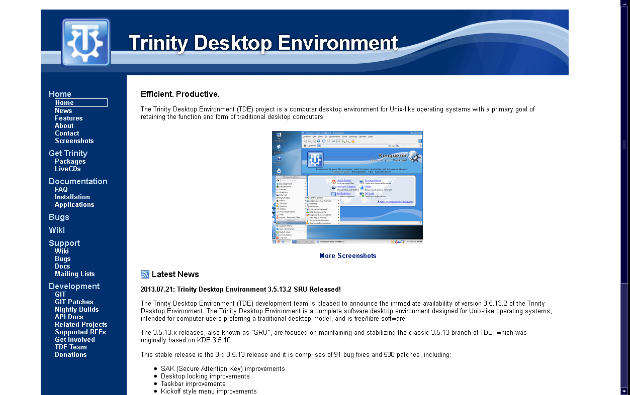
The current intended appearance is as shown in the attached screenshot (note: said screenshot was taken on a system with font hinting and anti-aliasing set to off, so the jaggedness of the text is not due to anything about the site itself). This is slightly changed from the last preview, to bring it more into line with the updated graphics you've done.
I believe the current plan is to unveil the new site at the same time as the first V14 release candidate, if possible (which means, if I can get off my rear end and do the last few things that need to be done to it).
E. Liddell
Hi,
I'd like to know if there is a place I can see a preview of the future TDE website. I remember to have seen a preview here a few months ago, but I couldn't find it back. Maybe I could help with some artwork on it?
The current intended appearance is as shown in the attached screenshot (note: said screenshot was taken on a system with font hinting and anti-aliasing set to off, so the jaggedness of the text is not due to anything about the site itself). This is slightly changed from the last preview, to bring it more into line with the updated graphics you've done.
I believe the current plan is to unveil the new site at the same time as the first V14 release candidate, if possible (which means, if I can get off my rear end and do the last few things that need to be done to it).
E. Liddell Hi!
It is great! Here are some points that I would like to have different, but don't listen to me if you don't want to :)
1.It don't know f it is already the case, but is it possible to make the site grow its width just like the tdeui does, just to not see the site ''stop'' at the end of the graphic?
2.The top left logo looks a little blurred, due to being resized to a bigger size. Can you replace it with a non-blurry one? If you need, I can provide a larger resolution logo.
3.In my opinion, for the left panel, a very slight gradient from the actual top color to a slightly brighter blue at the bottom could make it more attractive. I can provide the required png file if needed.
Overall, good work! Thank you! -Alexandre
On Thu, 9 Oct 2014 18:34:11 -0400 Alexandre ac586133@hotmail.com wrote:
Hi,
I'd like to know if there is a place I can see a preview of the future TDE website. I remember to have seen a preview here a few months ago, but I couldn't find it back. Maybe I could help with some artwork on it?
The current intended appearance is as shown in the attached screenshot (note: said screenshot was taken on a system with font hinting and anti-aliasing set to off, so the jaggedness of the text is not due to anything about the site itself). This is slightly changed from the last preview, to bring it more into line with the updated graphics you've done. I believe the current plan is to unveil the new site at the same time as the first V14 release candidate, if possible (which means, if I can get off my rear end and do the last few things that need to be done to it).
Hi!
It is great! Here are some points that I would like to have different, but don't listen to me if you don't want to :)
1.It don't know f it is already the case, but is it possible to make the site grow its width just like the tdeui does, just to not see the site ''stop'' at the end of the graphic?
It's set up so that the graphic grows with the text width (up to a point, anyway--I put an absolute upper width limit of ~125 characters on the main area of the site, simply because many people find really wide paragraphs difficult to read). It downsizes smoothly too, at least until it gets too narrow for the title text to fit (somewhere between 800 x 600 and 640 x 480, so I'm not expecting it to be an issue).
2.The top left logo looks a little blurred, due to being resized to a bigger size. Can you replace it with a non-blurry one? If you need, I can provide a larger resolution logo.
Yeah, I know--I just re-used a .png I already had lying around rather than finding one of the right size. I'll fix that.
3.In my opinion, for the left panel, a very slight gradient from the actual top color to a slightly brighter blue at the bottom could make it more attractive. I can provide the required png file if needed.
There was a gradient in the sidebar in an earlier prototype of the site. I believe it was Tim who asked to have it removed on the grounds that it pushed an already somewhat retro design into looking even more retro.
E. Liddell
Hi!
It is great! Here are some points that I would like to have different, but don't listen to me if you don't want to :)
1.It don't know f it is already the case, but is it possible to make the site grow its width just like the tdeui does, just to not see the site ''stop'' at the end of the graphic?
It's set up so that the graphic grows with the text width (up to a point, anyway--I put an absolute upper width limit of ~125 characters on the main area of the site, simply because many people find really wide paragraphs difficult to read). It downsizes smoothly too, at least until it gets too narrow for the title text to fit (somewhere between 800 x 600 and 640 x 480, so I'm not expecting it to be an issue).
Yes, that's true, I haven't though about that, especially with larger and larger screens
2.The top left logo looks a little blurred, due to being resized to a bigger size. Can you replace it with a non-blurry one? If you need, I can provide a larger resolution logo.
Yeah, I know--I just re-used a .png I already had lying around rather than finding one of the right size. I'll fix that.
Good!
3.In my opinion, for the left panel, a very slight gradient from the actual top color to a slightly brighter blue at the bottom could make it more attractive. I can provide the required png file if needed.
There was a gradient in the sidebar in an earlier prototype of the site. I believe it was Tim who asked to have it removed on the grounds that it pushed an already somewhat retro design into looking even more retro.
Well well well... :) No comments on this one!
E. Liddell
Hi,
I'm still sure that it would look better with a gradient, just like the one I provided as an attachment. Is it slight, not exaggerated and it makes it more attractive. Is it possible to have a preview with it?
Here is an example of a website with such a blue gradient: pclinuxos.com
Have a great day! -Alexandre
-
 Alexandre
 -
 E. Liddell