
Here my batch of draft "trefoil knot" designs. (Drafts -- meaning not necessarily ready for use, as all previous batches too)
The trefoil triquetra (as opposed to the triquetra vesica, the one with the pointed arcs) is the most neutral of the symbols proposed so far, as it can be cleanly based on and linked to mathematical properties: it can be generated as a trochoide and it is both the simplest torus knot and simplest non-trivial knot. (Of course, whatever our choice of logo -- it would be wise to nail down our interpretations of both the logo and "trinity" in words (mission statement and the like), to prevent malevolent misinterpretion or pocket of word or logo "trademarks"!)
As with all batches, please load them into GIMP (or the tool of your choice): * set them before different backgrounds * zoom them to different sizes (most of my design behave reasonably well at small sizes) * feel free to reduce color saturation, shift the hue, darken, lighten to your hearts (or eyes) content (some think my colors to vivid, but IMHO it works better within GIMP to deplete colors from a too vivid design than the other way round)
I generated the basic form and then stroked the path(es) with various calligraphic pens (simulating a wide calligraphic quill) to achieve some vividness and spatial substance:
* in "Trefoil_Knot_1TM.png" one of the three symmetric pathes is traced (in black, to avoid charges of being to colorful ;-) and then rotated. It is essentially like drawing each line with a quill after rotating the paper.
* in "Trefoil_Knot_2TM.png" the same quill and orientation is used, but the paper not turned -- the identical pathes look different, as the quill orientation is different.
Then my personal limit of mono-colored design was reached ;-) Perhaps I have to explain my perception of colors on desktops, so you better understand my designs:
The first art based on additive colors was the art of stained glass windows, as refined in Europe during the Romanic and Gothic period (there are precursors in persian, arabic, and mauric buildings, beautiful and artful indeed, but with all proper respect not as sophisticated). The explicitely declared goal of the builders of gothic cathedrals was the impression of entering a juwel -- an ethereal room flooded with living light, reacting to sun and clouds. Essentially a medieval cyper-space ... Considering how many people are sucked into cyber-space nowaday, that might give you an idea how impressed the medieval crofter must have been. The best way to get an impression is to enter a Romanic or Gothic church (or crypt) where at least in one area there is only light from stained windows on a sunny day with chasing clouds (substituting stained glass windows in such churches with blank glass is a barbaric crime, IMNSHO!). The 2nd best alternative -- lacking the color spectrum -- is a room solely lit by a fireplace. Or a screensaver on a large display at night, displaying professional¹ photos of stained glass windows ... [¹: the stone tracery must be black!]
Alas, in the early 15th century the art declined and lost its magic, as it was adapted to replicate artwork from paintings, i.e. from the substractive colorspace. With the Art Noveau some revival started, as some artists realized that drawing additively with colored light is a completely different matter than drawing subtractively with colored pigments.
So, after having dumped my brain, I hope you understand and can excuse, that I had absolutely no choice, but to do the next design in colors (;-).
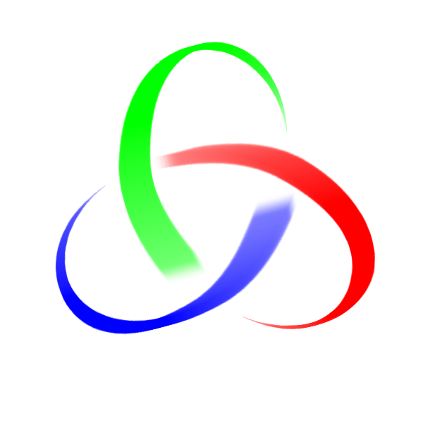
* in "Trefoil_Knot_3TM.png" the quill direction was changed, to give a much more spatial impression and each branch was colored seperately -- it might be the previous deprivation of colors, but I immediately fell in love with this design!
If you wonder, why I bothered with simulated pen stroke, have a look at "Trefoil_Knot_6TM.png", trying a neon-desktop-suitable design: This flat design of uniform width looks more like a warning sign (think radioactivity or bio- hazard) than a menu button you want to click. (of course the neon version could be improved², but it is here as an motivation for my choices) [²: obviously by starting from "Trefoil_Knot_3TM.png" to make it more spatial, and of course by keeping 3 colors ]=->
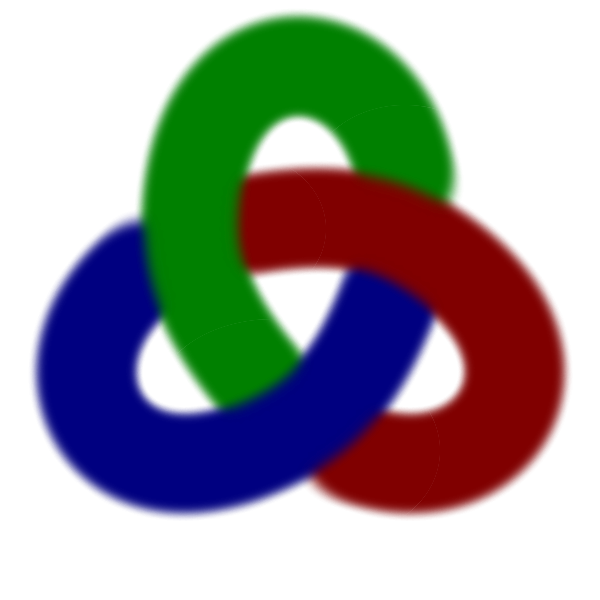
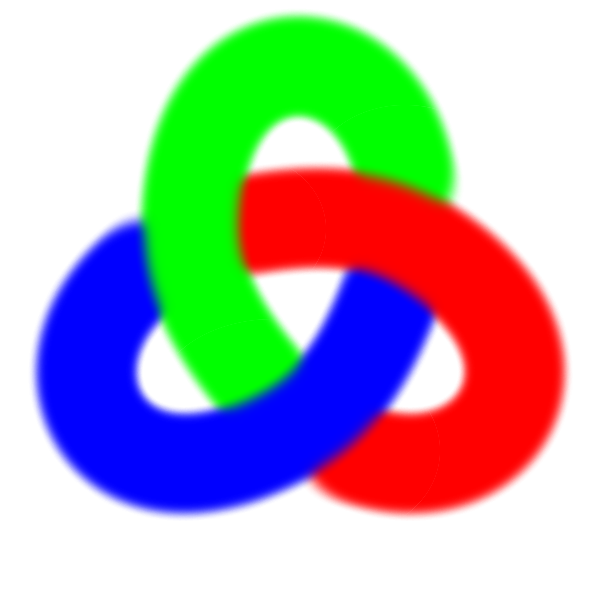
The following two pictures are not meant as real logo proposal but to sketch an idea, which -- alas -- is not easily achieved (at least not with "inkscape" or GIMP). The colors are intended to make it easier to imagine the knot as a spatial object. If, keeping this in mind, you take a look at "Trefoil_Knot_8TM.png" (a color-depleted version of "Trefoil_Knot_7TM.png"), perhaps you can imagine the trefoil knot done in space with a tube from an uniform material, lit and with shadows which make the spatial structure visible.
Doing so would be quite an effort for me: construct the 3D-model and render it in "povray" or some other 3D-rendering system would probably take me a weekend -- so I'd do this if there is interest in such a "knotted tube design" (which, I promise, would be realistic and not garish ;-) If there is somebody with the necessary skills and tools, to do this faster -- you are invited to step forward!
Finally, if we are also considering triquetra-vesica designs (from E.), I want to throw the idea of a glover into the ring -- of course it is as the triquetra-vesica design strongly loaded with religious (St. Patrick) and Irish associations, but the need to fend of unwanted associations exists IMHO for any choice ...
It could either a cut-out of a real clover, or a more formal design like "Clover_Drafts-TM.svg.png".
ciao,
ThoMaus