
Hi everyone!
Here is a new TDEUI proposal. I propose it here, because I am not totally sure about it myself...
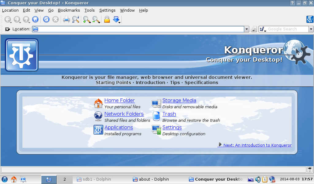
The background is easy to change, since transparencies are used in the pictures, as opposed to the old one where the pictures were not transparent and not adapted to different background. The text size and color is also easy to adjust.
The background can be changed to pretty much anything, ranging from something very similar to the old one to something that would match with the new boot splash and side of K menu.
Tell me what you think! I am not sure on this one, so I want advices! -Alexandre

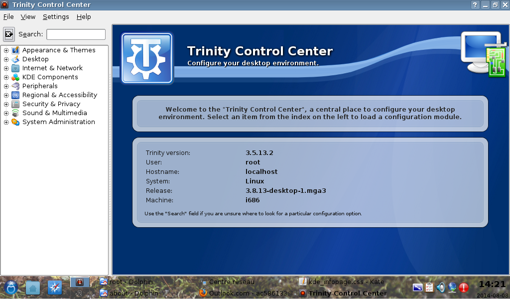
Hi Alex, thanks for the new pictures. Here is my opinion. Opinions from other users are welcomed.
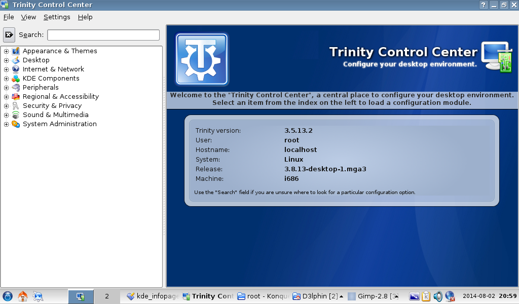
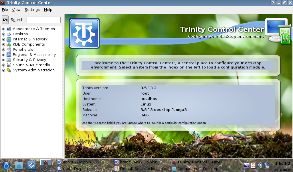
The first one (the darker one) looks pretty good and it is in line with the new intro theme and TDE Classic Menu side line color. This contributes to give TDE its own look and feel and improves the rebranding effort we have being doing. I also like the white color used for the top writing ("Trinity Control Center blah blah blah") and the updated icon on the top right, which matches the icon of the Trinity Control Center used in the menu. Instead I think we need to improve the following things:
1) the section "Welcone to the Trinity Control Center blah blah blah" looks a little awkward, the text is not vertically centered compared to the light color horizontal stripe. It would be nice if that looked similar to the bottom rounded rectangle: same width, same rounded corners, eventually use three text lines instead of two. Also I think it is better to remove the quotes (") around Trinity Control Center.
2) the current Trinity Control Center has a sort of horizontal light colored "band" on the top, going from left to right (see attached file). That is the main theme of the new TDE website (whenever we will launch it :) ) and would be good to maintain that. Could you manage to fit such "band" into the new color scheme?
Let's also see other's opinions.
Cheers Michele
Date: Sun, 3 Aug 2014 03:44:03 +0100 From: michele.calgaro@yahoo.it To: trinity-devel@lists.pearsoncomputing.net Subject: [trinity-devel] R: [trinity-devel] New TDEUI proposal
Hi Alex, thanks for the new pictures. Here is my opinion. Opinions from other users are welcomed.
The first one (the darker one) looks pretty good and it is in line with the new intro theme and TDE Classic Menu side line color. This contributes to give TDE its own look and feel and improves the rebranding effort we have being doing. I also like the white color used for the top writing ("Trinity Control Center blah blah blah") and the updated icon on the top right, which matches the icon of the Trinity Control Center used in the menu. Instead I think we need to improve the following things:
- the section "Welcone to the Trinity Control Center blah blah blah" looks a little awkward, the text is not vertically centered compared to the light color horizontal stripe. It would be nice if that looked similar to the bottom rounded rectangle: same width, same rounded corners, eventually use three text lines instead of two.
Also I think it is better to remove the quotes (") around Trinity Control Center.
- the current Trinity Control Center has a sort of horizontal light colored "band" on the top, going from left to right (see attached file). That is the main theme of the new TDE website (whenever we will launch it :) ) and would be good to maintain that. Could you manage to fit such "band" into the new color scheme?
Let's also see other's opinions.
Cheers Michele
Hi,
Ok, I'll look at the text band in the middle.
I tried to use the existing color band, but after I cut the top and the bottom blue and tested it. I stumbled on the problem that the middle part is taking all of the width. With the previous non-transparent pictures, it was not seen, because the 2 side pictures would cover the problem. If someone here can help me to find a way to delimit the band to start at the end of the left picture and stop at the beginning of the right picture. The pictures are ready, if someone find a way to do it. If it is not possible to do, the 2 following options are available: 1.Keep the old top part, which would pretty much loose the effect or 2. Keep it without the old light colored band. But the old light colored band has probably made its time too...
I'll look at that! -Alexandre
If someone here can help me to find a way to delimit the band to start at the end of the left picture and stop at the beginning of the right picture.
In tde/main/tdelibs/doc/common you can find the basic pictures to start with. From bottom-right.png you can try to adjust the color to match the new schema. And in tdebase/kcontrol/kcontrol/about the file top-right-kcontrol.png is the picture displayed at the top. We can overwrite that if necessary.
Cheers Michele
Date: Sun, 3 Aug 2014 14:44:30 +0100 From: michele.calgaro@yahoo.it To: trinity-devel@lists.pearsoncomputing.net Subject: RE: [trinity-devel] R: [trinity-devel] New TDEUI proposal
If someone here can help me to find a way to delimit the band to start at the end of the left picture and stop at the beginning of the right picture.
In tde/main/tdelibs/doc/common you can find the basic pictures to start with. From bottom-right.png you can try to adjust the color to match the new schema. And in tdebase/kcontrol/kcontrol/about the file top-right-kcontrol.png is the picture displayed at the top. We can overwrite that if necessary.
Cheers Michele
Hi,
I think that we just didn't understood it in the same way :) I already have the pictures.
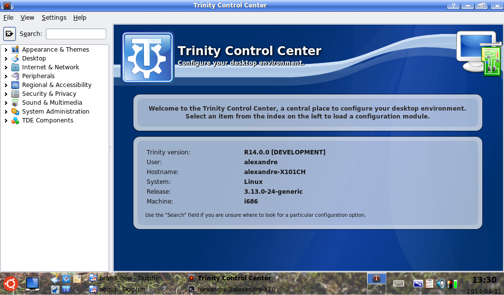
The top part is made of 3 items: -The left part, where there is the TDE logo. This part has a fixed size. -The middle part, which is where you see the horizontal stripe on the actual TDEUI. This part has an adaptive size, depending of the screen resolution. -The left part, where you can see the rounded part of the ribbon. This part has a fixed size.
Here is the drawing order of the current TDEUI: -The middle part is repeated horizontally across all of the screen width. -The left part is drawn on top of the left part. -The right part is drawn on top or the right part.
It causes no problems with the old TDEUI, because these pictures were not transparent at all. So, the left and right parts covers fully the middle part, which would be otherwise displayed all across the width of the window. But, with the transparent pictures, the problem is that this horizontal ribbon is still seen all across the screen, which is ugly, as in the attachement...
What I'd want to do is to find a way to make the middle part be drawn only at the end of the left picture and stop at the beginning of the right picture. Is it possible?
Also, I tried to transform the Welcome to... bar in a box, but for an unknown the same transparency that works for the box doesn't work for the bar... Which is pretty much going to stay a bar... Except that it can be adjusted to have the same width as the box under it.
-Alexandre

On Sun, 3 Aug 2014 10:48:57 -0400 Alexandre ac586133@hotmail.com wrote:
Date: Sun, 3 Aug 2014 14:44:30 +0100 From: michele.calgaro@yahoo.it To: trinity-devel@lists.pearsoncomputing.net Subject: RE: [trinity-devel] R: [trinity-devel] New TDEUI proposal
If someone here can help me to find a way to delimit the band to start at the end of the left picture and stop at the beginning of the right picture.
In tde/main/tdelibs/doc/common you can find the basic pictures to start with. From bottom-right.png you can try to adjust the color to match the new schema. And in tdebase/kcontrol/kcontrol/about the file top-right-kcontrol.png is the picture displayed at the top. We can overwrite that if necessary.
Cheers Michele
Hi,
I think that we just didn't understood it in the same way :) I already have the pictures.
The top part is made of 3 items: -The left part, where there is the TDE logo. This part has a fixed size. -The middle part, which is where you see the horizontal stripe on the actual TDEUI. This part has an adaptive size, depending of the screen resolution. -The left part, where you can see the rounded part of the ribbon. This part has a fixed size.
Here is the drawing order of the current TDEUI: -The middle part is repeated horizontally across all of the screen width. -The left part is drawn on top of the left part. -The right part is drawn on top or the right part.
It causes no problems with the old TDEUI, because these pictures were not transparent at all. So, the left and right parts covers fully the middle part, which would be otherwise displayed all across the width of the window. But, with the transparent pictures, the problem is that this horizontal ribbon is still seen all across the screen, which is ugly, as in the attachement...
What I'd want to do is to find a way to make the middle part be drawn only at the end of the left picture and stop at the beginning of the right picture. Is it possible?
Also, I tried to transform the Welcome to... bar in a box, but for an unknown the same transparency that works for the box doesn't work for the bar... Which is pretty much going to stay a bar... Except that it can be adjusted to have the same width as the box under it.
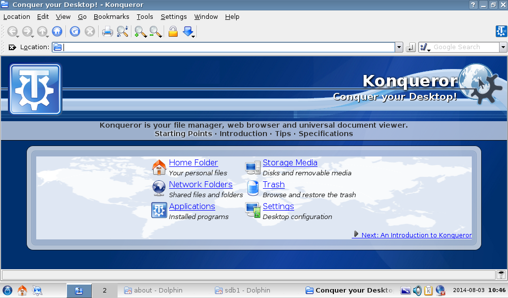
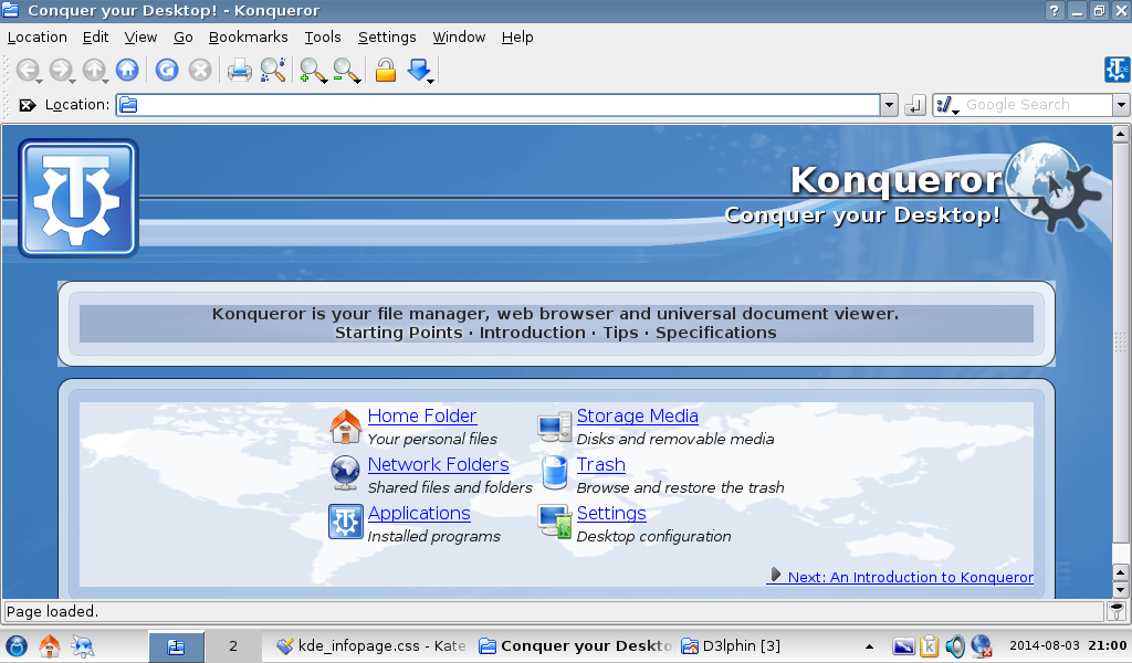
That display is just an HTML page, {TDE}/share/apps/konqueror/about/intro.html (more or less--there's some docbook-related injection, I think, but that's the base). We're looking at, in part (whitespace collapsed somewhat in the interest of brevity):
<div ID="header">
  <div ID="headerL"></div>
  <div ID="headerR"></div>
  <div ID="title">Konqueror</div>
  <div ID="tagline">Conquer your Desktop!</div>
</div>
There are two governing stylesheets for this file (on my system, they're /usr/kde/3.5/share/apps/kdeui/about/kde_infopage.css and /usr/kde/3.5/share/apps/konqueror/about/konq.css, but the locations will be slightly different on a proper Trinity system). The relevant bits here are:
#header { background-image: url(top-middle.png); width: 100%; height: 131px; }
from the first file and
#headerR { width: 430px; height: 131px; background-image: url(top-right-konqueror.png); }
from the second.
In other words, the stripe continues on through the right side of the header because it's being displayed as the background of the enclosing element. The easiest ways to fix this are to 1. provide an opaque background for the headerR div (possibly not workable for this design) or 2. create a headerCenter div to display the background. It's possible that a couple of other pages from the same directory will need to be edited to match.
Oh, and, in general, I can adjust the header and sidebar in the webpage, wiki, and bugzilla designs to match this better if we decide we want to go for it.
E. Liddell
That display is just an HTML page, {TDE}/share/apps/konqueror/about/intro.html (more or less--there's some docbook-related injection, I think, but that's the base). We're looking at, in part (whitespace collapsed somewhat in the interest of brevity):
<div ID="header"> <div ID="headerL"></div> <div ID="headerR"></div> <div ID="title">Konqueror</div> <div ID="tagline">Conquer your Desktop!</div> </div>There are two governing stylesheets for this file (on my system, they're /usr/kde/3.5/share/apps/kdeui/about/kde_infopage.css and /usr/kde/3.5/share/apps/konqueror/about/konq.css, but the locations will be slightly different on a proper Trinity system). The relevant bits here are:
#header { background-image: url(top-middle.png); width: 100%; height: 131px; }
from the first file and
#headerR { width: 430px; height: 131px; background-image: url(top-right-konqueror.png); }
from the second.
In other words, the stripe continues on through the right side of the header because it's being displayed as the background of the enclosing element. The easiest ways to fix this are to 1. provide an opaque background for the headerR div (possibly not workable for this design) or 2. create a headerCenter div to display the background. It's possible that a couple of other pages from the same directory will need to be edited to match.
Oh, and, in general, I can adjust the header and sidebar in the webpage, wiki, and bugzilla designs to match this better if we decide we want to go for it.
E. Liddell
Hi,
I think you understood well the situation. This new design allow use of any picture as the background and it is something that I would like to keep, if it is possible. I don't know much about web programming, but I did it by comparing the differents sections with the same file in KDE 4.10.
Would it be possible for you to provide the code for the header part, with a headerCenter div?
If it is not possible at all, the solution that I would personally prefer is to drop that rounded ribbon, just as in the first picture proposed in this post. I also prefer brighter color in large areas such as the toned-down Crystal-fire picture of the second proposal. It also looks more like classic 3.5.10 KDE, but it looses the similarity with the new K menu side picture and the splash.
If this design end up being choosen, I a willing to modify the other similar pages in TDE. As of now, I think that these are: Konqueror, TDE Control Center, Akregator and Help.
Thank you! -Alexandre
On Sun, 3 Aug 2014 13:35:01 -0400 Alexandre ac586133@hotmail.com wrote:
In other words, the stripe continues on through the right side of the header because it's being displayed as the background of the enclosing element. The easiest ways to fix this are to 1. provide an opaque background for the headerR div (possibly not workable for this design) or 2. create a headerCenter div to display the background. It's possible that a couple of other pages from the same directory will need to be edited to match.
I think you understood well the situation. This new design allow use of any picture as the background and it is something that I would like to keep, if it is possible. I don't know much about web programming, but I did it by comparing the differents sections with the same file in KDE 4.10.
Would it be possible for you to provide the code for the header part, with a headerCenter div?
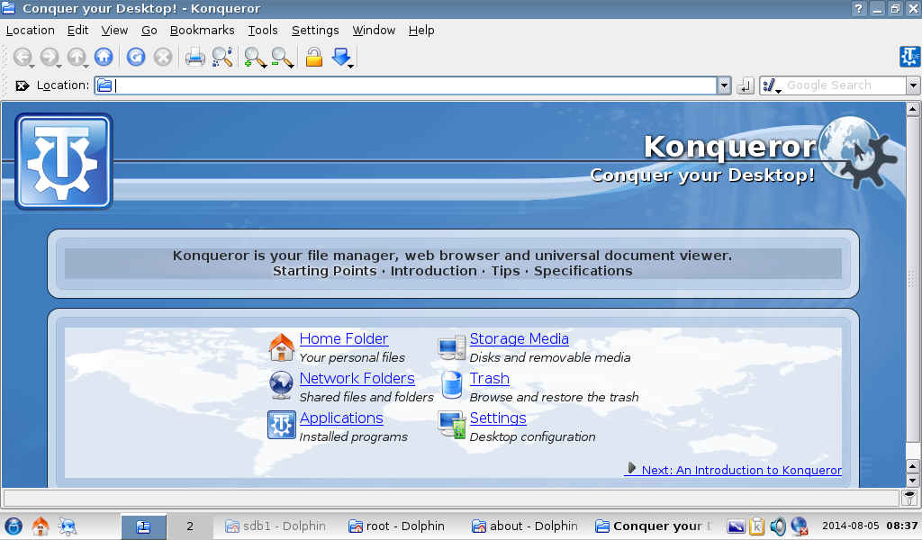
Okay, I think I have it. You need to make changes to two files. In {TDE}/share/apps/konqueror/about/intro.html , change
<div id="headerL"/> <div id="headerR"/>
to
<div id="headerL"/> <div id="headerCenter"/> <div id="headerR"/>
This surgery is also going to have to be performed on most of the other HTML files in the same directory--all but one of them use the same header.
Then go to the first stylesheet (kde_infopage.css on my system, might be tde_infopage.css or the like on yours) and patch it with the attached .diff file.
After that, you should have a new headerCenter div that displays the background stripe only where you want it.
If this doesn't work, there's some kind of file regeneration step missing--I saved off a copy of the page instead of trying to work with the system files.
E. Liddell
Thank you for your great work! It works right as it should! The new transparent picture with the ribbon is not yet 100% like I want it, but it gives a good idea of what it would be.
I personally definitely like the one with the toned-down Crystal-fire background. It is more in style with classic KDE 3.5.10.2, so it won't hurt too much the more conservative users :), while providing something less flat, with a texture. It also fits much better with the actual ribbon, which I still have to work on, to make it integrate well with any picture.
I still have to check out why does ''Akregator'' and ''Help'' does not uses the regular TDEUI files, and uses their own ones.
Also, Michele talked about transforming the bar, under the top part, into a box, just like the middle box. I tried to adapt the file to transform it in a box, by comparing the text, but for an unknown reason, the transparency doesn't work around the rounded corners, just as on the middle box. Is there something to do about it?
Tell me which one you prefer! Or if you want to submit another background, to check what it would look like. -Alexandre
On Sun, 3 Aug 2014 18:13:55 -0400 Alexandre ac586133@hotmail.com wrote:
Also, Michele talked about transforming the bar, under the top part, into a box, just like the middle box. I tried to adapt the file to transform it in a box, by comparing the text, but for an unknown reason, the transparency doesn't work around the rounded corners, just as on the middle box. Is there something to do about it?
If you're talking about the bar with "Konqueror is your file manager . . ." on it, it has a background colour attribute set. Go into kde_infopage.css (or whatever it's called) again and change this:
#bar { background-color: #5BABE5; border-bottom: 1px solid #000000; padding-bottom: 0.5ex; padding-top: 0.5ex; width: 100%; }
to this:
#bar { padding-bottom: 0.5ex; padding-top: 0.5ex; width: 100%; }
and see if that fixes it.
E. Liddell
Hi,
This one doesn't seem to work! But in the KDEUI folder there are some ''bar-(part)-(position of it).png'' pictures without transparencies. I guess that I am not the first one to have this problem. Can you look at the kde_infopage.css, to see if you can find the problem? I don't understand why the transparency would work for the box, but not for the bar...
If you try it on your system, it is possible that you will not have all the pictures.
Thank you for your help! -Alexandre
On Sun, 3 Aug 2014 21:20:01 -0400 Alexandre ac586133@hotmail.com wrote:
Also, Michele talked about transforming the bar, under the top part, into a box, just like the middle box. I tried to adapt the file to transform it in a box, by comparing the text, but for an unknown reason, the transparency doesn't work around the rounded corners, just as on the middle box. Is there something to do about it?
If you're talking about the bar with "Konqueror is your file manager . . ." on it, it has a background colour attribute set. [...]
This one doesn't seem to work! But in the KDEUI folder there are some ''bar-(part)-(position of it).png'' pictures without transparencies. I guess that I am not the first one to have this problem. Can you look at the kde_infopage.css, to see if you can find the problem? I don't understand why the transparency would work for the box, but not for the bar...
Try applying the attached diff to kde_infopage.css . On my system, it produces identical boxes around the bar and the original box area (except that the bar doesn't have the world map background image).
At the moment, it's using the "box-(part)-(position).png" graphics for both. If you want to separate them, go to the section with the "* the nav bar" header and change the filenames in each "background-image: url([file]);" line.
E. Liddell
Thank you!
Now the bar is a box and it works well. It was a good idea to transform it in a box! I will probably modify the corners and the borders to make it appear vertically slimmer. These borders were quite big.
The ribbon is really hard to make it fit with different colors. I did try different combinations of effects on the ribbon, but it never seems to fit as I would like it. If someone still have somewhere the original file of the ribbon only, with transparency, it would help a lot. But unfortunately, I think that it has been lost in history...
As of now, what I suggest is either: 1. Using the toned-down version of the Crystal-fire background with the ribbon. Fits really well. 2. Using the Lineart logo background (the dark one) version without the ribbon, as in the first proposal.
Do you really want to keep the ribbon?
I would like to have the opinion of Timothy Pearson on this one too, if possible.
-Alexandre
As of now, what I suggest is either:
- Using the toned-down version of the Crystal-fire background with the ribbon. Fits really well.
- Using the Lineart logo background (the dark one) version without the ribbon, as in the first proposal.
Do you really want to keep the ribbon?
IMO, a box with uniform background and no ribbon around it should be good. Can you post some updated screenshot so we have a better idea?
Thanks Michele
ect: RE: [trinity-devel] R: [trinity-devel] New TDEUI proposal
As of now, what I suggest is either:
- Using the toned-down version of the Crystal-fire background with the ribbon. Fits really well.
- Using the Lineart logo background (the dark one) version without the ribbon, as in the first proposal.
Do you really want to keep the ribbon?
IMO, a box with uniform background and no ribbon around it should be good. Can you post some updated screenshot so we have a better idea?
Thanks Michele
Here it is! I wanted to slim-down the top box vertically, but I didn't had the time yet. It is not final picture yet too.
-Alexandre
IMO, a box with uniform background and no ribbon around it should be good.
Here it is! I wanted to slim-down the top box vertically, but I didn't had the time yet.It is not final picture yet too.
Ah ah! Perhaps I misunderstood the previous mail. By "ribbon" did you mean the band going from left to right on the top? My understanding was for the border around the top box (the one containing "Welcome to blah blah blah...."). I think without the top band it looks a little "empty", but it is just my opinion. Would be good to hear from Slavek and Tim as well :-)
Anyhow, thanks for the big effort so far. No need to rush :-)
Cheers Michele
Date: Tue, 5 Aug 2014 14:21:54 +0100 From: michele.calgaro@yahoo.it To: trinity-devel@lists.pearsoncomputing.net Subject: RE: [trinity-devel] R: [trinity-devel] New TDEUI proposal
IMO, a box with uniform background and no ribbon around it should be good.
Here it is! I wanted to slim-down the top box vertically, but I didn't had the time yet.It is not final picture yet too.
Ah ah! Perhaps I misunderstood the previous mail. By "ribbon" did you mean the band going from left to right on the top? My understanding was for the border around the top box (the one containing "Welcome to blah blah blah...."). I think without the top band it looks a little "empty", but it is just my opinion. Would be good to hear from Slavek and Tim as well :-)
Yes, it will be better with the ribbon.
Anyhow, thanks for the big effort so far. No need to rush :-)
Cheers Michele
Hi,
Okay, now I think that it has attained a level where I like it! I have been able to cut the background around the original ribbon much better, to the point where it fits quite well with various backgrounds.
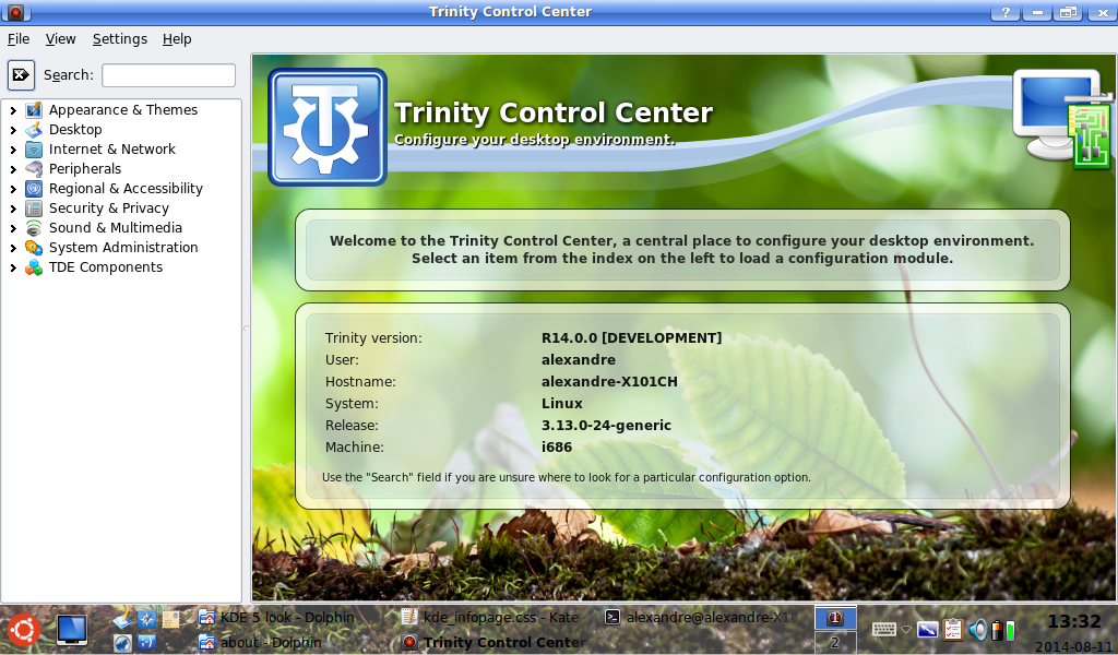
-The one with the natural green background is not a proposal - it is only to show that the TDEUI has now full support for transparency and different background, as opposed to the old one. But it looks so good that it is almost making the others looking plain, boring :)
I think that it will be a good idea to replace the old TDEUI with this one for R14, because all of the TDE and KDE reviews are always showing either Konqueror or the Control Center. If reviewers sees no visual change at all, they will think that TDE has not progressed from classic KDE 3.5.10, even if it is not true.
I would still like to have the advice or opinion of the other devs. Michele, can you contact them, just in case they don't look at this message?
-Alexandre
The one with the natural green background is not a proposal - it is only to show that the TDEUI has now full support for transparency and different background, as opposed to the old one. But it looks so good that it is almost making the others looking plain, boring :)
The green looks quite good indeed :-) I am also almost tempted by it, but I think some other users may like a more traditional approch.
I think that it will be a good idea to replace the old TDEUI with this one for R14, because all of the TDE and KDE reviews are always showing either Konqueror or the Control Center. If reviewers sees no visual change at all, they will think that TDE has not progressed from classic KDE 3.5.10, even if it is not true.
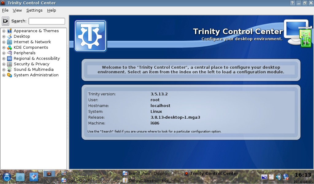
Yes, well said! I think we should discard tdeui10 (the light one) because it is too similar to the KDE 3.5 ones. tdeui9 (the dark one) is probably a good balance between changes and traditional look.
One more small thing, if you can fix it. The background of the inner part of each box is different and it looks like there is a double border for each box. Could you adjust it? See the attach picture for what I mean.
I would still like to have the advice or opinion of the other devs. Michele, can you contact them, just in case they don't look at this message?
Every developer is copied to this mails. If we don't get any more feedback within few days, early next week I will ask Tim and Slavek directly (this weekend I am busy and probably I will have no time for TDE).
Cheers Michele
On Tue, 5 Aug 2014 20:35:56 -0400 Alexandre ac586133@hotmail.com wrote:
Okay, now I think that it has attained a level where I like it! I have been able to cut the background around the original ribbon much better, to the point where it fits quite well with various backgrounds.
-The one with the natural green background is not a proposal - it is only to show that the TDEUI has now full support for transparency and different background, as opposed to the old one. But it looks so good that it is almost making the others looking plain, boring :)
I think that it will be a good idea to replace the old TDEUI with this one for R14, because all of the TDE and KDE reviews are always showing either Konqueror or the Control Center. If reviewers sees no visual change at all, they will think that TDE has not progressed from classic KDE 3.5.10, even if it is not true.
I would still like to have the advice or opinion of the other devs. Michele, can you contact them, just in case they don't look at this message?
Okay, a few things:
1. The dark blue version does look better than the light one (something about hue or saturation that I'm too lazy to figure out)
2. Both of them would probably look better if the opaque background in the center portion of the boxes was translucent instead. Since Konqueror doesn't support CSS3, that means using a translucent .png image instead of the solid-colour background provided by the stylesheet. I can help you with the CSS for this if you need it. Alternatively, you could either make the inner part of the border opaque while leaving the outer part translucent, or "fade in" the opacity towards the center using a gradient.
3. If we're going to do extensive visual rebranding of Trinity (and I don't object to that--moving away from the KDE3 default scheme is a reasonable thing to do), we should do it completely and consistently if possible. That means that the splash screen (which you've already hit), the Konqueror/Control Center background, and I think the default desktop wallpaper, should clearly go together, as they do in KDE3.
4. Yes, I would like to keep the ribbon, although I think you cut too much of it on the last iteration when you ditched the intended-to-be-translucent stripes. I can try to reconstruct the original graphic properly this weekend--I've been meaning to for a while anyway.
I'll tweak the website, etc. to match whatever the final product turns out to be.
E. Liddell
I think that it will be a good idea to replace the old TDEUI with this one for R14, because all of the TDE and KDE reviews are always showing either Konqueror or the Control Center. If reviewers sees no visual change at all, they will think that TDE has not progressed from classic KDE 3.5.10, even if it is not true.
I would still like to have the advice or opinion of the other devs. Michele, can you contact them, just in case they don't look at this message?
Okay, a few things:
- The dark blue version does look better than the light one (something about hue or saturation
that I'm too lazy to figure out)
- Both of them would probably look better if the opaque background in the center portion
of the boxes was translucent instead. Since Konqueror doesn't support CSS3, that means using a translucent .png image instead of the solid-colour background provided by the stylesheet. I can help you with the CSS for this if you need it. Alternatively, you could either make the inner part of the border opaque while leaving the outer part translucent, or "fade in" the opacity towards the center using a gradient.
- If we're going to do extensive visual rebranding of Trinity (and I don't object to that--moving
away from the KDE3 default scheme is a reasonable thing to do), we should do it completely and consistently if possible. That means that the splash screen (which you've already hit), the Konqueror/Control Center background, and I think the default desktop wallpaper, should clearly go together, as they do in KDE3.
- Yes, I would like to keep the ribbon, although I think you cut too much of it on the last
iteration when you ditched the intended-to-be-translucent stripes. I can try to reconstruct the original graphic properly this weekend--I've been meaning to for a while anyway.
I'll tweak the website, etc. to match whatever the final product turns out to be.
E. Liddell
Hi,
I transformed the opaque box center to a transparent one. I did it that way, primarily because I know that some persons here does not agree with the idea that important text might be on anything else than a plain color. It is certainly understandable.
Yes, I had to ditch out the transparent part at first, because they were hard to cut and had to make fit with many colors. But I did put the same ribbon picture, a few pixel down a 5% opacity. It was there, but not very visible. On this new picture, I put this second layer at 15% opacity, instead of 5%. Now it is visible. I have no problem with it if you want to provide a new ribbon. I would just have made the job easier for me!
As of the default wallpaper, I do not intent to work on it, at least for now, because my personal preference goes for a natural background picture, which is enjoyable when you have to work indoor for a long time. All of these pictures were based on the Lineart-logo wallpaper, which is part of Trinity since at least KDE 3.5.10.
Tell me what you think! -Alexandre
Tell me what you think!
Alex, IMO the latest version is absolutely brilliant! Great job!! Let's wait for a few days, but if there are no objections I would like to push it to GIT sometime next week. Then we will also need the same thing for Konqueror.
As of the default wallpaper, I do not intent to work on it, at least for now, because my personal preference goes for a natural background picture,
Even if you do not use the default background, would you consider working on it when you have time so that the people that use it can have a full "new style" experience? That would be much appreciated.
Cheers Michele

On Thursday 07 of August 2014 00:38:03 Alexandre wrote:
I think that it will be a good idea to replace the old TDEUI with this one for R14, because all of the TDE and KDE reviews are always showing either Konqueror or the Control Center. If reviewers sees no visual change at all, they will think that TDE has not progressed from classic KDE 3.5.10, even if it is not true.
I would still like to have the advice or opinion of the other devs. Michele, can you contact them, just in case they don't look at this message?
Okay, a few things:
- The dark blue version does look better than the light one (something
about hue or saturation that I'm too lazy to figure out)
- Both of them would probably look better if the opaque background in
the center portion of the boxes was translucent instead. Since Konqueror doesn't support CSS3, that means using a translucent .png image instead of the solid-colour background provided by the stylesheet. I can help you with the CSS for this if you need it. Alternatively, you could either make the inner part of the border opaque while leaving the outer part translucent, or "fade in" the opacity towards the center using a gradient.
- If we're going to do extensive visual rebranding of Trinity (and I
don't object to that--moving away from the KDE3 default scheme is a reasonable thing to do), we should do it completely and consistently if possible. That means that the splash screen (which you've already hit), the Konqueror/Control Center background, and I think the default desktop wallpaper, should clearly go together, as they do in KDE3.
- Yes, I would like to keep the ribbon, although I think you cut too
much of it on the last iteration when you ditched the intended-to-be-translucent stripes. I can try to reconstruct the original graphic properly this weekend--I've been meaning to for a while anyway.
I'll tweak the website, etc. to match whatever the final product turns out to be.
E. Liddell
Hi,
I transformed the opaque box center to a transparent one. I did it that way, primarily because I know that some persons here does not agree with the idea that important text might be on anything else than a plain color. It is certainly understandable.
Yes, I had to ditch out the transparent part at first, because they were hard to cut and had to make fit with many colors. But I did put the same ribbon picture, a few pixel down a 5% opacity. It was there, but not very visible. On this new picture, I put this second layer at 15% opacity, instead of 5%. Now it is visible. I have no problem with it if you want to provide a new ribbon. I would just have made the job easier for me!
As of the default wallpaper, I do not intent to work on it, at least for now, because my personal preference goes for a natural background picture, which is enjoyable when you have to work indoor for a long time. All of these pictures were based on the Lineart-logo wallpaper, which is part of Trinity since at least KDE 3.5.10.
Tell me what you think! -Alexandre
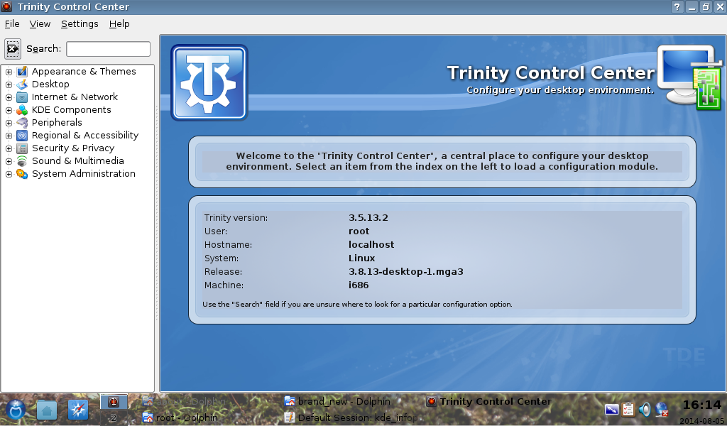
Proposals with a dark background seem to me better. Proposal 11 looks great. The previous proposals bothered me discrepancy text background.
I also liked the proposal 7 => without "wave" in the header. As the background is dark, so the wave is too dominant. Please, can you try two more options:
1) Instead of wave use a simple dark line - as there used previously from the symbol icon on the right side.
2) The wave leave as is and text "on wave" align left.
I'm not saying that some of these variants will be better, because proposal 11 looks really good, I just wanted to try it.
Proposals with a dark background seem to me better. Proposal 11 looks great. The previous proposals bothered me discrepancy text background.
I also liked the proposal 7 => without "wave" in the header. As the background is dark, so the wave is too dominant. Please, can you try two more options:
- Instead of wave use a simple dark line - as there used previously from the
symbol icon on the right side.
- The wave leave as is and text "on wave" align left.
I'm not saying that some of these variants will be better, because proposal 11 looks really good, I just wanted to try it.
-- Slavek
Hi,
First of all, for those who might be interested in it, I have found earlier today a page on the KDE website where there is ''almost'' source files of different graphic elements used in classic KDE: http://www.kde.org/stuff/clipart.php E. Liddell, if you still intent to rebuild the top ribbon, it might help you.
I have also found the SVG scalable file of the Lineart-logo background on kde-look.org: http://kde-look.org/content/show.php/KDE+Lineart+Logo+for+16%3A10+displays?c...
It is not ready yet to be pushed to GIT. I want to have it in a ''final'' state, before I can adapt it to other TDE apps using it, such as aKregator, Help, Konqueror...
Slavek, I made a rapid simulation of what you wrote about in KPaint. Not sure, but we won't know until we try! I'm sorry, I'm not sure to understand the second one you asked for. Can you give more details?
My preferred one is proposal 8, but it is certainly not going to be accepted :)
Thank you! If you have any idea, just let me know! -Alexandre
On Friday 08 of August 2014 02:20:26 Alexandre wrote:
Slavek, I made a rapid simulation of what you wrote about in KPaint. Not sure, but we won't know until we try! I'm sorry, I'm not sure to understand the second one you asked for. Can you give more details?
My preferred one is proposal 8, but it is certainly not going to be accepted :)
Thank you! If you have any idea, just let me know! -Alexandre
Thank you.
Although I thought the dark line with light base, as seen for example on proposal 6, but even this is probably clear that it is not a good idea.
The second idea was to leave all of the graphics as is on the proposal 11, just texts "on the wave" align to the left - close to TDE logo - to do not cross the wave with text.
-- Slavek
Hi,
Here it is!
-Alexandre
Both tdeui11 and tdeui13 looks pretty good. Small preference for tdeui13 for me, looks a little nitier. Good job!
Michele
On Saturday 09 of August 2014 15:53:30 Michele Calgaro wrote:
Both tdeui11 and tdeui13 looks pretty good. Small preference for tdeui13 for me, looks a little nitier. Good job!
Michele
For me exactly the same - both are good, I prefer tdeui13. Thank you Alexandre.
Hi,
Thank you for your comments!
I have a question for E. Liddell: Is it possible to make the background picture not scroll with the rest of the content? By this I mean that the background picture should be scaled to fit the whole window, and not the whole content of some long pages. So, everything should scroll, except the background picture.
I have seen that on crappy hardware (or good hardware with crappy drivers), or computers using vesa or fbdev graphic drivers, scrolling is a little slower than the old TDEUI. I want to see if it would make it faster, if it is possible to do.
I provided the kde_infopage.css to look at it.
Thank you! -Alexandre
On Sat, 9 Aug 2014 22:04:19 -0400 Alexandre ac586133@hotmail.com wrote:
Hi,
Thank you for your comments!
I have a question for E. Liddell: Is it possible to make the background picture not scroll with the rest of the content? By this I mean that the background picture should be scaled to fit the whole window, and not the whole content of some long pages. So, everything should scroll, except the background picture.
I have seen that on crappy hardware (or good hardware with crappy drivers), or computers using vesa or fbdev graphic drivers, scrolling is a little slower than the old TDEUI. I want to see if it would make it faster, if it is possible to do.
I provided the kde_infopage.css to look at it.
Try the attached. (I also corrected some syntax and moved the title and tagline over 20px so that they can't overlap the logo.) This fixes the main page background only in place. That odd vendor-specific -khtml-background-size attribute seems to make the background scale with the window (rather than with the page content).
It would be dangerous to try to do the same for the banner, etc. because Konqueror doesn't quite interpret the CSS attribute required correctly, causing the page to break in weird ways if the window is resized. Just doing it to the main background seems to be okay, though.
Even if it doesn't help performance, we might want to consider keeping the look anyway.
E. Liddell
And here is the swoosh as an independent graphical element, without the background, globe, gear, etc. Original svg and png export at 96 dpi. Hope that's of use.
E. Liddell
Date: Sun, 10 Aug 2014 15:24:06 -0400 From: ejlddll@googlemail.com To: trinity-devel@lists.pearsoncomputing.net Subject: Re: [trinity-devel] R: [trinity-devel] New TDEUI proposal
And here is the swoosh as an independent graphical element, without the background, globe, gear, etc. Original svg and png export at 96 dpi. Hope that's of use.
E. Liddell
------
Hi,
Thank you! I'll adapt the pictures to use it!
Can you take a look at bug report 2087? It is not really even causing a bug, but it is strange to find 2 folders with exactly the same tdeui content...
Thanks! I'll prepare the rest by the beginning of the week. Alexandre
On Sun, 10 Aug 2014 20:34:20 -0400 Alexandre ac586133@hotmail.com wrote:
Can you take a look at bug report 2087? It is not really even causing a bug, but it is strange to find 2 folders with exactly the same tdeui content...
There's a Windows version of KMail--I don't know if it dates all the way back to KDE3, but it might have been in the planning stages even if it wasn't usable. Unless it bundled all of kdelibs (and I can't see why it would), it might have needed an independent set of graphics. If that's the reason for the duplication, we should just drop the set in tdepim, since we don't have to support that use case.
E. Liddell

On Monday 11 August 2014 01:34:20 Alexandre wrote:
Hi,
Thank you! I'll adapt the pictures to use it!
Can you take a look at bug report 2087? It is not really even causing a bug, but it is strange to find 2 folders with exactly the same tdeui content...
Thanks! I'll prepare the rest by the beginning of the week. Alexandre
For me it does not honour the browser setting ! If I leave it empty then I get Konqueror when I click on a link.
Thanks Guys. Looking forward to R14.
Okay, ready for (almost...) final check.
Please tell me which one you prefer: tdeui15: With E. Liddell ribbon tdeui13: With my ribbon tdeui16: Is provided to show how transparency deals with other colors with E. Liddell ribbon
As of any of these choices, you can be sure that it'll look good in the TDE R14 reviews! I also provided the Gimp file containing the ribbon prepared for each apps, if someone wants to play with it.
Thank you! We're almost getting it! -Alexandre
Please tell me which one you prefer: tdeui15: With E. Liddell ribbon tdeui13: With my ribbon
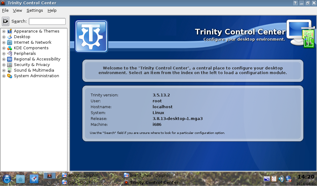
For me, the ribbon of tdeui15 looks better. I think one more small change is required for tdeui15. Alex, could you raise the "Trinity Control Center - Configure your desktop environment." text a little bit, so that it does not overlap with the ribbon, as in tdeui13? Thanks as always!
Cheers Michele
Date: Tue, 12 Aug 2014 14:13:05 +0100 From: michele.calgaro@yahoo.it To: trinity-devel@lists.pearsoncomputing.net Subject: RE: [trinity-devel] R: [trinity-devel] New TDEUI proposal
Please tell me which one you prefer: tdeui15: With E. Liddell ribbon tdeui13: With my ribbon
For me, the ribbon of tdeui15 looks better. I think one more small change is required for tdeui15. Alex, could you raise the "Trinity Control Center - Configure your desktop environment." text a little bit, so that it does not overlap with the ribbon, as in tdeui13? Thanks as always!
Cheers Michele
Here it is!
Tell me what you think! -Alexandre
Wow! Great work. Thanks to both you and E. for such big effort.
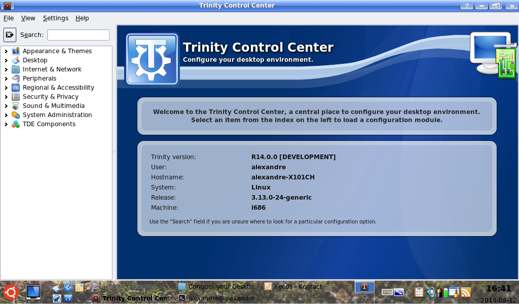
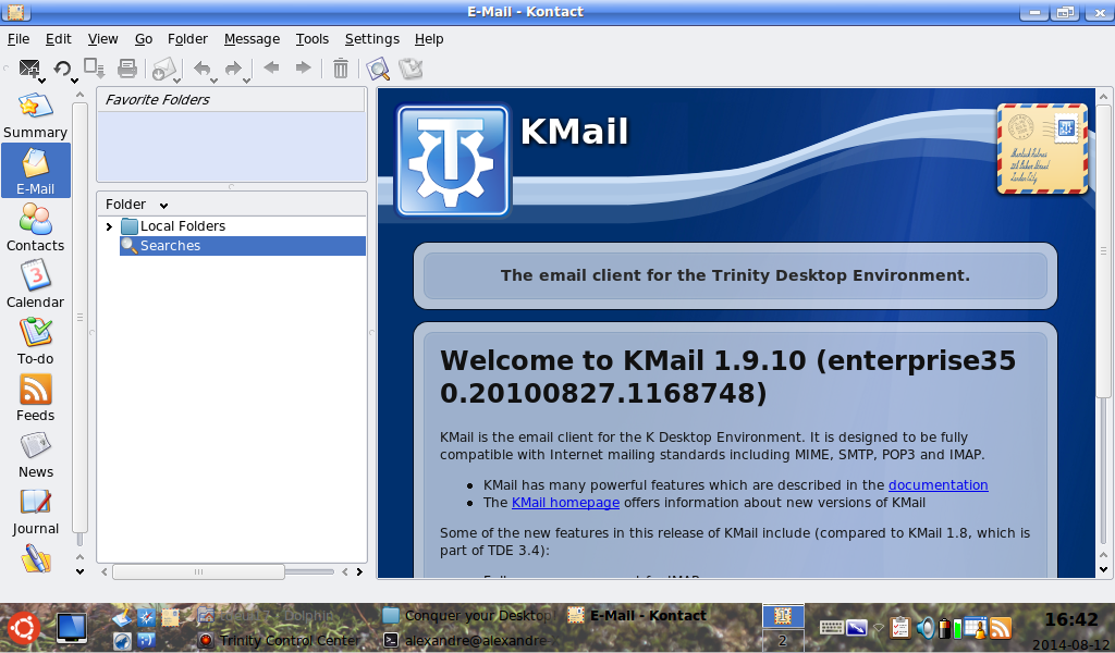
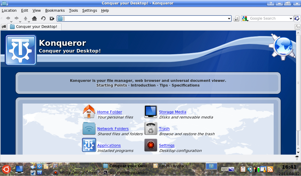
- Kmail and Akregator looks ok to me, ready to be pushed. - TDE Control Center looks good as well, but I propose we remove the dot at the end of "Configure your desktop environment". After that it should be ready to be pushed as well. - Konqueror looks good but IMO it is not fully ready. The center part has a whitish background, which somehow differs from the rest of the TDE theme. Could you try the following things? 1) using the same blueish background used in TDE Control Center? 2) using the whitish background but with rounded corners instead of 90 degree ones, so that is looks "aligned" with the borders around it.
Sorry for the continuous change requests, but since we are doing a new style let's make it as good as possible :-) Let's also see the opinions of other users.
Cheers Michele
On Wed, 13 Aug 2014 02:09:47 +0100 Michele Calgaro michele.calgaro@yahoo.it wrote:
Wow! Great work. Thanks to both you and E. for such big effort.
- Kmail and Akregator looks ok to me, ready to be pushed.
I'm not entirely pleased with the placement of the text for these--it looks like it should be moved downward a bit so that it's centered in the space between the top logo edge and the top ribbon edge. That's likely the fault of the stylesheet, though. (Yes, I'm picky. Alexandre, if you're feeling beset, feel free to ignore me.)
- Konqueror looks good but IMO it is not fully ready. The center part has a whitish background,
which somehow differs from the rest of the TDE theme.
You're talking about the "world map" graphic--it probably needs to be translucent to the same degree as the other background graphics if we want to avoid that effect.
E. Liddell
--------------------------------------------------------------------- To unsubscribe, e-mail: trinity-devel-unsubscribe@lists.pearsoncomputing.net For additional commands, e-mail: trinity-devel-help@lists.pearsoncomputing.net Read list messages on the web archive: http://trinity-devel.pearsoncomputing.net/ Please remember not to top-post: http://trinity.pearsoncomputing.net/mailing_lists/#top-posting
Trop de bulletins d’informations ? Vous pouvez résilier l’abonnement. Actions Michele Calgaro 2014-08-12 Groupes À : trinity-devel@lists.pearsoncomputing.net Wow! Great work. Thanks to both you and E. for such big effort.
- Kmail and Akregator looks ok to me, ready to be pushed. - TDE Control Center looks good as well, but I propose we remove the dot at the end of "Configure your desktop environment". After that it should be ready to be pushed as well. - Konqueror looks good but IMO it is not fully ready. The center part has a whitish background, which somehow differs from the rest of the TDE theme. Could you try the following things? 1) using the same blueish background used in TDE Control Center? 2) using the whitish background but with rounded corners instead of 90 degree ones, so that is looks "aligned" with the borders around it.
Sorry for the continuous change requests, but since we are doing a new style let's make it as good as possible :-) Let's also see the opinions of other users.
Cheers Michele
Ok, I think I'll just drop the world map for the same transparent png file as the others.
Date: Wed, 13 Aug 2014 06:55:03 -0400 From: ejlddll@googlemail.com To: trinity-devel@lists.pearsoncomputing.net Subject: Re: [trinity-devel] New TDEUI proposal
On Wed, 13 Aug 2014 02:09:47 +0100 Michele Calgaro michele.calgaro@yahoo.it wrote:
Wow! Great work. Thanks to both you and E. for such big effort.
- Kmail and Akregator looks ok to me, ready to be pushed.
I'm not entirely pleased with the placement of the text for these--it looks like it should be moved downward a bit so that it's centered in the space between the top logo edge and the top ribbon edge. That's likely the fault of the stylesheet, though. (Yes, I'm picky. Alexandre, if you're feeling beset, feel free to ignore me.)
What is doing this is that aKregator and Kmail does not have a second line of smaller text under the big title. Since these 2 apps already use a seperate set of TDEUI files, maybe we could just drop bug report 2087, so that I'll be able to center the text with a different setting for these 2 apps.
- Konqueror looks good but IMO it is not fully ready. The center part has a whitish background,
which somehow differs from the rest of the TDE theme.
You're talking about the "world map" graphic--it probably needs to be translucent to the same degree as the other background graphics if we want to avoid that effect.
Yes, I plan to either drop this background map to use the same transparent png as the other apps. Or maybe I can replace the ''water'' with the transparent png, so that only ''land'' will not be transparent?
E. Liddell
To unsubscribe, e-mail: trinity-devel-unsubscribe@lists.pearsoncomputing.net For additional commands, e-mail: trinity-devel-help@lists.pearsoncomputing.net Read list messages on the web archive: http://trinity-devel.pearsoncomputing.net/ Please remember not to top-post: http://trinity.pearsoncomputing.net/mailing_lists/#top-posting
The last one that I need to look at is KHelpCenter. But this one is different, and I don't fully understand how to do it. I am looking for the ''skeleton'' file, from where, as I understand, help files are built with. A little like the kde_infopage.css, but for the help. I have seen png files in
/opt/trinity/share/doc/tde/HTML/en/khelpcenter/common/, but I'm not sure yet what to do with it. -Alexandre
Hi,
Here is the package with everything that is needed top apply the new TDEUI on your system. If it is to be applied on a 3.5.13.2, just rename tdeui folder for kdeui and everything will work.
In this one, I replaced the world map of Konqueror by the same transparent png file of the other boxes and I better placed the text for KMail and aKregator. The background picture can be replaced with almost anything, to suit your needs and tastes.
Thank you! -Alexandre
In this one, I replaced the world map of Konqueror by the same transparent png file of the other boxes and I better placed the text for KMail and aKregator.The background picture can be replaced with almost anything, to suit your needs and tastes.
Thanks Alex, later I will test and possibly post some screenshot for everyone to see. Cheers Michele

Hi,
Here it is!
-Alexandre
tdeui13.png
I like this one best :-)
nik
Okay, still waiting for other's view on this. Would still like to have Timothy Pearson's view on this one.
Once it will be said as ''ready'', I will adapt it for the other apps using TDEUI, such as Konqueror, aKregator, Help,...
-Alexandre

On Sat, 9 Aug 2014, Alexandre wrote:
Hi,
Here it is!
-Alexandre
tdeui13.png
I like this one best :-)
nik
Okay, still waiting for other's view on this.
My view? http://en.wiktionary.org/wiki/bikeshedding
WHERE IS RELEASE 14?
Jonesy
On Saturday 09 of August 2014 18:29:39 Jonesy wrote:
On Sat, 9 Aug 2014, Alexandre wrote:
Hi,
Here it is!
-Alexandre
tdeui13.png
I like this one best :-)
nik
Okay, still waiting for other's view on this.
My view? http://en.wiktionary.org/wiki/bikeshedding
WHERE IS RELEASE 14?
Jonesy
A little exaggerated comparison. In this discussion:
+ is only a small number of discussants + talk is constructive + relatively quickly finding consensus
But I understand that you're impatient for a long-delayed R14 final release...
Tell me which one you prefer! Or if you want to submit another background, to check what it would look like.
Alex, E., good job and thanks for your contribution.
My preference is for the darker tone (tdeui3.png), but I am also fine if we end up using the lighter one. IMO, the darker one reinforces the concept that TDE is now a project on its own, no longer a mainteined KDE 3.5.x. Would it be possible to modify the "gear" symbol on the top right corner? It looks a little like we are still in 1995. Maybe we can find a better design or better symbol for it.
Thanks again and keep it up! Cheers Michele
Hi Alexandre,
On Sunday 03 August 2014 02:19:22 Alexandre wrote:
Hi everyone!
Here is a new TDEUI proposal. I propose it here, because I am not totally sure about it myself...
Tell me what you think! I am not sure on this one, so I want advices! -Alexandre
Either looks good ! Though I lean towards the first one "tdeui.png".
-
 Alexandre
 -
 Baron
Baron -
 Dr. Nikolaus Klepp
 -
 E. Liddell
 -
 Jonesy
 -
 Michele Calgaro
 -
 Slávek Banko