
-----BEGIN PGP SIGNED MESSAGE----- Hash: SHA224
Am Mittwoch, 15. Oktober 2014 schrieb Timothy Pearson:
All,
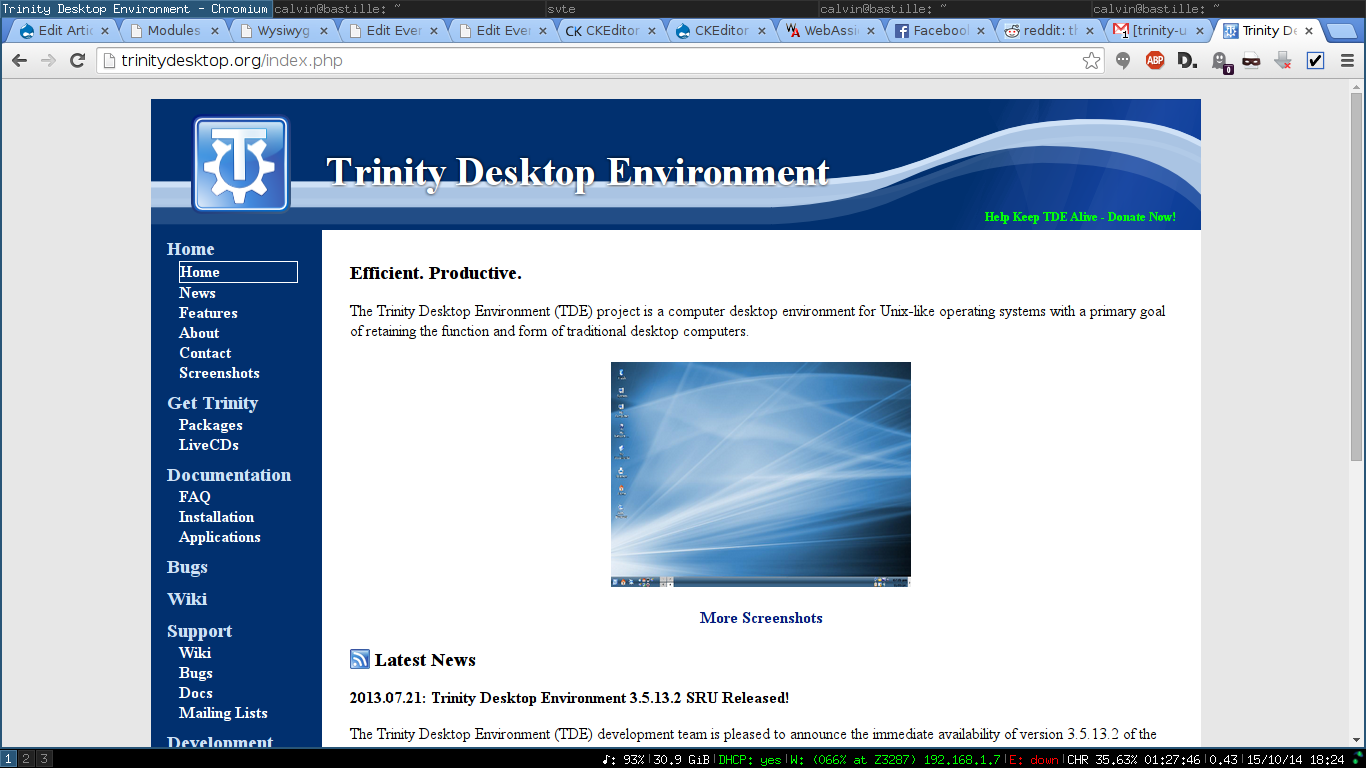
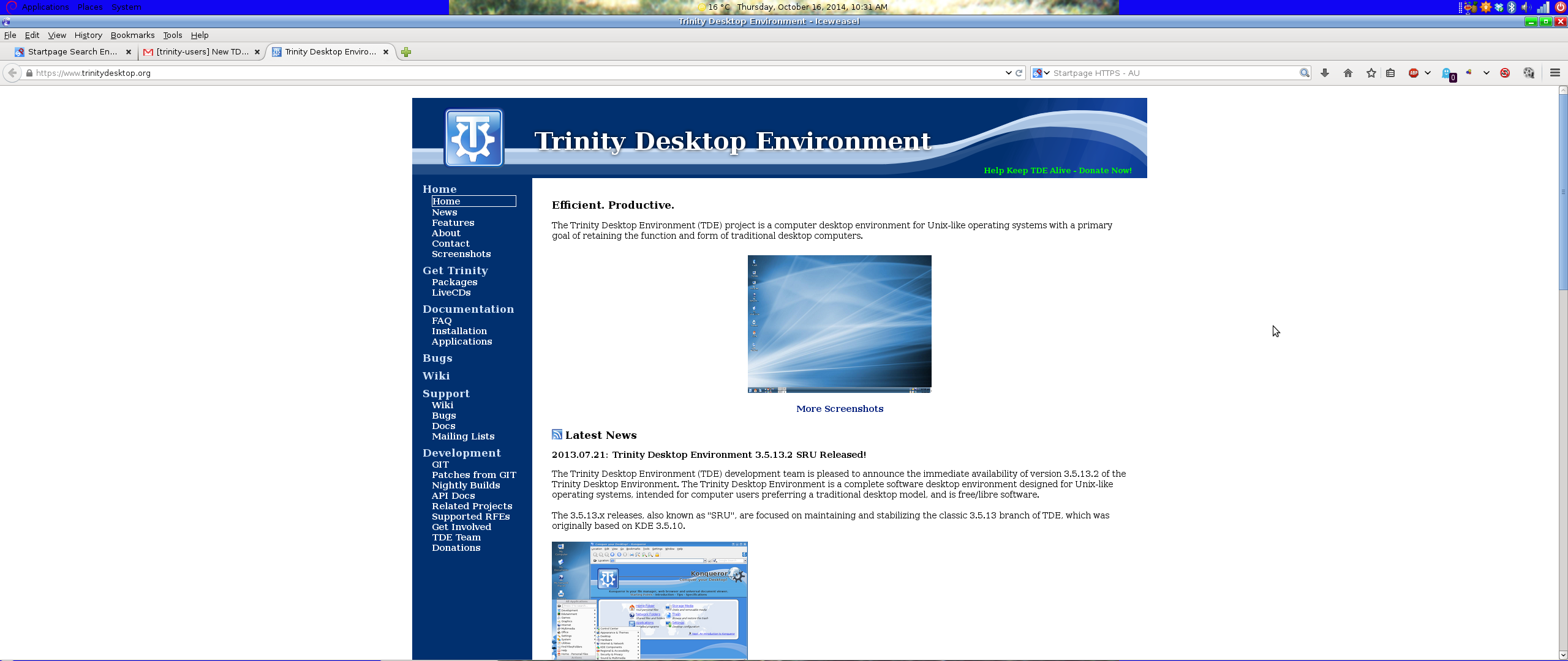
Thanks to the efforts of the TDE web development team we proudly announce the debut of our new website (https://www.trinitydesktop.org)!
The new site provides a cleaner and easier to use interface without
sacrificing availability of any information. In fact, several items were
added, including a new FAQ page and application documentation.
Additionally, per popular request we have transitioned from our old
FOSWIki installation to a new MediaWiki installation, with all old content
having been migrated over the course of several months. This should make it much easier to add new content to the TDE knowledge base.
Let us know what you think!
Timothy Pearson Trinity Desktop Project
Looks really nice in firefox, but the left menu tree breaks in konqueror
;-)
Nik
Thanks for the info; hadn't thought to check it in Konqueror.
I'm not sure I can fix it; Konqueror's broken HTML rendering is a known problem but I haven't gotten around to seeing what would be required to replace KHTML with Webkit. That process will be lengthy and won't happen for R14 in any case.
Tim

Timothy Pearson composed on 2014-10-15 14:31 (UTC-0500):
Konqueror's broken HTML rendering is a known problem but I haven't gotten around to seeing what would be required to replace KHTML with Webkit. That process will be lengthy and won't happen for R14 in any case.
Keep in mind in planning whether to replace or to provide two options as KDE4 does that KHTML is the only rendering engine that completely preserves physical units as physical units for screen display, e.g. pt, mm, cm, in, etc. Geckos can do it only via their proprietary mozmm CSS unit, making it as useless as the others except on pages specifically styled or restyled to use that unit. All engines except KHTML converted physical units into logical units to conform with the spec change from CSS2 to CSS3, losing the ability to present accurate physical sizes on desktops configured to use an accurate display density.
Example page using pt and mozmm: http://fm.no-ip.com/Auth/dpi-screen-window.html
Only those who do have physical screen density more than nominally different from 96 DPI and have X configured to match should see a difference between e.g. Chrome and Firefox or Konq configured to use KHTML. As X has forced DPI to 96 for several years, the number of people able to notice is rather small. IOW, e.g. on a 17" 1920x1200 laptop, where physical density is 133 DPI, if X is accurately configured to match 133 DPI, the difference among browsers in font sizes in both page and UI is very striking. Only in Konq & FF will the 1 inch block measure an inch with a physical ruler, and only in Konq & FF will 12pt text measure 12pt physically.
-----BEGIN PGP SIGNED MESSAGE----- Hash: SHA224
Timothy Pearson composed on 2014-10-15 14:31 (UTC-0500):
Konqueror's broken HTML rendering is a known problem but I haven't gotten around to seeing what would be required to replace KHTML with Webkit. That process will be lengthy and won't happen for R14 in any case.
Keep in mind in planning whether to replace or to provide two options as KDE4 does that KHTML is the only rendering engine that completely preserves physical units as physical units for screen display, e.g. pt, mm, cm, in, etc
<snip>
I didn't know that. Thanks for all the info!
On thinking about this further I wonder how hard it would be to replace our KHTML with KDE's KHTML. I don't want to drag in a bunch of KDE libraries but there was an effort some time ago to make certain core KDE features use less of the non-core KDE libraries.
Does anyone know the status of KHTML in KDE4? Is it just as broken as our version or has it been maintained over time? I was under the impression that KHTML had been largely abandoned but now I'm not sure...
Thanks!
Tim

On my desktop, admittedly a 29" Ultra wide screen, the content looks awkward in the middle of a lot of white space. Instead of using physical units, cm etc, I use percentages, e.g. left column 10% middle 78% right column 10% The 2% is deliberately left out to take into account screen resolutions and give things a little bit of room to adjust themselves.On this screen it appears as though the left and right white space is about 30% each.
Cheers. Michael.

Looks great so far, this definitely addresses major shortcomings of the last website (I.E the nav links never really worked out well)
Actually, you don't want to use percentages past a certain point because things tend to get very wide, and thus hard to read.
I think what would be to set the content background to white, and the background to be a subtle grey, this has the advantage of keeping things visually tight, instead of being a visual canyon. I think this is actually a bit of a problem for the news entries too, small things like a horizontal rule, or box around entries might make it more clear.
I would also recommend moving the page header into the content, and leaving the current header as 'trinity desktop' because the eyes skip over the header, assuming it doesn't change, it wasn't until i said 'these pages need headers" when I realized they were hidden what my mind took as the site logo, a static piece of content
Also, there are 2 home links. not sure why.
On 15 October 2014 17:39, Michael . keltoiboy@gmail.com wrote:
On my desktop, admittedly a 29" Ultra wide screen, the content looks awkward in the middle of a lot of white space. Instead of using physical units, cm etc, I use percentages, e.g. left column 10% middle 78% right column 10% The 2% is deliberately left out to take into account screen resolutions and give things a little bit of room to adjust themselves.On this screen it appears as though the left and right white space is about 30% each.
Cheers. Michael.
Here's an attachment with a quick css change to maybe make it less cavernous.
Anyway just some suggestions, either way looks good.
On 15 October 2014 18:26, Calvin Morrison mutantturkey@gmail.com wrote:
Looks great so far, this definitely addresses major shortcomings of the last website (I.E the nav links never really worked out well)
Actually, you don't want to use percentages past a certain point because things tend to get very wide, and thus hard to read.
I think what would be to set the content background to white, and the background to be a subtle grey, this has the advantage of keeping things visually tight, instead of being a visual canyon. I think this is actually a bit of a problem for the news entries too, small things like a horizontal rule, or box around entries might make it more clear.
I would also recommend moving the page header into the content, and leaving the current header as 'trinity desktop' because the eyes skip over the header, assuming it doesn't change, it wasn't until i said 'these pages need headers" when I realized they were hidden what my mind took as the site logo, a static piece of content
Also, there are 2 home links. not sure why.
On 15 October 2014 17:39, Michael . keltoiboy@gmail.com wrote:
On my desktop, admittedly a 29" Ultra wide screen, the content looks awkward in the middle of a lot of white space. Instead of using physical units, cm etc, I use percentages, e.g. left column 10% middle 78% right column 10% The 2% is deliberately left out to take into account screen resolutions and give things a little bit of room to adjust themselves.On this screen it appears as though the left and right white space is about 30% each.
Cheers. Michael.
-----BEGIN PGP SIGNED MESSAGE----- Hash: SHA224
Here's an attachment with a quick css change to maybe make it less cavernous.
Anyway just some suggestions, either way looks good.
Not bad; I didn't even notice the change until I read the previous messages.
If others approve I can push it up to the main site.
Tim
Just to be clear, I wouldn't suggest that exact change, but something along those lines. Focusing in on the content of the page can help users navigate longer pages more easily, after all the whole point of headers and other things are to give visual clues to the user
On 15 October 2014 18:43, Timothy Pearson kb9vqf@pearsoncomputing.net wrote:
-----BEGIN PGP SIGNED MESSAGE----- Hash: SHA224
Here's an attachment with a quick css change to maybe make it less cavernous.
Anyway just some suggestions, either way looks good.
Not bad; I didn't even notice the change until I read the previous messages.
If others approve I can push it up to the main site.
Tim -----BEGIN PGP SIGNATURE----- Version: GnuPG v1.4.9 (GNU/Linux)
iFYEARELAAYFAlQ++HkACgkQLaxZSoRZrGE3kwDfVkwYI63ia2J0K75zvRlO0et1 wnTCw4J7EuEh5QDfc23pvmG4Wm+hzBMRztpychRs/t911ijVQlc+0A== =wuHw -----END PGP SIGNATURE-----
To unsubscribe, e-mail: trinity-users-unsubscribe@lists.pearsoncomputing.net For additional commands, e-mail: trinity-users-help@lists.pearsoncomputing.net Read list messages on the web archive: http://trinity-users.pearsoncomputing.net/ Please remember not to top-post: http://trinity.pearsoncomputing.net/mailing_lists/#top-posting

On Wednesday 15 October 2014 23:43:05 Timothy Pearson wrote:
-----BEGIN PGP SIGNED MESSAGE----- Hash: SHA224
Here's an attachment with a quick css change to maybe make it less cavernous.
Anyway just some suggestions, either way looks good.
Not bad; I didn't even notice the change until I read the previous messages.
If others approve I can push it up to the main site.
I know that I am only one, but please, no! I am not the only partially sighted person in the world, but I can speak only for myself.
There are so few usable sites, becoming fewer, and I love the "cavernous" version. I was thrilled when I saw it. It is so clear and easy to see. I have been dreading change and "modernisation". As proposed, this was great.
All these decorative backgrounds make life so difficult. The new site as it is now is an improvement on the old. The proposed version is not really. It is harder to look at.
The idea of the site is surely to inform? Please *inform* as well as possible. ;-)
Lisi
-----BEGIN PGP SIGNED MESSAGE----- Hash: SHA224
On Wednesday 15 October 2014 23:43:05 Timothy Pearson wrote:
-----BEGIN PGP SIGNED MESSAGE----- Hash: SHA224
Here's an attachment with a quick css change to maybe make it less cavernous.
Anyway just some suggestions, either way looks good.
Not bad; I didn't even notice the change until I read the previous messages.
If others approve I can push it up to the main site.
I know that I am only one, but please, no! I am not the only partially sighted person in the world, but I can speak only for myself.
There are so few usable sites, becoming fewer, and I love the "cavernous" version. I was thrilled when I saw it. It is so clear and easy to see. I have been dreading change and "modernisation". As proposed, this was great.
All these decorative backgrounds make life so difficult. The new site as it is now is an improvement on the old. The proposed version is not really. It is harder to look at.
The idea of the site is surely to inform? Please *inform* as well as possible. ;-)
Lisi
Sounds good; we can keep it as-is no problem.
Tim
The advantage of percentages is they work to screen size/ resolution. Other methods don't and a site can look very different from one machine to the next.
Lisi, I understand and respect your position but knowing other people who are also partially sighted myself included, my left eye only has about 15% capability, I am also speaking for myself from experience.
This screenshot is just awkward. I have a widescreen to make things easy for me, and others who use it, so much "vacant land" so to speak with everything jammed in one segment doesn't make things easy for some people.
I made a suggestion I won't fuss on about it any further.
Cheers. Michael.
Michael . composed on 2014-10-16 10:45 (UTC+1100):
a site can look very different from one machine to the next.
That's a good thing. A standard and necessary web browser feature is accommodation of source to environment. Appropriate font and viewport sizes vary all over the place according to user needs, hardware, and available space. Looking "the same" would only be good from one designer's perspective, because not everyone who sees at all sees everything the same.
-----BEGIN PGP SIGNED MESSAGE----- Hash: SHA224
The advantage of percentages is they work to screen size/ resolution. Other methods don't and a site can look very different from one machine to the next.
Lisi, I understand and respect your position but knowing other people who are also partially sighted myself included, my left eye only has about 15% capability, I am also speaking for myself from experience.
This screenshot is just awkward. I have a widescreen to make things easy for me, and others who use it, so much "vacant land" so to speak with everything jammed in one segment doesn't make things easy for some people.
I made a suggestion I won't fuss on about it any further.
Cheers. Michael.
Yeah it is pretty bad, trouble is I don't know what to do about it. I'm also not sure why it is coming out that way in the first place; on my system (granted not ultra-widescreen but still 16:9) I only have a tiny white border.
Tim

On 10/15/2014 05:15 PM, Timothy Pearson wrote:
Yeah it is pretty bad, trouble is I don't know what to do about it. I'm also not sure why it is coming out that way in the first place; on my system (granted not ultra-widescreen but still 16:9) I only have a tiny white border.
Michael's screenshot is 2560 pixels wide. The best solution is for those with screens that wide to simply make their browser window a little narrower if they don't want to look at all the empty white space. They can't reasonably expect every website to render perfectly at that kind of screen width.
Meh,
A lot of knee jerk reactions in the thread which is sad. One purpose of setting a dark (no not a flashing GIF as lisi slippery-sloped me into earlier) is to give the page more of a "piece of paper" feeling. With a darker background, a crazy wide monitor the site focuses the user on the contents of the page, and on a narrower monitor it will just barely show up, or not at all.
About a year ago I developed a queryable database for biologists, and I used this method, a fixed width, and a clear 'page' to it. I think it looks good, is extremely functional, and isn't full any modern design
http://pogo.ece.drexel.edu/about.php
I was alluding to something along the lines of that website.
On 15 October 2014 20:38, Dan Youngquist dan@homestead-products.com wrote:
On 10/15/2014 05:15 PM, Timothy Pearson wrote:
Yeah it is pretty bad, trouble is I don't know what to do about it. I'm also not sure why it is coming out that way in the first place; on my system (granted not ultra-widescreen but still 16:9) I only have a tiny white border.
Michael's screenshot is 2560 pixels wide. The best solution is for those with screens that wide to simply make their browser window a little narrower if they don't want to look at all the empty white space. They can't reasonably expect every website to render perfectly at that kind of screen width.
-- PGP key: http://homestead-products.com/pubkey.htm
To unsubscribe, e-mail: trinity-users-unsubscribe@lists.pearsoncomputing.net For additional commands, e-mail: trinity-users-help@lists.pearsoncomputing.net Read list messages on the web archive: http://trinity-users.pearsoncomputing.net/ Please remember not to top-post: http://trinity.pearsoncomputing.net/mailing_lists/#top-posting
-----BEGIN PGP SIGNED MESSAGE----- Hash: SHA224
Meh,
A lot of knee jerk reactions in the thread which is sad. One purpose of setting a dark (no not a flashing GIF as lisi slippery-sloped me into earlier) is to give the page more of a "piece of paper" feeling. With a darker background, a crazy wide monitor the site focuses the user on the contents of the page, and on a narrower monitor it will just barely show up, or not at all.
Personally I don't see a problem; I asked for opinions and got them, a wide range of them but all favorable towards the new design. Now we're just hashing out how best to handle a > 2000 pixel corner case.
I wasn't fully paying attention in my last couple of replies (long day here), so sorry for swinging one direction and then another so suddenly.
About a year ago I developed a queryable database for biologists, and I used this method, a fixed width, and a clear 'page' to it. I think it looks good, is extremely functional, and isn't full any modern design
Hey, that page looks somewhat familiar! I don't know if a similar visual "de-accentuation" would help or hinder the current site though; I am leaning toward the latter but not sure.
In any case I think the more pressing concern is fixing the news article segmentation; it could use some work. This is best done on the dev site so as not to disturb production until the design is finalized.
Tim
Timothy Pearson composed on 2014-10-15 20:49 (UTC-0500):
Personally I don't see a problem; I asked for opinions and got them, a wide range of them but all favorable towards the new design. Now we're just hashing out how best to handle a > 2000 pixel corner case.
Summary:
Thinking in pixels is absolutely the wrong thing to do in web styling. It's why there's so much difficulty using the web, why people routinely use zoom and other browser defense mechanisms.
Saying 2560 resolution is "wide" doesn't mean anything without knowing whether the text size used on it can only fit 15 words (roughly twice optimal line length) or has room for 30 words (way too long for comfortable reading[1]). Setting a paragraph max-width in em (or rem) would be exactly the right thing to do here.
Details:
2560 wide on a 40" screen is very much different than 2560 wide on a 27" screen. Without knowing how tightly the pixels are packed, they have no correlation to physical size, much less to whatever physical sizes are appropriate to the user and his environment, how many pixels it takes to render a comfortably sized glyph. Even if you knew the physical size, you still would have no clue to viewing distance, or visual acuity of the user.
2560x1440 on 27" packs them into a space 597mm wide by 336mm high, 2010 sq cm. 2560x1440 on 40" is 885mm wide by 498mm high, and 4411 sq cm, 219% of the space of 27" even though only 148% of its height or width.
Luckily, you don't need to care about resolution, or density. Computers deal with that automatically, so let them. As designer all you need to or should care about is the relationships between the page's parts. While you could do that in pixels, they do not adapt to user requirements. In fact, pixels wholly and utterly disregard them.
Instead, you can use rem and/or em units, the size of letter glyphs. If it's easier on you to visualize, convert the letters to words (increases required math, but it works on the same principles). You could use %, but that too has no predictable relationship to physical size, only to available space.
IOW, think how many letters tall, or how many words wide should a space be. If you want a left side menu block to fit 20 letters, make it that many letters wide (~10rem, because letters average half the width of the height that equates to a CSS "size"). If you want a paragraph to be no more than 14 words wide, decide how many letters in your average words (e.g. 6), multiply by 14 (84), then divide by 2 (half height equals average width), and you get 42em for max-width. Let the computer figure out how many pixels that requires based on however many the browser has had its default size set to to make the default the user's optimal reading size.
The new site already has the basics right by respecting the user's default text size. It just could a bit of restraint so that people looking at higher density screens than average get to see things in reasonable (and similar) proportions instead of seeing masses of empty space if they fullscreen their browsers. Saying 2560 resolution is "wide" doesn't mean anything without knowing whether the text size used on it can only fit 15 words (roughly twice optimal line length) or has room for 30 words (way too long for comfortable reading). Setting a paragraph max-width in rem would be exactly the right thing to do here.
[1] see e.g. http://baymard.com/blog/line-length-readability

On Thursday 16 October 2014, Calvin Morrison wrote:
About a year ago I developed a queryable database for biologists, and I used this method, a fixed width, and a clear 'page' to it. I think it looks good, is extremely functional, and isn't full any modern design
Sorry to disagree about functionality of fixed width sites. If you reduce the browser's to a size smaller than the width of the site, you have to scroll all the way through the text. If I work on my Netbook I hate sites that do not reformat the text for a smaller screen and I have to scroll back and for to read through the text.
I could see the benefit for wide screens though. I do not know if there is a possibility to say "not bigger than max width" but reformat if screen is smaller. Might be a compromize.
Just my 2 cent Gerhard
I have done some work on the home page and css file.So far it works beautifully on my laptop and also on my desktop. I can reduce the width on my desktop and the page reformats itself accordingly.
There are 2 issues, 1 of which is on the original page as well. 1. As you scroll down the page there is a huge amount of white space at the bottom. It appears to be bigger than the textblock. I think I know what is causing this and will sort it out tomorrow. 2. The banner at the top. When I saved the site to my laptop it mustn't have save all the pictures used in the logo. I am missing the flat tri colour stripe but have the wavy part. Without the flat part the tri colour doesn't go right across the top section.
Apart from those two issues and a little tidying up everything is done. I will finish the tidying up tomorrow and either post it as a screen shot or post a link to my dropbox for people to peruse at their leisure.
Cheers. Michael.
On 16 October 2014 18:27, Gerhard Zintel gerhard.zintel@mrs-thomas.de wrote:
On Thursday 16 October 2014, Calvin Morrison wrote:
About a year ago I developed a queryable database for biologists, and I used this method, a fixed width, and a clear 'page' to it. I think it
looks
good, is extremely functional, and isn't full any modern design
Sorry to disagree about functionality of fixed width sites. If you reduce the browser's to a size smaller than the width of the site, you have to scroll all the way through the text. If I work on my Netbook I hate sites that do not reformat the text for a smaller screen and I have to scroll back and for to read through the text.
I could see the benefit for wide screens though. I do not know if there is a possibility to say "not bigger than max width" but reformat if screen is smaller. Might be a compromize.
Just my 2 cent Gerhard
To unsubscribe, e-mail: trinity-users-unsubscribe@lists.pearsoncomputing.net For additional commands, e-mail: trinity-users-help@lists.pearsoncomputing.net Read list messages on the web archive: http://trinity-users.pearsoncomputing.net/ Please remember not to top-post: http://trinity.pearsoncomputing.net/mailing_lists/#top-posting

On Thu, 16 Oct 2014 19:38:18 +1100 "Michael ." keltoiboy@gmail.com wrote:
I have done some work on the home page and css file.So far it works beautifully on my laptop and also on my desktop. I can reduce the width on my desktop and the page reformats itself accordingly.
There are 2 issues, 1 of which is on the original page as well.
- As you scroll down the page there is a huge amount of white space at the
bottom. It appears to be bigger than the textblock. I think I know what is causing this and will sort it out tomorrow.
It's an error in the CSS definition for #sidetext. You want to reduce the height to match #sidebar.
- The banner at the top. When I saved the site to my laptop it mustn't
have save all the pictures used in the logo. I am missing the flat tri colour stripe but have the wavy part. Without the flat part the tri colour doesn't go right across the top section.
In the attachment.
Apart from those two issues and a little tidying up everything is done. I will finish the tidying up tomorrow and either post it as a screen shot or post a link to my dropbox for people to peruse at their leisure.
I'd prefer to be able to play with the actual page, for multi-browser testing purposes.
(Hi, I'm the main designer for the site as it stands. I'm sorry it didn't work out so well for large widescreens--I have an old and rather smallish main monitor, for complicated reasons involving a 486 desktop that was still in service until about a year ago.)
E. Liddell
On Thursday 16 October 2014 12:39:22 E. Liddell wrote:
Hi, I'm the main designer for the site as it stands.
Try to persuade Waitrose to give you a job. I love your site - and I have to manage to buy my groceries every week from Waitrose. :-( (Their site is one of my pet bugbears.)
It is so refreshing to meet a site that seems to have a priority of giving information. If I want "pretty" I'll go to KDE-look.org and chose a new screensaver or background. And anyway, I think that it looks nice.
But then I like things to look functional. Compare Brunel's beautiful suspension bridge at Clifton 1), designed by an engineer to work, with the Millennium bridge 2), designed by an architect to look nice. It doesn't look nice, and when people first crossed it, it swayed.
Thank you very much for your site. I hope that we are going to be allowed to keep it!
Lisi 1) https://www.google.co.uk/search?q=clifton+suspension+bridge&es_sm=93&... 2) https://www.google.co.uk/search?q=millennium+bridge+london&es_sm=93&...
Hi E. Liddell
1. Thanks for that, it was bed time for me last night so I didn't keep looking
2.Thanks for the attachment.
3. I'm testing it in Iceweasel and Chromium
4. I understand not everyone has a wide screen. My previous screen was a 15" CRT that I had owned for nearly 20 years. I bought this one cause it makes life easier.
I'll continue working on it a bit later today, please understand I'm not wanting to step on your toes I just want to help TDE gain as wide an audience as possible.
Cheers. Michael.
On 16 October 2014 22:39, E. Liddell ejlddll@googlemail.com wrote:
On Thu, 16 Oct 2014 19:38:18 +1100 "Michael ." keltoiboy@gmail.com wrote:
I have done some work on the home page and css file.So far it works beautifully on my laptop and also on my desktop. I can reduce the width on my desktop and the page reformats itself accordingly.
There are 2 issues, 1 of which is on the original page as well.
- As you scroll down the page there is a huge amount of white space at
the
bottom. It appears to be bigger than the textblock. I think I know what is causing this and will sort it out tomorrow.
It's an error in the CSS definition for #sidetext. You want to reduce the height to match #sidebar.
- The banner at the top. When I saved the site to my laptop it mustn't
have save all the pictures used in the logo. I am missing the flat tri colour stripe but have the wavy part. Without the flat part the tri
colour
doesn't go right across the top section.
In the attachment.
Apart from those two issues and a little tidying up everything is done. I will finish the tidying up tomorrow and either post it as a screen shot
or
post a link to my dropbox for people to peruse at their leisure.
I'd prefer to be able to play with the actual page, for multi-browser testing purposes.
(Hi, I'm the main designer for the site as it stands. I'm sorry it didn't work out so well for large widescreens--I have an old and rather smallish main monitor, for complicated reasons involving a 486 desktop that was still in service until about a year ago.)
E. Liddell
To unsubscribe, e-mail: trinity-users-unsubscribe@lists.pearsoncomputing.net For additional commands, e-mail: trinity-users-help@lists.pearsoncomputing.net Read list messages on the web archive: http://trinity-users.pearsoncomputing.net/ Please remember not to top-post: http://trinity.pearsoncomputing.net/mailing_lists/#top-posting
-----BEGIN PGP SIGNED MESSAGE----- Hash: SHA224
Hi E. Liddell
- Thanks for that, it was bed time for me last night so I didn't keep
looking
2.Thanks for the attachment.
I'm testing it in Iceweasel and Chromium
I understand not everyone has a wide screen. My previous screen was a
15" CRT that I had owned for nearly 20 years. I bought this one cause it makes life easier.
I'll continue working on it a bit later today, please understand I'm not wanting to step on your toes I just want to help TDE gain as wide an audience as possible.
Cheers. Michael.
Please do work on it; this project is supposed to be about getting to the best solution even if some toes are stepped on in the process. I draw the line at personal insults/attacks/etc, but other than that it's best to keep the arguments here instead of obliviously releasing a bad product and having the criticisms all show up on various news sites and comment boards. :-)
Tim

On Thu, 16 Oct 2014, Gerhard Zintel wrote:
On Thursday 16 October 2014, Calvin Morrison wrote:
About a year ago I developed a queryable database for biologists, and I used this method, a fixed width, and a clear 'page' to it. I think it looks good, is extremely functional, and isn't full any modern design
Sorry to disagree about functionality of fixed width sites. If you reduce the browser's to a size smaller than the width of the site, you have to scroll all the way through the text. If I work on my Netbook I hate sites that do not reformat the text for a smaller screen and I have to scroll back and for to read through the text.
I could see the benefit for wide screens though. I do not know if there is a possibility to say "not bigger than max width" but reformat if screen is smaller. Might be a compromize.
Just my 2 cent Gerhard
I 100% agree as I don't have a big screen and don't want one. (I don't even like the larger smartphones!)
it's nice not to have to scroll around to see a site.
F.
That's a common misconception that sites designed to suit big screens make you scroll around if you're on a smaller screen. 2 facts need to be understood. 1. It is the amount of content on a page that makes users scroll around. 2. Using percentages makes the page adjust itself on difference resolutions and screen sizes. If you use a fixed width and someone on a small screen has to scroll around because there is so much content then so does someone with a larger screen. You saw my screenshot The exact same content, not the same look is on my laptop. I have to scroll on both screens but it would be nice if I didn't have to on my desktop because of design features. If you use % then the page adapts itself to suit the screen. If you don't want to scroll around the only solution is less information on each page.
On 17 October 2014 00:09, Felmon Davis davisf@union.edu wrote:
On Thu, 16 Oct 2014, Gerhard Zintel wrote:
On Thursday 16 October 2014, Calvin Morrison wrote:
About a year ago I developed a queryable database for biologists, and I used this method, a fixed width, and a clear 'page' to it. I think it looks good, is extremely functional, and isn't full any modern design
Sorry to disagree about functionality of fixed width sites. If you reduce the browser's to a size smaller than the width of the site, you have to scroll all the way through the text. If I work on my Netbook I hate sites that do not reformat the text for a smaller screen and I have to scroll back and for to read through the text.
I could see the benefit for wide screens though. I do not know if there is a possibility to say "not bigger than max width" but reformat if screen is smaller. Might be a compromize.
Just my 2 cent Gerhard
I 100% agree as I don't have a big screen and don't want one. (I don't even like the larger smartphones!)
it's nice not to have to scroll around to see a site.
F.
-- Felmon Davis
Somehow I reached excess without ever noticing when I was passing through satisfaction. -- Ashleigh Brilliant
To unsubscribe, e-mail: trinity-users-unsubscribe@ lists.pearsoncomputing.net For additional commands, e-mail: trinity-users-help@lists. pearsoncomputing.net Read list messages on the web archive: http://trinity-users. pearsoncomputing.net/ Please remember not to top-post: http://trinity. pearsoncomputing.net/mailing_lists/#top-posting

On Friday 17 October 2014 00:19:41 Michael . wrote:
That's a common misconception that sites designed to suit big screens make you scroll around if you're on a smaller screen. 2 facts need to be understood.
- It is the amount of content on a page that makes users scroll around.
- Using percentages makes the page adjust itself on difference resolutions
and screen sizes.
Well, it was invented a concept known as "responsive web design".
http://en.wikipedia.org/wiki/Responsive_web_design
A very good framework for a responsive website is Twitter's Bootstrap:
Apart from 1 unit at university on basic Xhtml and css I am self taught. At uni we were never told of RWD, I enjoyed the unit but it seemed to lack content so I never went any further at uni, I am grateful for the links you provided.
On 17 October 2014 08:25, Serghei Amelian serghei@thel.ro wrote:
On Friday 17 October 2014 00:19:41 Michael . wrote:
That's a common misconception that sites designed to suit big screens
make
you scroll around if you're on a smaller screen. 2 facts need to be understood.
- It is the amount of content on a page that makes users scroll around.
- Using percentages makes the page adjust itself on difference
resolutions
and screen sizes.
Well, it was invented a concept known as "responsive web design".
http://en.wikipedia.org/wiki/Responsive_web_design
A very good framework for a responsive website is Twitter's Bootstrap:
-- Serghei
To unsubscribe, e-mail: trinity-users-unsubscribe@lists.pearsoncomputing.net For additional commands, e-mail: trinity-users-help@lists.pearsoncomputing.net Read list messages on the web archive: http://trinity-users.pearsoncomputing.net/ Please remember not to top-post: http://trinity.pearsoncomputing.net/mailing_lists/#top-posting
On Thursday 16 October 2014, Michael . wrote:
That's a common misconception that sites designed to suit big screens make you scroll around if you're on a smaller screen. 2 facts need to be understood.
- It is the amount of content on a page that makes users scroll around.
- Using percentages makes the page adjust itself on difference resolutions
and screen sizes. If you use a fixed width and someone on a small screen has to scroll around because there is so much content then so does someone with a larger screen. You saw my screenshot The exact same content, not the same look is on my laptop. I have to scroll on both screens but it would be nice if I didn't have to on my desktop because of design features. If you use % then the page adapts itself to suit the screen. If you don't want to scroll around the only solution is less information on each page.
I might have misunderstood parts, I'm no native speaker. Only for clarification. There is no problem scrolling up and down - the mouse wheel works well for that. Problem is if have to scroll left and right. This should not happen.
Gerhard
-----BEGIN PGP SIGNED MESSAGE----- Hash: SHA224
On Thursday 16 October 2014, Michael . wrote:
That's a common misconception that sites designed to suit big screens make you scroll around if you're on a smaller screen. 2 facts need to be understood.
- It is the amount of content on a page that makes users scroll around.
- Using percentages makes the page adjust itself on difference
resolutions and screen sizes. If you use a fixed width and someone on a small screen has to scroll around because there is so much content then so does someone with a larger screen. You saw my screenshot The exact same content, not the same look is on my laptop. I have to scroll on both screens but it would be nice if I didn't have to on my desktop because of design features. If you use % then the page adapts itself to suit the screen. If you don't want to scroll around the only solution is less information on each page.
I might have misunderstood parts, I'm no native speaker. Only for clarification. There is no problem scrolling up and down - the mouse wheel works well for that. Problem is if have to scroll left and right. This should not happen.
Gerhard
You stated your point clearly, and I agree with it. The basic functionality you describe has been available since the dawn of the Internet; modern designs should not interfere with it (within limits of course; at some point the graphics won't allow the page to compress any further horizontally--the current page reaches this point at around 600 pixels wide, which is fine as far as I am concerned).
Tim
Sorry Gerhard I misunderstood your point. Scrolling sideways should never happen on a well designed page regardless of screen size and resolution (800x600 being the lower limit). After 800x600 you are getting into mobile device territory and I have no experience with design for them yet.
Thanks Lou I misunderstood.
I must go and get some work done outside, I'll post back when I have more done on the page and css.
Cheers.
On 17 October 2014 08:35, Timothy Pearson kb9vqf@pearsoncomputing.net wrote:
-----BEGIN PGP SIGNED MESSAGE----- Hash: SHA224
On Thursday 16 October 2014, Michael . wrote:
That's a common misconception that sites designed to suit big screens make you scroll around if you're on a smaller screen. 2 facts need to be understood.
- It is the amount of content on a page that makes users scroll around.
- Using percentages makes the page adjust itself on difference
resolutions and screen sizes. If you use a fixed width and someone on a small screen has to scroll around because there is so much content then so does someone with a larger screen. You saw my screenshot The exact same content, not the same look is on my laptop. I have to scroll on both screens but it would be nice if I didn't have to on my desktop because of design features. If you use % then the page adapts itself to suit the screen. If you don't want to scroll around the only solution is less information on each page.
I might have misunderstood parts, I'm no native speaker. Only for clarification. There is no problem scrolling up and down - the mouse
wheel
works well for that. Problem is if have to scroll left and right. This should not happen.
Gerhard
You stated your point clearly, and I agree with it. The basic functionality you describe has been available since the dawn of the Internet; modern designs should not interfere with it (within limits of course; at some point the graphics won't allow the page to compress any further horizontally--the current page reaches this point at around 600 pixels wide, which is fine as far as I am concerned).
Tim -----BEGIN PGP SIGNATURE----- Version: GnuPG v1.4.9 (GNU/Linux)
iFYEARELAAYFAlRAOj0ACgkQLaxZSoRZrGFpHgDggkouMy2XmckaXK7XSBJQGzkH Y+kJ3TZe3GyDfADePsuPHB0v6JBTD9hvDd3eEmpOFYsM4Vsg2ptDhA== =3qkL -----END PGP SIGNATURE-----
To unsubscribe, e-mail: trinity-users-unsubscribe@lists.pearsoncomputing.net For additional commands, e-mail: trinity-users-help@lists.pearsoncomputing.net Read list messages on the web archive: http://trinity-users.pearsoncomputing.net/ Please remember not to top-post: http://trinity.pearsoncomputing.net/mailing_lists/#top-posting

On Thursday 16 October 2014 22:19:41 Michael . wrote:
That's a common misconception that sites designed to suit big screens make you scroll around if you're on a smaller screen. 2 facts need to be understood.
- It is the amount of content on a page that makes users scroll around.
- Using percentages makes the page adjust itself on difference resolutions
and screen sizes. If you use a fixed width and someone on a small screen has to scroll around because there is so much content then so does someone with a larger screen. You saw my screenshot The exact same content, not the same look is on my laptop. I have to scroll on both screens but it would be nice if I didn't have to on my desktop because of design features. If you use % then the page adapts itself to suit the screen. If you don't want to scroll around the only solution is less information on each page.
I think they are referring to having to scroll HORIZONTALLY because of the bad design.
Lou
I could see the benefit for wide screens though. I do not know if there is a possibility to say "not bigger than max width" but reformat if screen is smaller. Might be a compromize.
Of course there is a way to do it. It is standard CSS and is relatively
easy to apply using media queries. Knowing that this is not only possible, but pretty easy, do you still disagree with the functionality of fixed width sites? The whole purpose of 'responsive designs' is so that one site can be used across many devices with only some changes to css.
On Thursday 16 October 2014, Calvin Morrison wrote:
I could see the benefit for wide screens though. I do not know if there is a possibility to say "not bigger than max width" but reformat if screen is smaller. Might be a compromize.
Of course there is a way to do it. It is standard CSS and is relatively
easy to apply using media queries. Knowing that this is not only possible, but pretty easy, do you still disagree with the functionality of fixed width sites? The whole purpose of 'responsive designs' is so that one site can be used across many devices with only some changes to css.
My comment was triggered by looking at your mentioned example
I'm not happy with those kind of sites using with smaller screens. I totally agree that having a maximum width could be of benefit depending on the content. But it should reformat at smaller sizes. If this is possible I'm fully satisfied.
Gerhard
Trinity must truly be part of the .1% because 99.9% of web users have screen resolutions at least width of 1024
On 16 October 2014 14:38, Gerhard Zintel gerhard.zintel@mrs-thomas.de wrote:
On Thursday 16 October 2014, Calvin Morrison wrote:
I could see the benefit for wide screens though. I do not know if
there is
a possibility to say "not bigger than max width" but reformat if
screen is
smaller. Might be a compromize.
Of course there is a way to do it. It is standard CSS and is relatively
easy to apply using media queries. Knowing that this is not only
possible,
but pretty easy, do you still disagree with the functionality of fixed width sites? The whole purpose of 'responsive designs' is so that one
site
can be used across many devices with only some changes to css.
My comment was triggered by looking at your mentioned example
I'm not happy with those kind of sites using with smaller screens. I totally agree that having a maximum width could be of benefit depending on the content. But it should reformat at smaller sizes. If this is possible I'm fully satisfied.
Gerhard
To unsubscribe, e-mail: trinity-users-unsubscribe@lists.pearsoncomputing.net For additional commands, e-mail: trinity-users-help@lists.pearsoncomputing.net Read list messages on the web archive: http://trinity-users.pearsoncomputing.net/ Please remember not to top-post: http://trinity.pearsoncomputing.net/mailing_lists/#top-posting
-----BEGIN PGP SIGNED MESSAGE----- Hash: SHA224
Trinity must truly be part of the .1% because 99.9% of web users have screen resolutions at least width of 1024
Careful...this sounds just a tad insulting.
As mentioned on-list even though the *screen* is bigger than 1024 pixels wide doesn't mean the *browser* is set to that width. This is after all a true windowing system that can have many restored windows of different sizes (unlike "Window 8" ;-)).
You are also forgetting those of us who have mobile devices; while I wouldn't dream of doing real intensive work on them I do from time to time load up a Web page to check something or other. I detest the pages that make me scroll back and forth every line to read text (Weather Underground classic scientific forecaster discussion, I'm looking at you!)
Please try to be civil. TDE is actually quite large, and as open source projects go fairly healthy. So we're not the size of KDE or Gnome, so what?
Tim

On Thursday 16 of October 2014 20:59:51 Timothy Pearson wrote:
Careful...this sounds just a tad insulting.
As mentioned on-list even though the *screen* is bigger than 1024 pixels wide doesn't mean the *browser* is set to that width. This is after all a true windowing system that can have many restored windows of different sizes (unlike "Window 8" ;-)).
You are also forgetting those of us who have mobile devices; while I wouldn't dream of doing real intensive work on them I do from time to time load up a Web page to check something or other. I detest the pages that make me scroll back and forth every line to read text (Weather Underground classic scientific forecaster discussion, I'm looking at you!)
Please try to be civil. TDE is actually quite large, and as open source projects go fairly healthy. So we're not the size of KDE or Gnome, so what?
I can confirm - I usually have a screen resolution of at least 1024, but very very rarely I have windows maximized. In fact, I consider maximizing windows as sickness :) That's why I do not like sites that compels me to maximize window just because they can not adapt to a smaller size.
Likewise seems to me silly when page limits its width instead make full use of the window size. It is the only user who can influence to the width of the browser window. And look silly if it remains, for example, 40% of the width on white background because the author decide greater width as inappropriate. Only if the page can adjust by the width of the window, allows for all users to view a page as it suits exactly for them. Otherwise, always will be someone for whom causes discomfort.
On 16 October 2014 11:38, Dan Youngquist dan@homestead-products.com wrote:
Michael's screenshot is 2560 pixels wide. The best solution is for those with screens that wide to simply make their browser window a little narrower if they don't want to look at all the empty white space. They can't reasonably expect every website to render perfectly at that kind of screen width.
I can work with Iceweasel and LibreOffice open side by side but that does
not change the perspective of what is on the screen by much. I don't expect anything to change for my benefit and I don't believe my comments indicate unreasonable expectations. Timothy asked for opinions and I voiced mine.
Timothy if it's ok with you I'd like to play with this, would you mind sharing the code for the site?
Cheers. Michael.
-----BEGIN PGP SIGNED MESSAGE----- Hash: SHA224
On 16 October 2014 11:38, Dan Youngquist dan@homestead-products.com wrote:
Michael's screenshot is 2560 pixels wide. The best solution is for those with screens that wide to simply make their browser window a little narrower if they don't want to look at all the empty white space. They can't reasonably expect every website to render perfectly at that kind of screen width.
I can work with Iceweasel and LibreOffice open side by side but that does
not change the perspective of what is on the screen by much. I don't expect anything to change for my benefit and I don't believe my comments indicate unreasonable expectations. Timothy asked for opinions and I voiced mine.
Timothy if it's ok with you I'd like to play with this, would you mind sharing the code for the site?
Cheers. Michael.
Well, you can get what you need to fiddle with it by just saving the home page to your local machine. There is one CSS file that controls the styles; edit it and the HTML to taste and share what you come up with.
Thanks!
Tim

In the Wiki section, the items under "Main site" on the left hand side menu still points to the development version site. Need to be updated to point to the public TDE site.
Cheers Michele
-----BEGIN PGP SIGNED MESSAGE----- Hash: SHA224
In the Wiki section, the items under "Main site" on the left hand side menu still points to the development version site. Need to be updated to point to the public TDE site.
Cheers Michele
Fixed.
Thanks for the heads up!
Tim
-
 Calvin Morrison
 -
 Dan Youngquist
 -
 E. Liddell
 -
 Felix Miata
 -
 Felmon Davis
 -
 Gerhard Zintel
 -
 Lisi Reisz
 -
 Lou Gogan
 -
 Michael .
 -
 Michele Calgaro
 -
 Serghei Amelian
 -
 Slávek Banko
 -
 Timothy Pearson