
-----BEGIN PGP SIGNED MESSAGE----- Hash: SHA224
All,
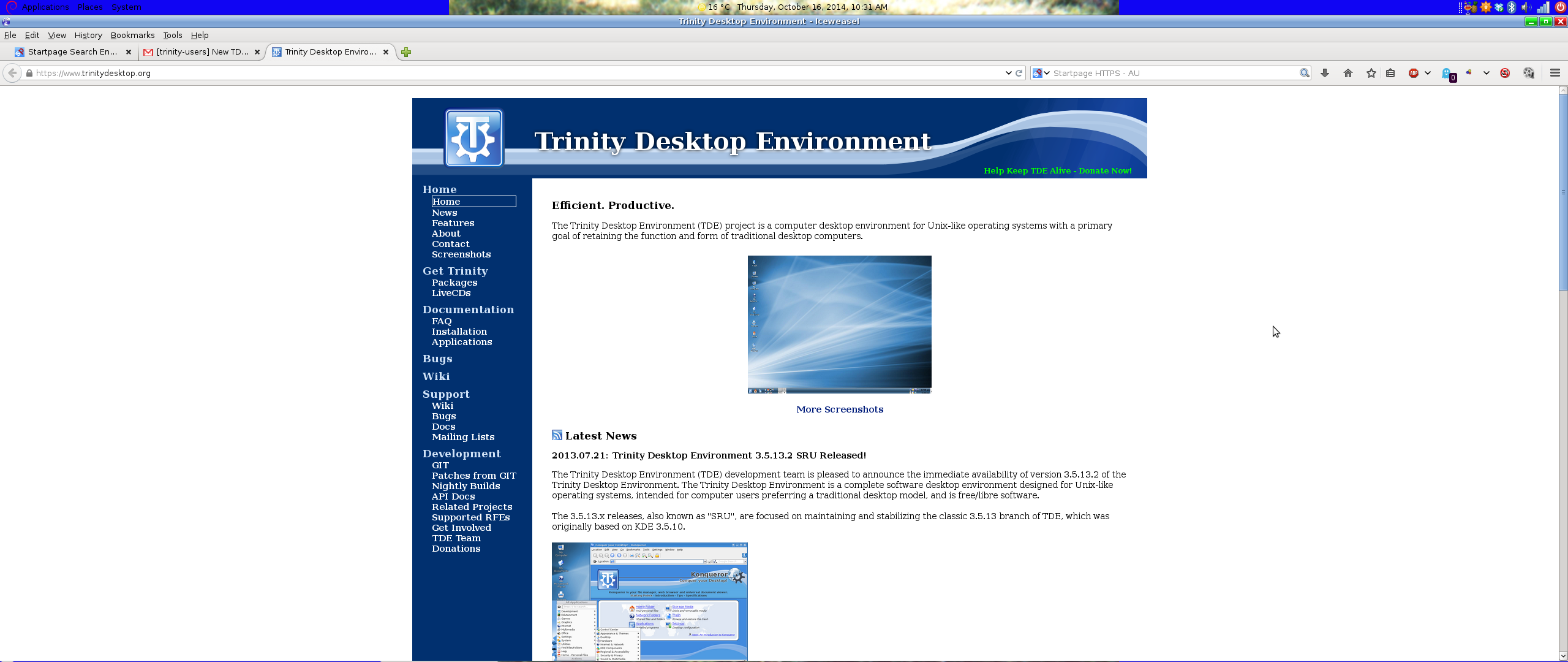
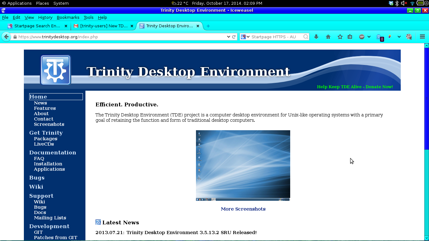
Thanks to the efforts of the TDE web development team we proudly announce the debut of our new website (https://www.trinitydesktop.org)!
The new site provides a cleaner and easier to use interface without sacrificing availability of any information. In fact, several items were added, including a new FAQ page and application documentation.
Additionally, per popular request we have transitioned from our old FOSWIki installation to a new MediaWiki installation, with all old content having been migrated over the course of several months. This should make it much easier to add new content to the TDE knowledge base.
Let us know what you think!
Timothy Pearson Trinity Desktop Project

Am Mittwoch, 15. Oktober 2014 schrieb Timothy Pearson:
All,
Thanks to the efforts of the TDE web development team we proudly announce the debut of our new website (https://www.trinitydesktop.org)!
The new site provides a cleaner and easier to use interface without sacrificing availability of any information. In fact, several items were added, including a new FAQ page and application documentation.
Additionally, per popular request we have transitioned from our old FOSWIki installation to a new MediaWiki installation, with all old content having been migrated over the course of several months. This should make it much easier to add new content to the TDE knowledge base.
Let us know what you think!
Timothy Pearson Trinity Desktop Project
Looks really nice in firefox, but the left menu tree breaks in konqueror ;-)
Nik

Timothy Pearson composed on 2014-10-15 13:43 (UTC-0500):
Thanks to the efforts of the TDE web development team we proudly announce the debut of our new website (https://www.trinitydesktop.org)!
...
Let us know what you think!
Few flaws in a rare gem!!!
No need to zoom!!! :-D
The small screenshot sizes look lost in a vast sea of whitespace: http://fm.no-ip.com/SS/tdeHome201410.jpg
The location of the permalink pointing to July last year has me having to think about why it exists. Maybe each news item ought to have some kind of bordering, maybe just a shade different background color, or maybe links made to resemble buttons via a thick, rounded-corners border. Another possibility is a horizontal bar delineating each news item's end, <hr> maybe.

On Wed, Oct 15, 2014 at 01:43:14PM -0500, Timothy Pearson wrote:
-----BEGIN PGP SIGNED MESSAGE----- Hash: SHA224
All,
Thanks to the efforts of the TDE web development team we proudly announce the debut of our new website (https://www.trinitydesktop.org)!
Thank you! A couple of comments:
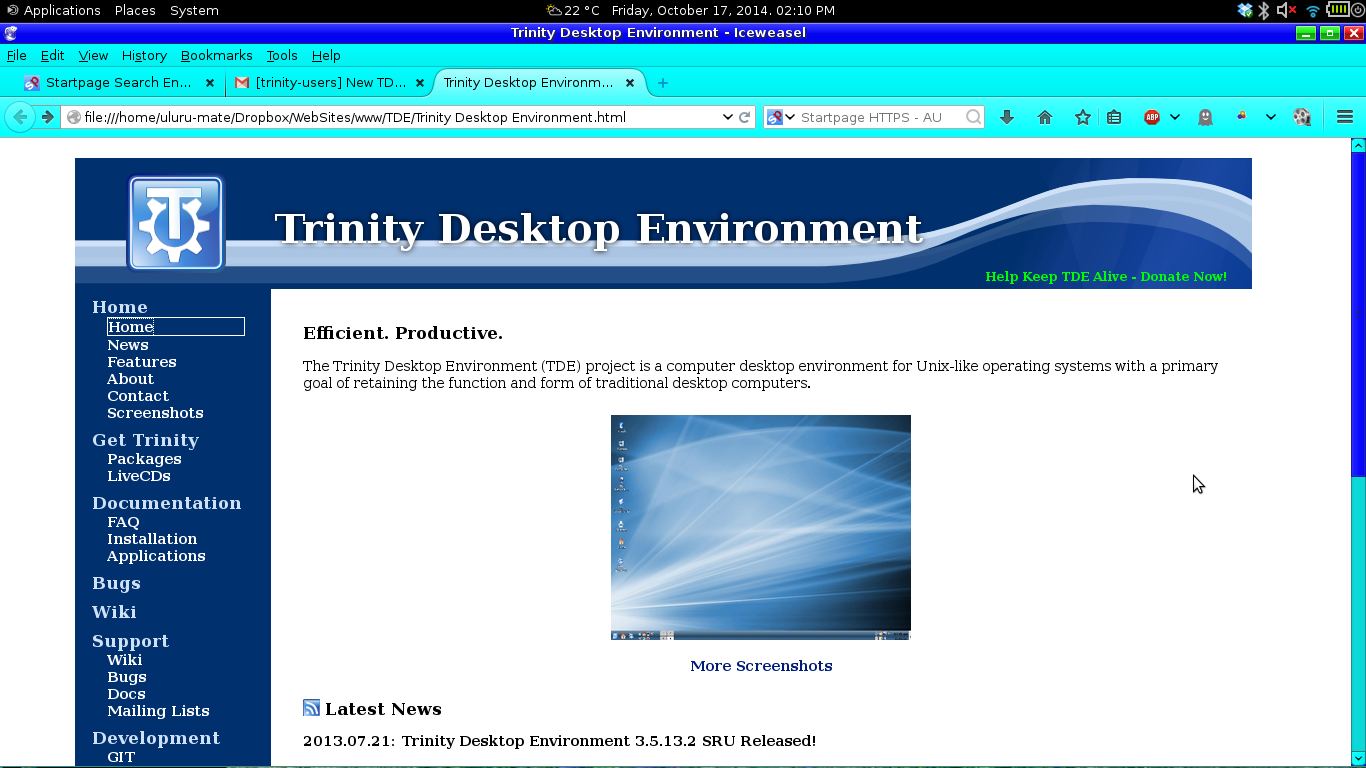
Thumbnails should, I believe, be actual thumbnails and so load extremely quickly. The first time I loaded the home page, I could watch the introductory screen shot render almost row by row. Here is the image:
https://www.trinitydesktop.org/media/screenshots/large/tde4_mainpage.png
It's a 638px × 392px image, but then scaled to 300px × 225px, which means it is about four times as big as it needs to be. Replacing it with a pre-scaled image would mean it could download four times as quickly.
Likewise for the image in the Latest News section:
https://wiki.trinitydesktop.org/images/d/d5/Tde_3_5_13_1_snapshot2.png
which is 1,024px × 768px but scaled to 320px × 240px, which means it's ten times bigger than it needs to be.
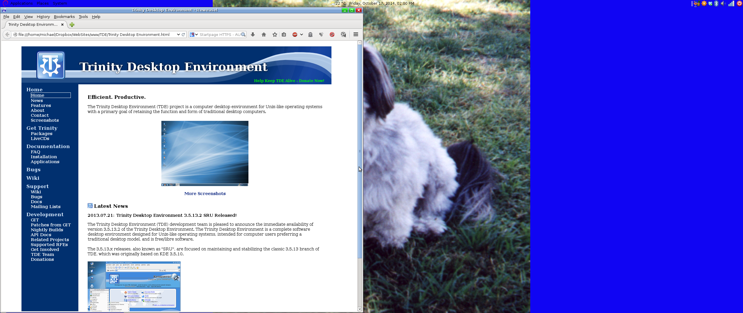
I find that most screen shots for desktop environments turn me off immediately. They either show too much stuff happening all at once, giving the impression of over-complexity and complication, or they show so little that I don't get a sense for the look and feel and get the impression that the environment must be pretty weak. And I'm afraid that your choosen introductionary image on the front page falls firmly in that second category.
I don't think that introductory screen shot makes a good advertisement for TDE. It's too plain and minimal: apart from a bare task bar at the bottom, and a few icons along the left hand side, it's effectively just a picture of the wallpaper. I don't think you should focus on the wallpaper there on the front page, every GUI desktop environment these days can display a wallpaper image. I think the introductory image ought to focus on what makes TDE look and feel like TDE, but without being too busy that it looks scarily complicated.
The trick is, I think, to find a happy medium between the minimalism of the current intro image where nearly everything is negative space, and the common "everything including the kitchen sink" screen shot that tries to put a significant element on every pixel of the screen, e.g.
https://www.trinitydesktop.org/media/screenshots/large/tde5.png
Both have their places in design, but as opposite extremes I don't think either belongs as the showcase screen shot on the front page. I think a better showcase image would be something that gives a good flavour of the TDE look and feel, without being too busy and cluttered. This is closer to what I think:
https://www.trinitydesktop.org/media/screenshots/large/tde3.png
but still a bit too full.
What I have in mind is something that is about a half to two-thirds negative space (i.e. the wallpaper), and the rest consisting of design elements (e.g. the icons down the left hand side, the task bar, three or four apps visible on screen). The apps should be small and elegent rather than too technical looking, and should avoid looking like a wall of text. I think something like a calculator, KNotes, KAlarm, a calendar, or similar applications which don't need a lot of physical space on screen. The usefulness of them should be immediately obvious to people who aren't techs or computer geeks.
Why small applications? Because the emphasis should be on TDE itself, not any specific app, and particularly not anything outisde of TDE (e.g. LibreOffice, Firefox). A busy design says "low value but cheap", while minimalist design says "costly but high value":
http://thevisualcommunicationguy.com/2013/06/19/design-principle-horror-vacu...
Both design principles (extremely busy, extremely minimalist) have their place, and there is nothing wrong with showing examples of both on the main screenshots page, but on the home page you have a unique opportunity to capture people's attention for the first time, and I think we want something that falls in the middle ground between the two extremes but slightly closer to the "high value" end (i.e. more negative space).
Negative space is strongly associated with simplicity, which can be a good thing:
http://verkoren.files.wordpress.com/2012/04/scaledsimplicity.jpeg
but too much empty space suggests that it can't do anything. I think we want to show TDE is simple but not so simple that is is useless, rich in functionality but not complicated and difficult to use, hence the image should show multiple applications which are immediately and obviously useful, while still showing plenty of negative space.
You should also consider the three-second rule: most users will make up their mind to move on or stay for a closer look within three seconds. Too much text and graphics diminishes the opportunity to convince them to stay:
http://zacgery.blogspot.com.au/2012/09/the-first-three-seconds-how-users-are...
I hope these suggestions will be useful to you.

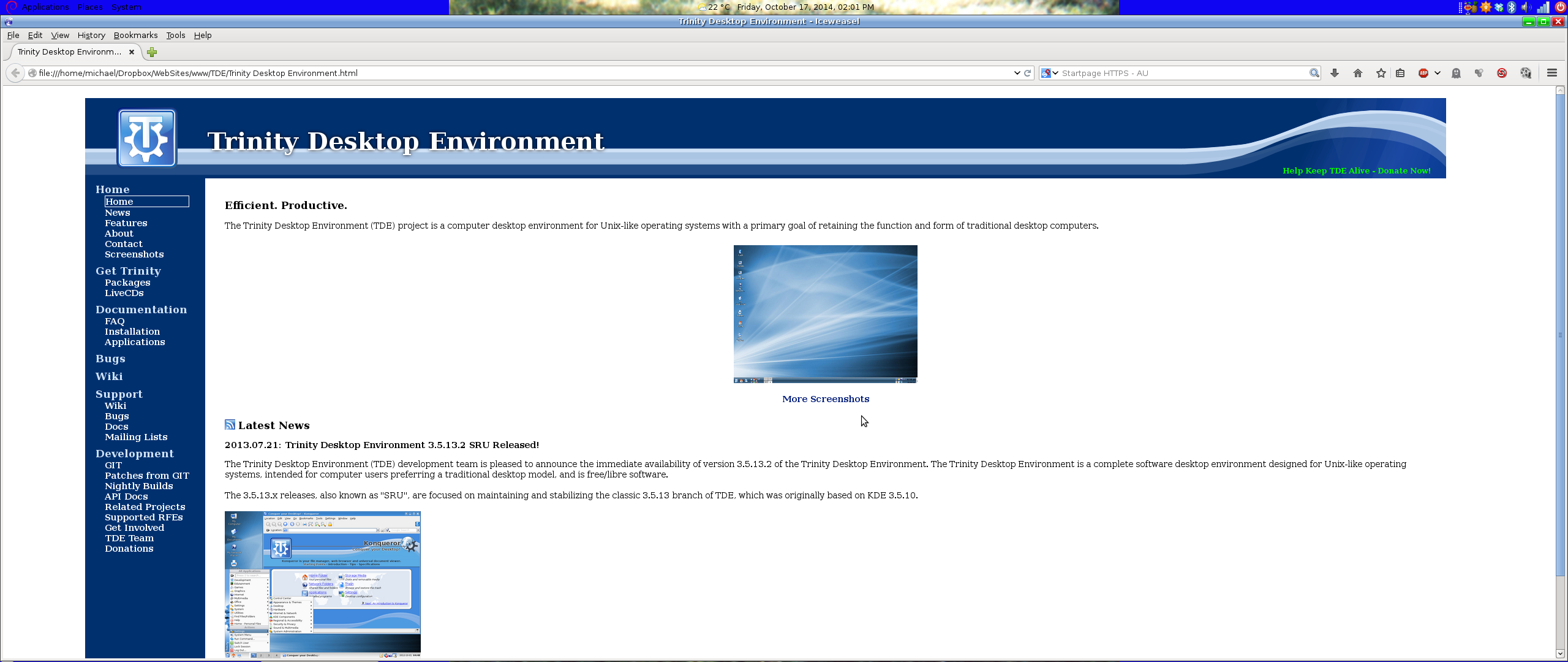
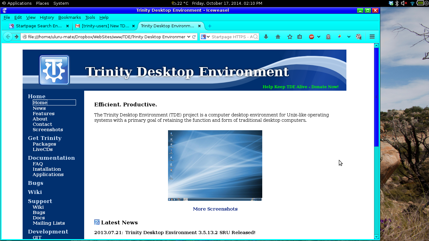
Ok 3 screenshots 1st is original 2nd is half screen width on my widescreen 3rd is full screen width on my widescreen. I will post screenshots from my laptop soon.
Cheers. Michael.
P.S. Sorry about the "other" DE in the screenshots [?]
On 17 October 2014 12:53, Steven D'Aprano steve@pearwood.info wrote:
On Wed, Oct 15, 2014 at 01:43:14PM -0500, Timothy Pearson wrote:
-----BEGIN PGP SIGNED MESSAGE----- Hash: SHA224
All,
Thanks to the efforts of the TDE web development team we proudly announce the debut of our new website (https://www.trinitydesktop.org)!
Thank you! A couple of comments:
Thumbnails should, I believe, be actual thumbnails and so load extremely quickly. The first time I loaded the home page, I could watch the introductory screen shot render almost row by row. Here is the image:
https://www.trinitydesktop.org/media/screenshots/large/tde4_mainpage.png
It's a 638px × 392px image, but then scaled to 300px × 225px, which means it is about four times as big as it needs to be. Replacing it with a pre-scaled image would mean it could download four times as quickly.
Likewise for the image in the Latest News section:
https://wiki.trinitydesktop.org/images/d/d5/Tde_3_5_13_1_snapshot2.png
which is 1,024px × 768px but scaled to 320px × 240px, which means it's ten times bigger than it needs to be.
I find that most screen shots for desktop environments turn me off immediately. They either show too much stuff happening all at once, giving the impression of over-complexity and complication, or they show so little that I don't get a sense for the look and feel and get the impression that the environment must be pretty weak. And I'm afraid that your choosen introductionary image on the front page falls firmly in that second category.
I don't think that introductory screen shot makes a good advertisement for TDE. It's too plain and minimal: apart from a bare task bar at the bottom, and a few icons along the left hand side, it's effectively just a picture of the wallpaper. I don't think you should focus on the wallpaper there on the front page, every GUI desktop environment these days can display a wallpaper image. I think the introductory image ought to focus on what makes TDE look and feel like TDE, but without being too busy that it looks scarily complicated.
The trick is, I think, to find a happy medium between the minimalism of the current intro image where nearly everything is negative space, and the common "everything including the kitchen sink" screen shot that tries to put a significant element on every pixel of the screen, e.g.
https://www.trinitydesktop.org/media/screenshots/large/tde5.png
Both have their places in design, but as opposite extremes I don't think either belongs as the showcase screen shot on the front page. I think a better showcase image would be something that gives a good flavour of the TDE look and feel, without being too busy and cluttered. This is closer to what I think:
https://www.trinitydesktop.org/media/screenshots/large/tde3.png
but still a bit too full.
What I have in mind is something that is about a half to two-thirds negative space (i.e. the wallpaper), and the rest consisting of design elements (e.g. the icons down the left hand side, the task bar, three or four apps visible on screen). The apps should be small and elegent rather than too technical looking, and should avoid looking like a wall of text. I think something like a calculator, KNotes, KAlarm, a calendar, or similar applications which don't need a lot of physical space on screen. The usefulness of them should be immediately obvious to people who aren't techs or computer geeks.
Why small applications? Because the emphasis should be on TDE itself, not any specific app, and particularly not anything outisde of TDE (e.g. LibreOffice, Firefox). A busy design says "low value but cheap", while minimalist design says "costly but high value":
http://thevisualcommunicationguy.com/2013/06/19/design-principle-horror-vacu...
Both design principles (extremely busy, extremely minimalist) have their place, and there is nothing wrong with showing examples of both on the main screenshots page, but on the home page you have a unique opportunity to capture people's attention for the first time, and I think we want something that falls in the middle ground between the two extremes but slightly closer to the "high value" end (i.e. more negative space).
Negative space is strongly associated with simplicity, which can be a good thing:
http://verkoren.files.wordpress.com/2012/04/scaledsimplicity.jpeg
but too much empty space suggests that it can't do anything. I think we want to show TDE is simple but not so simple that is is useless, rich in functionality but not complicated and difficult to use, hence the image should show multiple applications which are immediately and obviously useful, while still showing plenty of negative space.
You should also consider the three-second rule: most users will make up their mind to move on or stay for a closer look within three seconds. Too much text and graphics diminishes the opportunity to convince them to stay:
http://zacgery.blogspot.com.au/2012/09/the-first-three-seconds-how-users-are...
I hope these suggestions will be useful to you.
-- Steven
To unsubscribe, e-mail: trinity-users-unsubscribe@lists.pearsoncomputing.net For additional commands, e-mail: trinity-users-help@lists.pearsoncomputing.net Read list messages on the web archive: http://trinity-users.pearsoncomputing.net/ Please remember not to top-post: http://trinity.pearsoncomputing.net/mailing_lists/#top-posting
Screenshots from my laptop 1st is original 2nd is modified full width 3rd is modified part width.
Please also find attached the modified (with original css commented out but still available) css file.
Cheers Michael.
On 17 October 2014 12:53, Steven D'Aprano steve@pearwood.info wrote:
On Wed, Oct 15, 2014 at 01:43:14PM -0500, Timothy Pearson wrote:
-----BEGIN PGP SIGNED MESSAGE----- Hash: SHA224
All,
Thanks to the efforts of the TDE web development team we proudly announce the debut of our new website (https://www.trinitydesktop.org)!
Thank you! A couple of comments:
Thumbnails should, I believe, be actual thumbnails and so load extremely quickly. The first time I loaded the home page, I could watch the introductory screen shot render almost row by row. Here is the image:
https://www.trinitydesktop.org/media/screenshots/large/tde4_mainpage.png
It's a 638px × 392px image, but then scaled to 300px × 225px, which means it is about four times as big as it needs to be. Replacing it with a pre-scaled image would mean it could download four times as quickly.
Likewise for the image in the Latest News section:
https://wiki.trinitydesktop.org/images/d/d5/Tde_3_5_13_1_snapshot2.png
which is 1,024px × 768px but scaled to 320px × 240px, which means it's ten times bigger than it needs to be.
I find that most screen shots for desktop environments turn me off immediately. They either show too much stuff happening all at once, giving the impression of over-complexity and complication, or they show so little that I don't get a sense for the look and feel and get the impression that the environment must be pretty weak. And I'm afraid that your choosen introductionary image on the front page falls firmly in that second category.
I don't think that introductory screen shot makes a good advertisement for TDE. It's too plain and minimal: apart from a bare task bar at the bottom, and a few icons along the left hand side, it's effectively just a picture of the wallpaper. I don't think you should focus on the wallpaper there on the front page, every GUI desktop environment these days can display a wallpaper image. I think the introductory image ought to focus on what makes TDE look and feel like TDE, but without being too busy that it looks scarily complicated.
The trick is, I think, to find a happy medium between the minimalism of the current intro image where nearly everything is negative space, and the common "everything including the kitchen sink" screen shot that tries to put a significant element on every pixel of the screen, e.g.
https://www.trinitydesktop.org/media/screenshots/large/tde5.png
Both have their places in design, but as opposite extremes I don't think either belongs as the showcase screen shot on the front page. I think a better showcase image would be something that gives a good flavour of the TDE look and feel, without being too busy and cluttered. This is closer to what I think:
https://www.trinitydesktop.org/media/screenshots/large/tde3.png
but still a bit too full.
What I have in mind is something that is about a half to two-thirds negative space (i.e. the wallpaper), and the rest consisting of design elements (e.g. the icons down the left hand side, the task bar, three or four apps visible on screen). The apps should be small and elegent rather than too technical looking, and should avoid looking like a wall of text. I think something like a calculator, KNotes, KAlarm, a calendar, or similar applications which don't need a lot of physical space on screen. The usefulness of them should be immediately obvious to people who aren't techs or computer geeks.
Why small applications? Because the emphasis should be on TDE itself, not any specific app, and particularly not anything outisde of TDE (e.g. LibreOffice, Firefox). A busy design says "low value but cheap", while minimalist design says "costly but high value":
http://thevisualcommunicationguy.com/2013/06/19/design-principle-horror-vacu...
Both design principles (extremely busy, extremely minimalist) have their place, and there is nothing wrong with showing examples of both on the main screenshots page, but on the home page you have a unique opportunity to capture people's attention for the first time, and I think we want something that falls in the middle ground between the two extremes but slightly closer to the "high value" end (i.e. more negative space).
Negative space is strongly associated with simplicity, which can be a good thing:
http://verkoren.files.wordpress.com/2012/04/scaledsimplicity.jpeg
but too much empty space suggests that it can't do anything. I think we want to show TDE is simple but not so simple that is is useless, rich in functionality but not complicated and difficult to use, hence the image should show multiple applications which are immediately and obviously useful, while still showing plenty of negative space.
You should also consider the three-second rule: most users will make up their mind to move on or stay for a closer look within three seconds. Too much text and graphics diminishes the opportunity to convince them to stay:
http://zacgery.blogspot.com.au/2012/09/the-first-three-seconds-how-users-are...
I hope these suggestions will be useful to you.
-- Steven
To unsubscribe, e-mail: trinity-users-unsubscribe@lists.pearsoncomputing.net For additional commands, e-mail: trinity-users-help@lists.pearsoncomputing.net Read list messages on the web archive: http://trinity-users.pearsoncomputing.net/ Please remember not to top-post: http://trinity.pearsoncomputing.net/mailing_lists/#top-posting

On Fri, Oct 17, 2014 at 02:14:55PM +1100, Michael . wrote:
Screenshots from my laptop 1st is original 2nd is modified full width 3rd is modified part width.
And don't, not even for a second, think about the possibility that by some chance other readers of the mailing list may be under restricted connectivity conditions (aka, no 16Mbit DSL or something)...
It's only the third time that this happens, since I'm on the list, which is not much, but in all cases there was no actual information transport through the images... so is this really necessary?
I'm frequently reading how much all TDE users appreciate to avoid bloat software... could we please stick to no-bloat mailing as well?
(The same holds for the "thumbnails" on the web page --- thumbnails have not only been invented for small display, but also for fast download... well...)
Thanks in advance, Jagged
And don't, not even for a second, think about the possibility that by some chance other readers of the mailing list may be under restricted connectivity conditions (aka, no 16Mbit DSL or something)...
I don't have super fast anything either. If this was a forum, but it isn't, I'd have posted in the title that there are images (not very big at all actually) to warn people.
On 18 October 2014 00:22, Jagged O'Neill jagged_4tr@jagged.tk wrote:
On Fri, Oct 17, 2014 at 02:14:55PM +1100, Michael . wrote:
Screenshots from my laptop 1st is original 2nd is modified full width 3rd is modified part width.
And don't, not even for a second, think about the possibility that by some chance other readers of the mailing list may be under restricted connectivity conditions (aka, no 16Mbit DSL or something)...
It's only the third time that this happens, since I'm on the list, which is not much, but in all cases there was no actual information transport through the images... so is this really necessary?
I'm frequently reading how much all TDE users appreciate to avoid bloat software... could we please stick to no-bloat mailing as well?
(The same holds for the "thumbnails" on the web page --- thumbnails have not only been invented for small display, but also for fast download... well...)
Thanks in advance, Jagged
-- valgrind python -c 'for i in range(1,1): print(i)' 2>&1 | grep error
To unsubscribe, e-mail: trinity-users-unsubscribe@lists.pearsoncomputing.net For additional commands, e-mail: trinity-users-help@lists.pearsoncomputing.net Read list messages on the web archive: http://trinity-users.pearsoncomputing.net/ Please remember not to top-post: http://trinity.pearsoncomputing.net/mailing_lists/#top-posting

On Friday 17 October 2014 04:14:55 Michael . wrote:
Screenshots from my laptop 1st is original 2nd is modified full width 3rd is modified part width.
Please also find attached the modified (with original css commented out but still available) css file.
These are so much more wearing on the eye (and therefore less legible) than the original.
Sorry, everybody. Drums, the beating of, etc. spring to mind. I just _love_ E. Liddell's design. I wish that he designed all the websites I have to use frequently!
Lisi
I'm sorry Felix if I have caused a problem. I have Graves Disease and Chronic Fatigue both conditions have a symptom called Brain Fog. Sometimes things don't come easily without explanation so I'd ask you to bear with me.I have spent two days doing what used to take an hour.
Now to reply to your general gist. A user should never have to adjust their screen. They buy a screen install it and use it. PCs and peripheral devices are now PnP and normal users should never be required to adjust pixels, resolutions, or anything else for that matter. In essence these things should "just work". For everyone else to be required to adjust their resolutions so an inch on your screenshot is an inch on their screen creates work for everyone else that they would never be required to do in any other, normal usage, circumstance. It is beyond reason that we would expect anyone, especially "Windows refugees", to do such things. We want to attract people to TDE not make them adjust their screens so they can use a website for TDE.
Mine offers a physical context, a way to see what I see by scaling the
image
size to its original physical size. Yours provides no such opportunity, no way to scale the image in order to see the same perspective presented to
your
eyes.
Sorry but mine offers a "physical context" as well. They are screenshots of a 29" ultra wide screen with the TDE website on it. I presented 3 shots from this screen and another 3 from my laptop. Scaling am image to its physical size? It's a picture of what was on my screen in its physical size. That is why websites are not made to measure but rather are made to adjust to the users individual setup. It does not matter one iota how many lines of text there are what matters is the screen real estate is used wisely. Having two thirds of a screen with white space isn't very good usage of screen real estate.
These are so much more wearing on the eye (and therefore less legible) than the original.
Sorry, everybody. Drums, the beating of, etc. spring to mind. I just
_love_
E. Liddell's design. I wish that he designed all the websites I have to
use
frequently!
Lisi what you see in my pictures, the large screen would not be what appears on your screen (unless you have a 29" screen) If you have a small screen, like my laptop, then there would be very little, if any, noticeable difference. Take a look at the shots from my laptop and see that there is absolutely no difference in width for any of it and only 1 text line deference in height in the menu but not in the rest of the content. The adjustments make it easier to use on a bigger screen and make no real difference to smaller screens. That is the beauty of css and using percentages.
Cheers. Michael.
On 18 October 2014 01:28, Lisi Reisz lisi.reisz@gmail.com wrote:
On Friday 17 October 2014 04:14:55 Michael . wrote:
Screenshots from my laptop 1st is original 2nd is modified full width 3rd is modified part width.
Please also find attached the modified (with original css commented out
but
still available) css file.
These are so much more wearing on the eye (and therefore less legible) than the original.
Sorry, everybody. Drums, the beating of, etc. spring to mind. I just _love_ E. Liddell's design. I wish that he designed all the websites I have to use frequently!
Lisi
To unsubscribe, e-mail: trinity-users-unsubscribe@lists.pearsoncomputing.net For additional commands, e-mail: trinity-users-help@lists.pearsoncomputing.net Read list messages on the web archive: http://trinity-users.pearsoncomputing.net/ Please remember not to top-post: http://trinity.pearsoncomputing.net/mailing_lists/#top-posting
On Friday 17 October 2014 22:30:55 Michael . wrote:
Take a look at the shots from my laptop and see that there is absolutely no difference in width for any of it and only 1 text line deference in height in the menu but not in the rest of the content.
Unlike you I am not in the least worried about the width. What bothers me is the clarity and legibility. And the original version is much better. Much better contrast and fewer colours that add no functionality at all. (That unnecessary blue stripe that necessitates changing the colour of the writing so that the two stripes are different colours instead of uniform. Tiring and harder to read.)
Unlike you I am not in the least worried about the width. What bothers me
is
the clarity and legibility. And the original version is much better. Much better contrast and fewer colours that add no functionality at all. (That unnecessary blue stripe that necessitates changing the colour of the
writing
so that the two stripes are different colours instead of uniform. Tiring
and
harder to read.)
That "blue stripe" is a GTK theme and has nothing to do with the webpage. There is nothing on the webpage that is not on the original webpage. There is no change in content, colours, or anything else on the webpage at all. The only thing that was adjusted was the capacity to suit many screen sizes and this was done in the css by using percentages instead of fixed widths. There is no reason for you to change any font colour because of that "blue stripe".
On 18 October 2014 09:06, Lisi Reisz lisi.reisz@gmail.com wrote:
On Friday 17 October 2014 22:30:55 Michael . wrote:
Take a look at the shots from my laptop and see that there is absolutely no difference in width for any of it and only 1 text line deference in height in the menu but not in the rest of the content.
Unlike you I am not in the least worried about the width. What bothers me is the clarity and legibility. And the original version is much better. Much better contrast and fewer colours that add no functionality at all. (That unnecessary blue stripe that necessitates changing the colour of the writing so that the two stripes are different colours instead of uniform. Tiring and harder to read.)
To unsubscribe, e-mail: trinity-users-unsubscribe@lists.pearsoncomputing.net For additional commands, e-mail: trinity-users-help@lists.pearsoncomputing.net Read list messages on the web archive: http://trinity-users.pearsoncomputing.net/ Please remember not to top-post: http://trinity.pearsoncomputing.net/mailing_lists/#top-posting
On Friday 17 October 2014 23:31:04 Michael . wrote:
Unlike you I am not in the least worried about the width. What bothers me
is
the clarity and legibility. And the original version is much better. Much better contrast and fewer colours that add no functionality at all. (That unnecessary blue stripe that necessitates changing the colour of the
writing
so that the two stripes are different colours instead of uniform. Tiring
and
harder to read.)
That "blue stripe" is a GTK theme and has nothing to do with the webpage. There is nothing on the webpage that is not on the original webpage. There is no change in content, colours, or anything else on the webpage at all. The only thing that was adjusted was the capacity to suit many screen sizes and this was done in the css by using percentages instead of fixed widths. There is no reason for you to change any font colour because of that "blue stripe".
For whatever reason, yours renders differently from the original and I like the original better.
Lisi
That's fine Lisi I respect your opinion, I was just making sure you were not confusing things that were not part of the actual web page.
On 18 October 2014 12:18, Lisi Reisz lisi.reisz@gmail.com wrote:
On Friday 17 October 2014 23:31:04 Michael . wrote:
Unlike you I am not in the least worried about the width. What bothers
me
is
the clarity and legibility. And the original version is much better. Much better contrast and fewer colours that add no functionality at
all.
(That unnecessary blue stripe that necessitates changing the colour of the
writing
so that the two stripes are different colours instead of uniform.
Tiring
and
harder to read.)
That "blue stripe" is a GTK theme and has nothing to do with the webpage. There is nothing on the webpage that is not on the original webpage.
There
is no change in content, colours, or anything else on the webpage at all. The only thing that was adjusted was the capacity to suit many screen
sizes
and this was done in the css by using percentages instead of fixed
widths.
There is no reason for you to change any font colour because of that
"blue
stripe".
For whatever reason, yours renders differently from the original and I like the original better.
Lisi
To unsubscribe, e-mail: trinity-users-unsubscribe@lists.pearsoncomputing.net For additional commands, e-mail: trinity-users-help@lists.pearsoncomputing.net Read list messages on the web archive: http://trinity-users.pearsoncomputing.net/ Please remember not to top-post: http://trinity.pearsoncomputing.net/mailing_lists/#top-posting
@Timothy, if it is at all possible could you please remove the post with my screenshots. I didn't realise that by doing so I was braking rules and being rude. If you or E. Liddell want a copy of the modified css I'll send it to you. If not that's fine.
On 18 October 2014 12:21, Michael . keltoiboy@gmail.com wrote:
That's fine Lisi I respect your opinion, I was just making sure you were not confusing things that were not part of the actual web page.
On 18 October 2014 12:18, Lisi Reisz lisi.reisz@gmail.com wrote:
On Friday 17 October 2014 23:31:04 Michael . wrote:
Unlike you I am not in the least worried about the width. What
bothers me
is
the clarity and legibility. And the original version is much better. Much better contrast and fewer colours that add no functionality at
all.
(That unnecessary blue stripe that necessitates changing the colour of the
writing
so that the two stripes are different colours instead of uniform.
Tiring
and
harder to read.)
That "blue stripe" is a GTK theme and has nothing to do with the
webpage.
There is nothing on the webpage that is not on the original webpage.
There
is no change in content, colours, or anything else on the webpage at
all.
The only thing that was adjusted was the capacity to suit many screen
sizes
and this was done in the css by using percentages instead of fixed
widths.
There is no reason for you to change any font colour because of that
"blue
stripe".
For whatever reason, yours renders differently from the original and I like the original better.
Lisi
To unsubscribe, e-mail: trinity-users-unsubscribe@lists.pearsoncomputing.net For additional commands, e-mail: trinity-users-help@lists.pearsoncomputing.net Read list messages on the web archive: http://trinity-users.pearsoncomputing.net/ Please remember not to top-post: http://trinity.pearsoncomputing.net/mailing_lists/#top-posting

A lot of interesting comments. And I'm glad, ahem, that no one is getting testy... Well, much. :-)
Andy
Michael . composed on 2014-10-18 08:30 (UTC+1100):
A user should never have to adjust their screen.
Ideally, yes, but it is not realistic to think none should want or need to use controls provided for that purpose.
They buy a screen install it and use it.
Or they don't. Screens purchasers and screen users are probably different more often than they are the same. Not everyone gets to choose the screen he must use.
normal users
Not everyone is "normal". You just wrote you have uncommon limitations. I do too.
should never be required to adjust pixels, resolutions, or anything else for that matter. In essence these things should "just work".
That would be nice. It isn't reality. Computers and software offer various adjustment possibilities for good reason, among which, personalization. People's capabilities, needs and preferences vary in many ways and for many reasons. Controls are provided so accommodation can be made to them by the user. Do you remember what the "P" in "PC" means?
For everyone else to be required to adjust their resolutions so an inch on your screenshot is an inch on their screen creates work for everyone else that they would never be required to do in any other, normal usage, circumstance.
You missed the point of both screenshot and instructions for viewing it. You don't *need* to adjust anything - *unless* you want an opportunity for the same perspective observed here, seeing something close to what is presented to my eyes, that being viewing the subject page on a high *density* display, to compare to whatever the source URL presents viewed in your browser at whatever pixel *density* your own screen features.
That's part of the root problem with web design, that designers *don't* take initiative to observe from perspectives other than their own. Having only one or two displays and rarely or never making adjustments from shipped settings greatly impedes incorporating the myriad of possible user perspectives into design thought processes.
Sorry but mine offers a "physical context" as well. They are screenshots of a 29" ultra wide screen with the TDE website on it.
Your '"physical context"' is incomplete. Even knowing your resolution and screen size, there's nothing within any of your images that offers a viewer any ease, if any possibility at all, to achieve the same perspective as yours, unless he happens to have a display of suitable size with pixel density matching yours. He would have to do a bunch of manual calculations to figure out how to adjust the size of your images in order to acquire your viewing perspective.
My screenshot contains an object that can be measured with a ruler so as to be readily adjusted to achieve the perspective observed here.
I presented 3 shots from this screen and another 3 from my laptop. Scaling am image to its physical size? It's a picture of what was on my screen in its physical size.
How does that help anyone lacking the same screen size and resolution (measuring unit / resolution = density) as yours to see the context and perspective you see?
That is why websites are not made to measure but rather are made to adjust to the users individual setup.
Except most *are* made to measure (in px units), and are *not* made to adjust to the users individual setup (constrained as well as enhanced by site/author CSS). Most size most objects in CSS px, which wholly disregard the user's environment.
It does not matter one iota how many lines of text there are what matters is the screen real estate is used wisely.
How many words fit on the screen is a yardstick for measuring the wisdom of space usage. Text experts universally agree that too many words per line negatively impact reading efficiency. Site styles putting huge numbers of words on a line are indicators of unwise use of screen space.
Having two thirds of a screen with white space isn't very good usage of screen real estate.
No disagreement from here. Our differences are about the evaluation of why it happens, its impact, and what might best be done to avoid or eliminate it.
@ Felix
Ideally, yes, but it is not realistic to think none should want or need to use controls provided for that purpose.
I never said it was realistic I am merely pointing out that people browse the web and do not want to adjust their screen everytime they go to a different page.
Or they don't. Screens purchasers and screen users are probably different more often than they are the same. Not everyone gets to choose the screen
he
must use.
People by a personal computer to use personally. Yes in business and some other instances someone different than the end user will purchase the product.
Not everyone is "normal". You just wrote you have uncommon limitations. I
do too.
Nobody is perfect. I asked you for a bit of leway due to a couple of conditions, to suggest I am not "normal" is a little over the top.
That would be nice. It isn't reality. Computers and software offer various adjustment possibilities for good reason, among which, personalization. People's capabilities, needs and preferences vary in many ways and for many reasons. Controls are provided so accommodation can be made to them by the user. *Do you remember what the "P" in "PC" means?*
Bold highlight by me. A little bit condescending there but I will reply. It is Personal but you said above that not everyone who buys a Screen is the person who uses it so in that instance it is not personal.
You missed the point of both screenshot and instructions for viewing it.
Once you explained it to me I did not miss the point but you most certainly miss mine. You see the screenshot is of my system not yours. I offered 2 different PCs in the 2 sets of screenshots to show that the adjustment fits. That is how the before and after look on my screens. Nothing more nothing less.
That's part of the root problem with web design, that designers *don't*
take
initiative to observe from perspectives other than their own.
I'm sorry I thought posting things here was taking initiative and allowing others to see things from their perspective. You are sharing your perspective and I am now discussing it with you. To say to me as a designer I haven't taken initiative by letting you see things makes no sense. I could have hidden it from you but I didn't.
Your '"physical context"' is incomplete.
Actually it is complete and it has no added extras. It is what it is unlike the shot you offered which has a lot of added extras that are basically a measuring device. People don't sit browsing the web "normally" with a ruler on their screen, they have an open page as it was designed without a ruler telling them that an inch is 25.4 cm.
My screenshot contains an object that can be measured with a ruler so as to be readily adjusted to achieve the perspective observed here.
That is fine for some people, I have no argument at all about that but to suggest everybody needs to use such a device ignores people who just buy and use without fiddling around.
How does that help anyone lacking the same screen size and resolution (measuring unit / resolution = density) as yours to see the context and perspective you see?
It's a screenshot they see it as it is in the picture, no need to adjust it because even at reduced size the proportions are the same.
Except most *are* made to measure (in px units), and are *not* made to
adjust
to the users individual setup (constrained as well as enhanced by
site/author
CSS). Most size most objects in CSS px, which wholly disregard the user's environment.
Sorry but we are going round in circles. Let me just say in my experience most are not made to measure in px units. Why because people view the web in smart phones, tablets, laptops, standard screens, wide screens, and now ultra wide screens, TVs, and some even on fridges. To make everything in made to measure px units would make small devices scroll while large screens are mostly empty.
How many words fit on the screen is a yardstick for measuring the wisdom of space usage. Text experts universally agree that too many words per line negatively impact reading efficiency. Site styles putting huge numbers of words on a line are indicators of unwise use of screen space.
I disagree with you, lets leave that at that.
No disagreement from here. Our differences are about the evaluation of why
it
happens, its impact, and what might best be done to avoid or eliminate it.
Felix if you agree offer up some ways to fix it. You have alot of knowledge and information yet have not offered 1 suggestion that I have seen (I admit I may have missed them and if so p0lease point me to them) as how to fix it. I am willing to learn new ways (or old in this case) but to learn them it is often best to be guided by someone who knows. I am eagerly waiting for your help and suggestions.
Cheers. Michael.
Michael . composed on 2014-10-18 12:11 (UTC+1100):
Felix Miata composed on 2014-10-17 19:49 (UTC-0400):
Except most *are* made to measure (in px units), and are *not* made to adjust to the users individual setup (constrained as well as enhanced by site/author CSS). Most size most objects in CSS px, which wholly disregard the user's environment.
Let me just say in my experience most are not made to measure in px units.
Then your experience is naive. I've been subscribing to various web design, CSS, browser development, and web standards mailing lists and other forums since last century. Almost as long I've been inspecting styles of a wide variety of sites, very often suggesting or recommending changes to increase usability and accessibility. If anything, more sites have in their latest incarnations abandoned or significantly reduced their use of relative units, most after M$ dropped IE6 & & support, which dropped IE's (virtual) inability to "resize" text styled in px units, thus removing experts' reason for recommendating that px units for sizing text be avoided.
Following is a small sample of styles from some high profile sites that refutes your assertion. For every major site you find that does not size P text either directly or via cascade in relative units, if I was inclined to waste the time (I'm definitely not), I could probably find at least 5 that do it in px in the same amount of time spent looking, probably closer to 12 or 15. I know it's been a while since I've looked at most sites on http://fm.no-ip.com/Inet/shame.html but if you don't believe most stylists of major sites are married to using px units, take a long look for yourself. In case you haven't noticed, Google'w home page weighs in at over 1GB if saved as web page complete in Gecko. About 10% of it is the HTML page. Most of the rest is insufferably complex CSS and JS. Digging out what's going on is neither easy nor fun on any but the smallest of sites. In the following samples, note:
A:Many serve CSS with newlines filtered out, making direct examination painful. You can tell which do so because all rules in the source are on line 1 (sometimes line 2 following an empty line 1).
B:Those that do not strip newlines sometimes have a 4 digit line count, which may not be apparent until discovering the total line count among multiple served CSS files. In any event, CSS not unusually outweighs the HTML by several multiples.
C:Some sites Domi provided no CSS URL for, and I just accepted on faith whatever rules Domi showed me instead of looking for source URL or digging embedded out of markup or JS.
1 http://www.libreoffice.org/ http://www.libreoffice.org/themes/libreofficenew/css/bootstrap.min.css?m=139... line 68: body {font-size: 14px} line 156: .container {width: 750px} line 158: .container {width: 970px} line 160: .container {width: 1170px} line 886: .navbar {min-height: 50px} line 886: .navbar {margin-bottom: 20px}
2 http://espn.go.com/ line 2: body {font-size: 13px} line 2: #content.container, #scoreboard {width: 924px} line 2: #scoreboard {height: 55px}
3 http://www.loc.gov/ http://www.loc.gov/static/stylesheets/base.css?18999 line 173: body {font-size: 12px; line-height: 18px} line 648: .container {width: 980px} line 5231: .intersite-nav {font-size: 11px}
4 http://www.mozilla.org/en-US/ https://mozorg.cdn.mozilla.net/media/css/responsive-min.css?build=e503c67 line 1: body {font-size: 14px} line 1: #wrapper {width: 1000px} line 1: .promo-grid-inner {width: 1260px}
5 http://www.ubuntu.com/ http://assets.ubuntu.com/sites/guidelines/css/responsive/latest/ubuntu-style... line 1: body {font-size: 14px} line 1: .wrapper {width: 984px} http://assets.ubuntu.com/sites/ubuntu/1201/u/css/beta/global-responsive.css line 174: body {padding-top: 30px} line 351: .nav-global-wrapper {width: 984px}
6 http://dictionary.reference.com/ http://static.sfdict.com/dictcloud/r201410160523/css/combinedInterim.css line 1: body {font-size: 13px} line 1: #main {width: 971px; top: 108px; left: -4px; margin-bottom: 108px} line 1: .text-box {width: 460px; height: 203px; left: -4px; padding-top: 17px; font-size: 14px; line-height: 26px}
7 http://www.imdb.com/ line 24: html {min-width: 1008px} line 29: #root {width: 1008px} line 30: #root {font-size: 13px}
8 http://us.etrade.com/ https://cdn.etrade.net/1/14100700130.1/prosp/skins/min/css/prospect/global_p... line 1: body {font-size: 13px; min-width: 960px} line 1: #search-form {width: 163px; height: 60px}
9 http://www.paramount.com/ http://www.paramount.com/sites/default/files/css/css_NOcv0o5q6uyTPpnoh3-9oYv... line 2: body {line-height: 18px} line 2: body, label, input, select, textarea {font-size: 13px} line 2: .container {width: 940px; padding-bottom: 90px}
10 http://www.toyota.com/ http://www.toyota.com/common/css/v2/global.css line 1: body {font-size: 12px; line-height: 18px} line 1: #marquee {height: 568px} line 1: #wrapper {min-width: 978px} line 1: .navbar-wrapper {max-width: 978px; height: 60px} line 1: #search {font-size: 11px}
Felix if you agree offer up some ways to fix it. You have alot of knowledge and information yet have not offered 1 suggestion that I have seen (I admit I may have missed them and if so p0lease point me to them) as how to fix it. I am willing to learn new ways (or old in this case) but to learn them it is often best to be guided by someone who knows. I am eagerly waiting for your help and suggestions.
Partial diff of markup: http://fm.no-ip.com/Auth/Tmp/TDE/markup.diff
I truncated it due to the 4k+ line lengths. The bulk of differences are only for loading the images from the tmp directory here instead of from the original site, but the important ones are easily noticed, all to do with the focus of my changes, making the biggest image on the page automatically scale along with everything else that automatically scales, to fix a complaint of my 2014-10-15 15:45 -0400 thread reply.
Diff of CSS: http://fm.no-ip.com/Auth/Tmp/TDE/trinitycss.css
Page URL incorporating changes: http://fm.no-ip.com/Auth/Tmp/TDE/trinity.html
Screenshots: 96 DPI/1280x1024: http://fm.no-ip.com/SS/tdeHnoip-096-201410.jpg
108 DPI/1440x900: http://fm.no-ip.com/SS/tdeHnoip-108-201410.jpg
132 DPI/1920x1200: http://fm.no-ip.com/SS/tdeHnoip-132-201410.jpg
144 DPI/2048x1152: http://fm.no-ip.com/SS/tdeHnoip-144-201410.jpg
180DPI/2560x1440: http://fm.no-ip.com/SS/tdeHnoip-180-201410.jpg
The 144 is the only one with the page loaded in a browser window smaller than full screen, roughly 60% of screen width, a viewport bit less than 1200px wide. The only significant thing I changed is that the image of the TDE desktop stays sized in proportion to the whole page instead of whatever the original was supposed to be doing in .snap, which here was always 336px by 225px regardless of available space. The original here renders that image smaller than the size of KCalc, living in a vast sea of white over four times the image's width in the 180 DPI environment, small even for a window on a lower density (e.g. 96 or 108 DPI) screen.
I don't intend for any of the above other than images to remain much longer than this thread continues. It's all there for any and all to load and/or work from as they please, if they please.
On Sat, Oct 18, 2014 at 05:23:26AM -0400, Felix Miata wrote:
Following is a small sample of styles from some high profile sites that refutes your assertion. For every major site you find that does not size P text either directly or via cascade in relative units,
[...]
Um, I think this is getting way off-topic for this list.
Off-topic or not, there's one thing that I find just too astonishing to let stand:
In case you haven't noticed, Google'w home page weighs in at over 1GB if saved as web page complete in Gecko. About 10% of it is the HTML page. Most of the rest is insufferably complex CSS and JS.
Surely not. That would imply that in order to use Google via HTTPS, you would have to download 1GB *each and every time* you visited the site. (Browsers don't cache https pages.) On my system, that would take about 1.5 hours each time. I'm sure I would have noticed.
10% of 1GB is just over 100 MB, I'm pretty confident that Google's web page is not that big:
[steve@ando ~]$ wget --user-agent "Firefox 31 (Mozilla compatible)" --no-check-certificate https://www.google.com --2014-10-18 21:43:56-- https://www.google.com/ Resolving www.google.com... 74.125.237.179, 74.125.237.180, 74.125.237.176, ... Connecting to www.google.com|74.125.237.179|:443... connected. HTTP request sent, awaiting response... 302 Found Location: https://www.google.com.au/?gfe_rd=cr&ei=bURCVMSHDauN8Qflz4FI [following] --2014-10-18 21:44:00-- https://www.google.com.au/?gfe_rd=cr&ei=bURCVMSHDauN8Qflz4FI Resolving www.google.com.au... 74.125.237.175, 74.125.237.183, 74.125.237.184, ... Connecting to www.google.com.au|74.125.237.175|:443... connected. WARNING: certificate common name `google.com' doesn't match requested host name `www.google.com.au'. HTTP request sent, awaiting response... 200 OK Length: unspecified [text/html] Saving to: `index.html?gfe_rd=cr&ei=bURCVMSHDauN8Qflz4FI'
[ <=> ] 64,679 89.7K/s in 0.7s
2014-10-18 21:44:01 (89.7 KB/s) - `index.html?gfe_rd=cr&ei=bURCVMSHDauN8Qflz4FI' saved [64679]
[steve@ando ~]$ du -h index.html?gfe_rd=cr&ei=bURCVMSHDauN8Qflz4FI 68K index.html?gfe_rd=cr&ei=bURCVMSHDauN8Qflz4FI
Anyway, can we get back to the topic of making the TDE website do a better job of selling TDE?
Steven D'Aprano composed on 2014-10-18 21:50 (UTC+1100):
On Sat, Oct 18, 2014 at 05:23:26AM -0400, Felix Miata wrote:
In case you haven't noticed, Google'w home page weighs in at over 1GB if saved as web page complete in Gecko. About 10% of it is the HTML page. Most of the rest is insufferably complex CSS and JS.
Surely not. That would imply that in order to use Google via HTTPS, you would have to download 1GB *each and every time* you visited the site. (Browsers don't cache https pages.) On my system, that would take about 1.5 hours each time. I'm sure I would have noticed.
10% of 1GB is just over 100 MB, I'm pretty confident that Google's web page is not that big:
1GB was a typo. It should have been 1MB. Details:
HTML file: 107358 bytes 11 Other files: 971940 bytes Total saved to disk: 1079298 bytes Other files: 46743 Oct 18 10:56 416924f9b7e7a933.js 138422 Oct 18 10:56 cbgapi.loaded_0 1590 Oct 18 10:56 frame.html 2286 Oct 18 10:56 googleplus_color_33-d28e37b6be3328c1aab7a37fa108901f.png 14022 Oct 18 10:56 logo11w.png 366890 Oct 18 10:56 rsACT90oFFNUT-etJuf5ZjYTr2wdpZnggskA 118554 Oct 18 10:56 rsACT90oFFNUT-etJuf5ZjYTr2wdpZnggskA_002 13556 Oct 18 10:56 rsAItRSTNWHvMePXFuCj5Lvjl9zTImv2dfvA.css 83655 Oct 18 10:56 rsAItRSTO9MCciJDIuur7K3Vtmjxbw2iu2lA 160696 Oct 18 10:56 rsAItRSTOd4SEnseBY4S0h3Jnva5nL7YmxJQ 25526 Oct 18 10:56 rsAItRSTOd4SEnseBY4S0h3Jnva5nL7YmxJQ_002
The point of all that is to show what an ad hoc group of contributors wouldn't be able to manage even if they wanted to, an example of complications to avoid, how bad bad can get behind the face of a simple looking page like Google's home page.
Anyway, can we get back to the topic of making the TDE website do a better job of selling TDE?
Nobody's stopping anybody that I can see. My prior post, long as it was, amounted to simplification of both HTML and CSS in the process of reducing whitespace and increasing proportional retention across varying viewport contexts.
My last particpation in this topic.
@Steven. From my memory I never stated my laptop was the same as my widescreen. It is obvious what screenshot has the web page poorly framed. As for images I only posted 6 not 7. In your haste you have made a couple of errors. I will be patient with you and show understanding that you made a mistake or 2. Just so you know the 7th file is a css text file not an image file,
@Felix
Then your experience is naive.
Thanks for the carefully considered put down Felix. I admitted very early on I am self taught, I have never claimed to have the wide ranging experience, nor have I claimed to be on many mailing lists, that you appear to be on. You see Felix, and I asked for some slack a little while back and explained why. I don't have much time or energy to deal with things like that nor the argumentative people on them. Up until this I have found this group to be quite accommodating of difference.
Please accept my humble apology for using what experience I do have to try and make something work for a greater range of users. I will leave the "fix" of this issue between you, Timothy, and E. Liddell. With your experience I am sure you can have the site looking in ship shape on all screen sizes in a very short time. My code changes are there if people want to use them if not no harm is done. When you get the site looking like it fits on all screen sizes (without causing anyone to adjust their setup to suit), please post up that you have done it and I will check it out via Timothy's link.
That.'s me done. Cheers. Michael.
On Sat, Oct 18, 2014 at 10:03:23PM +1100, Michael . wrote:
My last particpation in this topic.
@Steven. From my memory I never stated my laptop was the same as my widescreen.
I never said you did. You seem to be arguing against things which I never said or never implied. I said:
Having said that, I don't understand what you think you are showing in these screen shots [of your laptop]. If there is a difference between the original and the modified full width one [on your laptop], I didn't notice any.
It is obvious what screenshot has the web page poorly framed.
But it is not obvious what your purpose in sending screen shots from your laptop was. I'm not trying to pick a fight with you, I'm trying to *understand what message you are trying to send*. You sent screen shots of your laptop. I assume you have some reason to do this. I do not understand what the reason is, or what you are trying to say. Please help me understand what you are saying.
As for images I only posted 6 not 7.
One here: http://trinity-users.pearsoncomputing.net/?0::6780
Three here: http://trinity-users.pearsoncomputing.net/?0::6816
And three here: http://trinity-users.pearsoncomputing.net/?0::6817
Makes a total of seven. Like I said, I opened and looked at all seven of them.
Michael . composed on 2014-10-18 12:11 (UTC+1100):
Felix Miata composed on 2014-10-17 19:49 (UTC-0400):
Except most *are* made to measure (in px units), and are *not* made to adjust to the users individual setup (constrained as well as enhanced by site/author CSS). Most size most objects in CSS px, which wholly disregard the user's environment.
Let me just say in my experience most are not made to measure in px units.
Then your experience is naive. I've been subscribing to various web design, CSS, browser development, and web standards mailing lists and other forums since last century. Almost as long I've been inspecting styles of a wide variety of sites, very often suggesting or recommending changes to increase usability and accessibility. If anything, more sites have in their latest incarnations abandoned or significantly reduced their use of relative units, most after M$ dropped IE6 & & support, which dropped IE's (virtual) inability to "resize" text styled in px units, thus removing experts' reason for recommendating that px units for sizing text be avoided.
Following is a small sample of styles from some high profile sites that refutes your assertion. For every major site you find that does not size P text either directly or via cascade in relative units, if I was inclined to waste the time (I'm definitely not), I could probably find at least 5 that do it in px in the same amount of time spent looking, probably closer to 12 or 15. I know it's been a while since I've looked at most sites on http://fm.no-ip.com/Inet/shame.html but if you don't believe most stylists of major sites are married to using px units, take a long look for yourself. In case you haven't noticed, Google'w home page weighs in at over 1GB if saved as web page complete in Gecko. About 10% of it is the HTML page. Most of the rest is insufferably complex CSS and JS. Digging out what's going on is neither easy nor fun on any but the smallest of sites. In the following samples, note:
A:Many serve CSS with newlines filtered out, making direct examination painful. You can tell which do so because all rules in the source are on line 1 (sometimes line 2 following an empty line 1).
B:Those that do not strip newlines sometimes have a 4 digit line count, which may not be apparent until discovering the total line count among multiple served CSS files. In any event, CSS not unusually outweighs the HTML by several multiples.
C:Some sites Domi provided no CSS URL for, and I just accepted on faith whatever rules Domi showed me instead of looking for source URL or digging embedded out of markup or JS.
1 http://www.libreoffice.org/ http://www.libreoffice.org/themes/libreofficenew/css/bootstrap.min.css?m=139... line 68: body {font-size: 14px} line 156: .container {width: 750px} line 158: .container {width: 970px} line 160: .container {width: 1170px} line 886: .navbar {min-height: 50px} line 886: .navbar {margin-bottom: 20px}
2 http://espn.go.com/ line 2: body {font-size: 13px} line 2: #content.container, #scoreboard {width: 924px} line 2: #scoreboard {height: 55px}
3 http://www.loc.gov/ http://www.loc.gov/static/stylesheets/base.css?18999 line 173: body {font-size: 12px; line-height: 18px} line 648: .container {width: 980px} line 5231: .intersite-nav {font-size: 11px}
4 http://www.mozilla.org/en-US/ https://mozorg.cdn.mozilla.net/media/css/responsive-min.css?build=e503c67 line 1: body {font-size: 14px} line 1: #wrapper {width: 1000px} line 1: .promo-grid-inner {width: 1260px}
5 http://www.ubuntu.com/ http://assets.ubuntu.com/sites/guidelines/css/responsive/latest/ubuntu-style... line 1: body {font-size: 14px} line 1: .wrapper {width: 984px} http://assets.ubuntu.com/sites/ubuntu/1201/u/css/beta/global-responsive.css line 174: body {padding-top: 30px} line 351: .nav-global-wrapper {width: 984px}
6 http://dictionary.reference.com/ http://static.sfdict.com/dictcloud/r201410160523/css/combinedInterim.css line 1: body {font-size: 13px} line 1: #main {width: 971px; top: 108px; left: -4px; margin-bottom: 108px} line 1: .text-box {width: 460px; height: 203px; left: -4px; padding-top: 17px; font-size: 14px; line-height: 26px}
7 http://www.imdb.com/ line 24: html {min-width: 1008px} line 29: #root {width: 1008px} line 30: #root {font-size: 13px}
8 http://us.etrade.com/ https://cdn.etrade.net/1/14100700130.1/prosp/skins/min/css/prospect/global_p... line 1: body {font-size: 13px; min-width: 960px} line 1: #search-form {width: 163px; height: 60px}
9 http://www.paramount.com/ http://www.paramount.com/sites/default/files/css/css_NOcv0o5q6uyTPpnoh3-9oYv... line 2: body {line-height: 18px} line 2: body, label, input, select, textarea {font-size: 13px} line 2: .container {width: 940px; padding-bottom: 90px}
10 http://www.toyota.com/ http://www.toyota.com/common/css/v2/global.css line 1: body {font-size: 12px; line-height: 18px} line 1: #marquee {height: 568px} line 1: #wrapper {min-width: 978px} line 1: .navbar-wrapper {max-width: 978px; height: 60px} line 1: #search {font-size: 11px}
Felix if you agree offer up some ways to fix it. You have alot of knowledge and information yet have not offered 1 suggestion that I have seen (I admit I may have missed them and if so p0lease point me to them) as how to fix it. I am willing to learn new ways (or old in this case) but to learn them it is often best to be guided by someone who knows. I am eagerly waiting for your help and suggestions.
Partial diff of markup: http://fm.no-ip.com/Auth/Tmp/TDE/markup.diff
I truncated it due to the 4k+ line lengths. The bulk of differences are only for loading the images from the tmp directory here instead of from the original site, but the important ones are easily noticed, all to do with the focus of my changes, making the biggest image on the page automatically scale along with everything else that automatically scales, to fix a complaint of my 2014-10-15 15:45 -0400 thread reply.
Diff of CSS: http://fm.no-ip.com/Auth/Tmp/TDE/trinitycss.css
Page URL incorporating changes: http://fm.no-ip.com/Auth/Tmp/TDE/trinity.html
Screenshots: 96 DPI/1280x1024: http://fm.no-ip.com/SS/tdeHnoip-096-201410.jpg
108 DPI/1440x900: http://fm.no-ip.com/SS/tdeHnoip-108-201410.jpg
132 DPI/1920x1200: http://fm.no-ip.com/SS/tdeHnoip-132-201410.jpg
144 DPI/2048x1152: http://fm.no-ip.com/SS/tdeHnoip-144-201410.jpg
180DPI/2560x1440: http://fm.no-ip.com/SS/tdeHnoip-180-201410.jpg
The 144 is the only one with the page loaded in a browser window smaller than full screen, roughly 60% of screen width, a viewport bit less than 1200px wide. The only significant thing I changed is that the image of the TDE desktop stays sized in proportion to the whole page instead of whatever the original was supposed to be doing in .snap, which here was always 336px by 225px regardless of available space. The original here renders that image smaller than the size of KCalc, living in a vast sea of white over four times the image's width in the 180 DPI environment, small even for a window on a lower density (e.g. 96 or 108 DPI) screen.
I don't intend for any of the above other than images to remain much longer than this thread continues. It's all there for any and all to load and/or work from as they please, if they please.
On Fri, Oct 17, 2014 at 02:14:55PM +1100, Michael . wrote:
Screenshots from my laptop 1st is original 2nd is modified full width 3rd is modified part width.
I don't understand what this has to do with my comments about the *content* of the introductory screen shot. I made comments about what should be seen in the screen shot, and you've hijacked the thread to talk about something completely unrelated. That's not very polite.
Having said that, I don't understand what you think you are showing in these screen shots. If there is a difference between the original and the modified full width one, I didn't notice any.
Also, next time, if you must send such things, please use JPEGs rather than PNGs as they will be much smaller in memory usage, with only a slight degredation of quality, which for the purposes of showing what your screen looks like is not important.
@ Steven I wasn't responding to you so it has nothing to do with your comment.
With regards to not noticing any difference it seems to me you didn't open the pictures to actually see the difference. Try opening them and notice that the 1st is about 60% white space and no content while the modified full screen the content actually takes up the screen real estate as it should.
As for highjacking, and by extension being rude, I offered to work with it and Timothy replied "Well, you can get what you need to fiddle with it by just saving the home page to your local machine. There is one CSS file that controls the styles; edit it and the HTML to taste and *share what you come up with*."
Later he said "*Please do work on it*; this project is supposed to be about getting to the best solution even if some toes are stepped on in the process. I draw the line at personal insults/attacks/etc, but other than that it's best to keep the arguments here instead of obliviously releasing a bad product and having the criticisms all show up on various news sites and comment boards. :-)"
I have done as Timothy asked and shared what I have come up with via screenshots that clearly show a difference. I have been in this discussion from the day it started (more than 48 hours ago in my timezone) you come in 21 hours ago. I can take criticism (when it has solid foundations) but you have accused me of being rude and highjacking the thread based on your own misunderstanding of the purpose my reply with the screenshots. Please don't assume any further replies from me are directed towards you unless I open them as I opened this one.
Cheers. Michael.
On 18 October 2014 09:55, Steven D'Aprano steve@pearwood.info wrote:
On Fri, Oct 17, 2014 at 02:14:55PM +1100, Michael . wrote:
Screenshots from my laptop 1st is original 2nd is modified full width 3rd is modified part width.
I don't understand what this has to do with my comments about the *content* of the introductory screen shot. I made comments about what should be seen in the screen shot, and you've hijacked the thread to talk about something completely unrelated. That's not very polite.
Having said that, I don't understand what you think you are showing in these screen shots. If there is a difference between the original and the modified full width one, I didn't notice any.
Also, next time, if you must send such things, please use JPEGs rather than PNGs as they will be much smaller in memory usage, with only a slight degredation of quality, which for the purposes of showing what your screen looks like is not important.
-- Steven
To unsubscribe, e-mail: trinity-users-unsubscribe@lists.pearsoncomputing.net For additional commands, e-mail: trinity-users-help@lists.pearsoncomputing.net Read list messages on the web archive: http://trinity-users.pearsoncomputing.net/ Please remember not to top-post: http://trinity.pearsoncomputing.net/mailing_lists/#top-posting
On Sat, Oct 18, 2014 at 10:17:10AM +1100, Michael . wrote:
@ Steven I wasn't responding to you so it has nothing to do with your comment.
Pardon me, but you replied to my post. Go and read your original, and you will see underneath your top-posted comments (which violates this list's rules) my comments are quoted.
You are absolutely correct though that what you were talking about had nothing to do with my comments. Which is why I asked why you replied to my post to make them.
With regards to not noticing any difference it seems to me you didn't open the pictures to actually see the difference.
Oh, you've hacked into my computer and can see what I have done can you? I don't think so.
I assure you, I opened all seven images you have posted so far, including the three from your laptop which are the ones I'm talking about. The standard and "modified" laptop images seem pretty similar to me -- if there is a difference, I can't tell what it is.
Try opening them and notice that the 1st is about 60% white space and no content while the modified full screen the content actually takes up the screen real estate as it should.
On your laptop? Are you sure?
As for highjacking, and by extension being rude, I offered to work with it and Timothy replied "Well, you can get what you need to fiddle with it by just saving the home page to your local machine. There is one CSS file that controls the styles; edit it and the HTML to taste and *share what you come up with*."
Let me give you a simple analogy that you might understand. I've walked up to Timothy and begun a new conversation, about the content of the picture on the front page. "Nice website," I say, "but the picture doesn't really advertise TDE very well." Only by email, not actual speech.
At which point you barge in to this thread of the conversation and start going on about your enormous screen and how the webpage doesn't flow to use the full width of it, instead of keeping that discussion in the thread of the conversation where it had already started.
You already had a thread to discuss that issue. Reply to that thread, not my comments.
[...]
Please don't assume any further replies from me are directed towards you unless I open them as I opened this one.
If you reply to an email written by me, you are replying to me.
@ Steven Let me oiffer my most profuse apology for clicking Relpy underneath the masses of posts so far and not searching through more than 48 hours worth of posts to go back to Timothy's post and have them quoted directly underneath my reply. You and I dear sir are not going to agree so lets end it here and stop now.
On 18 October 2014 11:08, Steven D'Aprano steve@pearwood.info wrote:
On Sat, Oct 18, 2014 at 10:17:10AM +1100, Michael . wrote:
@ Steven I wasn't responding to you so it has nothing to do with your comment.
Pardon me, but you replied to my post. Go and read your original, and you will see underneath your top-posted comments (which violates this list's rules) my comments are quoted.
You are absolutely correct though that what you were talking about had nothing to do with my comments. Which is why I asked why you replied to my post to make them.
With regards to not noticing any difference it seems to me you didn't
open
the pictures to actually see the difference.
Oh, you've hacked into my computer and can see what I have done can you? I don't think so.
I assure you, I opened all seven images you have posted so far, including the three from your laptop which are the ones I'm talking about. The standard and "modified" laptop images seem pretty similar to me -- if there is a difference, I can't tell what it is.
Try opening them and notice that the 1st is about 60% white space and no content while the modified full screen the content actually takes up the screen real estate as it should.
On your laptop? Are you sure?
As for highjacking, and by extension being rude, I offered to work with
it
and Timothy replied "Well, you can get what you need to fiddle with it by just saving the
home
page to your local machine. There is one CSS file that controls the styles; edit it and the HTML to taste and *share what you come up with*."
Let me give you a simple analogy that you might understand. I've walked up to Timothy and begun a new conversation, about the content of the picture on the front page. "Nice website," I say, "but the picture doesn't really advertise TDE very well." Only by email, not actual speech.
At which point you barge in to this thread of the conversation and start going on about your enormous screen and how the webpage doesn't flow to use the full width of it, instead of keeping that discussion in the thread of the conversation where it had already started.
You already had a thread to discuss that issue. Reply to that thread, not my comments.
[...]
Please don't assume any further replies from me are directed towards you unless I open them as I opened this one.
If you reply to an email written by me, you are replying to me.
-- Steven
To unsubscribe, e-mail: trinity-users-unsubscribe@lists.pearsoncomputing.net For additional commands, e-mail: trinity-users-help@lists.pearsoncomputing.net Read list messages on the web archive: http://trinity-users.pearsoncomputing.net/ Please remember not to top-post: http://trinity.pearsoncomputing.net/mailing_lists/#top-posting
Steven D'Aprano composed on 2014-10-18 11:08 (UTC+1100):
...list's rules...
Steven D'Aprano composed on 2014-10-18 09:55 (UTC+1100):
Also, next time, if you must send such things, please use JPEGs rather than PNGs as they will be much smaller in memory usage, with only a slight degredation of quality, which for the purposes of showing what your screen looks like is not important.
Regardless of rules, if you want to be as polite as possible, one does not attach either .jpgs or .pngs (or any binaries for that matter) to mailing list posts. Instead, upload them somewhere, then provide links to them to the list. That way, the bandwidth they require is used only by those few who wish to see them, regardless how big they are or how many people subscribe to the list.
Speaking of size, one cannot necessarily be sure whether any particular screenshot will be larger or smaller according to whether saved as .png or .jpg. Multiple factors play into how well the creation compression works and size on disk or moving through the www. I've seen a .png as much as 5X the size of the very same shot saved as .jpg, while other times half the size. One needs try both to be sure about minimizing size. Often, significantly more can be saved via a png shrinker like optipng or pngcrush.

Timothy Pearson composed on 2014-10-15 13:43 (UTC-0500):
A screenshot from a high density display: http://fm.no-ip.com/SS/tdeHome-180-201410.png source for above setup: http://fm.no-ip.com/Tmp/sc-tdehome.html
To get a proper *perspective* of what it looks like here, open it in a viewer where the one inch and 25.4mm wide blocks can be made to display 25.4mm wide.
Felix I don't get the point of your last post. Could you clarify it for me please.
On 17 October 2014 16:56, Felix Miata mrmazda@stanis.net wrote:
Timothy Pearson composed on 2014-10-15 13:43 (UTC-0500):
A screenshot from a high density display: http://fm.no-ip.com/SS/tdeHome-180-201410.png source for above setup: http://fm.no-ip.com/Tmp/sc-tdehome.html
To get a proper *perspective* of what it looks like here, open it in a viewer where the one inch and 25.4mm wide blocks can be made to display 25.4mm wide. -- "The wise are known for their understanding, and pleasant words are persuasive." Proverbs 16:21 (New Living Translation)
Team OS/2 ** Reg. Linux User #211409 ** a11y rocks!
Felix Miata *** http://fm.no-ip.com/
To unsubscribe, e-mail: trinity-users-unsubscribe@lists.pearsoncomputing.net For additional commands, e-mail: trinity-users-help@lists.pearsoncomputing.net Read list messages on the web archive: http://trinity-users.pearsoncomputing.net/ Please remember not to top-post: http://trinity.pearsoncomputing.net/mailing_lists/#top-posting
Michael . composed on 2014-10-17 14:51 (UTC+1100):
Felix Miata wrote:
Timothy Pearson composed on 2014-10-15 13:43 (UTC-0500):
A screenshot from a high density display: http://fm.no-ip.com/SS/tdeHome-180-201410.png source for above setup: http://fm.no-ip.com/Tmp/sc-tdehome.html
To get a proper *perspective* of what it looks like here, open it in a viewer where the one inch and 25.4mm wide blocks can be made to display 25.4mm wide.
Felix I don't get the point of your last post. Could you clarify it for me please.
What's not to get? It was triggered by your 2014-10-16 23:07 (UTC-0400) post with attached screenshots, particularly your last, showing vast empty space.
Mine shows that lots of screen resolution doesn't have to translated into vast empty space. The higher the display density, the less empty space results, except where objects sized in px or pt are involved. P text here instead of 16px is 30px. 30px text is 352% the size of 16px text. That 300px by 225px image in the middle displays only 1.67" by 1.25" on a 180 DPI screen. Everything relatively sized on the page is bigger on a high density screen, except the whitespace, and since the highlight images are sized in px, they are smaller, a lot smaller, increasing the whitespace in the container holding them.
On yours, the first paragraph only uses a single line taking up roughly half the width of the screen. On mine, that same text takes a line and a half.
Mine offers a physical context, a way to see what I see by scaling the image size to its original physical size. Yours provides no such opportunity, no way to scale the image in order to see the same perspective presented to your eyes.
-
 Andy
Andy -
 Dr. Nikolaus Klepp
 -
 Felix Miata
 -
 Jagged O'Neill
 -
 jlitwinski@vp.pl
 -
 Lisi Reisz
 -
 Michael .
 -
 Steven D'Aprano
 -
 Timothy Pearson