
For your amusement (and to test whether I can actually *post* to the new mailing lists, since I got the confirm and welcome mails, but other messages have only been coming from the old list), I offer the following glimpses of what the tweaked website will look like on smaller devices:
Really narrow screens (such as phones) will see this:
https://i.postimg.cc/m2tsMdWb/tdepage-phone.png
Note the vertical menu at the bottom, and the header has been resized so that the word "Development" doesn't overflow off the screen to the right.
Screens between 520px and 800px wide (of which I don't expect to find many—some tablets held in portrait mode, maybe) will get this instead:
https://i.postimg.cc/y6fKkM5Q/tdepage-medium.png
Menu horizontal at the bottom, header larger but still not full-sized.
At 800px, it reverts to the format we all know and . . . love? In any case, at 800px, the sidebar takes up a little more than 20% of the screen, which should be acceptable to most.
The resizing trick doesn't work in Konqueror, unfortunately, since it doesn't support CSS @media queries at the necessary level, but I am going to be very surprised if anyone manages to get Konqueror onto a phone. The page does resize itself correctly on the three modern browsers I've tested.
E. Liddell

On Sunday 11 of October 2020 21:25:24 E. Liddell wrote:
For your amusement (and to test whether I can actually *post* to the new mailing lists, since I got the confirm and welcome mails, but other messages have only been coming from the old list), I offer the following glimpses of what the tweaked website will look like on smaller devices:
Really narrow screens (such as phones) will see this:
https://i.postimg.cc/m2tsMdWb/tdepage-phone.png
Note the vertical menu at the bottom, and the header has been resized so that the word "Development" doesn't overflow off the screen to the right.
Screens between 520px and 800px wide (of which I don't expect to find many—some tablets held in portrait mode, maybe) will get this instead:
https://i.postimg.cc/y6fKkM5Q/tdepage-medium.png
Menu horizontal at the bottom, header larger but still not full-sized.
At 800px, it reverts to the format we all know and . . . love? In any case, at 800px, the sidebar takes up a little more than 20% of the screen, which should be acceptable to most.
The resizing trick doesn't work in Konqueror, unfortunately, since it doesn't support CSS @media queries at the necessary level, but I am going to be very surprised if anyone manages to get Konqueror onto a phone. The page does resize itself correctly on the three modern browsers I've tested.
E. Liddell ____________________________________________________
That looks great!
I originally had no idea if there would be a sense of a vertical menu at the bottom, but now I see that it makes a very good sense. I really like it - all these variants. It's not a problem that the resizing trick doesn't work in Konqueror.
Thank you for a great job!
Note: In the log on the mail server I see that a message from the new mailing list has been sent to you, so I hope it works all right.
Cheers

On Mon, 12 Oct 2020 03:31:40 +0200 Slávek Banko via tde-users ml-migration-agent@trinitydesktop.org wrote:
On Sunday 11 of October 2020 21:25:24 E. Liddell wrote:
For your amusement (and to test whether I can actually *post* to the new mailing lists, since I got the confirm and welcome mails, but other messages have only been coming from the old list), I offer the following glimpses of what the tweaked website will look like on smaller devices:
[snip]
That looks great!
I originally had no idea if there would be a sense of a vertical menu at the bottom, but now I see that it makes a very good sense. I really like it - all these variants. It's not a problem that the resizing trick doesn't work in Konqueror.
Thank you for a great job!
Now I get to do the difficult part: rearranging the PHP to generate the menu at the end rather than the beginning of each page, which was regrettably necessary to pull this off.
Note: In the log on the mail server I see that a message from the new mailing list has been sent to you, so I hope it works all right.
I'm still receiving listmail only from lists.pearsoncomputing.net and not from trinitydesktop.org . It's possible that fastmail is censoring it because I couldn't unsubscribe from the old list (no unsubscribe confirmation email was ever sent to me), so my mailbox would be getting two copies of each message from different addresses.
E. Liddell
--------------------------------------------------------------------- To unsubscribe, e-mail: trinity-users-unsubscribe@lists.pearsoncomputing.net For additional commands, e-mail: trinity-users-help@lists.pearsoncomputing.net Read list messages on the web archive: http://trinity-users.pearsoncomputing.net/ Please remember not to top-post: http://trinity.pearsoncomputing.net/mailing_lists/#top-posting
On Monday 12 of October 2020 21:16:49 E. Liddell via tde-users wrote:
On Mon, 12 Oct 2020 03:31:40 +0200
Slávek Banko via tde-users ml-migration-agent@trinitydesktop.org wrote:
On Sunday 11 of October 2020 21:25:24 E. Liddell wrote:
For your amusement (and to test whether I can actually *post* to the new mailing lists, since I got the confirm and welcome mails, but other messages have only been coming from the old list), I offer the following glimpses of what the tweaked website will look like on smaller devices:
[snip]
That looks great!
I originally had no idea if there would be a sense of a vertical menu at the bottom, but now I see that it makes a very good sense. I really like it - all these variants. It's not a problem that the resizing trick doesn't work in Konqueror.
Thank you for a great job!
Now I get to do the difficult part: rearranging the PHP to generate the menu at the end rather than the beginning of each page, which was regrettably necessary to pull this off.
I see. Would it be a solution to modify the function so that doHeader() stores the information necessary for the menu in a global variable, and a later call to doFooter() would generate a menu?
Note: In the log on the mail server I see that a message from the new mailing list has been sent to you, so I hope it works all right.
I'm still receiving listmail only from lists.pearsoncomputing.net and not from trinitydesktop.org . It's possible that fastmail is censoring it because I couldn't unsubscribe from the old list (no unsubscribe confirmation email was ever sent to me), so my mailbox would be getting two copies of each message from different addresses.
Do you have information from the log? For example, for a recent message I see delivery:
Oct 12 19:24:25 mail sm-mta[662]: 09CJIAYI032766: to=ejlddll@warpmail.net, delay=00:03:41, xdelay=00:00:12, mailer=esmtp, pri=534513, relay=in1-smtp.messagingengine.com. [66.111.4.73], dsn=2.0.0, stat=Sent (Queued as 35BFBE5E2BD)
Can you verify what the next handling of the message with ID 35BFBE5E2BD was on the server on your side?
By the way, are you also subscribed in the announcements list? It is not synchronized with the old announcements list, so there is no double delivery.
E. Liddell
Cheers

On 2020-10-11 20:31:40 Slávek Banko via tde-users wrote:
Screens between 520px and 800px wide (of which I don't expect to find many—some tablets held in portrait mode, maybe) will get this instead:
Some of us (well, me anyway) don't make our browser windows too wide (waste of screen real estate); but 800px wide is rather extreme. :-)
Leslie
Dne Sunday 11 of October 2020 21:25:24 E. Liddell napsal(a):
For your amusement (and to test whether I can actually *post* to the new mailing lists, since I got the confirm and welcome mails, but other messages have only been coming from the old list), I offer the following glimpses of what the tweaked website will look like on smaller devices:
Really narrow screens (such as phones) will see this:
https://i.postimg.cc/m2tsMdWb/tdepage-phone.png
Note the vertical menu at the bottom, and the header has been resized so that the word "Development" doesn't overflow off the screen to the right.
Screens between 520px and 800px wide (of which I don't expect to find many—some tablets held in portrait mode, maybe) will get this instead:
https://i.postimg.cc/y6fKkM5Q/tdepage-medium.png
Menu horizontal at the bottom, header larger but still not full-sized.
At 800px, it reverts to the format we all know and . . . love? In any case, at 800px, the sidebar takes up a little more than 20% of the screen, which should be acceptable to most.
The resizing trick doesn't work in Konqueror, unfortunately, since it doesn't support CSS @media queries at the necessary level, but I am going to be very surprised if anyone manages to get Konqueror onto a phone. The page does resize itself correctly on the three modern browsers I've tested.
E. Liddell ____________________________________________________
Please, is there any progress? Can we help? Do you want to add permissions so you can push it into git? Do you want to allow the creation of your personal git repositories in TGW?
Cheers
On Tue, 1 Dec 2020 20:50:55 +0100 Slávek Banko via tde-users users@trinitydesktop.org wrote:
Dne Sunday 11 of October 2020 21:25:24 E. Liddell napsal(a):
For your amusement (and to test whether I can actually *post* to the new mailing lists, since I got the confirm and welcome mails, but other messages have only been coming from the old list), I offer the following glimpses of what the tweaked website will look like on smaller devices:
Really narrow screens (such as phones) will see this:
https://i.postimg.cc/m2tsMdWb/tdepage-phone.png
Note the vertical menu at the bottom, and the header has been resized so that the word "Development" doesn't overflow off the screen to the right.
Screens between 520px and 800px wide (of which I don't expect to find many—some tablets held in portrait mode, maybe) will get this instead:
https://i.postimg.cc/y6fKkM5Q/tdepage-medium.png
Menu horizontal at the bottom, header larger but still not full-sized.
At 800px, it reverts to the format we all know and . . . love? In any case, at 800px, the sidebar takes up a little more than 20% of the screen, which should be acceptable to most.
The resizing trick doesn't work in Konqueror, unfortunately, since it doesn't support CSS @media queries at the necessary level, but I am going to be very surprised if anyone manages to get Konqueror onto a phone. The page does resize itself correctly on the three modern browsers I've tested.
E. Liddell ____________________________________________________
Please, is there any progress? Can we help? Do you want to add permissions so you can push it into git? Do you want to allow the creation of your personal git repositories in TGW?
Cheers
Sorry, I got sidetracked with Gentoo packaging stuff and unrelated personal projects. I'll try to perform the last required tweak tonight.
E. Liddell
On Sunday 11 of October 2020 21:25:24 E. Liddell wrote:
For your amusement (and to test whether I can actually *post* to the new mailing lists, since I got the confirm and welcome mails, but other messages have only been coming from the old list), I offer the following glimpses of what the tweaked website will look like on smaller devices:
Really narrow screens (such as phones) will see this:
https://i.postimg.cc/m2tsMdWb/tdepage-phone.png
Note the vertical menu at the bottom, and the header has been resized so that the word "Development" doesn't overflow off the screen to the right.
Screens between 520px and 800px wide (of which I don't expect to find many—some tablets held in portrait mode, maybe) will get this instead:
https://i.postimg.cc/y6fKkM5Q/tdepage-medium.png
Menu horizontal at the bottom, header larger but still not full-sized.
At 800px, it reverts to the format we all know and . . . love? In any case, at 800px, the sidebar takes up a little more than 20% of the screen, which should be acceptable to most.
The resizing trick doesn't work in Konqueror, unfortunately, since it doesn't support CSS @media queries at the necessary level, but I am going to be very surprised if anyone manages to get Konqueror onto a phone. The page does resize itself correctly on the three modern browsers I've tested.
E. Liddell ____________________________________________________
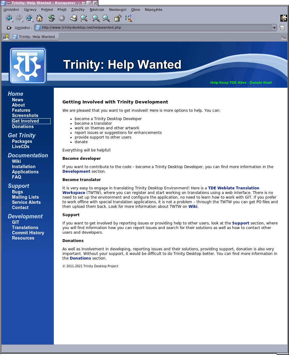
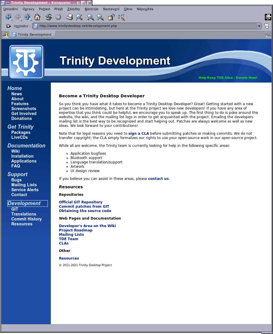
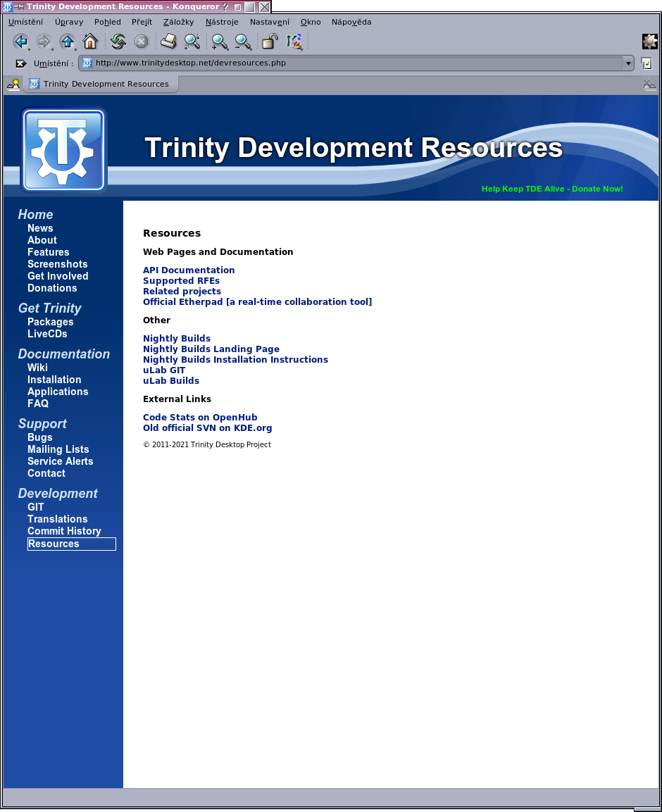
In order to move forward in refresh web, I prepare a new content of Get Involved page. Its original content that was focused on developers I have moved to the Development page. And the existing links for developers I divided between Development and Resources. See attached images.
Keep in mind that this is not a final state - there is still a need for more work on other pages, including Development section.
Cheers
-
 E. Liddell
 -
 E. Liddell
 -
 J Leslie Turriff
 -
 Slávek Banko